Tutorial on Movement and Spacing:
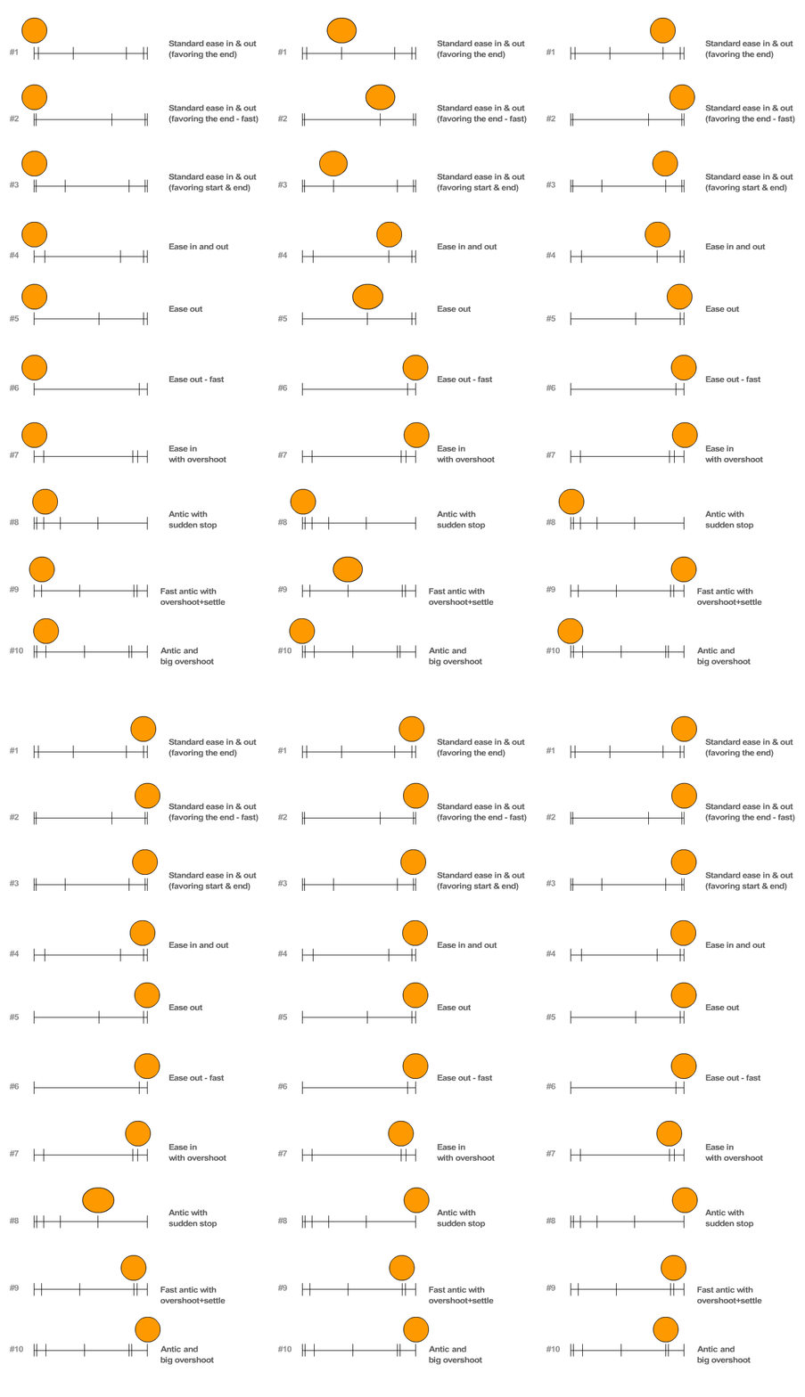 Slow-in / Slow-out
As an action starts, you may have more drawings near the starting pose, one or two in the middle, and more drawings near the next pose. Fewer drawings make the action faster and more drawings make the action slower. Slow-ins and slow-outs soften the action, making it more life-like. For a gag action, we may omit some slow-out or slow-ins for shock appeal or the surprise element. This will give more snap to the animation.
Timing, or the speed of an action, is an important principle because it gives meaning to movement - the speed of an action defines how well the idea behind the action will read to an audience. It reflects the weight and size of an object, and can even carry emotional meaning.
Proper timing is critical to making ideas readable. It is important to spend enough time, preparing the audience for, the anticipation of an action; the action itself; and the reaction to the action. If too much time is spent on any of these, the audience's attention will wander. If too little time is spent the movement may be finished before the audience notices it, thus wasting the idea. The faster the movement, the more important it is to make sure the audience can follow what is happening. The action must not be so fast that the audience cannot read it and understand the meaning of it.
More than any other principle, timing defines the weight of an object. Two objects, identical in size and shape, can appear to be two vastly different weights by manipulating timing alone. The heavier an object is, the greater it's mass, and the more force is required to change its motion. A heavy body is slower to accelerate and decelerate than a light one. It takes a large force to get a cannonball moving, but once moving, it tends to keep moving a the same speed and requires some force to stop it. When dealing with heavy objects, one must allow plenty of time and force to start stop or change their movements, in order to make their weight look convincing. Light objects have much less resistance to change of movement and so need much less time to start moving. The flick of a finger is enough to make a balloon accelerate quickly away. When moving, it has little momentum and even the friction of the air quickly slows it up.
Timing can also contribute greatly to the feeling of size or scale of an object or character. A giant has much more weight, more mass and more inertia than a normal man; therefore he moves more slowly. Like the cannonball, he takes more time to get started and, once moving, takes more time to stop. Any changes of movement take place more slowly. Conversely, a tiny character has less inertia than normal, so his movements tend to be quicker. The way an object behaves on the screen, the effect of weight that it gives, depend entirely on the spacing of the poses and not on the poses themselves. No matter how well rendered a cannonball may be, it does not look like a cannonball if it does not behave like one when animated. The same applies to any object or character. The emotional state of a character can also be defined more by its movement than by its appearance, and the varying speed of those movements indicates whether the character is lethargic, excited, nervous or relaxed.
The relationship between timing & spacing:
Timing is the amount of time or frames that you give to each movement.
Spacing is the space or gap that you leave between each frame or pose.
Here's the old school, traditional animation version:

Flash version:
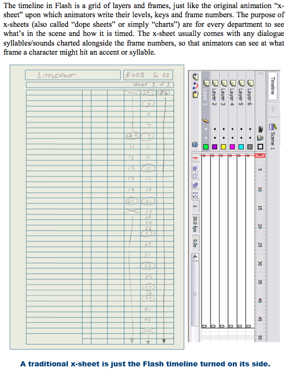

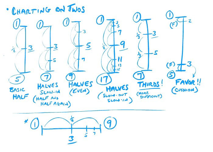
Charts can be made in halves or thirds, or animated on 1s or 2s.
It's all about how to break down and divide up the action within 24 frames per second.
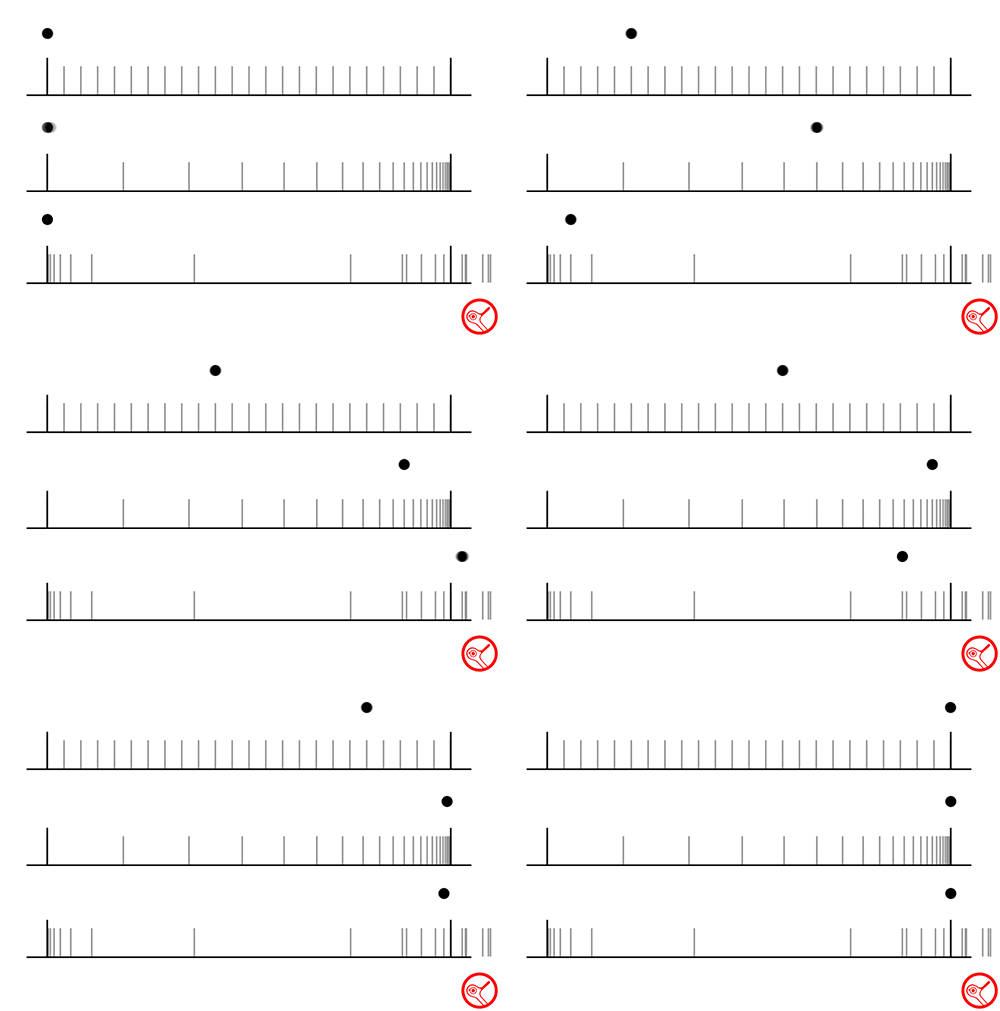
The relationship between timing and spacing is the very core of all animation.
See these three samples, they all have the exact same timing (start and stop at the same time), however the spacing for each one is very different, producing three very different effects.
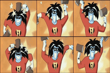
For example, see how John Kricfalusi has a distinctive style in the timing of his animation:
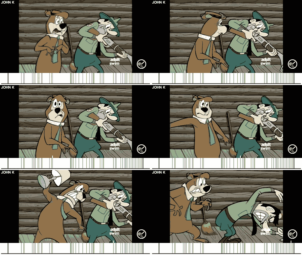
See when he decides to hold the poses, and for how long, when he slows down, and when he speeds up.
Learn more about Timing Charts here.
Test 10 | Standing High Jump |
Jump Samples:
> Animation Tutorial: Jumping Up & Down
> Animation Tutorial: Pose-to-Pose vs. Straight-Ahead
Practice drawing/posing this simple character model:
A character jump is a great way to practice overlapping action; the tendency for parts of the body to move at different rates (an arm will move on different timing from the head and so on).
Since a fully traditional animation technique should be used, I'd recommend you read these:
How to Draw Cartoons for Animation
Preston Blair's Cartoon Animation
Gesture Drawing for Animation
Dynamics of The Animated Drawing
Walt Stanchfield's Action Analysis
Look at this sample to observe how all the fundamentals of animation can be shown in a single clip.
Overlapping action is one of the most important principles to practice over and over again, it adds so much weight and life to character movements.
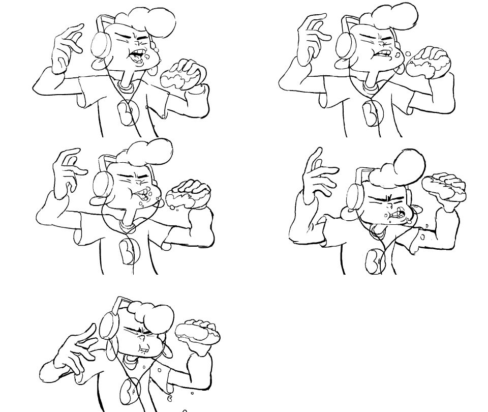
Here's a character jump tutorials and other helpful tips:
Remember - Many character movements can follow this system:
Anticipation - Action - Reaction
Anticipation- Preparation.
- Catches audiences eye.
- Directional focus, points out object of the action. Usually moves in the opposite direction to add punch and contrast to the action itself.
- In acting it will indicate character and personality.
- Once anticipation is established, the action itself is usually self evident (especially in fast actions).
- Slower actions have more minimal anticipations.

Action
- PRIMARY ACTION is not caused by another force. It is the motivating force.
- Once an action is started it must be completed.
- In dialogue, strong actions are cued by strong inflections in the spoken phrase.
- Real action is a manifestation of force. All actions have meaning, some stir an emotional response, these become gestures.
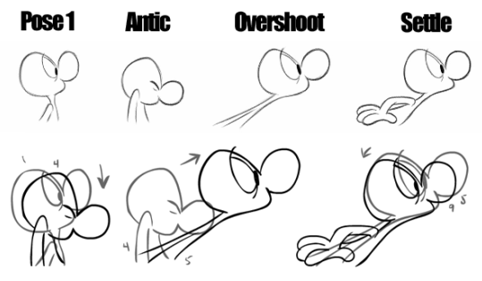
Reaction
- FOLLOW-THROUGH ACTION occurs as a result of another action.
- Subject to the effects of gravity, elasticity, buoyancy.
- Clothing is always secondary, either fixed or flowing.
- Drapery is secondary to body action and gravity.
- Appendages (ears, arms, tail, legs,) can be secondary to body actions and gravity, or become primary when motivated by thoughts.
- Overlapping action BEGINS within the action itself.
- Overlap a series of actions to enhance overall fluidity.
- Characters are subject to ALL the mechanics of structure and gravity.

(C) Animation by Dana Terrace
[ Animation Physics Lessons ]
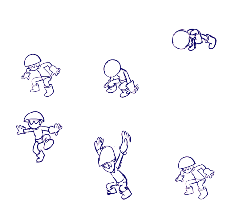
Timing, Spacing, and Gravity
These tutorials cover the basic elements of falling motion, specifically how to create believable timing and spacing.
- Intro to Falling [Video Tutorial]
- Uniform Motion [Video Tutorial]
- Slowing in & Slowing out [Video Tutorial]
- Falling Time [Video Tutorial]
- The Odd Rule [Video Tutorial]
- Fourth Down at Half-time Rule [Video Tutorial]
- Strobing and Stretch [Video Tutorial]
Week 4
Test 11 | Smoke Burst |
> A Step-By-Step Tutorial
Samples:
Test 12 | Laser FX |
> A Step-By-Step Tutorial
Samples:
Week 5
Test 13 | Ball Pitch |
> Successive Breaking of Joints & Flexibility
> Guideline for Smears Part 1
> Guideline for Smears Part 2
> Tutorial on Timing
> Anticipation and Path of Action
> Silouettes & Moving Holds
Keep in mind timing involves 2 things:
1) How fast something moves
2) How long it doesn't move (holds)
Evenness in timing is boring. A scene with characters all moving at the same speeds and inbetweened evenly, will look like mush. Even timing should only be used for smooth or mechanical movements. The closer together the drawings are, the slower the action.
Flash allows for animating on 1s and 2s (in combos) to be quite easy.
Use Flash to your advantage, render line tests often (On a PC: CTRL+ENTER - - on a Mac: CMD+ENTER) and quickly edit and move frames around to adjust your timing. Use combinations of 1s and 2s to keep from having the timing look too even. When something is moving fast (spacing between the drawings are far apart) have it on 1s, most other times it should be on 2s.
Slow moving action means heavy weight, tired and deliberate, animating on 2s and even on 3s to help keep it looking slow. The farther apart the drawings are, the faster the action. Quick movement implies lightness and high energy. Using 1's in the middle of an action adds fluidity, and keeps the time and attention focused on the extremes, where it belongs!
Sample:
Ball Pitch animation courtesy of Matt Lambert:
Planning Key Poses
Obviously when planning a set of key poses for a shot or scene, the animator needs to be acutely aware of the requirements of the script and the particular actions and events that are necessary to progress the storyline. Background layouts will define an 'acting space' while storyboard frames will indicate the 'business' of each shot. What is entirely under the animator's control is the way the character 'acts' out these events as informed by an understanding of the character's personality traits, visual design and current emotional state. The key pose planning process goes hand-in-hand with the idea of staging each action in such a way that it 'reads' well and communicates clearly.
Pose-To-Pose Animation Method
'Key poses', 'key drawings' or just 'keys' are terms used to describe those critical positions of an animated character or an object which depict the extreme points in its path of motion, or accents in its expression or mood, or even antics and overshoots. For this reason they are sometimes called 'extremes'.
This method of animating from one pose to the next, hence the term 'pose to pose' animation, allows the animator to map out the action in advance with storytelling drawings. It is a particularly useful animation method when a character must perform certain tasks within a predetermined time or where a series of actions must synchronise accurately with a recorded sound track. The technique helps ensure that characters arrive at a particular place on screen at a precise point in time. Usually the storyboards/animatic nd lengt of shots cannot be altered, the animators must work within these limits to complete the characters' performance within the given amount of scree time.
Look through this Flash file to see the difference between pose-to-pose and straight-ahead animation.
Here's samples of 'straight ahead' technique by master animator Rune Bennicke. You'll see how loose and lively the animation is. What it lacks in consistency, it makes up for in energetic and spontaneous actions:
Animation usually operates in the realm of caricature in which exaggeration becomes an important factor in order to capture the spirit of the action being depicted. Good strong key poses emphasize and communicate the intent of an action more efficiently than ill-considered ones. Put simply, strong keys lead to strong animation. It is therefore vital to spend time and thought working out the key poses until they do their job as expressively as possible as it will pay dividends in the quality of your scene. "Limited" styles of animation are based on keys only, and this labour saving technique does not necessarily affect the audience's enjoyment of a piece:
Expressive Poses
As animators we must work out the key poses of a particular sequence, you must also consider whether or not the action works well if reduced to a silhouette. Staging the action of hands gesturing immediately in front of the body may not be as effective as staging this action in profile where the various shapes and forms can be seen in a way that does not rely on the challenge of drawing complex foreshortening.
Poses should have both function - depicting the physical extreme of an action or setting up the character for an action to follow by loading its 'muscles', and impact - an expressive pose with a dynamic quality that implies what has gone before, what is about to come, and which registers and emphasizes the inner emotional state of the character.
Animation is an illusion requiring the audience to suspend its disbelief. The audience can be absolutely engaged within the stories we tell and the world of characters that we create. However the illusion is a very delicate one, and alas, it is all too easy to remind the audience that they are merely looking at a series of drawings, a puppet, or a moving computer model.
Test 14 | Dillon Walk Cycle |
> Dillon Character Model
> Walk Cycle Tutorial by Alex Butera
> Walk Cycle Tutorial by Harry Partridge
> Walk Cycle Guidelines
> How to create a walk cycle
> Tips for planning out a walk cycle #1
> Tips for planning out a walk cycle #2
> The Anatomy of a Walk Cycle
Tutorial:
The Physics of the Walk Cycle:

In all walk cycles you need arcs. They give the animation a more natural action and better flow. Think of natural movements in the terms of a pendulum swinging. All arm movements, head turns and even eye movements are executed on an arc. Arcs are a major principle attached to the inbetweening process. Most actions follow an arc or curved path of action. The reason for this is that most actions work like a fulcrum or pendulum. For example, your arm swings from your shoulder. The length of your arm is constant and so as it swings back and forth, the path of action forms an arc.
Samples:
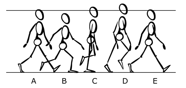
In its most simplest form: Always start off with the main poses. Based on what the legs are doing; A, C and E are presented as the key positions. The step, then the transition, then the next step - those are the legs' extreme poses. However, the torso's extremes (its highest and lowest points) are left to the breakdowns: B and D.
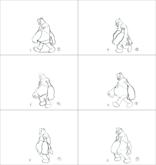
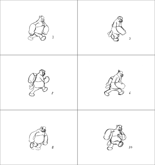
There is countless video resource archives for every possible action, always make sure to build up your personal stash of footage and lists of online sites to visit:

Week 6
Test 15 | Bat Swing |
> Tutorial on Balance
> Posing your Animation
> Favouring Poses
Sample:
Tutorial on the technique that can be used for the one-frame fast bat swing action:
Test 16 | Attitude Walk |
> Lots of Walk Cycle References
> 3D Attitude Walk Tutorial (Awesome)
> Creating a Characterized Walk Cycle (Part 1)
> Creating a Characterized Walk Cycle (Part 2)
> Richard Williams on creating exaggerated walks
Tutorial:
References:
Samples:
There are various styles of drawing, design, and techniques that can be use for a typical profile-view of a walk cycle, but the methodology is usually the same:
"...no matter how amazing you think your animation looks, it is NEVER perfect. Don't take criticism personally, use it to make your animation better and learn from it. Every animator struggles with this from time to time, but you must shake it off and make the best of what you're given..." - John Lasseter
More useful video tutorials:
- Flash Crash Course Part 1
- Flash Crash Course Part 2
- Flash Crash Course Part 3
- Flash Crash Course Part 4
