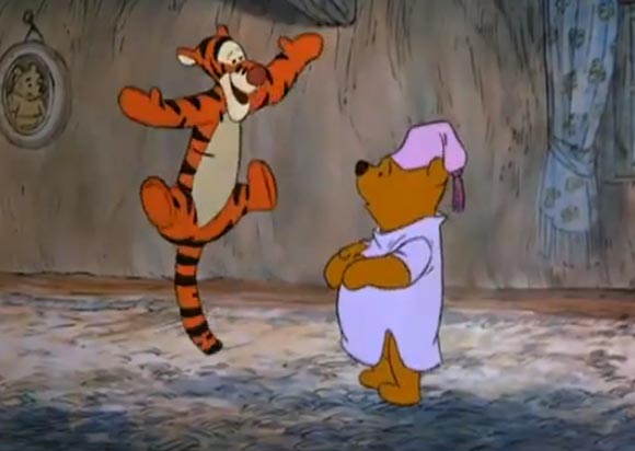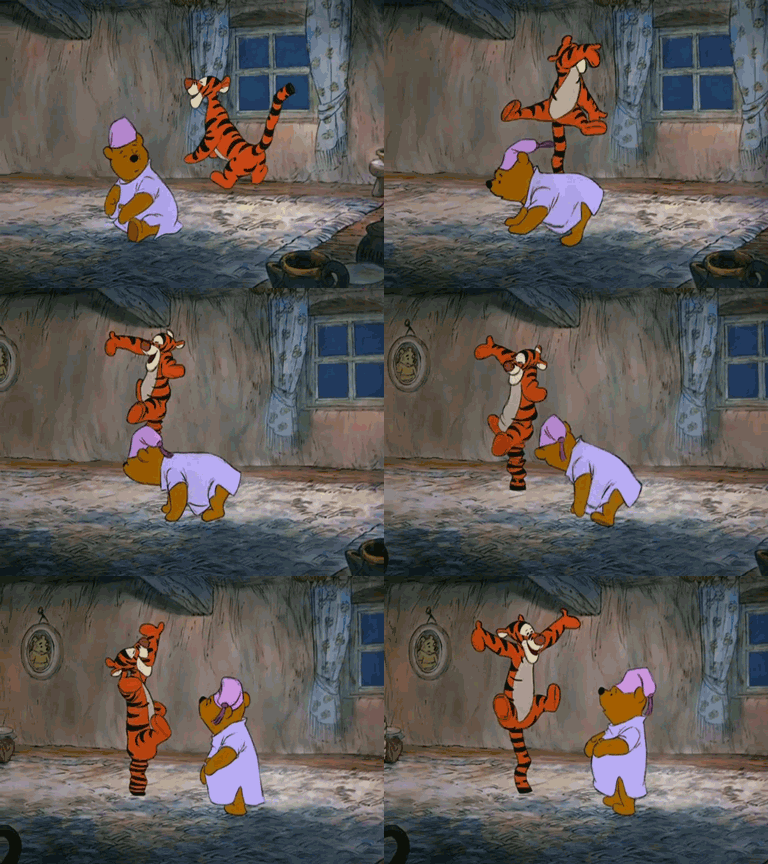
No surprise that this scene from Winnie the Pooh and the Blustery Day (1968) is a Milt Kahl scene. He's one of the all time masters of animation, All the admiration for him and his work is completely justified, he could handle anything, and make it look and move beautifully. His more cartoon-oriented animation really stands out as some of his best. See lots of Milt's animation poses and sketches here.
While the entire four-minute sequence of Tigger in Pooh's house is wonderful (great personality animation, dialogue, pacing, etc.), it's the shot of Tigger bouncing around Pooh that stands out for me. The reason I love that scene so much is that it perfectly encapsulates all twelve principles of animation. In about 7 seconds, each principle is flawlessly showcased, some multiple times, and some intertwining and overlapping one another. As broad and over the top as it is, there's layer upon layer of intricate elements that make the scene work.
For starters, watch when Tigger first begins bouncing:

There's little to no anticipation in his legs, but instead the anticipation is shown in the movement of his head going down before the take off. The tilt of his head, in relation to his arms, legs, ears and whiskers as he first jumps show a great use of arcs. Also notice the successive breaking of the joints on Tigger's arms, from his shoulders to his elbows to his wrists, and the drag on his fingertips.
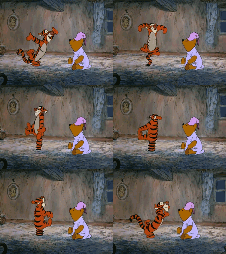
As he bounces in place, you can really feel the energy transferring through his body, from his head down to his tail and right back up to his head again, much like a wave action. The folds and wrinkles in his body as he squashes down not only tell us that Tigger is a well-worn toy with loose stuffing, but how much force and weight that Tigger is exerting with each bounce.
Now, Tigger begins to bounce in a circle around Pooh:

This is why Tigger's stripes play such an integral role in his design. The stripes sell the idea that Tigger is not a flat drawing, but a three-dimensional living creature. His stripes wrap around the forms of his body and give the illusion of volume. So when Tigger is bouncing around Pooh, those stripes make it clear that Tigger's body is turning away from us in perspective. Also notice the overlapping action on Tigger's tail, and how it bends and swings at the kinked parts.
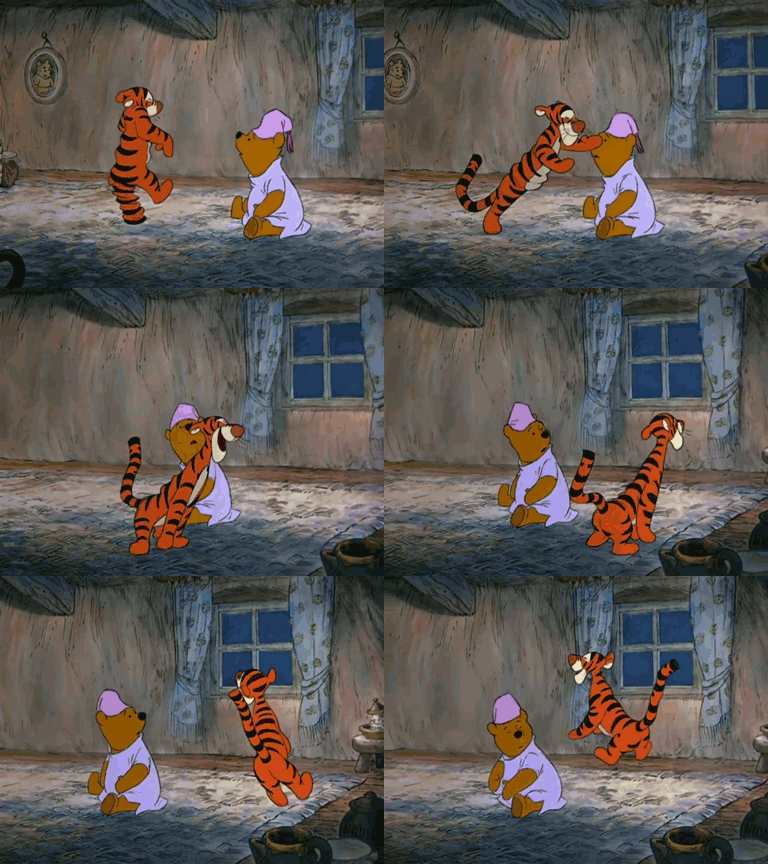
Tigger then jumps up and spins on his tail:

There's so much going on in this one-second action. Tigger's torso is twisting and contorting, his top half slightly delayed than his bottom half. Like before, his arms and legs following arcs, and his hands, ears and whiskers are dragging behind. And while all this is going on, he's squashing and stretching on every bounce until finally easing into his final pose before making physical contact with Pooh and charging offscreen.
And throughout that entire scene, on every bounce, footstep and contact, Tigger is hitting every single beat in the song. Each of Kahl's key poses are appealing, with clear staging and strong silhouettes. It's almost contradictory how Tigger moves. While he's galumphing around the screen like a roughhouse, there's a certain level of grace in his movements. And both Tigger and Pooh's personalities are easily distinguishable, Tigger being confident and boisterous and Pooh being underplayed and submissive. Overall, a tour de force of animation.
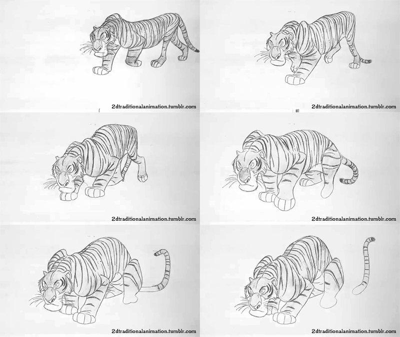
Coincidently, Kahl was also animating Shere Kahn in The Jungle Book around the same time. They're both tigers (Tigger loosely so), but look how drastically different in approach and execution they are from each other.

Shere Kahn is restrained and more subtle in how he's built and functioning like a real tiger, while Tigger is so full of energy and enthusiasm that he's practically bursting at the seams, and is a completely graphic design. Compare them to Kahl's caricatured tiger from the Goofy short Tiger Trouble twenty years earlier and you have some sense of how broad Kahl's abilities were as an animator.
Here's a breakdown of the scene, encompassing all the principle's of animation:
