- This site works better in Firefox, Safari or Chrome.
It will take a while to load up, please be patient.
- Please use Photoshop CS6, if you are using CS5 or CS4 (do NOT use the 64 bit version, unless your version of Windows is compatible), otherwise you will have problems accessing certain Filters.
- If you use CS3, you will have issues in regards to accessing Adjustment Layers, you can get by this by accessing the 'Adjustments' under the 'Image' menu.
If you are completely new to Photoshop, you may want to go through these lessons, they provide a fantastic starting point for beginners: Photoshop Guide
You may click on each assignment number to jump directly to the tutorial.
Create FOUR new custom Brushes, send an image file to the instructor including a stamp of all four different brushes in one document.
INSTRUCTIONS:
We will start off with this image, I found it on the internet, the more high resolution the image is, the better, find your own graphic or photo online (Google Images Search is a good place to start), find an image of something with a white background similar to this.
Now the aim here is to create a black and white image, with the correct contrast to make a successful brush. First, goto Image > Adjustments > Desaturate. This will remove all color from the image:
Next, goto Image > Adjustments > Levels, and adjust the slider to get rid of the colored background. We can still leave all the small details like the small cracks.
Next, press Ctrl+A or goto Select > All, then goto Edit > Define Brush Preset. This will bring up a box for us to name the brush:
***Note: if you cannot select the 'Define Brush Preset' option... most likely the problem is that your image is too big. Go to Image > Image Size: reduce the width and height dimension to anything below 2500 pixels. Then repeat the last two steps.
Give the brush a name and Photoshop will add the brush to the currently selected brush set. So if you choose the brush tool, and then goto the different brushes by clicking on the drop-down menu at the top, you should see the brush we just added at the bottom of the list.
We will have to make sure we save this brush set if we want to keep our custom brush, because if we do not, our custom brush will be lost when we change brush sets.
To save the brush set, we click on the small arrow () at the top-right of the brushes drop-down, and then choose Save Brushes. We will then be prompted for a filename. Once saved, you can load the brush set in the same way as you would any other - from this menu.
Now to use our brush we simply select it from the list and paint on our canvas !
Now as an alternative:
DOWNLOAD this tutorial - it shows another way of using the magic wand tool to select specific areas of a photo texture in order to create a custom textured brush.
Now you know of two ways of creating custom brushes. Create FOUR new Brushes, send an image file to the instructor including a stamp of all four different brushes in one document.
The skillset of digital painting is rooted in traditional drawing and painting, don't expect to be the next superstar concept artist overnight. Creativity is almost impossible to teach (at least not in 11 weeks) - so instead, think of this course as an opportunity to get to know the tools, to learn how to 'execute' the creative ideas you have. Over these five short lessons I'll show you what you need to do to get started on the path of digital painting.
You've probably seen your fair share of concept art on the internet. Whether you're looking at a sprawling Martian landscape or a craggy cave troll, it's likely that you've seen what a digital painter and concept artist is capable of. Though this creation process is involved and fast paced it can be distilled into two basic parts: Design and Execution. The first portion, design, is the deeply imaginative act. How many horns should the elder dragon have? What shape is the alien life form? What armor style and color will that steam-punked barbarian with cybernetic implants have? Digital Painters / Concept Artists work long and hard to create originality. For now, let's focus on the tools and the execution.
Lesson 1
Lose the Mouse
Traditional painters use brushes and pencils, and digital artist use pen tablets and Cintiqs. The key advantage that the tablet brings is pressure sensitivity. While a mouse is only capable of a binary clicking action, the USB tablet outputs a gradation of intensity. Press hard with one of these pens and you get a dark line; ease up to lighten your mark. Though I occasionally hear stories of a digital painter prefering to use a mouse, but it's quite rare.
*If you don't have a tablet yet, you'll have to make do with just a mouse... for now... get a tablet as soon as you can.
Welcome to Photoshop
Used for a variety of graphic tasks, Photoshop is a dense software filled with menus and options galore. Generally speaking, however, digital painting (including character model coloring and comicbook flatting) requires only a small fraction of these offerings. Knowing which parts to display and which parts to hide will make your challenge much easier! Let's begin by creating a new document.
When prompted with the new document dialog, enter the following settings to match those shown here.
Before we go any further, it's time to define a few things. In Photoshop terms, a palette is a free-floating window which contains information (A). When you open the window menu (B), you can reveal or hide the palettes. A check mark means that it's now visible. The vertical palette on the left side of the screen is called the "tool palette". Select the brush tool by clicking on the brush icon.
(A) A Photoshop Palette (B) The Window menu
Tool Properties
Whenever you have a tool selected, the information shown in the top bar will change. This is called the Tool Properties. In this case, there are three different properties which modify the brush tool. If your Tool Properties bar looks different than mine, you might have a different tool active.
Color Picker
Near the bottom of the tool palette, you'll see two squares of color - potentially black and white. These are called the foreground and background color. The color on your brush is known as the 'foreground color'. If you want to change this color, click on the foreground square and it opens up the color picker.
Getting Set Up
Now that you know some of the basics of the interface, it's time to get set up for painting. The necessary palettes to have displayed are the following: Navigator, Layers, Tools.
The Navigator will serve as your roadmap. It displays a thumbnail sized version of your canvas, and allows you to zoom and pan. The small and large mountain buttons control the zoom, and the red rectangle can be dragged around to pan your canvas when zoomed in. You can position these palettes wherever you like, but I like to keep them on the left side of my window. This layout works well for me because I am right handed.
Keyboard Shortcuts for Getting Around
Sometimes operating software feels like digging through a dense instruction manual. You're attempting to do a creative act, but getting bogged down by an endless sea of menus and pulldowns. What better way to speed up your painting than with keyboard shortcuts? These shortcuts* aren't very flashy, but they're worth learning before you progress any further.
*If you are a Mac user, replace each instance of 'Ctrl' with 'command'.
Zoom: To quickly zoom in and out, press Ctrl+ +/ and Ctrl+ -
Pan: If you're zoomed in to a portion of your canvas, hold down Spacebar to temporarily switch to the Hand tool, and left click drag to move your canvas around.
Hide the Interface: Need more space? Hide the UI with the Tab button. To reveal it, hit the Tab button a second time.
Knowing these shortcuts is especially useful if you like the minimalism of a hidden user interface. All keyboard shortcuts work regardless if their button-counterpart is visible, so you can zoom and pan to your heart's content with the interface hidden. Painting full-screen with the user interface hidden has a certain elegance - and might blow some minds at the coffee shop when passer-bys look over your shoulder.
Review
If this is your first experience with Photoshop you might be feeling a bit overwhelmed. Don't worry, everyone feels this way when they dive into new software. To review the concepts covered in this lesson I've created a simple drill.
In Class Practice: Basic Navigation Drill
Draw a red triangle in the upper left hand portion of your canvas.
Change your color to blue, and draw a rectangle in the lower right quadrant.
Change your color to green and draw a squiggle connecting the two shapes.
Hide the interface with the TAB key, and zoom into your canvas with Ctrl+ + so only the red triangle is visible.
Pan your visible canvas while holding the SPACBAR to follow the squiggle path toward the blue rectangle.
Once the blue rectangle is visible, zoom out to show your entire canvas with Ctrl+ -
Repeat this sequence until you feel comfortable with basic navigation!
Lesson 2
One tool, many forms
You might notice that the tool palette contains both a Pencil and a Brush tool. This seems like a reasonable distinction - after all, traditional painters have brushes, pencils, airbrushes, pens, and more. So where are the buttons for airbrushes? Spray paint? Markers? The answer is found in a single tool: the Brush tool. This single tool can take nearly any form - ranging from pens and pencils all the way to watercolor and rubber stamps. For your purposes the brush tool will be the only thing you need to add pigment to your canvas.
To change the type of brush that you're working with simply right click anywhere on the canvas (If you're using a Wacom tablet, the lower half of the rocker switch serves as right click. Be careful when gripping the pen - otherwise you might right click accidentially!)
When you do this a secret menu appears near your cursor. Each of these icons represents a different type of brush. You can add to this list with things called 'custom brushes', or make your own.
What brushes should you use?
Any artist will tell you a different answer to the question of brush choices. The best advice I can offer is to start simple. Limiting yourself to a handful of useful, versatile, brushes is the best way to approach digital painting. Even though I've been painting for years, the three following brushes are used for 90% of my painting.
Hard round - This has a circular head and a sharp edge. It's the most useful brush in all of Photoshop.
Soft round - Also circular, this brush lacks the definition of the hard round. It's more similar to an airbrush or spray paint. It is great for painting smooth transitions and moody atmosphere.
Hard flat - This is a variation of the Hard round. It has a flattened oval head and a hard edge. This has a more directional quality to it, but has a tendency to leave nice looking brush edge marks.
But what about that huge list of default brushes? In the pursuit of clarity, I would suggest getting rid of them. I'm not exaggerating when I say that the 'basic three' brushes are all you'll need to get going. I've provided a small .ABR file which contains my three basic brushes. Right click on this > this link to download this file, and save it somewhere you will remember.
Installing the 'Basic 3' Custom Brushes:
Restart Photoshop
Make a new document
Select the Brush (B) tool, and reveal the Brush palette
Click on the small Settings icon
Select the "Replace brushes" option
Locate and select the Basic_3.ABR file
Congratulations! You've now removed some unnecessary clutter. If you want them back at any time, find the 'reset brushes' option on the same menu.
Brush tool, expanded
By now you've probably experimented with the brush tool. It makes marks pressure sensitive marks in the active (foreground) color. With a few useful keyboard shortcuts, you can have much finer control!
Changing the color: To change the color without using the color picker, just hold down the ALT key. This changes your cursor to an eye dropper and wherever you click will select a new color.
Changing the size: To change the size with keyboard shortcuts, use the bracket keys found to the right of the "P" key. "[" makes the brush smaller, and "]" makes the brush larger.
Alternately, hold down alt+right click and drag the red preview shape to alter the size of your brush (ctrl+option+drag on Mac).
Drawing along a ruler: To draw a vertical or horizontal line, first hold down the shift key. As you draw, you'll notice that your line has a magnetic quality as if you're drawing along a ruler.
"Pulling a straight line": To draw a straight line at any other angle, follow these simple steps:
Click once to define the start, then release
While holding shift, click to define the end of the line.
The one caution of this technique is that the line's intensity will fade as it progresses from beginning to end. Keep in mind that the side you begin with will be darker than the ending side. If you're interested in making technical drawings, you could create a custom brush that has no pressure sensitivity - which would function more like an ink pen. A custom brush of this sort would not exhibit the same fading effect.
Move your current layer around: While the brush tool is active, you can hold the Ctrl key to temporarily select the Move tool. This can be handy if you want to change the placement of the layer you're drawing on.
The Eraser Tool
With all of that brush tool information you just trudged through, do you have the stamina left to learn about the Eraser tool? I'll let you in on a secret: you already have. The Eraser tool functions exactly the same as the brush tool - but it removes pigment instead of adding it. Everything you learned about the brush tool applies!
Because they share a custom brush library, you have access to the 'basic three' erasers when you right click.
In Class Practice: Brush Drills
You've just covered a lot of ground. To review, try your best to re-create the following drawing. I've used the "basic three" brushes to draw a variety of marks. Try to use exclusively keyboard shortcuts if you can.
Here's a quick tip regarding resolution and how it works:
****
Now, you know the basic tools, so let's get back to comicbook flatting.
'Flatting' is the art of applying the base coat of paint to a black and white illustration, no shading, no shadows, no highlights, just flat colors.
Right Click here >>>
Download this image, open it in Photoshop, and paint the character in any colors you wish, using the process shown below.
Step 1
The fastest way to do a quick and dirty paint job in Photoshop is to use the Mulitply-Layer-Method.
To begin, open the downloaded image into Photoshop.
Zoom in to about 50% for now, press Z on the keyboard and point-and-click on the image until it's at a nice size.
Create a new layer.
Click on the New Layer button at the bottom of the Layers tab.
If you cannot see the Layers tab, hit F7 to open it.
Step 2
Change the layer's Blend Mode from Normal to 'Multiply'. This will allow the black lines come through even though you will be painting on a level over top of the original line
work.
Step 3
Select the Brush tool.
Then go to the top left corner of the screen to access the Brush Tool options.
Choose any one of the Brushes from that top row and change the size to something around 40 to 50 pixels in size and make sure the Hardness is at 100% (to make sure the outer edge of your brush stays sharp and not fuzzy).
Step 4
Pick a color (any color).
Here we'll go with a slightly dark and dull red color for this Hellboy character.
The way this color spectrum works is the further to the right you go the more saturated the color will be, the further down you go, the more black you are adding to your color, thus making it darker. Therefore the higher up you go in the color box the lighter the color will be and the further left to move, the more muted the color will be. Control the actual color with the rainbow spectrum strip in the middle.
Step 5
Now we're ready to paint.
Start anywhere and click and drag to paint over top of the line work.
Don't worry about goign over the lines, you can fix that later.
If you are painting over the black lines, but the lines aren't popping over your color, then it means you don't have your Mulitply layer selected. Press UNDO (ctrl+z on the keyboard) and click on the 'Layer 1', then start painting again.
You may zoom in by pressing Z on the keyboard, click a few times on the image, then press B to get back to your Brush.
Step 6
So once you have a portion painted, you can go back and make some touch ups.
Switch to your eraser tool and you can remove the areas (the eyes or outside the contour of his head for example) to remove the access paint.
When you select your Eraser Tool, make sure it also has a large and hard-edged brush. Now remove the unwanted paint.
Step 7
Now let's continue with our base color.
To shift your way down the canvas, hold down the space bar and click and drag up to scroll down. Once you get used to moving around your image like this, it's faster than using the scroll bars on the sides.
A quick trick is to use a small-medium brush to do the edges and then enlarge your brush to do the larger inner portions of the surface area.
Another simple trick to change your brush size quickly is to use the bracket keys. Flipping between the two "[" "]" buttons on the top right portion of your keyboard will expand and shrink your brush size.
Remember, to always be changing brush size to paint larger areas with a big brush and smaller brushes for those tight spots and the edges of the character.
Once you've painted all his skin and his 'right hand of doom', you can start to make up new color for the leather belt, the buckle, the wrist bracelet and pouch.
If you ever want to go back and pick an old color that you had already painted with, simply click on the color box from the tool box, with the window open, click on the color you had painted with before, hit OK and now you have that old color again.
Step
Finally, zoom out, check for any areas you might have missed, or spots where you should erase paint that has bled passed the line's edge.
That's it! You're done!
It's that simple.
Now you know the basics for comic book flatting.
Step 1
Create a new Photoshop document (set the size to 720 x 480).
Press D (to set default foreground and background colors) Press Alt+Backspace to fill canvas with black color. Duplicate the layer (right click on the current layer on the layer's panel and select 'duplicate layer'). Continue working on this new layer.
Step 2
Select the gradient tool from the tool bar, place the cursor at the bottom of the canvas, click and drag it to the top of the canvas. Now your canvas has a black and white gradient fill.
Step 3
Click on Filter>Distort>Wave
The Wave window appears, change the settings to the same as these:
Step 4
Click on Filter>Distort>Polar Coordinates. The polar coordinates window opens up, give the settings as 100% and check the 'Rectangular to Polar' option.
Step 5
Click on Image>Adjustments>Hue/ Saturation - ***Check the 'Colorize' option*** then change the settings to - Hue: 200, Saturation: 25 and Lightness: 0.
Step 6
Next click on Filter>Render>Lighting Effects and set the Light type to Omni and tweak the other settings to give you a nice glow from the center outards.
***NOTE***
In Windows:
If you cannot find the 'Lighting Effects' Filter, it's because you are not running in 32 bit mode. Your Windows operating sysem comes in 2 versions: 64-bit and 32-bit. 64-bit can run both Photoshop versions. If, for example, your computer is running on Windows 7 64-Bit, you have the option of installing Photoshop 64-bit and regular 32-bit. The difference is pretty much how much RAM PS can use. So if you're using the 64-bit version of Photoshop, it doesn't have Lighting Effects, but the 32-bit version does. Open PS in 32-bit mode and Lighting Effects will be there.
On a Mac:
- Close Photoshop if it is open
- Find the Photoshop application file located in the Photoshop CS5 folder
- Right click or control click on the appliction and choose "Get Info"
- Click the checkbox "Open in 32-bit mode"
- Restart Photoshop
Wham! Bam! Thank you Mame! You've got your self a classic star burst effect used a billion times in movie posters.
Clipping masks can be used for a variety of reasons. They can be used to place an image inside text, or to place an image inside a shape. Clipping masks can also be used to edit a selected portion of an image.
Step One: Create a new document in Photoshop. If your document is going to be used on the web, I recommend setting the resolution to “72.” Next, type out your word(s). I chose “HELLO” to keep things simple, but you could also use this tutorial for blog headers, as text to lay on top of photos in posts, etc!
Step Two: Create a new layer ON TOP OF your text layer. You can create a new layer either by going to Layer >> New >> Layer (in the top menu) OR by clicking the thing that looks like a piece of paper next to the trash can in the bottom right of your layers panel. Your new layer will be blank (white). Then, you can draw whatever you want in that new layer. I chose to draw some colorful scribbles using the brush tool.
Step Three: Make sure your new layer is highlighted in the layers panel (like mine is).Then, go to Layer >> Create Clipping Mask. A shortcut is to hover between your two layers (in the layers panel) with your cursor while holding down the option key (on a Mac). You’ll see a little arrow pop up and when you click, it will create a clipping mask.
Step Four: Admire your badass work.
Alternatively, instead of creating a new layer in step two, you could drag a photo or another graphic on top of your text (just make sure it’s on top of your text in the layers panel). In the example below, I dragged a shiny gold image into my document. Then, when you create a clipping mask, your words will take on the effect of the image you’re using, which makes my words look gold!
This just illustrates the power of clipping masks.
Clipping masks are non-destructive. This means we can remove the clipping mask if we change our mind. To remove a clipping mask, select the clipping mask layer (the image layer). From the layers palette menu: simply click on the tiny little three lines at the top right of the layers palette, select Release Clipping Mask. This will remove the clipping mask and the entire image will now be visible.
Clipping masks are theoretically similar to layer masks, albeit with a few key differences:
• Clipping masks can be applied to multiple layers, while layer masks work on just single layers.
• Clipping masks act as layers themselves and thus, can be stacked, just like normal layer. A layer mask, on the other hand, is merely a modification of a layer.
Since clipping masks act as layers, you can apply multiple effects to them. In contrast, layer masks can only be used to control transparency of the underlying layer.
Source: melyssagriffin
It will tour you through the many features found in layer adjustment properties and settings. Try not to be overwhelmed, there's lots to take in, but it's actually a very fast and a simple guide to read through.
Play around with some Adjustment Layers to increase the vibrance, contrast, and color saturation, and do whatever you would like to enhance the photo. As another option; You can even use the Sponge Tool...
to accentuate the lips and eyes (set the Sponge to 'Saturate' in the Options bar at the top),
The final product could look something like this:
NEXT WEEK:
Bring a few of your own photos to class, you'll be having fun manipulating them.
In this tutorial, I'll show you how to convert your photograph to a black and white image and then selectively keeping certain part(s) of it colorized, in addition, we'll do a bit of optional color modifications.
First of all, find a photo, from the internet (or one of your own).
Open it in Photoshop and make sure you have your Adjustments and Layers tabs visible and handy.
Now duplicate your main layer by dragging it onto to the paper icon.
Then make the bottom layer invisible by click on the 'eye' icon.
Then click on the Adjustment Layer button.
Choose 'Hue/Saturation'.
You'll notice you have a new weird looking layer and your Adjustments panel has changed.
Now comes the fun stuff.
- Drag back the Saturation level to turn your photo into a black & white image.
- Choose black for your foreground color.
- Choose the Brush tool.
- Make sure you have the built-in Mask window selected.
- Make sure you have a hard edge brush, remember; you can
change the size with the bracket keys [ ] at any time.
- Start painting in the areas you want to have the colors come through.
Paint it whatever parts you want, once you're done, that's it!
HOWEVER! As an added bonus (completely optional)...
Simply select your 'copy' layer.
Go to Image > Adjustments > Hue/Saturation.
Click on the Colorize switch.
Play around with the two top levels until you get the color you want.
Click OK, and you've successfully isolated and altered color to the
black and white image.
You can use the image below (right click on it to save it to your Desktop), or use one of your own photos or find one from the internet.
Open the image that you will use for the change of color.
Take a soft brush and adjust the diameter according to the size of your image.
The larger the image resolution the bigger the brush you need to make.
Press the "Q" key to enter in quick mask mode (if this doesn't work click on the quick mask button at the bottom of your tool bar). Mark all the hair area, if you have problems and you go in some wrong areas, just use the eraser to correct. Adjust Brush size with the [ ] keys.
Once you're done - Press again "Q" to leave the quick mask mode.
Now we have a selection around the hair, but we need is the selection in the hair, so go up to the menu to invert the selection: Select > Inverse.
Now it is necessary to dye the area of the selection. To do this, make a New Fill Layer: Layer > New Fill Layer > Solid Color. The basic properties of the new fill layer will appear - change the mode to Soft Light. Click Ok.
Then use the color picker to select the hair color. Try a few different kinds to see which one you like best.
Find a photo to work with (either one of your own or from online), preferably a wide shot.
Here's the photo we'll be using for this tutorial:
Here's how it will look once we've added in our falling snow effect:
Step 1: Add A New Blank Layer
We'll be getting into managing layers with this assignment, layers will be the most used item in all your Photoshop projects, don't be afraid of them, get familiar with how to use them.
To begin, open the image and let's add a new blank layer above our photo. If we look in our Layers palette, we can see that our photo is sitting on the Background layer, which is currently the only layer we have. Click on the New Layer icon at the bottom of the Layers palette. It's the icon second from the right, beside the Trash Bin:
Nothing will seem to have happened in the document window since the layer we just added has nothing on it yet, but if we look again in the Layers palette, we can see that we now have a new blank layer, which Photoshop has automatically named "Layer 1" for us, sitting directly above the Background layer:
Step 2: Fill The New Layer With Black
Now that we have our new layer, let's fill it with black. Normally, to do anything to a specific layer, we first have to select the layer in the Layers palette, but in this case, Photoshop has automatically selected our new layer for us, so we're good to go. We can tell that "Layer 1" is selected because it's highlighted in blue. To fill the layer with black, we'll use Photoshop's Fill command. Go up to the Edit menu at the top of the screen and choose Fill:
This brings up the Fill command dialog box. At the top of the dialog box is the Contents section. This is where we tell Photoshop which color we want to use to fill the layer with. Choose Black from the list, then click OK to exit out of the dialog box:
Since "Layer 1" is sitting above our photo on the Background layer, filling "Layer 1" with black blocks our photo from view. The entire document window now becomes filled with black:
Step 3: Add Some Noise
Let's add some noise to this layer, which in just a few short steps will become our falling snowflakes. When most people hear the word "Noise", they immediately think of whatever music those darn teenagers are listening to these days, but in Photoshop, noise is actually nothing more than a whole bunch of little dots. Photoshop has a filter built specifically for adding noise to an image, and by sheer coincidence, it happens to be called the Add Noise filter. Go up to the Filter menu at the top of the screen, choose Noise, and then choose Add Noise:
This brings up the Add Noise filter dialog box. Use the Amount slider in the middle of the dialog box to adjust the amount of noise that's being added. There's no specific amount to add for this effect, we just need a lot of noise. Dragging the slider to a value of around 150% or so should do the trick. At the bottom of the dialog box, select the Gaussian option, and way down at the very bottom, select the Monochromatic option, which will give us little black and white dots for our noise instead of the default red, green and blue dots:
Click OK when you're done and you'll see your document window fill with noise:
Step 4: Apply Some Blurring To The Noise
Let's soften our noise up a little bit by applying some blurring to it. This will also help to clump some of the little dots together, creating different sizes and shapes for our snowflakes! The most popular way to blur something in Photoshop is with the Gaussian Blur filter because it's very simple to use and yet still gives us control over the amount of blurring being applied, but for this effect, we can use something even simpler. Go up to the Filter menu, choose Blur, and then choose Blur More:
The Blur and Blur More commands have been around since forever in Photoshop and both give us a quick, no-hassle way of blurring an image. Blur offers a subtle amount of blurring, and Blur More offers a slightly stronger amount. Problem is, as you may have noticed when you applied the Blur More command, there's no dialog box associated with them, which means we have no control over the amount of blurring that's applied.
Normally, that's a bad thing, and it's a good reason to stick with the Gaussian Blur filter or one of the other more advanced blurring filters in Photoshop. For this effect though, all we needed was a subtle amount of blurring to apply to our noise, so this was a rare case where the Blur More command worked just fine.
Step 5: Reduce The Amount Of Noise With The Levels Command
At this point, our document is filled with lots of noise. Too much noise, in fact. We need to get rid of some of it so our noise looks more like snowflakes and less like, well, noise. For that, we'll use Photoshop'sLevels command. Go up to the Image menu at the top of the screen, choose Adjustments, and then choose Levels:
This brings up the Levels dialog box. In the center of the dialog box is a graph known as a histogram which gives us a visual representation of the tonal, or brightness, range of our image. In other words, it shows us how many pixels in the image, if any, are pure black, how many, if any, are pure white, and where the rest of the pixels fall along the brightness scale between black and white.
Directly below the histogram are three little sliders - a black one on the far left, a white one on the far right, and a grey one in the middle. We're going to use these sliders to not only remove much of the noise but also to brighten the noise so that our snowflakes appear white and not some dull grey color.
First, to brighten the noise, click on the white slider below the histogram and drag it to the left until it's just past the point where the right side of the histogram slope begins. You'll see the noise in your image become brighter. Then, to remove much of the noise, click on the black slider and drag it to the right. As you drag the black slider, you'll see large areas of the noise getting progressively darker and eventually disappearing into pure black:
Continue dragging the black slider towards the right until you've removed enough noise so that what remains looks less like noise and more like snow, then click OK to exit out of the Levels dialog box. Your image should now look something like this:
Step 6: Change The Blend Mode Of The Layer To "Screen"
Things are starting to look a bit more wintry, but we do have one small problem. We've created all these nice white specks to use as snowflakes in our photo, but we can't actually see our photo! It's still being blocked from view. We need to hide all the black areas on the layer while keeping the white specks visible. Fortunately, Photoshop makes this incredibly easy thanks to layer blend modes! Blend modes give us all kinds of interesting ways to blend layers together, and one of them in particular will do exactly what we're looking for.
With "Layer 1" still selected, go up to the Blend Mode option at the top of the Layers palette. It doesn't actually say "Blend Mode" anywhere, but you'll see a drop-down box that by default is set to "Normal". This is the Blend Mode option. Select the Screen blend mode from the list:
With the blend mode of "Layer 1" set to Screen, any areas on the layer that are pure black will completely disappear from view, revealing our photo on the Background layer behind it, while our white snowflakes will remain visible! If we look at our image in the document window, we can see that sure enough, our photo is now visible behind the snowflakes:
Step 7: Apply The "Motion Blur" Filter
Our snowflakes are still looking a little harsh, and they also look like they're just stuck on the photo rather than falling from the sky. Let's give them some motion using Photoshop's Motion Blur filter. Go up to the Filter menu, choose Blur, and then choose Motion Blur:
This brings up the Motion Blur dialog box. At the bottom of the dialog box are the two controls for the filter. The first one is Angle, where we can set the direction we want our snowflakes to be falling from. Set it to around -65 degrees. Below that is the Distance option where we decide how much of a motion trail we want an object to have. Let's give our snowflakes just a hint of motion, not too much. I'm going to set mine to around 8 pixels:
Click OK when you're done to exit out of the dialog box, and your falling snowflakes should now look more realistic:
Step 8: Duplicate The Layer
Now that we have one layer of falling snow, let's use it to create a second layer, this time with bigger snowflakes, to give the snow a sense of depth. First, let's duplicate "Layer 1". Go up to the Layer menu at the top of the screen, choose New, and then choose Layer via Copy. Or, for a much faster way, simply press the keyboard shortcut Ctrl+J (Win) / Command+J (Mac). Either way duplicates "Layer 1" and if we look in the Layers palette, we can see that we now have a new layer named "Layer 1 copy" sitting above "Layer 1":
Step 9: Rotate The New Layer 180 degrees
Let's try to cover up the fact that we're using a copy of the exact same snowflakes by rotating the new layer 180 degrees. With "Layer 1 copy" selected in the Layers palette, go up to the Edit menu at the top of the screen, choose Transform, then choose Rotate 180 degrees:
This way, the snowflakes on the new layer will still appear to be falling at the same angle as the originals on "Layer 1" but they'll be spaced out differently. In fact, it will now look like you have twice as much snow falling in your image, when all we've done is made a copy of our original snowflakes layer and rotated it.
Step 10: Apply The "Crystallize" Filter
We need to convert our small snowflakes into bigger ones, and for this effect, Photoshop's Crystallize filter works nicely. Go up to the Filter menu, choose Pixelate and then choose Crystallize:
This brings up the Crystallize filter dialog box. The Crystallize filter breaks an image into little sections, or "cells", of color, and you can adjust the size of the cells with the Cell Size option at the bottom of the dialog box. The default value of 10 usually works well for this effect. If you look in the preview area of the dialog box, you'll see that our snowflakes have increased in size. They don't exactly look like snowflakes at the moment, but we'll fix that in a moment:
Click OK to exit out of the dialog box. The photo now has a nice mix of small snowflakes and larger, well, white shapes that will look more like snowflakes once we give them some motion:
Step 11: Apply The "Motion Blur" Filter
We need to give our larger snowflakes some motion so they look more realistic in the photo. Go up to the Filter menu, choose Blur, and then choose Motion Blur once again. When the Motion Blur dialog box appears, leave the Angle set to -65 degrees so the larger snowflakes appear to be falling at the same angle as the smaller ones. Since these flakes are larger than the original ones we created, we'll need to increase the length of the motion blur a little bit. Set your Distance option to around 16 pixels:
Click OK to exit out of the dialog box. And with that, our main "falling snow" effect is complete:
At this point, if you're happy with the results, you can stop here. If you find that your falling snow is a little hard to see in the image and you want to brighten it up a bit, follow along with the next couple of steps.
Step 12: Merge The Two Snow Layers Together
With the top "Layer 1 copy" layer still selected in the Layers palette, go up to the Layer menu and choose Merge Down:
This will merge the top two layers together, and we can see in the Layers palette that our two snowflakes layers have been merged into "Layer 1":
Step 13: Duplicate "Layer 1"
Now that all of our snowflakes are on a single layer, let's duplicate the layer. Use the keyboard shortcut Ctrl+J (Win) / Command+J (Mac) to quickly duplicate it. Our Layers palette shows that we're back to having two snowflakes layers, except this time, each layer contains all of our snowflakes:
With both layers now containing the exact same snowflakes and both layers set to the Screen blend mode, if we look at our image in the document window, we can see that we've doubled the brightness of the falling snow:
Step 14: Lower The Opacity Of The Top Layer
If you find that your falling snow is now too bright, simply lower the opacity of the top layer until you're happy with the results. You'll find the Opacity option directly across from the Blend Mode option at the top of the Layers palette. I'm going to lower mine all the way down to about 35%:
Once you've adjusted the brightness of the snow with the Opacity option, you're done! Here's my final result:
Ok, first step is pretty straight forward. All we are going to do is open Photoshop, and create a new canvas ( File > New ) and I am going to create a canvas 640px wide by 300px high.
We are going to add a background colour, so using the Paint Bucket tool (Shown below) we are going to simply click on the background layer with our selected colour. I am going to use a shade of dark red as my background colour:
Step 2 - Creating our type
We are now going to select the Horizontal Type Tool, which is the big "T" in the tools panel (Circled Below), we could also hit the "T" on our keyboard to select it. This will add an array of options at the top of the screen where you customize your font. I'm going to select the font "Coolvetica" (you can choose any bol and thick font, like arial black or impact), set it to about 172px in size and in the colour white.
Step 3 - Rasterising our type
Now we have our type set up, we are going to make it raster rather than vector (which it is currently in) - Raster means it can't be scaled without pixelisation basically. We do this by going to the layers panel, right clicking on our type layer and clicking " Rasterise Type" from the list.
Step 4 - Erasing the edges
Now we have our raster type on the canvas, we can start it edit its form directly. We need to select the "Eraser tool" from the tools menu - Eraser or press "E" on our keyboard. Then our tool menu will change at the top of the screen. We need to select the "Oil Pastel Large" brush.
We now need to just erase the edges of our type by clicking on our type layer and erasing around the type itself.
We can change the brush, and get a more varied effect, or even create your own brushes to erase with!
Step 5 - Adding effects
We can just as easily add grunge to the type now, instead of erasing it. So I'm going to select the "Brush Tool" from the tools tab (Or press B on the keyboard) and selecting a rough brush from the list. I'm going to use a variation of brushes from the predefined ones in Photoshop.
We could also look at rotating our type slightly to add a more random effect. We can do this by selecting the transform rotate tool from the menu " Edit > Transform > Rotate" then rotating slightly to add that more random look, hit Enter on your keyboard to apply the transformation
Step 6 - Finalizing your type
Now we have our grunge type, its time to experiment! Now experimentation is the best way you can learn Photoshop, you can play with the tools and filters to really create some masterpieces! Don't be afraid to experiment, have fun with it.
For some spray paint & splatter brushes you can use, download the set here.
Now, load the new custom brushes that you have just downloaded:
A - Open the zip file and drag the .abr files on to your DESKTOP.
B - Go back to your Photoshop, select the Brush tool, go to option palette at the top of the screen and click on the icon next to "Brush:" to open the brush preset picker.
Then click on little triangle in the right upper corner.
Next on the list you choose 'Load Brushes'
C - In the dialog box, click on DESKTOP, and choose on of the .abr files you extracted, hit OK, and your new brushes will appear in the Brush palette (at the bottom), repeat the process over and over to get all the .abr files into your system.
Choose the same color as the text, make a new layer, choose a Brush from the downloaded set at the bottom of your brush list and stamp it on where ever you'd like.
First off, download all the materials you'll need
here.
Now choose one of the pictures to manipulate, either the 'old man' photo, or the 'jolie' photo.
Open the image in Photoshop (I chose the snake chick for this tutorial).
Duplicate your background (drag the background layer on top of the new layer icon), and change the contrast of the new layer (image > adjustment > level). In my case, I used 50, 1.44, 255.
Give it a sepia tone effect using the color balance tool (ctrl+b). I entered 60,-5,-70 for my color levels.
Adjust the level again (image > adjustments > level). Now enter 30, 0.89, 255.
Now go through the paper texture files that you had downloaded.
Some are darker than others, some are more grungy and detailed than others, each will produce a different effect based upon which you choose, there's no wrong way of doing it, you just may have to tweak and adjust the opcaity of your layer if the effect is too harsh. Anyways, open up all the texture files in Photoshop and pick the one you like, then press Ctrl+A and Ctrl+C to select it and copy it.
Go back to your photo, press Ctrl+V to paste.
Depending on which texture you chose it may be too big, too small, or rotated the wrong way. Either way you'll have to adjust the texture to fit the dimensions of your photo.
Choose Edit > Free Transform. Slowly move your cursor around the top left corner of the texture, and you'll see you have two options (your sursor changes depending on how close or far you are from the corner edge), you can rotate or scale the image. When the cursor looks like a straight double arrow icon, hold down the SHIFT key while you click & drag to scale the image larger (or smaller), once you'vr sized it up, unclick and double-click on the image to render it. Then you can rotate the image (if need be) to the proper size, choose Edit > Free Transform, and again holding down the Shift key it will rotate the image in perfect 45 degree increments.
Now you've covered your photo with the texture.
Change the layer mode to either 'overlay' or 'soft light' or 'mulitply' depending on how detailed your texture is, all 3 blend options will have different effects, click between all 3 settings and you'll see which works best for you.
Overlay
Soft Light
Multiply
Click on the background copy layer, and use the dodge and burn tool to make your photo look older. With the BURN tool, brush in areas along the edges of body parts and anywhere you see creases or folds in fabric or skin. Then with the DODGE tool, lightly brush in areas that are already plain, without detail, and inbetween dark folds and creases, play around with the brush size, hardness and opacity settings of the tools for both cases, you don't want to go too extreme.
Then add some noise (filter > noise > add noise) to your photograph.
Press Ctrl+U and lower the saturation level.
Now for the final touch, click on your top layer and hit the new layer button.
Click on your Rectangular Marquee Tool.
Click and drag a selection box in the centre of your image, making a thick border.
Go to Select > Modify > Feather: 80 pixels.
Go to Select > Inverse
Go to Edit > Fill
Choose Black 30%
Set the this top layer to Overlay.
This create a slightly darker-edged boarder, foa a vignette-effect.
Wham-Bam! You're done!
Other options: Image > Adjustment > Levels on the texture layer and adjust the contrast of the texture. You can also reduce the Opacity on the first two layers above the main photo, and reducing the Saturation (Ctrl+U) to the main photo, can all produce variations to the "old effect".
NEXT WEEK: Bring a file of a close-up photo of yourself to class.
In this project, you will be adding a tattoo image on to a person's skin.
First thing's first, download all the materials you'll need. You can easily find you own tattoos and photos online or use your own photographs of people, but here's some some generic designs and faces for you to use:
DOWNLOAD.
This is a zip file, to open it, double click and drag the files off on to you desktop, then open the photo image files through Photoshop (save the eps file for later).
Step 1
Ok, open up your image (it can be one of the stock photos I provided or a photo of your own choosing) and duplicate it by clicking on the layer and dragging it to the New Layer icon down the bottom (it's the one to the left of the trash can).
Name this layer Base, desaturate it to remove the color (Ctrl+Shift+U) and duplicate it again. The reason you are doing this is to have multiple stages of your base image, just in case you mess up, so that you can come back at any given time and fix errors.
Step 2
Time to prepare our image. You really want to bring out the detail in the skin, so you're going to up the contrast and adjust the tones a little bit. Let's add a Curves adjustment layers: You can add one by going to Layer > New Adjustment Layer > Curves.
Adjustment layers allow you to change the properties of the image below without actually destroying or changing image data. Do this by fooling around with the graph line in the far right side of your screen in the Adjustments tab. Something similar to this should do.
Step 3
Now that we've finished prepping our image, we can finally start applying the tattoo. Open up (from Photoshop) the tattoo.eps file you downloaded. A 'Rasterize EPS Format' window will pop up, change the resolution to 600, click OK.
You might have to wait a while for the Photoshop to load up the image.
Step 4
Now choose the design you want. Take the Lasso tool and draw a selection around the graphic you want.
Copy and paste a design of your choice onto the face.
Ctrl+C (to copy), then go to your other Photoshop document (with the face), make a new layer (Shift+Ctrl+N) and press Ctrl+V (to paste). The hit "V" to get your Arrow tool to click+drag the image where ever you want.
Move the Tattoo Layer under your Curves Adjustment Layer (just click and drag it).
Move, Rotate and Scale it to adjust it according to where ever you want it to be using the Free Transform Tool (Ctrl+T). Once you're done scaling and turning it to the right position, double click on the tattoo to render it. Don't worry about any excess tattoo lines, you'll take care of that later
Step 5
Double click on the tattoo LAYER to rename the layer to 'Tattoo1' so that you can find it easier. No to shape the tattoo to fit the surface of the face. Depending on where you place the tattoo you need to make it look less flat. Edit > Transform > Warp. Push and pull the grid lines and corners around until it looks like it's conformed to the surface of the face or head.
Sometimes this takes a bit of experimenting to see what works best. Once you're done, choose the arrow tool and hit 'Apply' on the pop up window to render your changes.
Sometimes you have to get the Warp tool out again to make more adjustments to make it look like the tattoo is realistically wrapped around his head or nose.
You can keep warping it to tweak the perspective.
Step 6
Now depending on where you placed the tattoo, you might have to erase parts of it to remove the excess artwork. Take the eraser tool with a hard edge and just remove the bits that go off the edge of the face or into areas of the head that shouldn't belong.
Take the "eye" off of all the layers except for your tattoo layer and the base copy layer.
Reduce the base copy layer down to 50% Opcaity, you're doing this so that you can see through the layer by making it partially transparent, then click on the Tattoo layer and choose the Eraser tool, and start to trim the excess art by erasing the parts of the tattoo you want to remove. Note: change the size of your eraser brush with the [ ] bracket keys.
Now got to you Tattoo layer and change the Blend Options to Overlay.
Duplicate your Tattoo layer once or twice.
Now you have 2-3 layers (set to "Overlay") for the Tattoo graphic.
Depending on how dark you would like the tattoo and what part of the body you've placed it with the contrast levels, you need to achieve a nice blend where the tattoo appears to be semi-transparent.
Now make sure you bring the Opacity back up to 100% for your Base Copy layer.
Step 7
See how the edges of your tattoo appear to be too sharp?
So now go to Filter > Blur > Gaussian Blur and choose a setting between 2.5 to 3.0.
Then apply it to your other tattoo layer copies. Do this quickly by just selecting the layer and pressing Ctrl+F (to re-apply the Blur filter). Keep doing this until it looks like the edges of the tattoo are fuzzy enough.
Don't be afraid to play around with the opacity settings on each tattoo layer, if you want a more faded tattoo.
Step 8
Congratulations. You have created something that looks more or less real for a digitally-implanted tattoo. Now repeat this process at least 2 more times on the same subject and new tattoo designs of your choice!
> Copy and Paste your tattoo on to a new location.
> Scale and rotate the graphic to size up and position to where ever you want it to be (Ctrl+T).
> Use the Warp tool to shape the tattoo to the surface of the skin.
> Set the Layer to 'Overlay' and duplicate the Layer,
or adjust the Opacity of the Layer to make it more translucent.
> Blur the tattoo layers a bit to make it look more real.
> Have fun with it!
Option: If you grab an image from elsewhere, chances are you'll have a white background to the tattoo. To remove this you can click on the Magic Wand tool > Select the white portion, and hit Delete on the keyboard. Or you can simply set the layer to Multiply mode. The reduce the transparency of the layer and warp the image as usual.
Once you're done, save the image as a JPG file and send it to the instructor.
Assignment #12
Photo Alteration with 'Content Aware' Feature:
Using the content aware tool on different images produces different results. Here's a sample of what we're going to do in this tutorial:
As you can see, there are four kids in this photo. In this tutorial, we will use Photoshop CS5's Content Aware Feature to remove the toddler on the left.
We are going to extract the person on the left from this photo. Using the Pen Tool (P) Begin by making a path around the subject. The nice thing about using content aware is that you do not have to be exact when making a selection. In fact, do your best not to cut too close to the subject.
Notice in the image below how far I am drawing the path from the subject. Try to keep this distance all the way around. If you go too close, Content Aware will take pixels from the subject. If you cut too far it will take pixels from the kids on the right. Don't forget to include the reflection of the ground.
Once you complete the path around the subject, turn it into a selection. This can be done by right clicking on the path and selecting Make Selection.
A dialog box will pop-up, make sure the feathering is set to 0px. Leave all other options as they are. Click OK.
Now we have an active selection around our subject. In this step we will make the subject disappear from the image using Content Aware Fill. To do this, go to Edit > Fill.
A dialog box will pop-up, make sure the Content Aware option is selected. Blending mode is set to normal and the opacity is at 100%. Hit OK.
Magic! The kid is gone!
You can deselect by hitting CTRL+D
To repair any of the stray artifacts, select the Clone Stamp Tool.
Select a small to medium sized, soft-edge brush.
Hold down the Alt key and click on a part of the image next to the artifacts.
Let go of the ALT key. Then click and drag on the errors to erase them.
Repeat process to any other areas that have mistakes.
ALT click next to the artifact.
Drag the brsh across and it will clone those pixels as you paint on top.
Let's spice up the picture's colors a bit, go to Image > Adjustments > Curves.
Create a slight "S" curve in the graph just by clicking and dragging on a couple spots on the diagonal line. Click OK.
Finally, lets's crop the image a bit. Select the Recatangular Marquee Tool.
Click and drag a box around the kids.
Go to Image > Crop.
Snap! You're done!
Content Aware can be a very powerful tool, but depending on the level of detail, patterns and colors in the image - it can be glitchy sometimes, for example, an image with a gradient background such as a sky can be quite tricky to work with. You can cancel the selection at any time by making another selection or just by clicking anywhere else on the page with any selection tool, then try the Edit > Fill... Content Aware function again.
This will show you how to manipulate a photo of yourself into a decaying zombie!
First things first.
1. Find a nice portrait photo of yourself.
2. Now, open up your image into photoshop.
3. What we need next is to find some good brushes that can be used for this sample. Download from this link (right click and save to desktop):
Brushes.zip
4. Now, load the new custom brushes that you have just downloaded.
A - Open the zip file and drag the .abr files on to your DESKTOP.
B - Open your Adobe Photoshop, select the Brush tool, go to option palette at the top of the screen and click on the icon next to "Brush:" to open the brush preset picker. Then click on little triangle in the right upper corner.
Next on the list you choose 'Load Brushes'
C - In the dialog box, click on DESKTOP, and choose ONE of the .abr files you extracted, hit OK, and your new brushes will appear in the Brush palette (at the bottom), repeat the process over and over to get all the .abr files one at a time into your Photoshop.
5. Now, choose any one of the new brushes from your palette (scroll to the bottom of your brush list to see them) and find a place that you would like to brush. Set your foreground colour (on your toolbar) to Black, create a NEW LAYER, and just click the brush once somewhere on the face. Set the opacity of that layer to around 40%. And now duplicate that layer, and set the new layer to Overlay, and the Opacity = 100%.
6. Now, all you have to do is keep repeating the above step in various places on her face and other areas (do not do the parts where perspective becomes and issue until you follow the next step). The key is to have LOTS of layers, it alows you to have control over each individual scar, burn and skin-damage piece of art. As you do some of the following, you may have to change the opacity of the original brush stamp's layer to something other than 40%, just adjust it to what ever looks good. Add variety, change the size and color fo the brush slightly. If you click the brush somewhere and don't like how it turns out, have your fingers ready to press CTRL+Z to UNDO.
7. Now, for areas such the thumb, if you just place a brush on there, the perspective doesn't look very real. So to give it the right angles we will need to go to, Edit > Transform > Distort, and Drag your handles in the various directions needed to give it the proper angles.
8. You should get something like this...
9. Now, using what i have just told you, use the edit>transform>distort, for this area of her face. And you will recieve something like this...
10. Now, after you have gone around her face and hand, you should get something that looks like this...
11. Now, go to your original layer of the girl, and copy it, and place it over the previous one. Right click on that layer and set its Blending Mode to Hard Light. You will get something that looks similar to this...
12. Now, while on the layer you just created of the woman, go to your tools and pull out your Burn tool. And put in these settings...
13. Now, with a brush of about 60px or so, brush around where all the scars are. And it will look similar to this...
14. Do this for all the scars. For some of the areas, such as the top of her forehead, you have to play around with the setttings by switching from the Burn tool to the Dodge tool, and play around with changing the settings from midtones to highlights, and paint in areas that are void of details to add even more contrast to the image.
Switch back and forth between the Burn and Dodge tools to darken areas around and behind the scars, and to lighten up areas of the skin that are without detail (play with the opacity of the brush if you find the effects too extreme). You don't want to lighten the areas too much to make it look washed out, so be gentle with the dodge tool on the skin.
15. Now that you have done that, pull out your Dodge tool for her eyes. Set the brush to about the size of your eye, and do some light brushing on the eyes to give it a more clear effect.
16. After you have done that, you can go back and use the Burn tool around your hair in various places and you can get a quiet nice effect depending on your original hair color. Below is the final version of this photo sample after playing around a bit more; painting dark areas on her skin and went around her eyes with the Burn tool to give her some black eyes.
That's it, you're done!
Other versions:
Assignment #14
Cartoon Character Coloring, Shading, Texturing:
DOWNLOAD this file, unzip it, extract the black and white illustrations and pick ONE to paint. Experiment with some shading and highlights, and create some textured brushes and add in some subtle (or extreme) textures onto the character(s) as well.
Experiment with adding textures, here's a sample of a simple blood splatter image taken from the internet, copy/pasted on top, remove the white, set the layer to "Darken" and converted the layer to a Clipping Mask.
1) Download this file to your Desktop. Open the zip file and drag the two lightsaber images to your desktop. Open both of them through Photoshop. Choose one to work with, then close the other image.
2) Now, working with the lightsaber model of your choice, go to Image > Canvas Size. Click on the left square from the image grid, and increase the width to 2000 pixels. Click OK.
Make a new layer and then drag that layer underneath your original light saber "layer 0". Click on Layer 1, paint this new background layer a dark grey color, using the Piant Bucket Tool.
Zoom out a bit. Make a new layer (place this layer on top of all others) and using the square marque tool select a thin rectangular shape (make sure your Feather is set to zero first), click and drag to make a long rectangular selection:
To make the tip of the lightsabre a rounded edge, zoom in on the top, choose the eliptical marquee tool (make sure your Feather is set to zero in the top Options bar), hold down SHIFT, and click and drag to make a rounded top. It may take a few tries to get it right, just Edit > Undo (Ctrl+z), and try again. Then zoom back out.
3) Now go to Edit > Fill... choose White (100%), click OK.
Now right click on the top layer and choose Blending Options.
4) Now click on Outter Glow and choose these numbers -- Blend Mode: Normal, Opacity: 75%, Spread: 20%, Size: 80px, Range 75%
5) Then click on Inner Glow and choose these numbers -- Blend Mode: Normal, Opacity: 75%, Spread: 5%, Size: 15px, Range 50%
Click OK.
You can go back by double clicking on the FX in the layer if you want to make adjustments.
Now zoom in on the handle, reduce the opacity of the layer to 50%, and choose the Eraser tool, change the eraser to a hard edge and trim the light to match the edge of the handle.
6) Place the opacity back to 100%.
Go to Filter > Blur > Blur.
Then do it again...
Go to Filter > Blur > Blur.
This will take the hard edge off of the light shape.
Holding down the Shift key, click on Layer 2 and Layer 1, right click on one of the layers and choose Merge Layers.
Zoom out and observe you're newly constructed lightsabre!
Now you can have countless hours of fun inserting your lightsaber into the hands of you, your friends, or animals!!!
We will be working from photos of dried cracked mud, so go to google images and search for "dried mud". It works best on pictures with top view shots so we can see the cracks. Alternatively, you can use any of the images below. (Click to get larger size). Please note that the results may differ if your image is significantly different to the one I'm using in this tutorial, so experiment, different photos will yield different effects, and the higher the resolution (dpi) of your image the less extreme each filter will have on the image.
I'll be working on the 2nd photo for this tutorial. Based on that image (or whatever one you find), start a new document 800x800, or whatever size you want, you can crop it later.
Now open up the mud image, do a CTRL+A to select all, then press CTRL+C to copy, then go to the new document you just created and press CTRL+V to paste the image.The cracks are dark, so invert the image so it becomes white, this will give it a better explosion effect. So go to Image->Adjustment->Invert (or press CTRL+I).
Now use the eliptical marquee tool and make a large round selection on the image. Hold SHIFT while you create the selection to make a perfect round circle.
Click to view larger image.
Now go to Select->Inverse,
Then hit Delete so you are left with a circle from the mud image. DO NOT DESELECT YET.
Now, while you still got your selection, go to SELECT->INVERSE again to select the shape.
Now go to Filter->Distort->Spherize. Set amount to 100%. Then do it again, this time, 50%. You can now deselect.
Now lets fill the background layer (the layer underneath the mud layer) with black.
Then go to Layer->Flatten Image
Now go to Filter->Sharpen->unsharp Mask.
Amount: 500%. Radius: 1.7px. Threshold: 122 levels
Go to Filter->Distort->Polar Co-ordinates. Options: Polar to Rectangular.
Go to: Image->Rotate Canvas->90CW.
Apply: Filter->Stylize->Wind Method: Wind. Direction: From the right. Hit CTRL+F to re-apply.
Go to: Image->Rotate Canvas->90CCW.
Finally, apply Filter->Distort->Polar Coordinates. Options: Rectangular to Polar.
There you go, now all you do is just play around with colors, by either using Image > Adjustments > Hue and Saturation, or Image > Adjustments > Color Balance. I used color balance in the image below, sometimes I do a bit of both works best, keep experimenting till you find the best colors for your planet.s
Make sure the colors don't get washed out, create a nice balance of light and dark values. This tutorial will work for basically any flat image with textures such as cracks. Here are a few variations.
Before:
After:
Before:
After:
To add a bit more spice to it, make a background nebula. Change your front color to red and back color to black.
Create a new layer. Apply Filter->Render->Clouds. Then Filter->Render->Difference Clouds. Hit CTRL+F (once or twice) to re-apply.
Set the layer's Blending Options to Lighten. You can experiment with other layer settings for different whacky effects.
Optional: To add a slight glow to it.
Merge all your layers (if they're not already). Make TWO duplicate copies of the main layer.
To the middle one you should apply Filter > Sharpen > Sharpen and set the layer mode to Lighten.
To the top one apply Filter > Blur > Gaussian Blur with a radius of 2.5px and set the layer mode to Lighten. Then merge all the layers.
There you have it. This same process can be used for many other effects in different situations. Change the numbers and settings at each step for variety. Use the Smudge tool to stretch out some more light streaks outward for more intensity. Here's another sample using different color saturations.
Step 1 Create a new image > 1000 x 700 pixels will do, RGB color. Fill it with the color black. Then go to filter > noise > add noise. Amount 15, Guassian, Monochromatic.
Step 2 Create another layer. Fill this one with black. Again, go to filter, noise, add noise, and use the same settings. Set this layer's Blen Mode to Screen. Then go to brightness/contrast. Lower the brightness, and up the contrast until the stars are more spaced out. Then go to the first (background) layer, and brighten/contrast this layer as well. Using the eraser (very large brush with 0% hardness), delete some random areas in the top layer, to make the stars look more diverse. You can then merge the layers together.
Step 3 Repeat step 1, but make the stars even more sparse by lowering the brightness way down and the contrast way up, to where theres only a few bright stars on the layer. Put this layer on screen like the others.
With all layers on screen and then flattened-
Step 4 Create a new layer and fill it with black. Then go to filter, render, lens flare. I used the 105mm Prime. Create a small lens flare and then resize it, making it just a little bigger than the rest of the stars. Then desaturate it, and put the layer on screen.
Step 5 Duplicate this layer and resize it (Ctrl+T), placing it somewhere else on the page. Keep repeating this, until you have a few lens flares throughout the picture.
Step 6 Flatten the image, create a new layer, fill it with blue (Edit > Fill...), and set it to Overlay. You can adjust the opacity of this layer to whatever you would like.
You will need a logo that you can convert to a full white silouette.
For the tutorial below we'll be using the Nike logo, but you may use any logo, text art, or anything you'd like, preferably white in contrast.
We'll be going through a few "Blend Modes" in this tutorial. Blend Modes in the options bar control how pixels in two separate layers interact with and effect each other.
Step 1
Open Photoshop and create a new document. Dimensions: 1920x1200. After that select the background layer, duplicate the layer, select the duplicated layer and paint it white, got to Edit > Fill... Content - Use: White color, then go to Layer>Layer Style>Grandient Overlay. Use #150b06 and # 321c0f for the gradient colors, Radial for Style and Normal for Blend Mode.
Step 2
Create a new layer and go to Filter>Render>Clouds. Make sure that the colors were black and white for the foreground an background.
Step 3
Change the Blend Mode of the Clouds layer to Color Dodge.
Step 4
Select the Eraser Tool (E). Use a regular brush. Change the Hardness to 0% and use a big size. Now erase some areas, just leave the center like the image bellow.
Step 5
Place the logo and align it in the center of the document. To transfer your image to this document, open the image through Photoshop, then press Ctrl+A and Ctrl+C to select it and copy it. Then go to your working document and hit Ctrl+V to paste it into your file.
If you'd like, you can grab ANY logo from the internet (preferably a black and white one), and isolate the logo for the purposes of this assignment, here's a tip on how to dig out the logo from the image: Extraction Methods. For the uick and dirty way: If you have a white logo on a black background, you can simply use the Magic Wand tool to select the black and hit the Delete button. If your logo is black on a white background, press Ctl+i to reverse the colors, then you can simply use the Magic Wand tool to select the black and hit the Delete button.
Once you've placed your logo, go to Layer>Layer Styles>Outer Glow. Use #fffde2 for the color, Color Dodge for the Blend Mode, 80% opacity, 18% for the Spread and 18 pixels for the Size. That will create a nice glowing logo.
Step 6
Find some photos of fire sparks... or you can download the image I used here.
Step 7
Cut an area of the image and paste it in your document. Rotate and resize it (Ctrl+t) to fit with the symbol. After that change the Layer's Blend Mode to Screen.
Step 8
Now go to Image>Adjustments>Levels. Increase the black and a bit of the white of the image. That's necessary to match the colors of the image with the backgournd.
Step 9
Go to Edit>Transform>Scale, reduce the size of the streaks. Then go to Edit>Transform>Warp. Move the grid to make the streaks follow the symbol.
Step 10
Go to Image>Adjustments>Hue and Saturation. Increase the Saturation and the Hue. Reduce the Lightness.
Step 11
Duplicate the sparks layer. Go to Edit>Transform>Flip Vertical. Then resize it and adjust the position like the image below.
Step 12
Copy another art of the original Photo and paste it in your document. Repeat the steps 8, 9, and 10.
Step 13
Repeat again the Steps 8,9, and 10 to create a tail to the symbol, like the image below.
Step 14
Now lets create some stars, I have explained this in other tutorials so I won't spent too much time again. Basically just create a new layer and fill it with black. Make sure you have black and white for the background and foreground colors. Then go to Filter>Noise>Add Noise. Use Gaussian for, 15% Amount, and Monochromatic. Then change the layer's Blend Mode to Screen, then ZOOM in to 100% and go to Image>Adjustments>Levels. Increase the black and white levels until you get nice stars. Then you can just repeat the same steps again in this same layer, ZOOM out when you're done.
You can add a slogan in white text underneath if you'd like.
That's it, a simple logo with spark FX.
Here are samples of other logos with the same technique:
There are thousands of digital painting tutorials out there, but I find one of the most important fundamentals to cover (and practice) is drawing/painting eyes. Studying the human figure and shapes and poses of the body is common, but capturing the life found in the eyes of a character can take months and years of practice to get it right.
In this assignment, I only ask for you to try. If it's your first time doing this sort of thing, it's OK. You are not graded on the final quality and realism of the painting, only on your effort. If you've painted beautifully but the eyes look dead, you've not painted a human -- you've painted a mannequin. And that's totally fine. It's all about exploring and practicing. Try not to get frustrated if it's not turning out the way you like it. This is more a casual experiment then a case of making it look exactly like the sample provided.
The eye is probably the most catching thing about the human face. It's where we're looking when we're talking to people. It's where tears emerge from; it's where we indicate what we're looking at and often what we're thinking about.
Step 1:
Let us start with a blank piece of paper, only make it flesh coloured instead. Picking a good first colour for skin usually has some impact on all the other colours one will pick thereafter - for this reason, it's always vital to start with a colour that's not too pink, not too orange, and not too saturated.
Common mistakes: Using a colour that is too saturated or too grey, a colour that is too orange or too pink. Try to find the middle ground, it will affect the rest of the painting.
Step 2:
Sketch a simple eye. There are some things here that people tend to forget. The first one is that there is a lid below the eye as well as above it. Without this lid, the eye will sit very unnaturally in the face. Secondly, we have the corner of the eye where the tears come from. Leaving these things out are among the most common mistakes when it comes to painting eyes. Let's keep these 'sketch lines' on an entirely separate layer, on top of everything else.
Common mistakes: Forgetting the lower lid. Forgetting the corner of the eye.
Step 3:
Next, we try to get the feel for the shape of the eye. If we shade the bottom eyelid, and highlight the upper one, we suddenly see something emerge. A flat eyeball will mess up the entire eye, so it is very important that we get the roundness through. But the truth of the matter is that the area surrounding the eye should be showing the shape of the eyeball itself.
The eyeball is white and you won't be able to show much of its roundness because most of it is hidden, but by shading the lids you'll give the same message without making the eye look like it is bulging. I'm using a warm pink here to highlight, and a desaturated brown for the shadow. This will all change later.
Step 4:
Try to imagine that there are lines running across your face, showing the shape of it - it's sometimes hard to tell how the structure lies by just looking at something. Better yet, if you are inclined, paint straight lines running down your own face and take a photo of it to use as reference. At the least draw these curved lines on top of this painted eye (on a separate layer) to see the three-dimensional contours of the eyeball and socket.
You'll see that the lines look everything but straight when you look in a mirror - in fact, you might discover an entirely new way of looking at your own features.
When shading, keep these lines in mind. Don't paint them in unless you feel you have to (and if so, on a separate layer), at the least, try to imagine them while your shading, this will ensure your eye has more depth.
Common mistakes: Imagining the eyeball, not as round, but as elliptica (almond shape). Shading the surrounding area as well as the eyeball as if it is the shape and size of what shows, not what is hidden behind lid and flesh.
Step 5:
Build up the area around the eye. Do this by picking a highlight (in this case, the same one that I used for the eyelid) and figure out where the light would fall.
People have different shapes of eyes, but a rule of thumb is that you'll have a soft, pillowed area just below the eyebrow (along the entire length, actually, though I've only highlighted part of it here - the other part 'pops' out because I've shaded below and above), one upon the cheekbone and then it'll always help to make the area just around the corner of the eye look a little less flat. Close your eye and gently trace the shape with your fingertips. You'll have the swell of the eyelid, the area below the eyebrow and then the cheekbone, right? Remember that an area like this is likely to leave a shadow below.
The problem here, of course, is that we're not painting the entire face - it's easier to fit an eye in when there is something to fit it into.
Common mistakes: Too stark shading. Using pure black or even lines to show edges.
Step 6-7:
After this, we need to define the areas that I only very quickly blurred in on the previous stage. I'm working with soft edged brushes here, all along. In some places, I'll shift to a custom brush that is round but has slightly torn edges.
Pick warmer, more saturated colours. You can highlight and shade by using colours alone. Work shadows into the eyebrow, but more importantly accentuate the eye itself by shading the lower lid more and also adding some shape to the upper lid. Again, touch your own eyelid (carefully, keep your eye open) -- it sticks out a little but not too much. A common mistake is to make the upper eyelid look huge, and to forget the crease that shows that while you've got your eye open, the lid is slightly folded back.
Common mistakes: Accentuating all the creases and folds only with shadows instead of highlights.
Now, we're going to get tricky. Instead of just shadowing with dark colours underneath the eye and accomplish a look like an alcoholic that hasn't slept for five days, we're going to find the shapes with a combination of highlights and shadows. Never forget that across the planes and curves of a face, the values will be flowing.
You'll have light reflecting differently on the different types of skin (often oilier below the eyes, around the nose, moist on the lips). You'll have a few sharper creases (like upper eyelid) and then creases that soften out (like the one on the lower eyelid, which smoothens as it reaches the corner of the eye).
A face does not consist only of highlighted cheekbones, nose, lips and chin - it has all kinds of hills and valleys. No matter how good you become at painting, it will always look flat, false, and fake until you understand these shapes.
Step 8:
Trying to find shapes with a combination of highlights and shadows isn't always easy, but it's far more effective than trying to find it by using lines. For the most part, I won't even have the sketch lines here, they're merely here to demonstrate the shape of the eye as I build the face up around it.
Once more, accentuating the curves, planes and folds with a combination of lighter and darker areas. We're using no black, we're using no white. All variations of the same skin tone. Now - if you're clever, the highlighted area underneath the eye will have a slightly more bluish tone (as the skin here is extremely thin and the vessels underneath have a tendency of showing colour though), and use warmer highlights for the other parts of the face. If you pick the colours directly off this demonstration, you'll see that when I say 'bluish', I don't mean actually blue.
Taking a look, you'll see that in spite of the eyeball itself not having been drawn in, the eye already has shape!
Step 9:
Having just said that the face has shape even without the eyeball, that doesn't mean we can skip it altogether, does it now?
Let's sketch it in. Don't use white, use a mix of pale grey-beige and then brush over with the skin tone - I've found that this combination very closely resembles the actual colour of an eyeball (the skin tone is generally reflected on the highly glossy surface). Do not add highlights to this eyeball yet. It's a waste to work in the glossiness at this point - it'll be painted over by the iris and pupil anyway.
What's more important, though, is that the eyeball's shape is consistent with the shading you've done on the eyelids. If you've been thinking right, it should fit right in. If you've messed up, the eyeball will look like a golf ball pushed into an ill fitting hole. Keep imagining the round shape of it, and if it helps, sketch the outlines of the round shape on a separate layer and then shadow the eye below it accordingly.
Common Mistakes: Pure white for the eyeball.
Step 10:
The iris is completely round, some of it will be hidden by the eyelid - if you hide only a little, the eye will look widened, shocked and staring (such as in the example I'm painting here), while hiding half or more will give the eye another expression altogether: perhaps indolent, seductive, sly, or depressed.
Like the eyeball, never cease to imagine the iris as a round thing. To make absolutely sure, always paint the full round thing on a separate layer and then simply erase the bit that would be hidden by the eyelid. Like previously mentioned, we see the eyes, and we definitely see if something's messed up. A non-round iris will make it look alien and crooked - a neat thing if that's what you intended, but not so neat if you are aiming for a natural look.
So, pick a dark, random colour (nothing too extreme) and paint in the iris. Then on top of that, paint a lighter colour that will leave a slightly darker edge. Not all eyes have this darker edge at the outskirts of the iris, but we're settling for it this time around.
Step 11:
Similarly, the pupil is COMPLETELY round, no doubt about it. Paint in a round, dark circle in the middle of the iris. Just to get a good feel for it; dab a blotch of white on top of the iris and pupil, just to see how it would look. There's the eye, suddenly a little glossy.
Common Mistakes: As previously mentioned, there is a tendency to make the iris less than round.
Step 12:
There are no dark sketch-lines in a face, so it's time to get rid of them. There are two easy ways to do this - either you simply delete the layer, or you do as I did here: paint over them. I've found that painting over something rather than simply deleting it occasionally helps the liveliness of a picture. So for the sake of this exercise, paint over, don't delete.
What we have after we've done that is an eye that likely looks slightly messed up. We've used the lines as crutches, forgetting to shade the folds instead of letting simple lines do the talking. So the next mission is to do the highlighting and shading in the areas that are now looking stupid. For this, I use a brush that is either just hard edged and round.
I've found that this brush is excellent to blend colours with, either as just painting, or as smudging. But ANY brush will do that looks sort of like this, look through your library of brushes, you'll see there's a few that are shaped like this, click on the Smudge tool, change the brush to nyone of those type of brushes, and use it to clikc and drag to beld the colors to gether a bit.
Do not forget the fact that the bottom eyelid sticks out a little. It doesn't sit flat against the eyeball - we need a little 'rim' to show that there's a shape to it and it's not just pasted in place. Paint this 'rim' (just above the lashes) with a vague pink colour slightly lighter than the skintone below.
Also, it might be a good thing to scribble the eyebrow in at this point, because once the lines are removed, chances are it looked like a dark blur. We'll fix it up more later.
Common mistakes: Leaving the lines in or mimicking them once they're removed
Step 13:
At this point, look at your eye in the mirror, and notice that the white of the eye becomes pinker as it reaches the corner of the eye, and that the pink isn't entirely flat in shape right before the corner. We need a little glossiness here, a little colour to make it believable. A tint of blue added to the eyeball colour, and then some very soft, smooth touches of a round soft brush to pick out little highlights here and there. Most important here - be careful, chances are you'll overdo this area and end up with an eyeball that looks textured. This isn't the point. Point is, adding little touches of realism.
Also, redefining the shape of the eye at this point, and adding more detail to the eyebrow and the corner of the eye is almost a must. I've found that the realism is sometimes helped by further enhancing the shape of the corner of the eye by highlighting around it (take a look to the immediate left of it, you'll find a little highlight there). Try to work in more colours. Try to find little oranges, blues, reds and purples to discreetly add here and there for a more skinlike 'feel' to the area surrounding the eye.
This is where we start thinking about the iris, as well. The iris is a textured, wonderfully intricate thing and usually what makes an eye 'fly'. The first step to defining it would be just adding a very sloppy dark shadow at the top of it.
Common Mistakes: Forgetting to define the corner of the eye, or even leaving out that area altogether.
Step 14:
Create a new layer. Set the new layer to 'soft light', and paint with a dark, ruddy colour to emphasise the skin tone. This will make more difference than you know. Pay special attention to the eyelids (the lower one in particular) and the area underneath the eyebrow. There is a vast difference now that the skintones are picked up. This sort of alteration goes for any kind of detail in a face, especially the bottom of a nose, around the nostrils and the eyes, but also the corners of the mouth and the side of the nostrils.
In this step and the one before, I've smudged the eyebrows a little with the brush I previously showed.
Common Mistakes: Forgetting about skin tone variation. A face and all its details looks dead and flat without such small devices.
Step 15:
Continuing on the skin tone variations around the eye, make yet another layer above the first one, and now add textures. Use a small brush with pressure set to opacity and shape and just scribble away. The eye in this example is slightly exaggerated, but the practice is the same. Skin is NOT just a smooth, polished-stone texture. It's not porcelain. Do not forget to at least hint at the texture and the pores, sometimes only with little skin tone variations. I'll happily say that I learned this from the 3D art forums - watching all these marvellous artists work on the skin textures, and then in the end asking myself: why didn't I think of that?
The good thing about keeping the texture layer separate is that you can use a soft eraser to make some patches more transparent and others more opaque, giving a lively, 'real' look to it. Add a few birth marks while you're at it.
Common Mistakes: Leaving the texture out altogether. Big no-no.
Step 16:
Paint the lashes in by using a hard edged little brush with pressure set to size. Keep them just a little bit scraggly, and don't paint them too long. Keep them on a separate layer. A good thing to keep in mind is that the lashes rarely sweep out towards the outer corner of the eye, as they are often depicted to. Most of them will be curving downwards quite naturally.
After this has been done, use a combination of a tiny smudge brush and the eraser to soften the sharpness of the lashes. Rinse and repeat for the upper eyelid, but in this case remember not to point the lashes straight up, as this has a tendency to look unnatural.
Common Mistakes: Painting eyelashes as unnaturally long, and forgetting to taper them off at the end. Even worse, forgetting about the eyelashes altogether for a creepy-eyed look.
Step 17:
We're getting there! The iris is a plethora of textures. If you pick up a mirror and stare at your own eye really closely, you'll see that it's not even just the diamond shaped textures radiating from the pupil, but that they're layered. Layer upon layer of delicate little coloured shapes. Not an easy thing to mimic. We'll try, though, by painting little soft strokes of colour upon one another, not erasing if we make a mistake but just keeping to painting over and over for that right textured, deep look.
In the end, I decided to break the highlight up as well, just to make it look a little more realistic. It's a good thing to think about the light conditions of a picture before deciding where to place the highlight and what shape it should be, but in this case, I just smudged it a little and added the faintest possible touch of blue to it (I doubt you can even see there's blue there, but there is).
Common Mistakes: Making the iris look flat by painting only one layer of texture and using only one colour with different brightness.
Step 18:
There's not to much left to say, the rest is just adding more and more touch-ups and details in anyway you se fit, look in the mirror (photos on line of eyes) for reference. For the final step, look over your image for some things you might want to change or do differently - in this case, adding some more shading and shadowing to the eyeball itself as well as adding a touch of gloss to the iris.
The impostant thing is to have fun with it.
Another sample:
-Bonus-
Here's some video tutorials, first one is basics on lighting/shading. There's good tips here for future reference.
The second clip is a basic step-by-step on creating a little monster. Both of these videos cover the fundamentals of digital painting fairly well.
Choose ONE from this group of classic Halloween characters.
Paint that character.
Create a background for the character as well.
Keep it simple and have fun with it!
The background can be blurry/abstract, or it can be a
combination of photo manipulation and a splatter of colors and texture.
When painting the character, experiment with shadows, highlights and
overall lighting effects to enhance the depth and details of the artwork.
Creating and adding textures to the piece is important, take the
time to use multiple layers for colors and effects.
To remove the white BG (to create or place a BG in behind the character), simply duplicate the layer of the main artwork, make the bottom layer invisible, select the top layer again, select the magic wand too, click on the white background and hit DELETE. Repeat the process untill all the white is gone.
If you notice that it's deleting the white part inside the character, click undo (Ctrl+Z or Alt+Ctrl+Z) and go in with a small black brush and cloe the gaps so there's no open white gaps that will cause the selection tool to erase INSIDe the character. Once you close the gap off with some black paint, go back to the Magic Wand tool and start clicking and deleting the white around the character.
Create a new layer (Blending Mode set to 'Multiply') and start painting.
Download and observe these support materials:
Tutorial on Clip-Masking - For adding and trimming your textures or custom brush stamp to your artwork.
Guide to Photoshop Brushes - A detailled look at the full potential of creating your own custom brushes for special effects.
Textured Brushes - Shows another way of using the magic wand tool to select specific areas of a texture image in order to create a custom textured brush.
Once the art is complete - save a copy of the art as a JPG file, and send it to the instructor.
Samples:
A touch of texture in a brush stroke can make the early stages of a painting even more effective
Step 1 - Choose your brush
Choose one of the preset Bristle Brushes from the new Brush Presets palette. Having chosen your basic brush, hit the small icon within Brush Presets to access the Brush palette.
Step 2 - Load the textures
Adjust your Bristle Qualities within the Brush Tip Shape section, and then click the Texture category. Click in the texture pattern swatch, hit the small arrow and choose Artist Surfaces.
Step 3 - Texture options
You can choose any of these textures to use with the brush, and increase it's visibility by dragging the Depth slider to the left. Adjust the Scale slider to modify the size of the texture. Check "Protect Texture" to use this texture for all brushes.
Paint Brush Tips:
Color Tips:
FOR NEXT WEEK: Bring in some of your own digital photos to use, the higher the resolution, the better. A variety of shots of people and landscapes would be ideal to work with.
Here's another 'how to make your images look old' project; some pictures are better suitable than others for this effect, so don't get discouraged if it doesn't seem to work as well on some photos than others. The level of brightness and color contrast in your original photo will have various effects. It's a good thing to experiment a lot and find out if the result is to your liking. Not all settings suggested here are written in stone. Sometimes you discover the best effect by accident, it all comes down to personal preference, experiment and have fun.
Pick the photo you want to do this effect to, and open it in Photoshop.
Add contrast and saturation
Place the image in a separate layer. In the Layers palette click the adjustment layers menu icon and select "Brightness/Contrast". Check the preview option so you see the direct result. Set the Contrast to +20. Hit OK. Click the adjustment layers menu icon again and select "Hue/Saturation". Set the Saturation to +20. Hit OK.
Adjust curves
Add another adjustement layer. This time choose "Curves...". Select the Red channel and make sure the edit points icon is selected. Change the curve line a bit as show in the image above.
Select Green from the Channel dropdown menu and adjust the curve as shown in the image above.
Now select Blue from the Channel dropdown menu and adjust the curve as shown in the image above.
Add Vignette effect
Select the layer with your photo and go to the Filter menu and select "Convert for Smart Filters". Doing this means you can apply filters to the photo while leaving your original in tact. First you'll get a message that says the layer will be converted into a smart object. Click OK. With this approach you'll be able to adjust the filters you've applied at any time. These Smart Filters work a bit like Adjustments layers but then with filter effects.
Now go to the Filter > Lens Correction. In the new window, click on the Custom tab on the far right. In the Vignette options set the amount to -100 and the midpoint to +50. Hit the OK button. You'll see the Smart Filter appear below the layer. Double clicking this will open the Lens Correction filter options again where you can adjust anything you want. Double clicking the slider icon on the right will give you the option to adjust the layer mode and the transparency of the effect on the layer. Set the value to 70%. Now that's pretty neat stuff if you ask me :)
Add some Colorisation
Your photo should look pretty dramatic right now with a lot of contrast. Now we'll tone it all down again, but of course with a special effect to make it look like an old photo. In the Layers palette click the adjustment layers menu icon again and select "Hue/Saturation". Check the Colorize option in the bottom right corner as well as Preview. Drag the sliders until you get a bit of a sepia duo tone effect on your photo just as shown in the picture above. Change the opacity of this adjustement layer to 50%.
The final touch
You could say OK we're done, but there is one little accent that our photo needs to give that real vintage touch. These photos always have some pinkish glow as if colors are faded from the sun. Therefor click the Adjustment Layers menu icon in the Layers palette again and select "Solid Color" (Click on that new Adjustment layer button at the bottom of the Layers palette, it's shaped like a half circle). Select a very bright hot pink magenta color and click OK. Change the opacity of the layer to 5%. That's it. Now you should have a vintage photo.
Before and after
Here is another example:
Make sure you experiment with the settings of these adjustement layers and filters.
You can keep the effect looking subtle or make it look more extreme. It's up to you.
Tilt shift photographs create the illusion that makes scenes appear as if they are actually miniature models (like your uncle's train set). The outer edges are blurred which tricks the eye into perceiving everything in the unblurred parts as miniature. Real tilt shift lenses are quite expensive, but a similar effect can be achieved by using Photoshop after you take the photo. There is a Flickr group dedicated to this technique. It's a fun post processing trick - and it's quite easy to reproduce.
Finding the right photo. An above ground shot is usually best for this type of technique. Cityscapes, crowds, streets, and similar things are perfect. Google-Images is a good way to find some to practice on.
Step 1: Photo Selection
When choosing a photograph for the tilt-shift effect, bear in mind that you want to give the impression of a miniature model. Miniature models are usually viewed from above so try and choose a photo with an elevated viewpoint. Buildings, roads, traffic and railways are excellent choices but make sure there is a reasonable wide angle of view.
For this tilt-shift photography Photoshop tutorial, we are using a picture of Times Square during a typical day:
Even before the tilt-shift effect has been applied, it's not too hard to imagine the scene as if it were a model.
Tilt-Shift Photography isn't only for wide scale pictures; it is used to draw the focus to a certain area of the picture. No matter what kind of picture you are looking for remember that what's really key is the angle of the shoot, a wide shot with the angle pointing down works best.
Open the image in Photoshop and enter Quick Mask Mode by pressing Q on the keyboard, or select the Quick Mask icon as shown in the Tool Palette below:
Step 3. Choose Gradient Tool
Choose the Gradient Tool by pressing G on the keyboard, or select the Gradient Tool icon. Be sure to choose the Reflected Gradient option (the fourth icon along before the Mode drop-down).
Step 4. Draw A Line
Draw a vertical line; the start point will be the centre of the in-focus area, and the end will be where the transition from in-focus to out-of-focus is completed. This step, and the subsequent two steps, will need a fair degree of trial and error. If you look closely at the image below, you will see the line has been drawn from the back door of the silver car up to just under the word Hollywood beneath the street lamp.
Once you release the mouse button the area of focus will appear as a red band across the image, as shown in the next step.
Step 5. View Mask Area
Before progressing, review the position of the red mask. The middle of the mask is where the in-focus area will be, gradually losing focus towards the edges. The out-of-focus effect is yet to be applied, so make sure the position of this in-focus area is where you want it to be.
Step 6. Return To Standard Mode
Press Q on the keyboard to exit Quick Mask Mode and return to Standard Mode, or press the icon on the Tool Palette as shown below. The area to apply the focus effect to will be surrounded by the "marching ants" selection lines:
Step 7. Open Lens Blur Interface
Choose Filter > Blur > Lens Blur:
Step 8. Review Effect And Tweak Settings
Hopefully, you will now see a pleasing focus effect. The Photoshop default settings for Lens Blur seem to work well, but experiment with them to improve the effect. If you are unhappy with the position of the focus area, go back to Step 4 and try drawing a line in a different place or with a different centre of focus.
Step 9. Exit Lens Blur Interface
Assuming you were happy with the image preview in Step 8, click OK to accept the settings:
Step 10. Remove Selection Boundary
Press CTRL-D on the keyboard to remove the "marching ants" selection bounday:
Step 11. Open Hue/Saturation Adjustment Interface
You may want to boost the colour saturation, to improve the effect. Remember that model scenery is often brightly painted so enhancing the saturation helps trick the eye. Press CTRL-U on the keyboard or select Image > Adjustments > Hue/Saturation:
Step 12. Boost Saturation
In this example, we boost the Master saturation to +40.
Step 13. Open Curves Adjustment Interface
It may help to increase the contrast of the image slightly using the Curves adjustment. Press CTRL-M on the keyboard or select Image > Adjustments > Curves:
Step 14. Adjust Curves
In this example we use a very small S-shaped curve to increase contrast. Take care not to over-do this step; in fact, it may not be necessary at all.
For this tutorial you'll want to find a photo of someone doing something that looks a bit larger than life. I used a photo that I found on Google Images. For this tutorial you'll need a photo that you want to manipulate (you can downlaod the original little asian boy here) and some special brush sets which you can grab from here.
We'll start by creating a new layer on top of our original and filling it with black (Edit >> Fill...).
Next we want to select Filter >> Render >> Lens Flare
Use the 105mm Prime with the Brightness setting of your choice.
Click OK.
Set your top layer to 'Screen' mode.
This will create a bright flash.
Move it to the point where you want the 'energy ball' to appear (press V to activate your Selection tool), click and drag the light into position, then grab the Eraser tool, and choose a large fuzzy brush (300px at 0% hardness).
Erase around the light and remove any white haze around it, don't go too close to the white core of the flare.
Then go to Image >> Adjustments >> Levels.
Bring the black levels (the arrow on the far right) inwards to darken and shrink your light a bit.
Now repeat this process TWICE more.
New layer.
Fill black.
Filter: Lens Flare.
Set layer to Screen.
Move lens flare into position.
Erase around it.
Adjust Levels.
So now you should have something like this:
Your background layer (the original photo) and three layers with lens flares over top of it.
Create a new layer. Using theElliptical Marquee tool, draw and ellipse (click and drag on the image while holding down shift).
While the ellipse on the new layer is selected, Right-mouse-click and choose "stroke".
Apply settlings of 10px for stroke width and white color.
Press Ctrl+T to free transform, and then right-mouse-click on the image to choose Perspective. Try to distort the arc to a nice angle, move the image too as you go, skew it left or right, and squash the perspective until it lines up with the energy balls. Once you're done, double click on the circle. If the circle duplicates as you move it around you can simply click on it and delete it.
To make the arc fade away, Add a 'Layer Mask'.
Select default colors (white and black). With the layer mask selected, use the Gradient Tool >> Radial Gradient >> Reverse
and drag from the center outwards (as shown below ... if it's making the opposite end of the circle invisible then uncheck the "Reverse" box at the top of your screen). This will mask everything in a sphere around the center. This might take a few tries in order to eliminate the area you want to remove (in this case: the top right half of the circular arc).
Create a new layer
Load up the new downloaded brushes into your palette.
Select the brush tool, change the brush (at the top in your options panel) select a brush from the bottom of the list of brushes alter the size, and stamp it on a light source, change the brush and do it again, if you don't like it, Ctrl+z to Undo, and find another brush (or increase the size), and try again.
Do this for all three light sources and you can even overlap multiple effects brushes on the same spot.
Now add in some glow effects, right click on the layer with all your brush effects and choose Blending Options... Apply a blue outer glow and an inner glow like so:
Now select the layer with the original line arc, right click on the mask and choose Apply Mask (this won't change the look of your image it just combined your mask with the white arc.
Now apply a similar blending option to the light streak (with a stronger glow this time).
Right click on the layer and choose Duplicate layer..
Press Ctrl+i (to invert the colors so we can see it better).
Now go to Filter >> Liquify.
Choose the Warp tool (top left corner).
Lower the Pressure, Enlarge the Brush, and start to click and drag to bend and curve the line into a swirly spaghetti shape.
Click OK.
Press Ctrl+i again to return the line to normal.
You can do this a few more times if you wish, to add more tendrils of electrical energy.
Duplicate original arc layer.
Ctrl+i.
Filter > Liquify.
Ctl+i.
Repeat.
Now select the background layer (the original photo).
Ctrl+L to get the Levels window up, drag the left arrow to darken the image. Click OK.
Image >> Adjustments >> Photo Filter...
Choose a 'Cooling' filter (to match the color of the glows used in the blend options earlier).
Click OK.
And there you have it!
Playing around with adding more Brush effects, adjusting the intensity of the glows and adding more twists and turns to the arcs can produce more interesting results.
Extract this set of 84 awesome brushes, it's a big file so start downloading now!
Open Photoshop and create a new document, Dimensions: 1920x1200 pixels (72 dpi).
Step 2
Add a new layer, fill it with white then make sure you have black and white for the foreground and background colors. Then go to Filter>Filter Gallery>Texture>Texturizer. Use Canvas for the Texture, 75% for the Scaling, 3 for the Relief and for the Light choose Top Right. Click OK. Go up to Layer > Merge Visible
Step 3
Let's add a nice texture. You can use the image of your choice it could be parchment paper for example. If you'd like, you can download a stained paper image from here.
Place the image in the document on top of the other layers. After that, change the Opacity to 75%. Go up to Layer > Merge Visible
Step 4
Now let's place an image in our document. I'm using a photo of a guy walking in the field found from GoogleImages. You can use any photo you'd like, one you've taken yourself or anything you can grab from online that works well for this sort of effect.
The image has to go above the texture layer. With your photo layer still selected, go to Layer>Group Layer. The layer of the image will be inside a folder in the Layer Palette. Select the folder and go to Layer>Layer Mask>Hide all.
Step 5
The image is hiding because of the mask. So now, let's use some Watercolor Brushes. Install the brushes you downloaded earlier... If it's still downloading, then wait until it's done, then unzip and extract the files... If you're still waiting, you should check out this awesome Photoshop tutorial:
Still waiting? Check out this cool animated short, guaranteed you'll be entertained: Burning Safari
So now that you're all set and you've unzipped and loaded all the brushes into Photoshop:
Select one of the watercolor brushes (from the bottom of your Brush list) and choose white for the color and paint on the layer mask of the "Group 1". You will notice that the image will start showing. Just click the brush once to make a stamp, do NOT click and drag.
Step 6
Pick another Brush and paint again.
Step 7
Keep painting untill you can see the image without losing the brush splatters.
Step 8
Now add another layer, this time beneath the Folder that the image is in. Then again using the watercolor and paint brushes paint over the layer using colors like: pink, blue and yellow. Use the image below for reference.
Step 9
Let's just adjust the color of the image. Select the image and go to Image>Adjustment>Photo Filter. Select Warming Filter (85) and 55% for the Density. Also select the Preserve Luminosity option.
Step 10
Select the photo image and go to Filter>Artistic>Dry Brush. Use 0 for the Brush Size, 9 for the Brush Detail and 1 for the Texture.
Conclusion
Just place your logo, graphic, or photo and that's it. You will have a cool effect and super simple to accomplish and redo. Use it for website headers to create a nice painted style, and, of course to create posters. Also you can reduce the opacity of the paper texture. I reduced it to 50% (then added a white colored layer underneath of it), that way we can drive the viewer's attention to the oil paint/watercolor effect.
Version 2
You can swap different images as well, like the one below.
Go through all these instructions, then go back to the start here and pick one technique, create a any sort of texture from scratch as your assignment.
Go through all these instructions, then go back to the start here and pick one technique, create a any sort of texture from scratch as your assignment.
1. Brush and Paint
You can create a texture just by painting some random brushstrokes onto your canvas. The problem with doing this digitally, however, is that the brushstrokes start to look a little monotonous after awhile. The key to doing this right is to play with the brush settings while you are painting.
Take a look at your Brush palette (If it is not open, go to the Window > Brushes). There are lots of different settings to play around with. Also lots of textured brushes that come with Photoshop to choose from. Open a new document, paint some random brushstrokes, change a few brush settings, then paint some more. You can create some really great stuff just by layering on different colors and effects.
Here are some of my favorite settings to play with:
Brush Size - Make sure to change this once in awhile to add variety to your strokes.
Opacity - Lowering this will help you see the different layers of paint better.
Scattering - If you move this up and down while you are painting, you can create some cool effects.
Roundness and Angle - This is a great way to add variety to your brush shape, without having to switch to a different brush altogether.
Texture - Change the texture itself or play around with the Scale slider.
The Brush Itself - Don't just use one brush. Pick a new one once in while.
Examples:
2. The Wave Filter
Filters can be difficult to manage because they can start to look really "digital" really fast. Again, the key is to play around with the settings a lot and experimenting.
Start with a blank document. I like to start off by filling the background with a dark color.
Create a new layer. Choose a new color and scribble on a few lines.
Go to the Filter menu and go down to Distort. Select the Wave filter.
A new menu will open up with lots of sliders and options. Play around with these to get an idea of what they do. When you are done, click OK.
Make another scribble and run the Wave filter again.
Continue repeating this process. You'll want to change the filter settings each time by moving the sliders around. This is to keep it as random as possible. Here are some other factors that will help with this:
Switch to a new color once in awhile.
Run the filter multiple times by pressing Command-F. This repeats the last filter you ran with the same settings. Don't do this too many times, because then the texture starts to look a little too automated.
Create new layers and run the Wave filter on them too. Try using different layer modes like Overlay or Color Burn to create new effects.
When you're done, you can flatten your image and save to use later. Sometimes, after playing around so much, my colors start to look a little too confusing and clash too much, so I'll often tone down the color or make them monochromatic first.
Examples:
3. Liquify Tool
Create a new document. Fill your Background with a color.
Create a new layer and scribble a few colors onto it.
Go to the Filter menu and find Liquify.
A new interface will pop up. The liquefy tools are on the left side of the screen. You can push things around, twirl them, bloat them, pinch them - play around and see what you prefer. I like to simply use the "warp" tool to create an effect that's kinda like the wave filter, but with much more control over the direction and movement of the waves.
Examples:
4. Bevel and Emboss
I use this method to create a gessoed board-like effect. It also has a lot of other great uses.
Open and new document and fill the Background layer with a color.
Create a new layer. In the Layers palette, click the Effects button and choose Bevel and Emboss.
Change the Technique option to Chisel Soft, and Lower the Size to about 1-3 pixels. Click OK.
Pick a brush (a custom or textured brush works best) and paint on your new layer using the same color as the background. You will see that the Bevel/Emboss gives your brushstrokes a three-dimensional quality.
Slowly build up your texture. If it starts to become overworked and the texture starts to "flatten," create a new layer, apply the Bevel/Emboss effect to it, and continue painting. Since you will be doing this often, I find it easier to create a Layer Style (Window > Styles) so I can easily apply the Bevel/Emboss effect over and over again.
When you are done, flatten your image.
Examples:
The following is just more theory on creating textures from scratch with Photoshop. This isn't specifically part of the assignment, it's just for your own benefit to read and keep in mind for future reference.
So here are some exercises I found online from danidraws.com
it will help inspire you to play with your digital paint.
Creating Textures
Digital Photos
Probably the easiest way to create your own textures is to use a digital camera. A higher resolution one works best (8 megapixels or better works good). Simply take pictures of anything you can find, whether it is the tile on your kitchen floor or a rock in your backyard. I especially like to take my camera with me on camping trips. I usually find that the best textures come from nature, and the woods are just full of them. When I get back home, I usually have sixty percent of my memory card filled with moss and tree bark and close-ups of rocks and gravel. I don't really know what that says about me, but it makes for some great artwork.
Some examples of photos I've taken from my trips into the woods:
So go on and grab that camera and take a camping trip!
Scanning Objects
One of my favorite instances where illustrator Dani Jones used a texture in a painting was when he dumped a whole bunch of jelly beans on my scanner and used the scan to create a scaly skin on a dragon. So go ahead and find whatever random junk you have lying around, scan it, and see what happens. But remember, if you're scanning rocks or anything else that is sharp or rough, put a piece of acetate on your scanner first so you don't damage the glass. Scan it in grayscale mode (unless you plan on using the color somehow) at a high resolution of 300 ppi or more.
The dragon image with a close-up of the texture.
Painting
Get a scrap piece of your favorite watercolor paper, canvas, or illustration board and go all "Jackson Pollock" on it. Create whatever kind of mess you can think of, then go ahead and scan it. Remember to wait for it to dry, and if it is extra messy, you can always use the acetate trick I mentioned earlier. And if you are going to scan it in grayscale, you can stick to the black and white paint without using up all your other colors. It can be very fun to make these, but I have also found that the more subtle ones work the best when it comes down to using them in my actual paintings.
Some examples of textures I've painted. All of them were done using white gesso on some scrap black mat board.
Create Directly in Photoshop
Using a few choice brushes that come with the program itself, you can create your own textures pretty quickly and easily. Open a new blank document at a high resolution. An 8″x10″ document at 300 ppi should work pretty well. Pick a brush and paint away. A good brush to start with is the "Grass" brush, which creates a furry looking texture. Sometimes it is better to fill the canvas with black first, then paint on top with white. Try to make the pattern consistent and don't overdo it.
Painting with the "Grass" brush, and the "rice paper" effect you can create with it.
Using Texture
Now that you have created all these wonderful textures, how do you use them? First, in order to use your texture on a brush or in your layer effects, you have to add it to your pattern library. To do so, open your photo or scan in Photoshop and select the entire canvas (Select–>All). Then go to Edit–>Define Pattern. Go ahead and name it and push okay. Your texture will now be available to you wherever your patterns show up. You are now good to go!
Apply to a Brush
If you open the Brush Palette (Window–>Brushes), there is an option on the left for "Texture". Click on the checkbox, then click directly on the word "Texture" to open up its options. Here, you can use the drop down box to change the pattern to the texture you created. You will also want to change the "Mode" depending on how you want the texture to affect your brush. I find that either "Color Burn" or "Multiply" usually works best, but you can play around with them to see what works for you.
The Brush Palette Settings
Bevel/Emboss
Choose a layer, then go to the Layer Effects button on the bottom of the Layers Palette (Window > Layers). Choose "Bevel/Emboss" and when the Layer Style window opens, change the Direction to "Down" and move the Depth, Size, and Soften sliders all the way down. Then click on the word "Texture" on the left side of the window under "Bevel/Emboss". Change your pattern to whatever texture you like. This will create a dimensional texture on your layer with your white values being your "peaks" and your black values being your "valleys". I often use this to create a kind of base to start my painting on. And if you use a brush that has the same texture applied to it, it's as if you are painting on a textured board or canvas.
Click on the Layer Effects button and choose "Bevel/Emboss".
Layer Style and Bevel/Emboss texture settings
The result:
On a Separate Layer
This is usually where all my pictures from my camping trips come into play. Simply place your texture onto a new layer in your painting, then play around with the different layer effects. Usually "Overlay" or "Multiply" works well for me, but many of the others are great too, so this phase is often filled with a lot of experimentation. This is a quick way to create more interest in the background or to create patterns on certain things such as cloth or buildings. If you use a layer mask on your texture layer, you can make if affect only certain parts of your painting. Some of my images have many different textures all over the place being used in different ways.
This cover image for "The Greatest Mariachi in the World" was created using multiple textures on different layers.
Samples
Here are some free example textures for you to try out. They were all created by me and have been used in some of my previous paintings. Try them out for yourself and let me know how it goes!
Right-click and "Save As" (or "Save Link As") on the image to download to your computer.
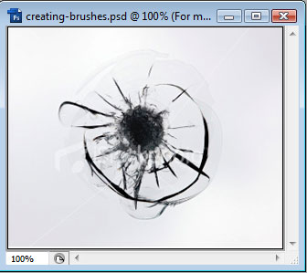


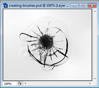


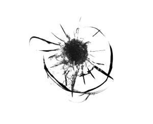
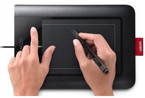
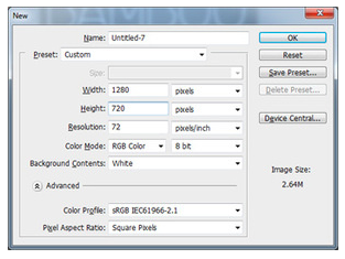
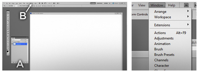

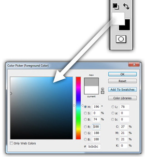
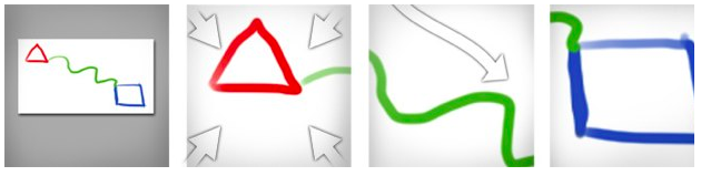
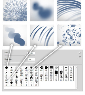
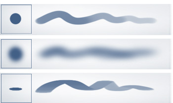

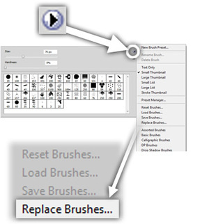
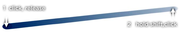

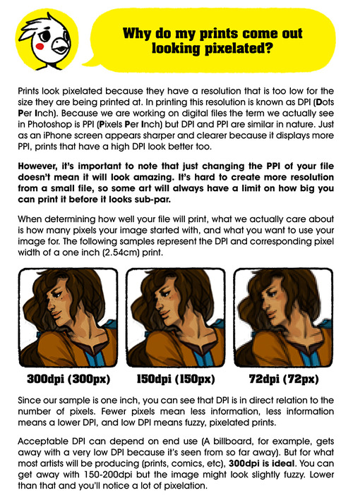
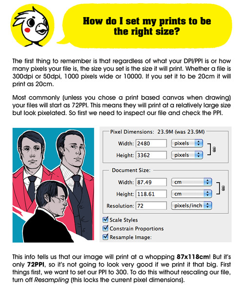
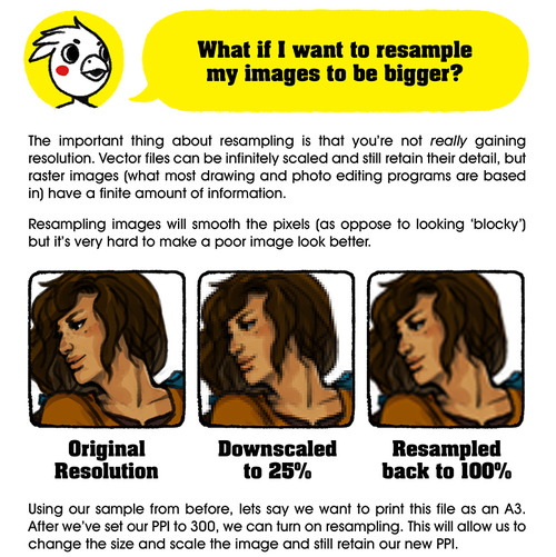
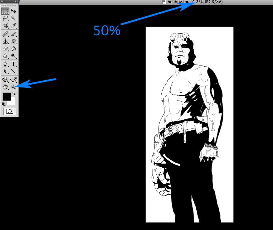
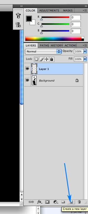
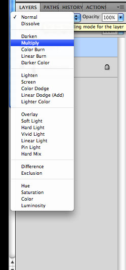
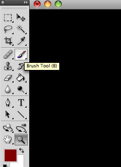
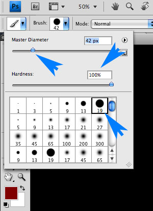
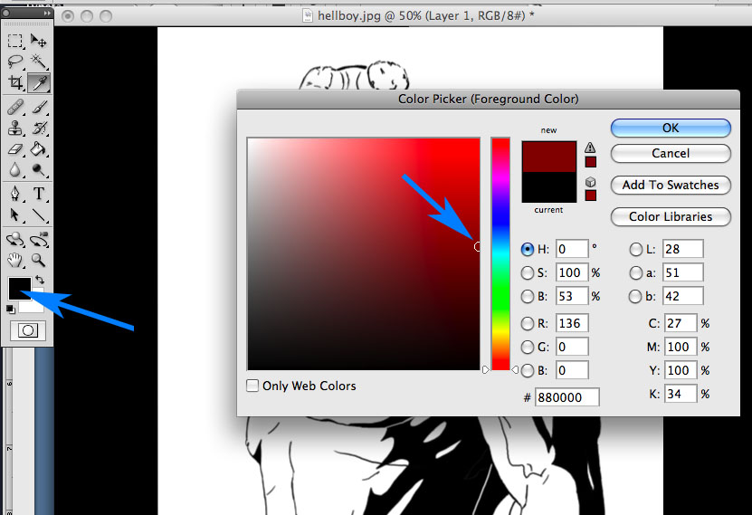
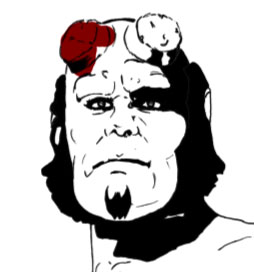
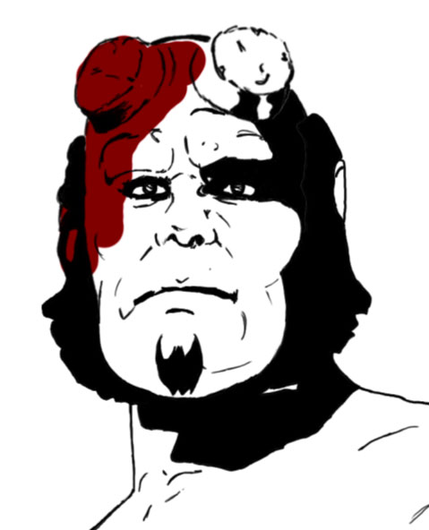
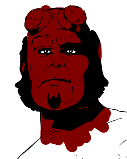
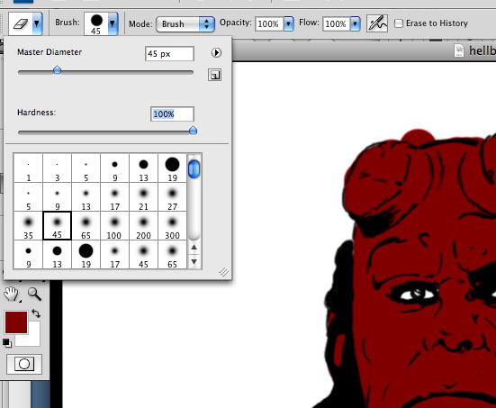
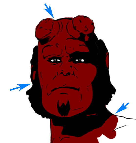
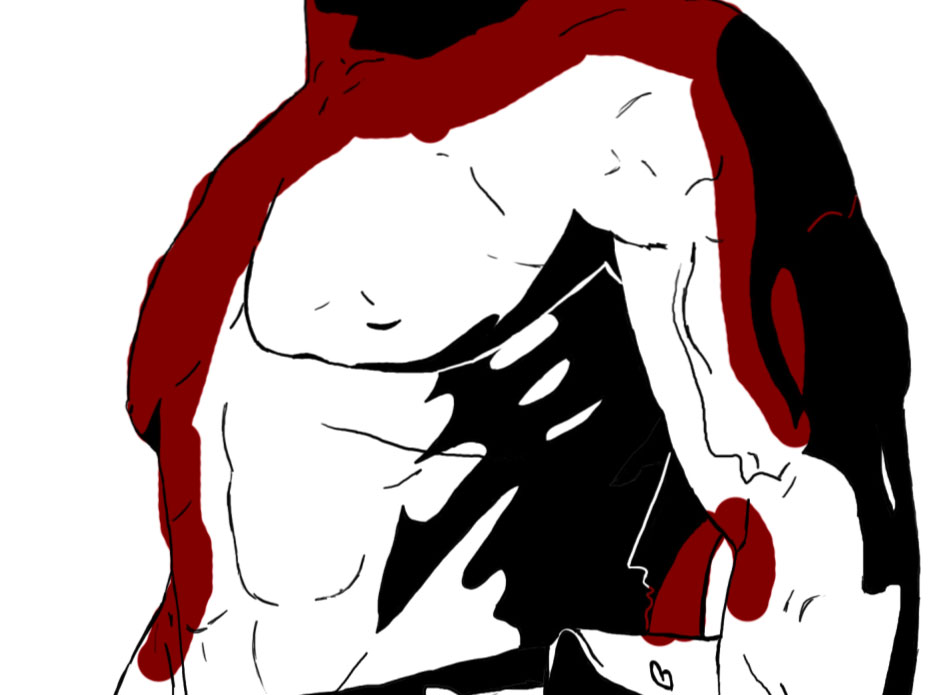
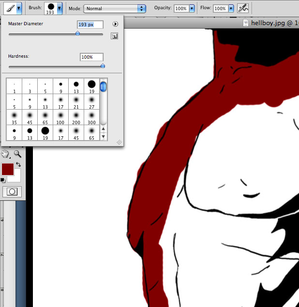
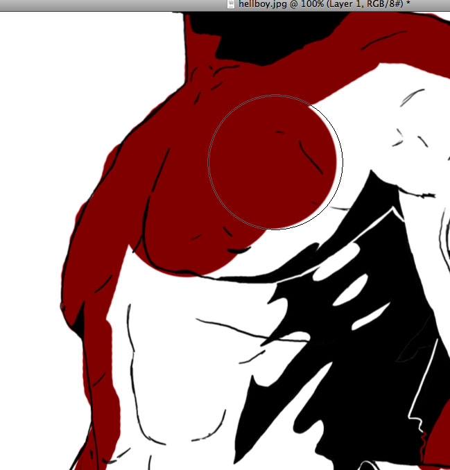
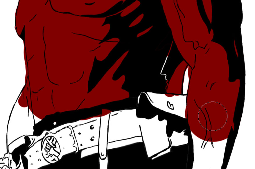
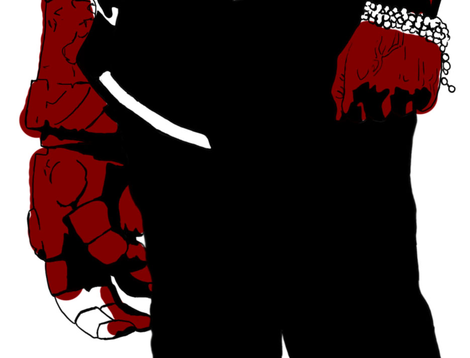
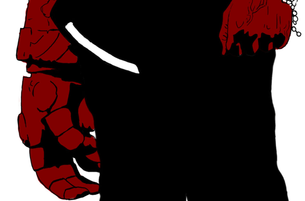
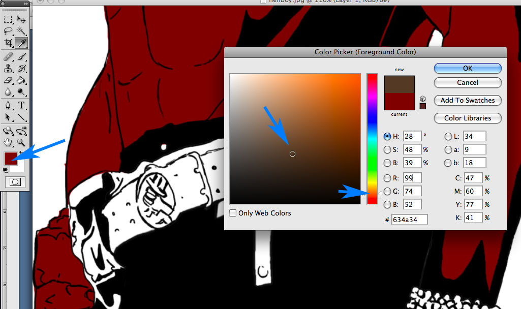
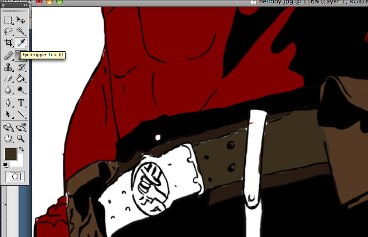
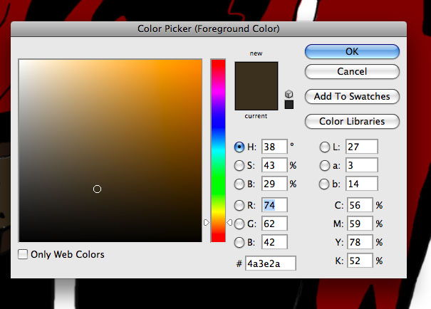
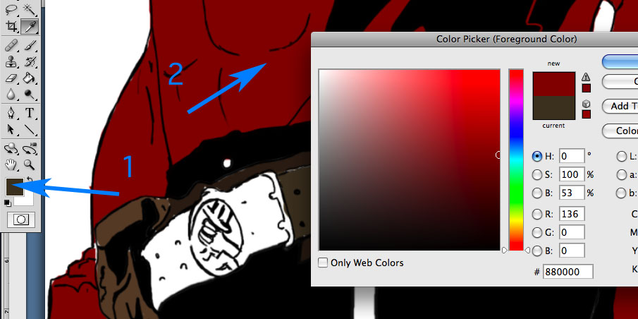
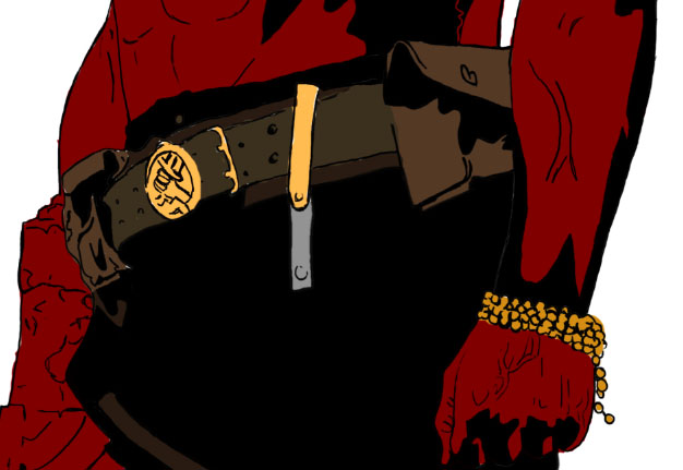
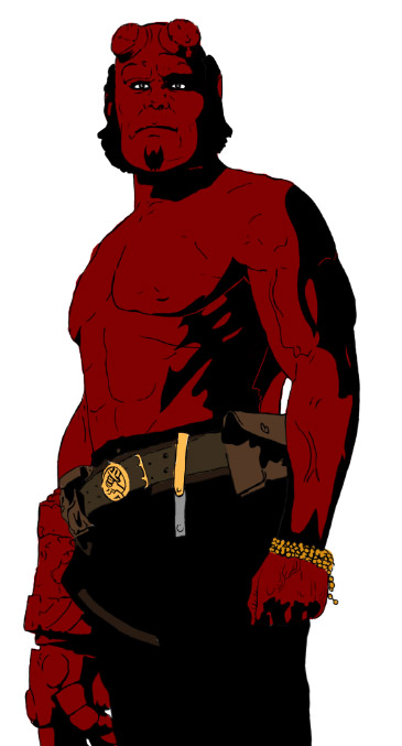
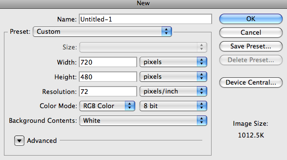


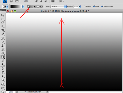

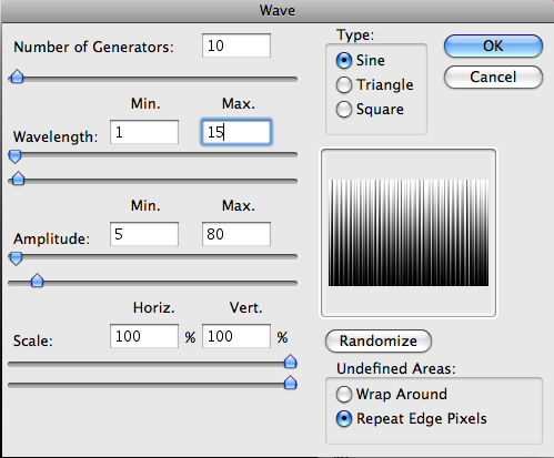

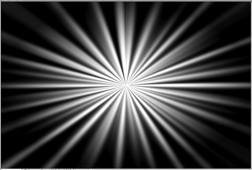
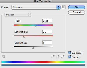
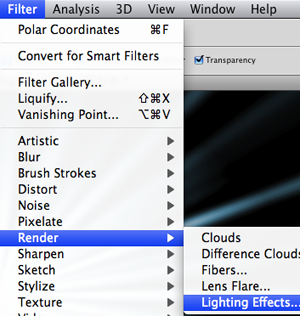
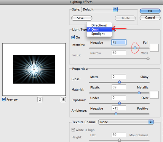
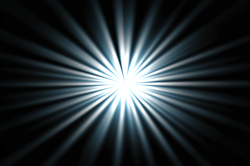
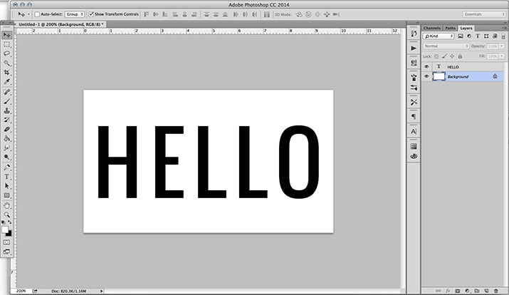
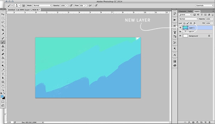
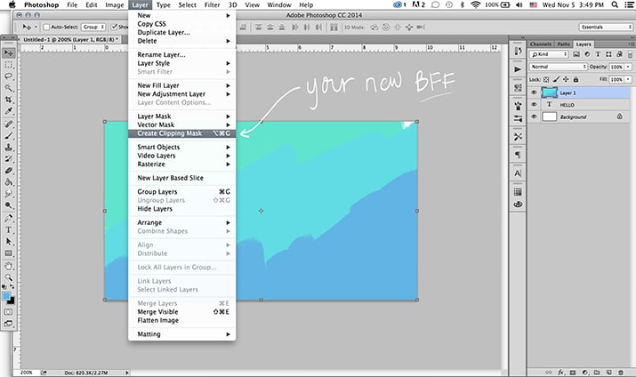
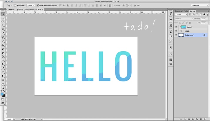
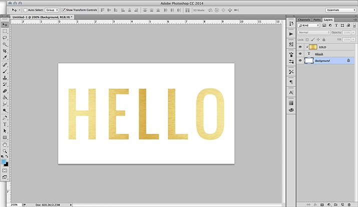
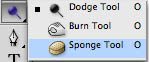
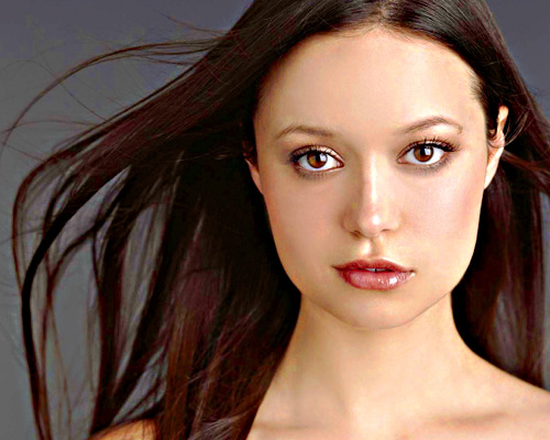
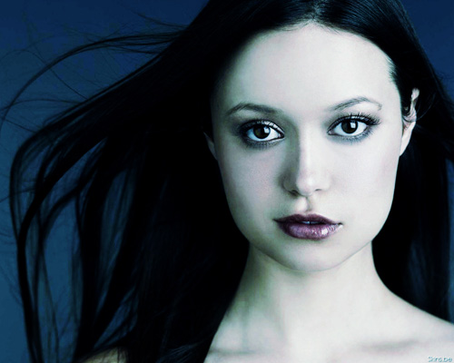

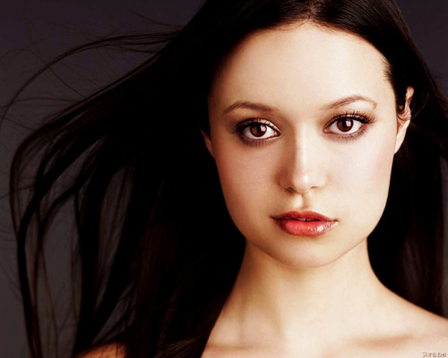
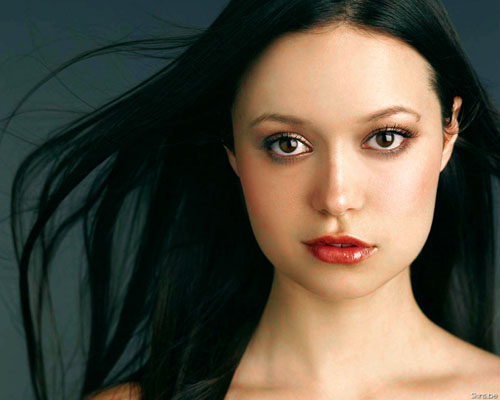
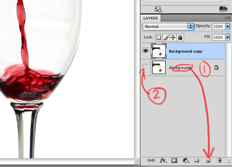
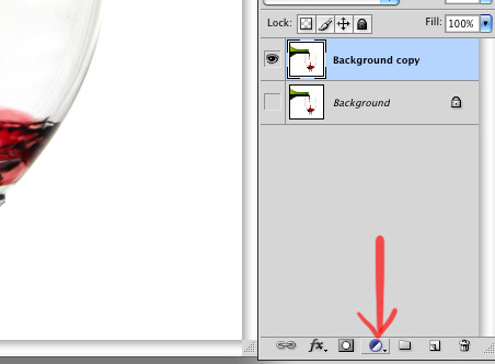
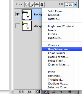
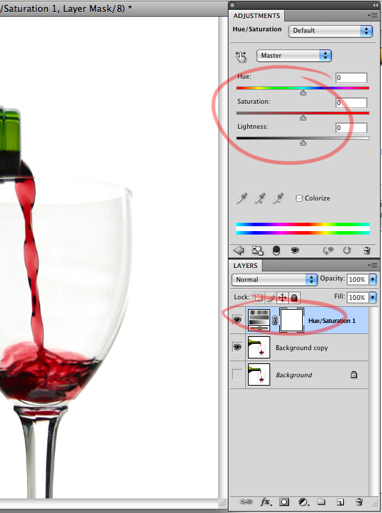
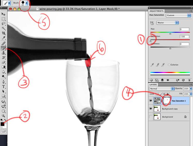
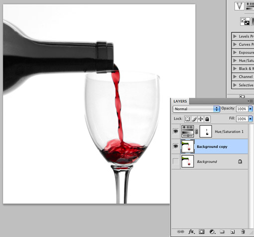
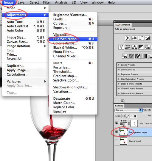
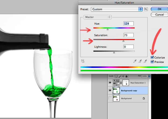
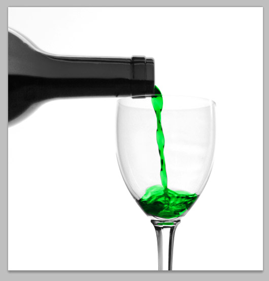
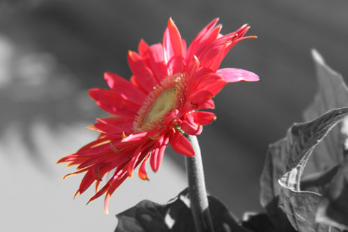
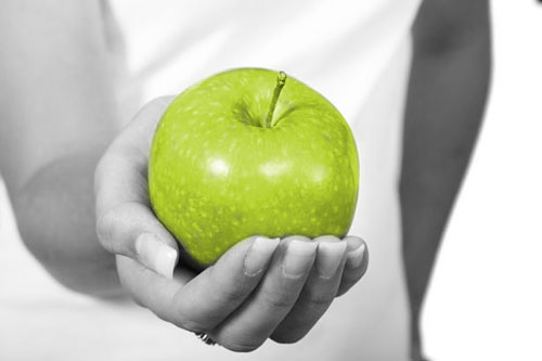
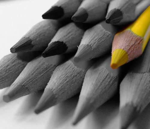

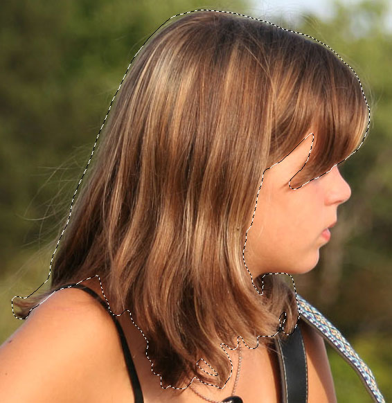
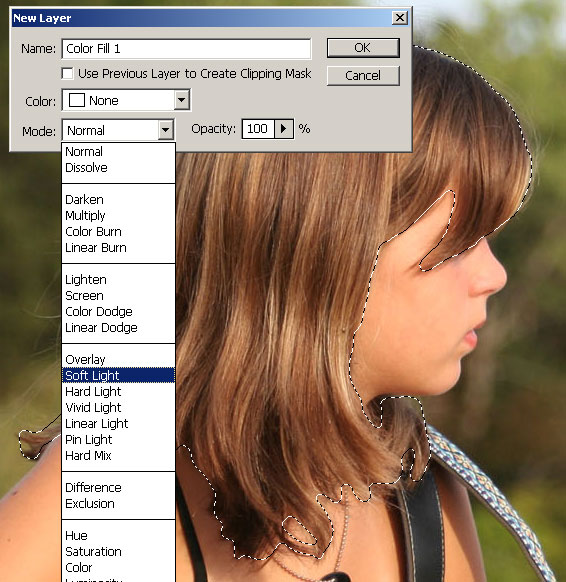
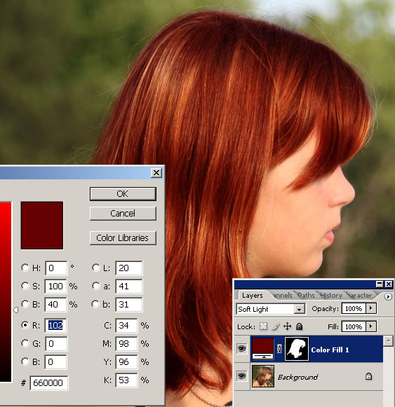
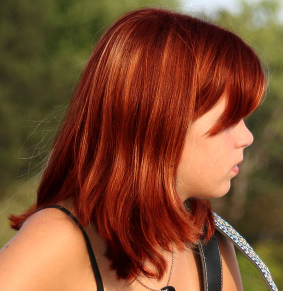
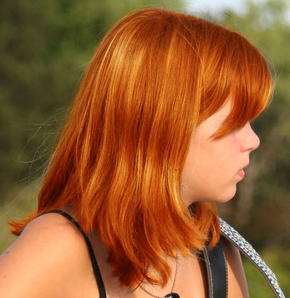
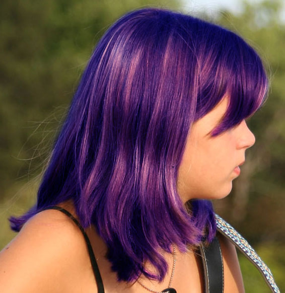
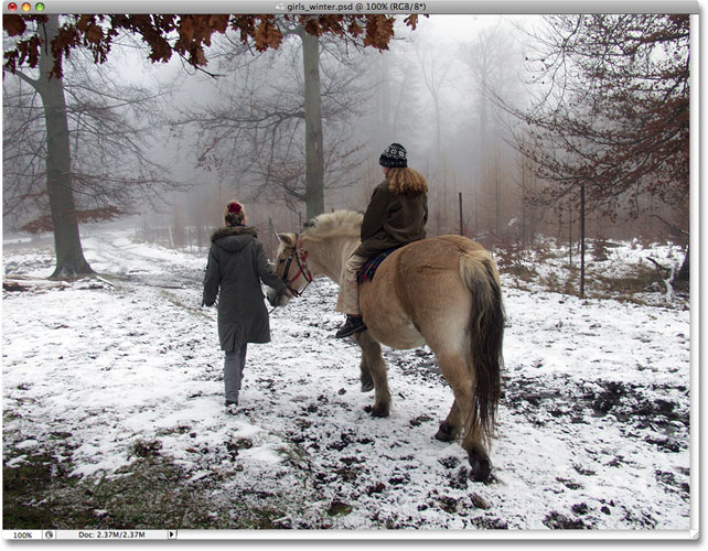

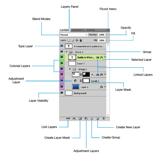
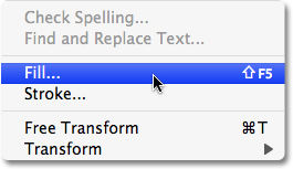
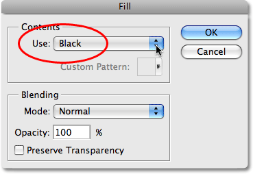
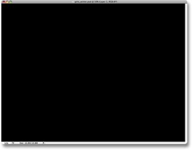
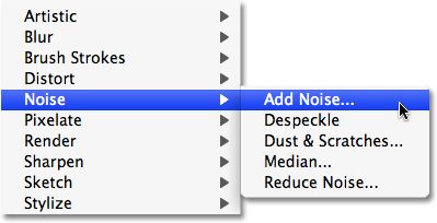
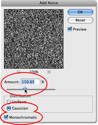

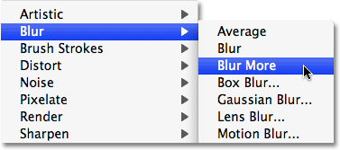
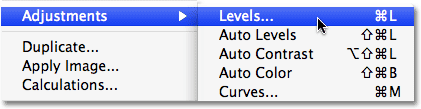
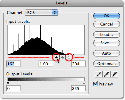
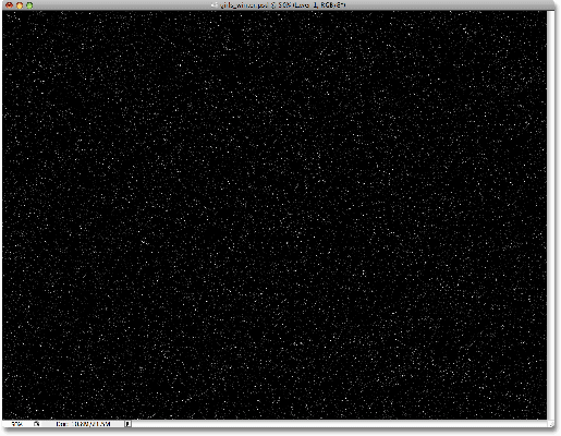
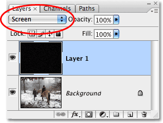

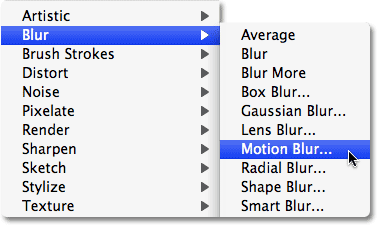
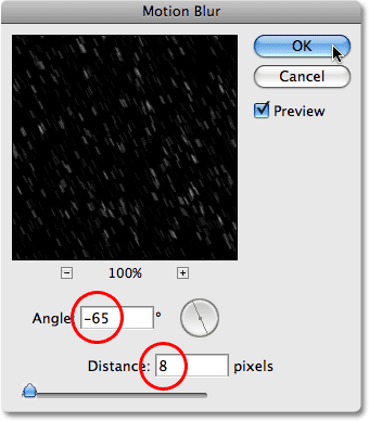

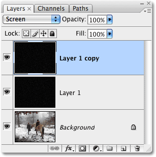
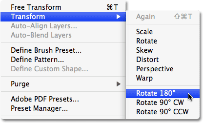
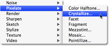
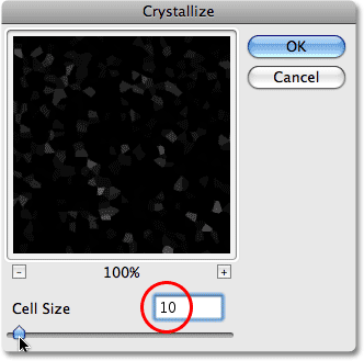
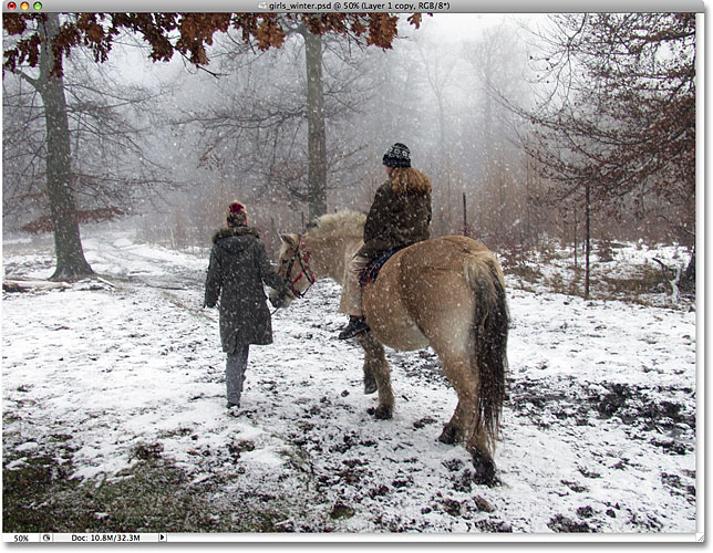
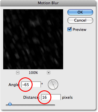

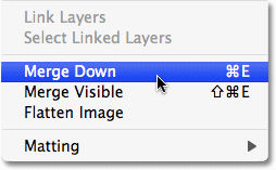
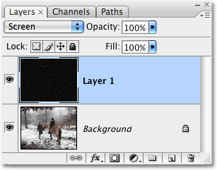
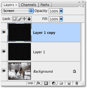
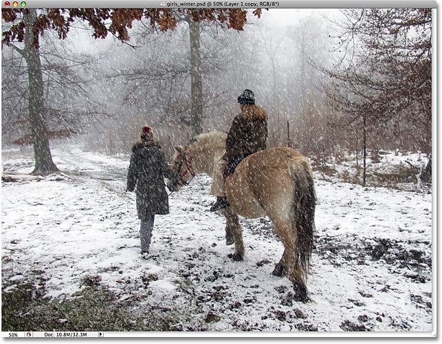
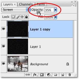


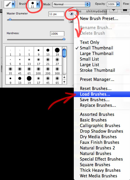

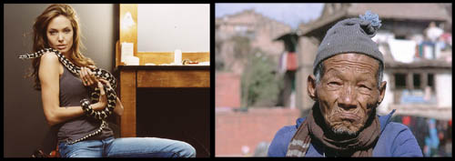
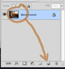
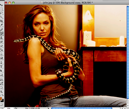
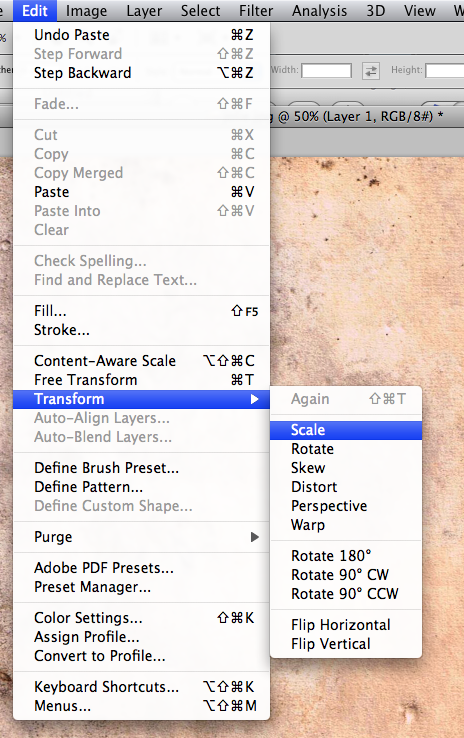
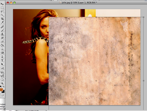
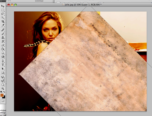
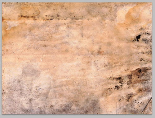

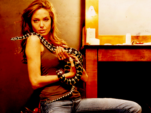
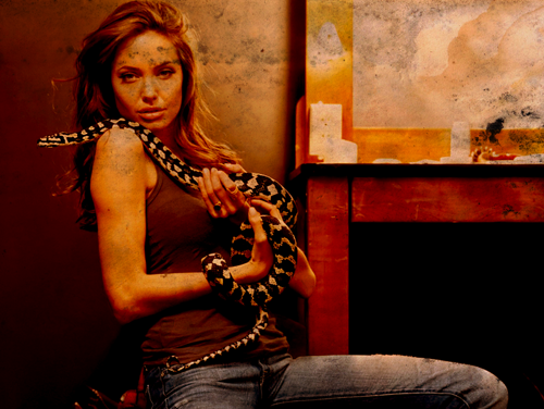
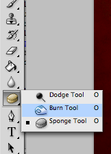
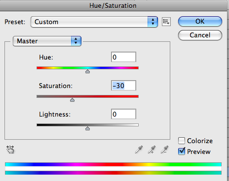
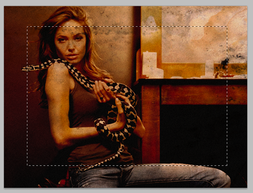
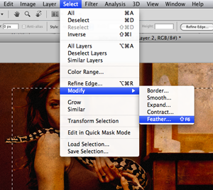
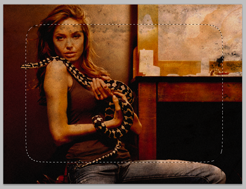
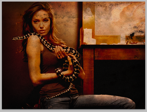
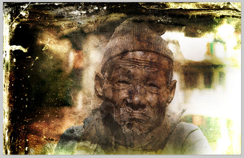
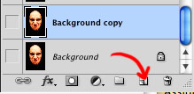
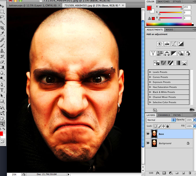

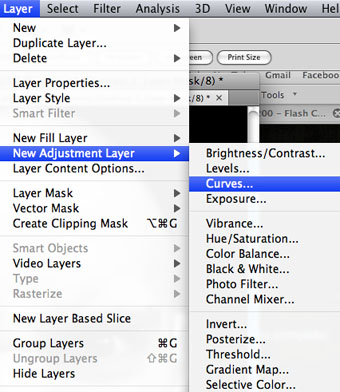
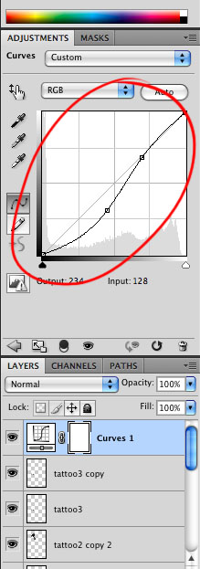
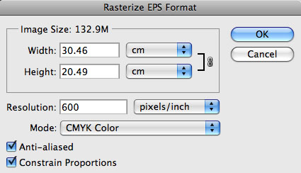
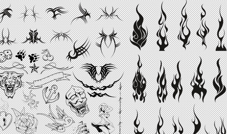
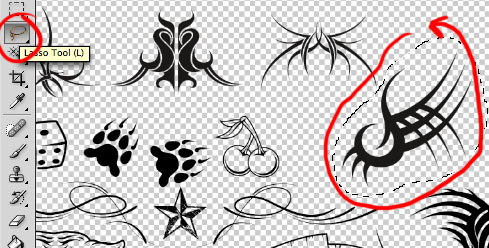
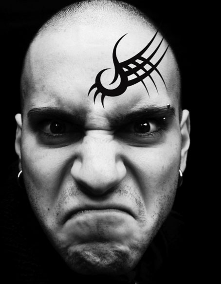
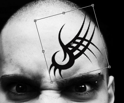
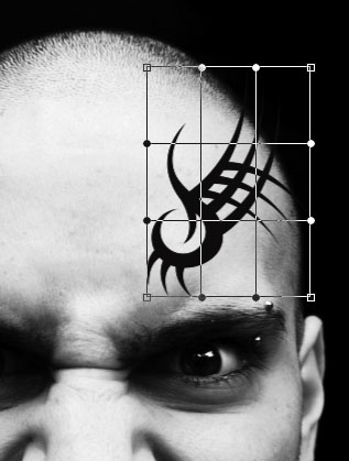
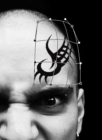
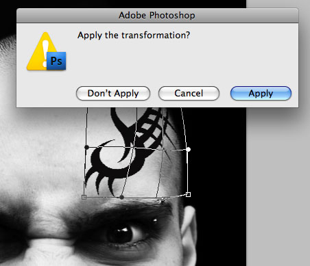
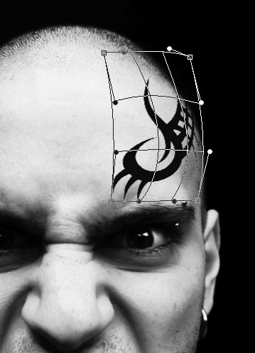
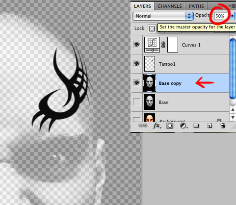
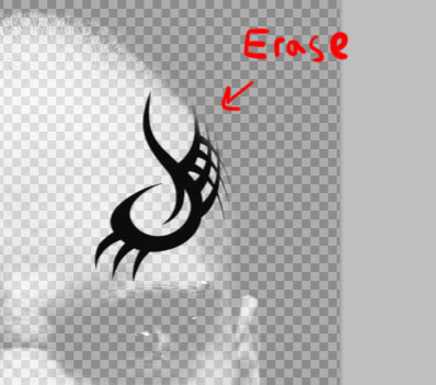
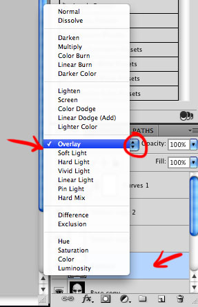
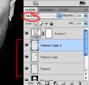
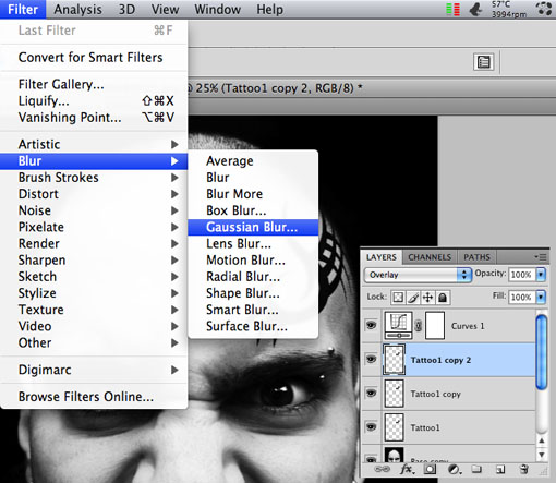
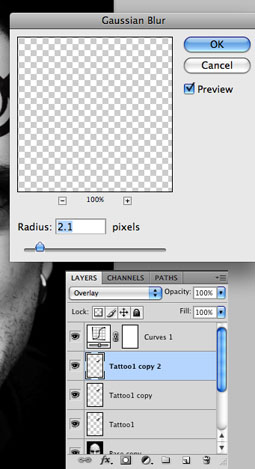
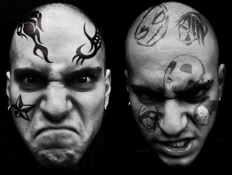
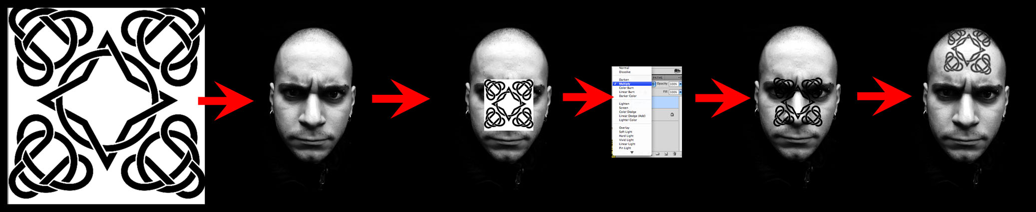
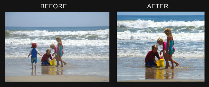
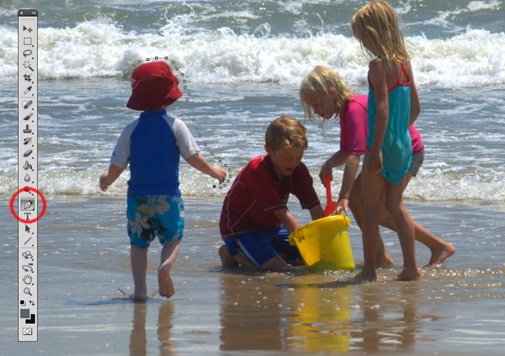
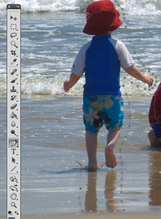
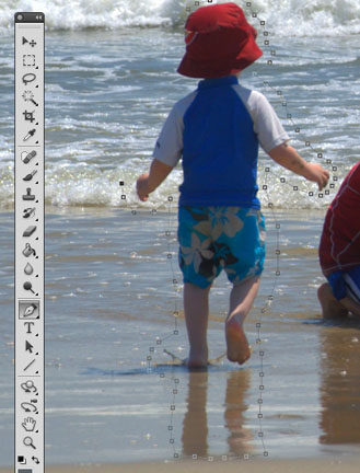
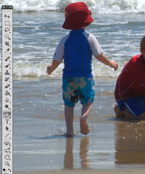
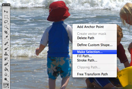
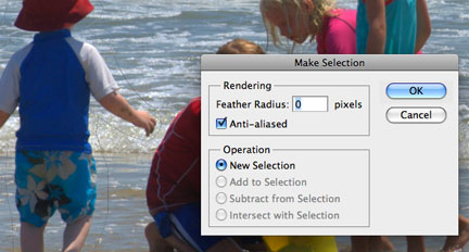
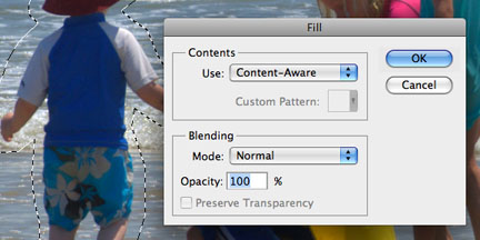
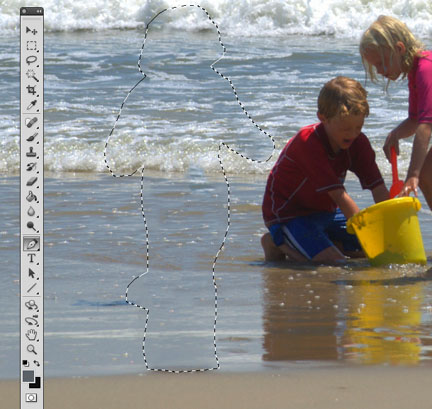
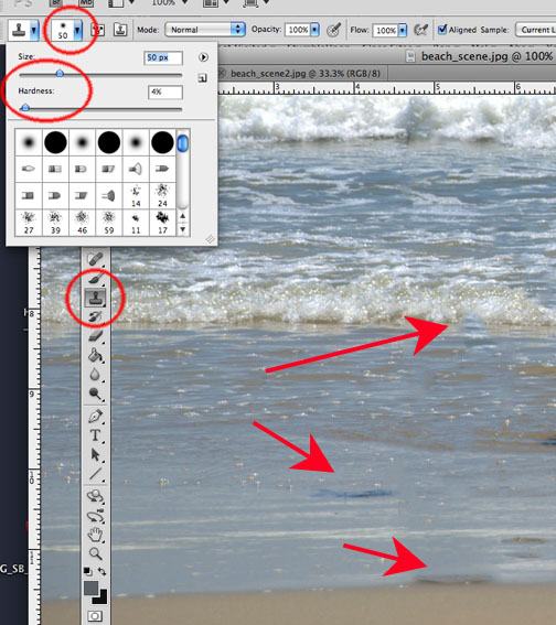
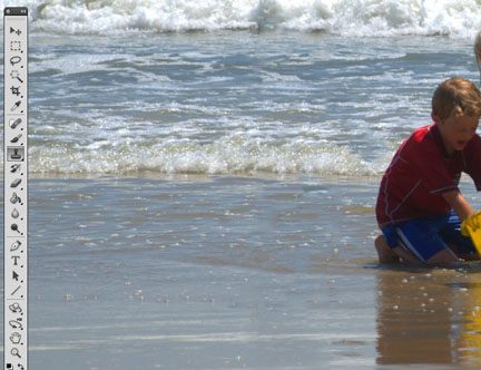
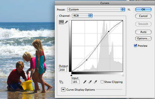
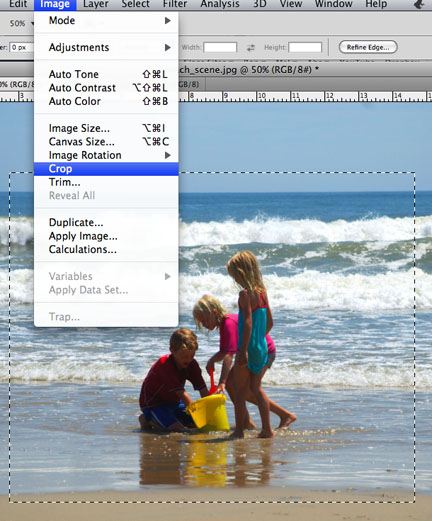
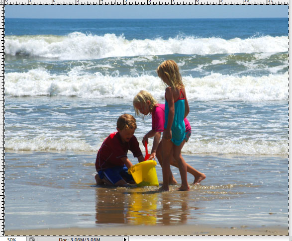
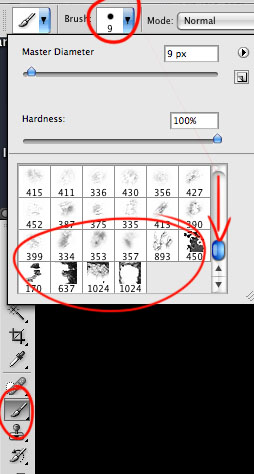

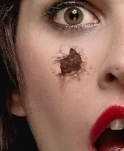

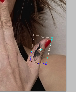
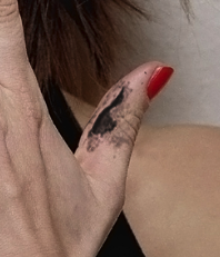
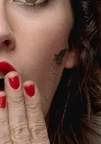
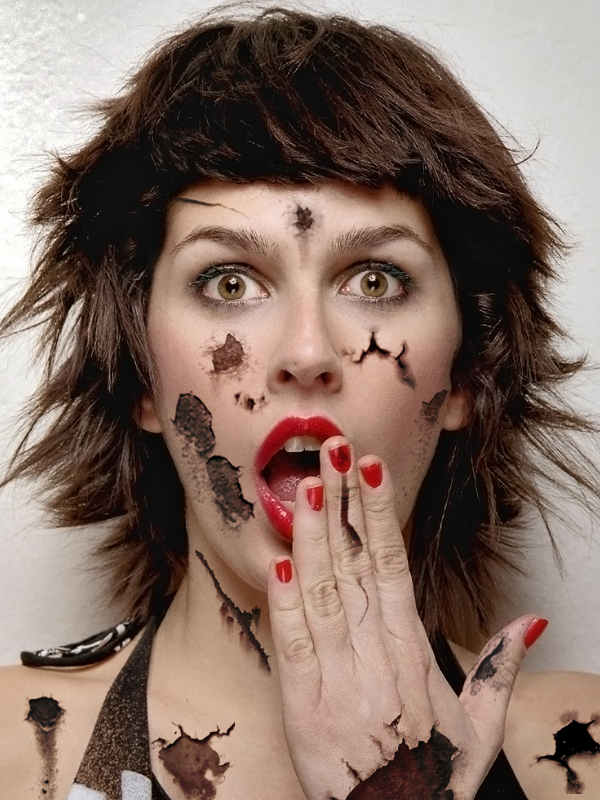
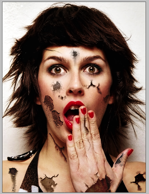

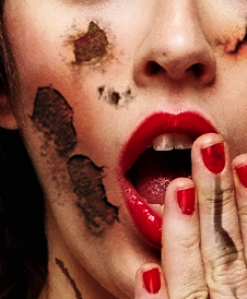
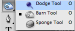
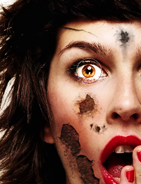
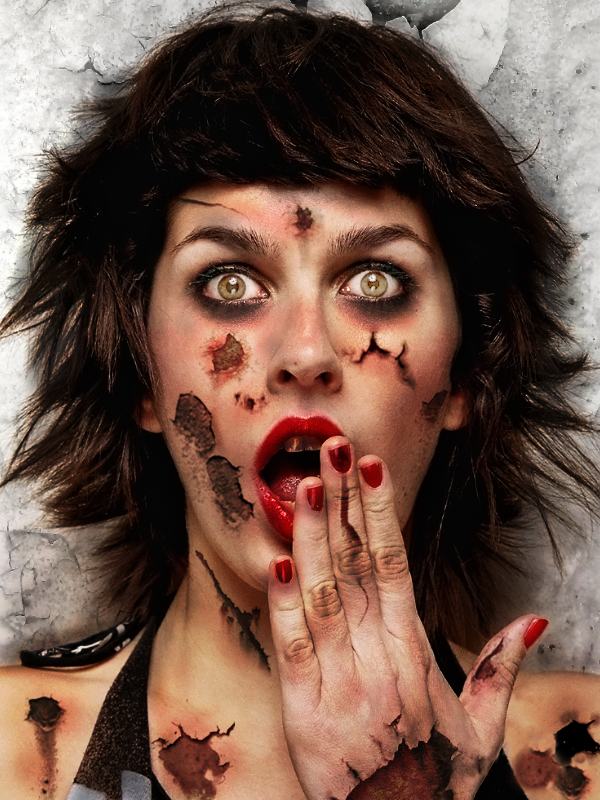
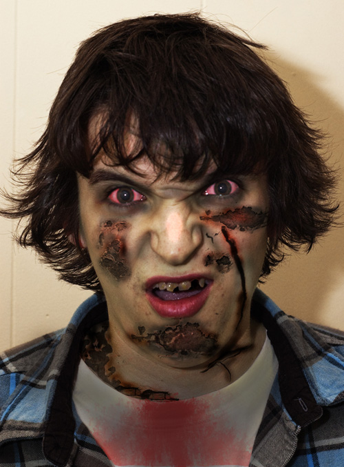
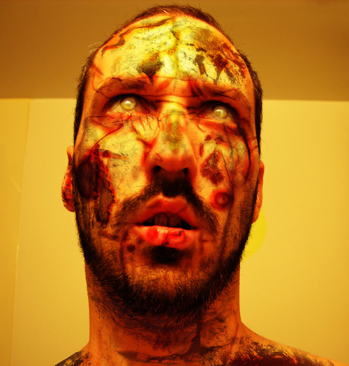
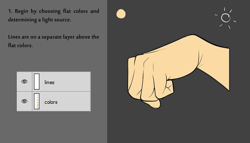
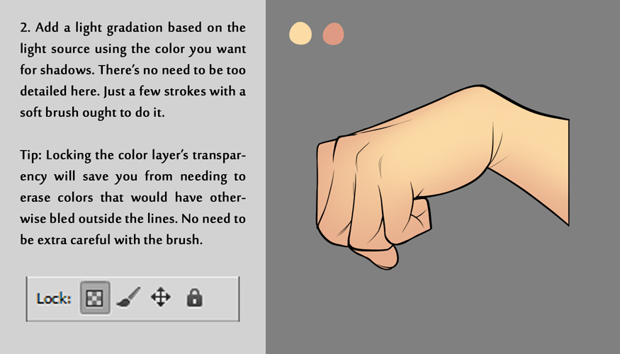
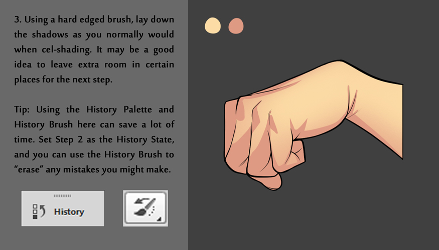
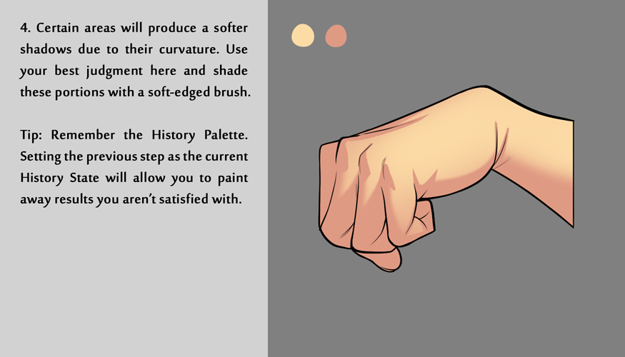
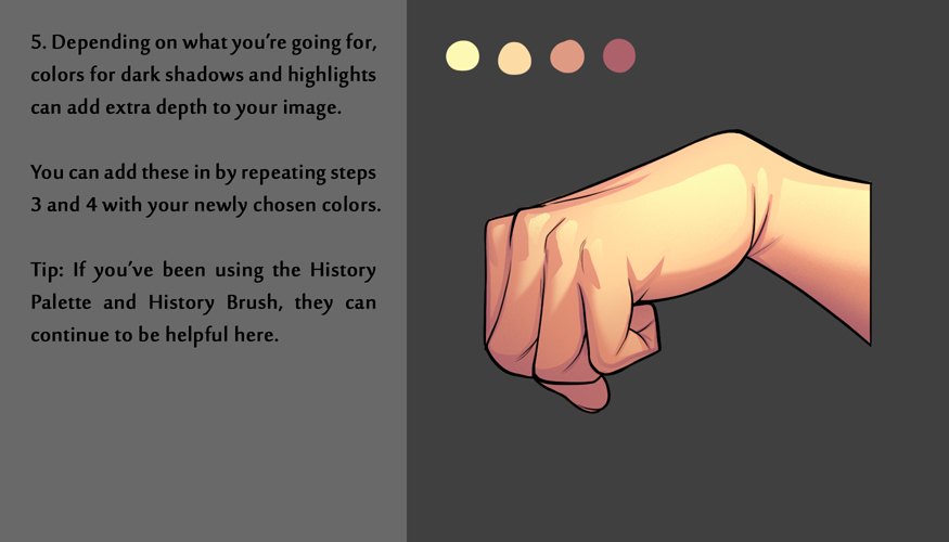
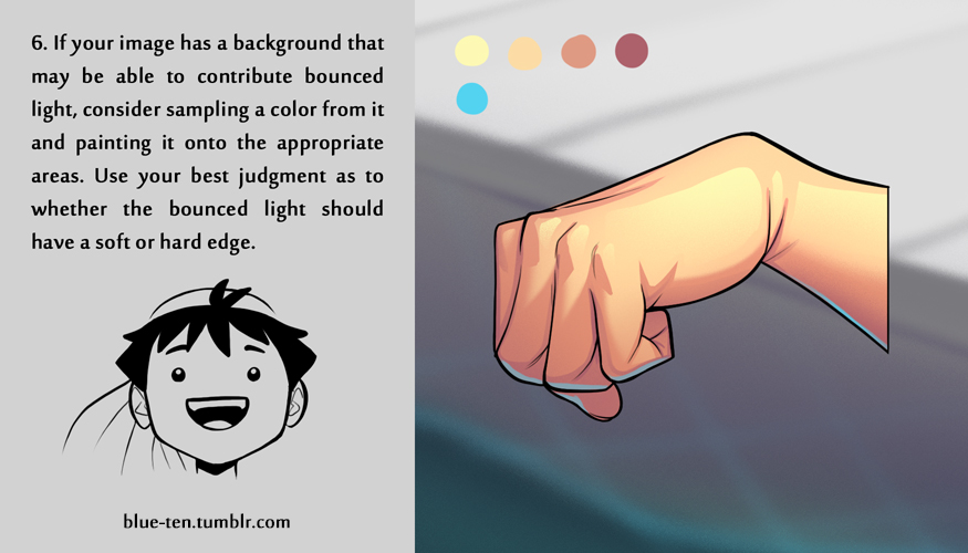
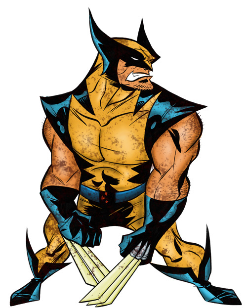
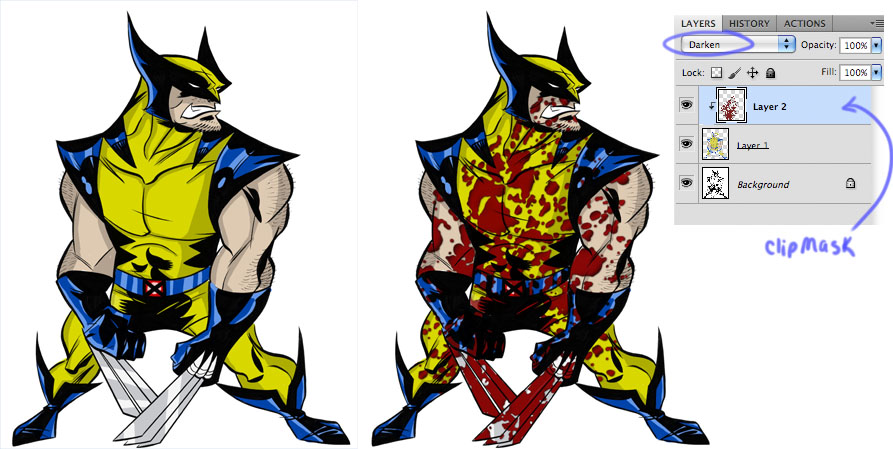
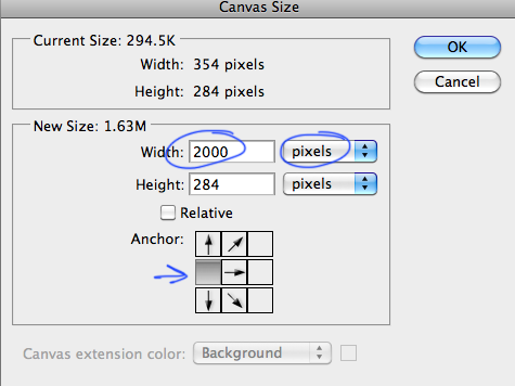
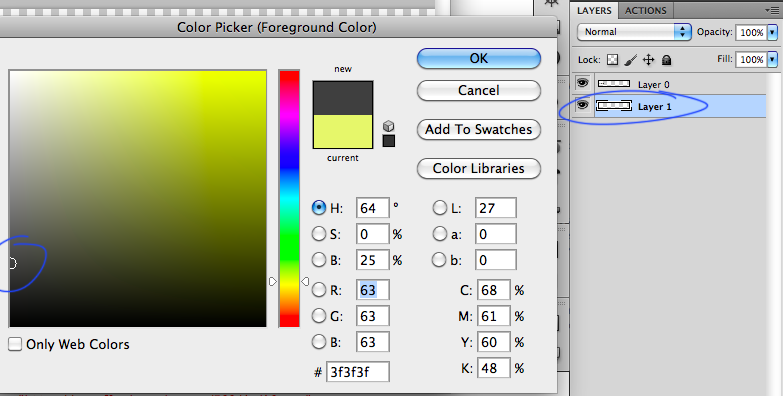
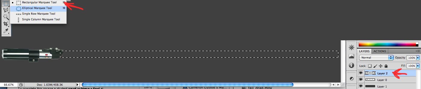
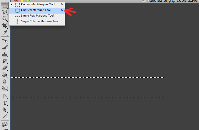
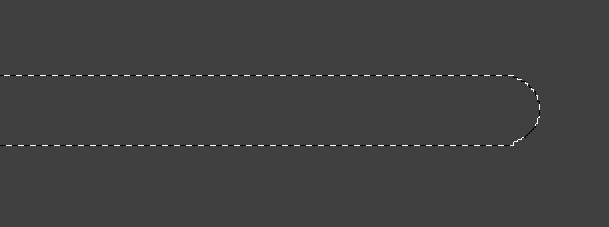
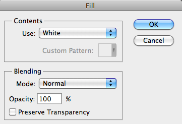
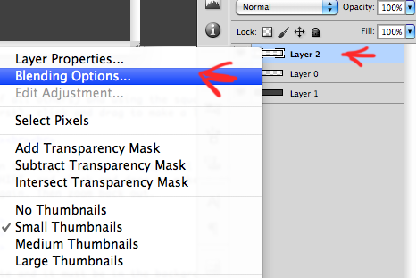
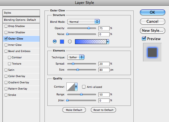
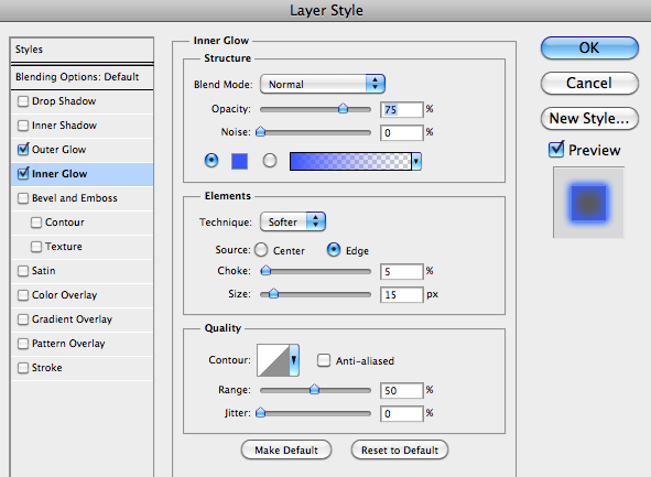
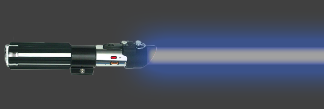
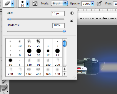
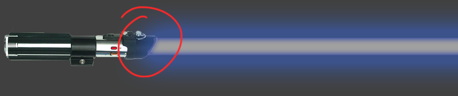
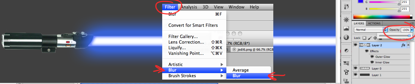
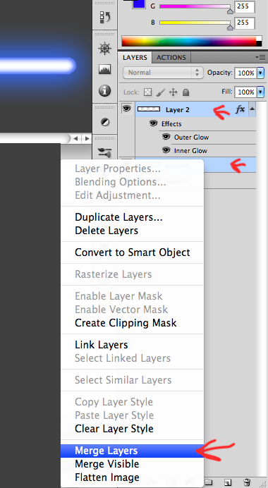
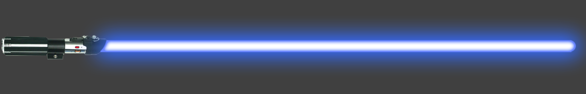
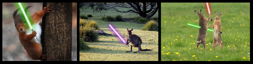
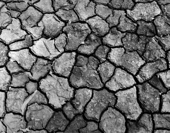
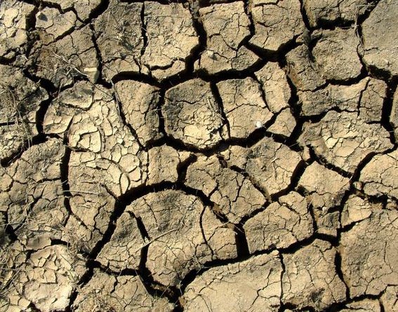
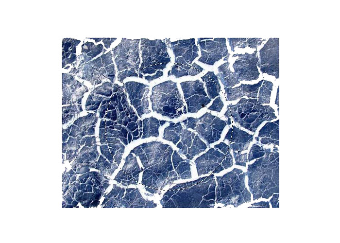
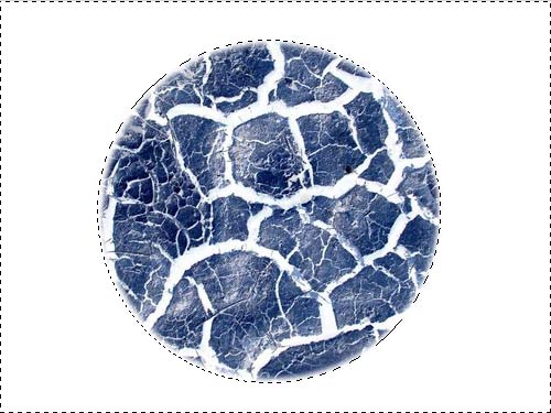
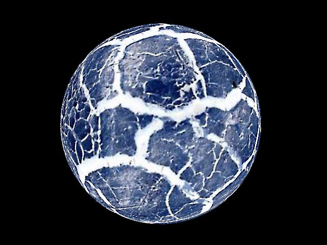
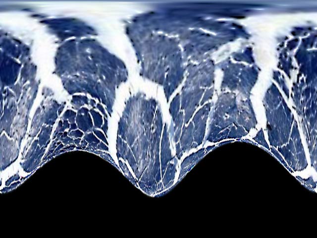
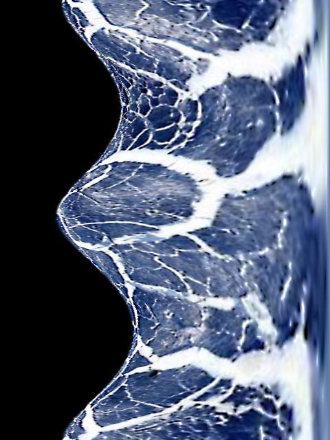
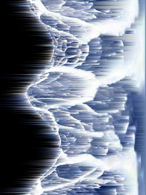
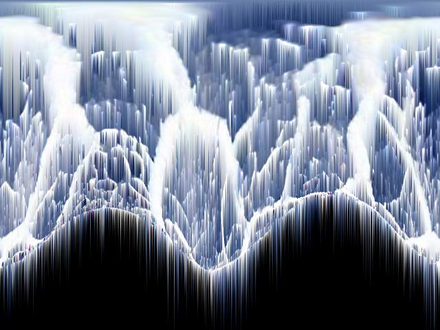
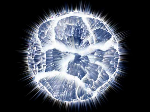

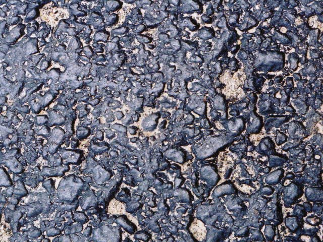
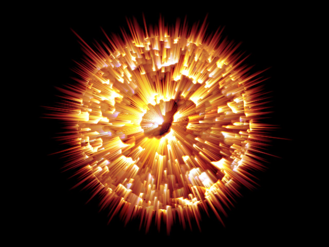
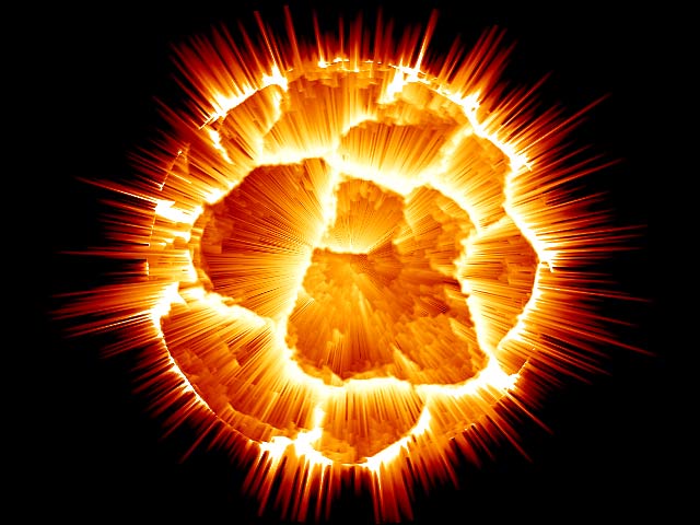

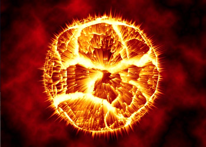


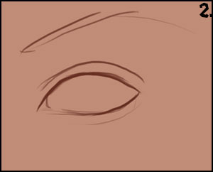
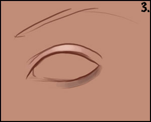
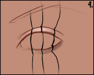
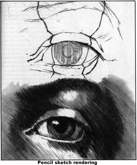
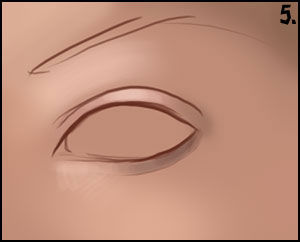
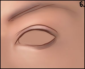
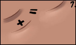
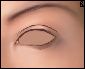
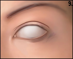
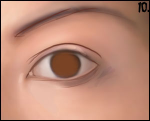
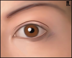
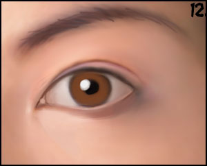
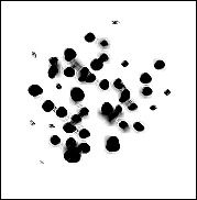
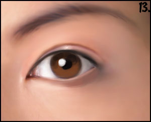
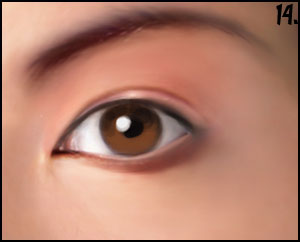
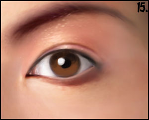
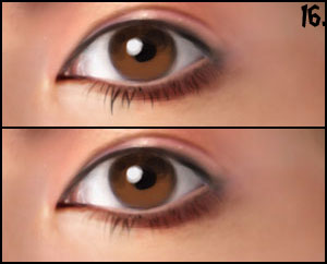
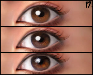
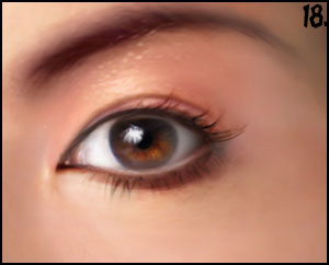
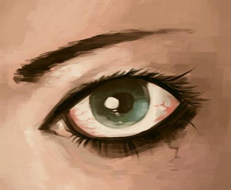
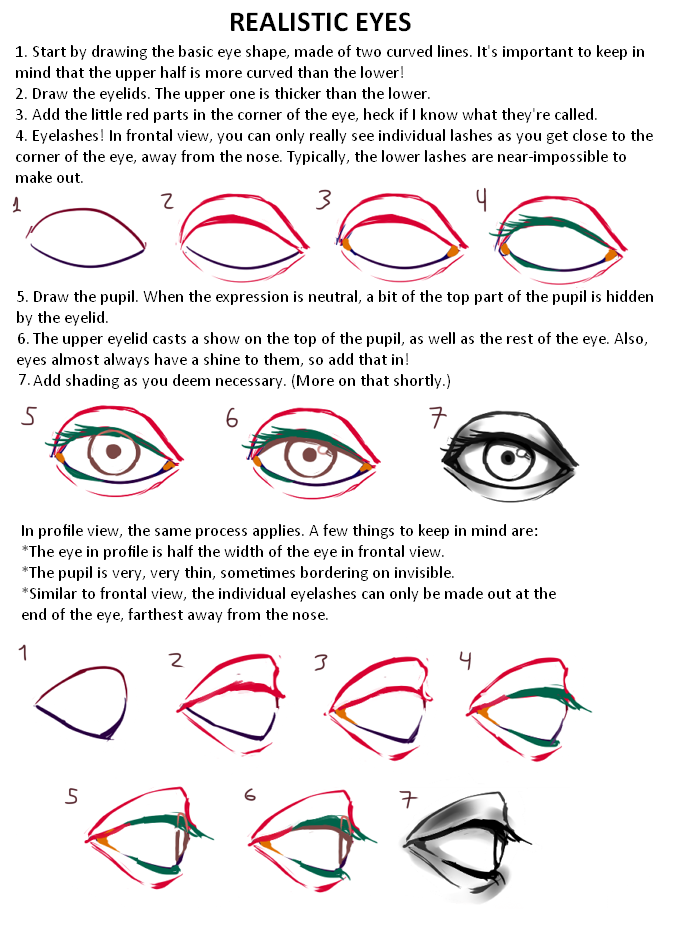
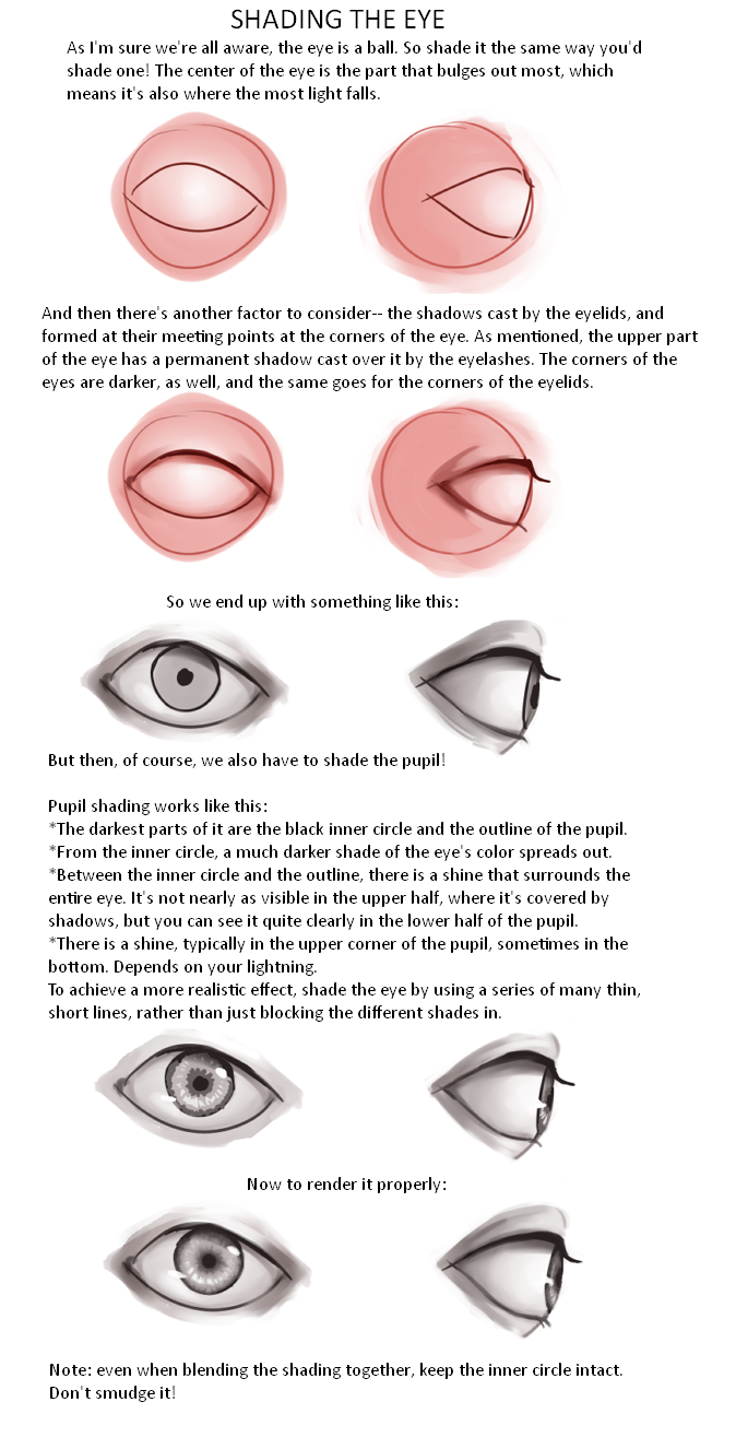
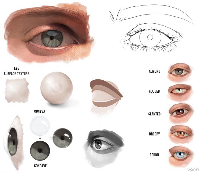
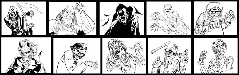
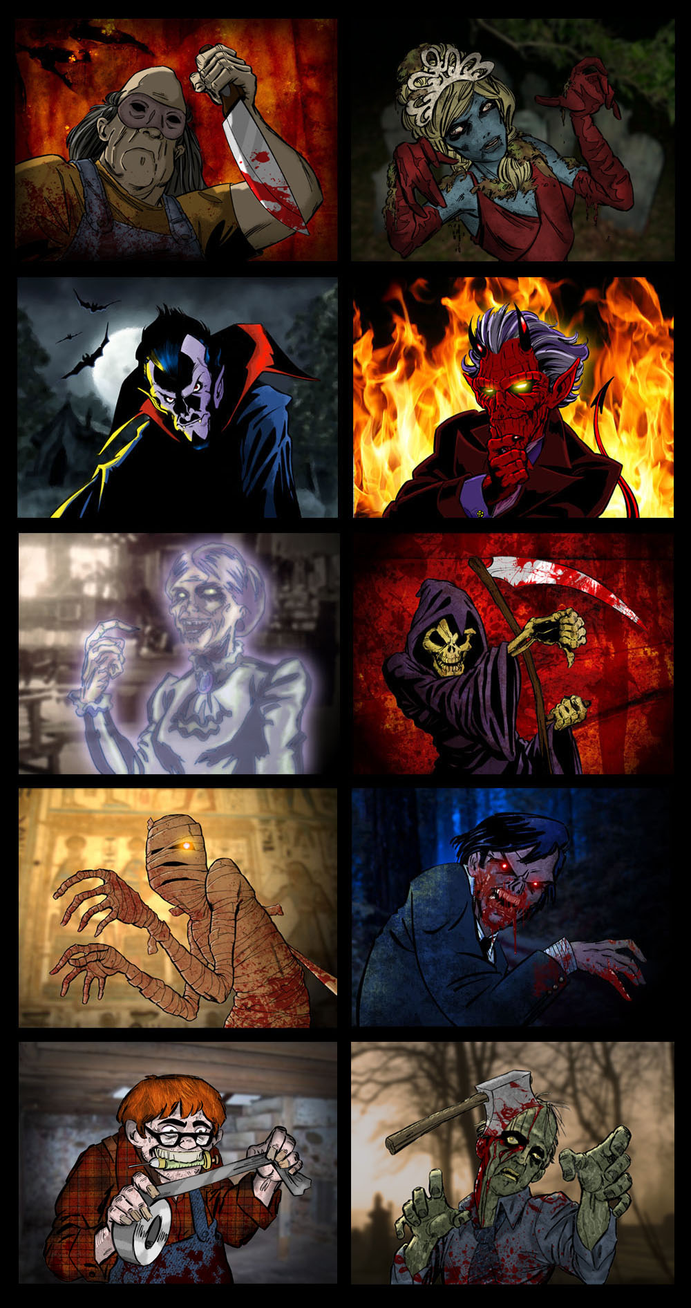


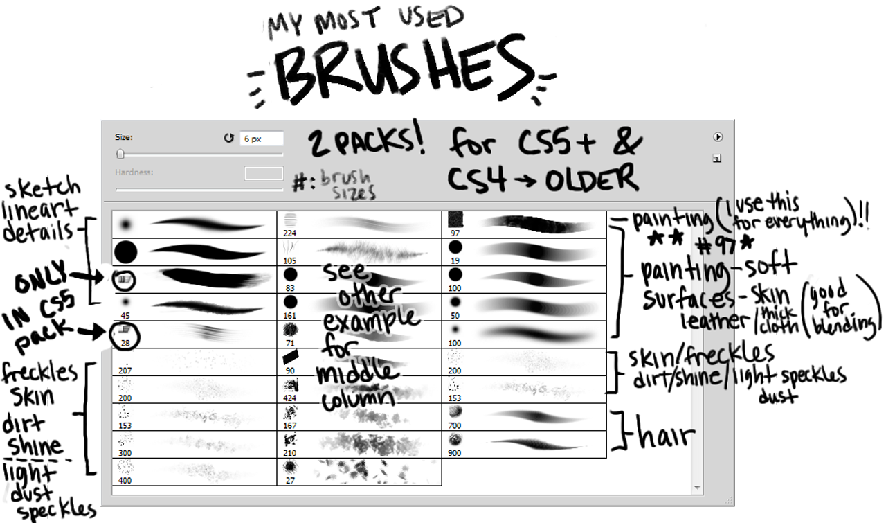


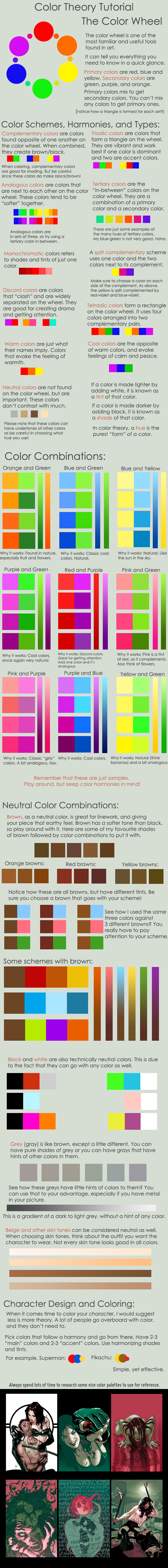


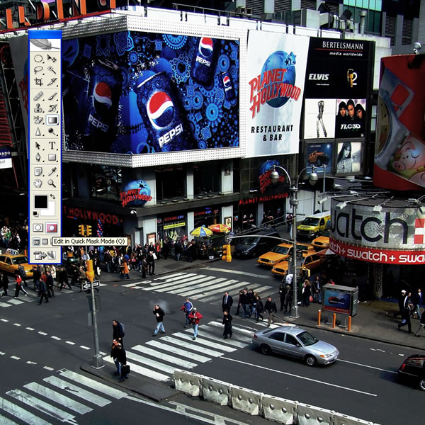
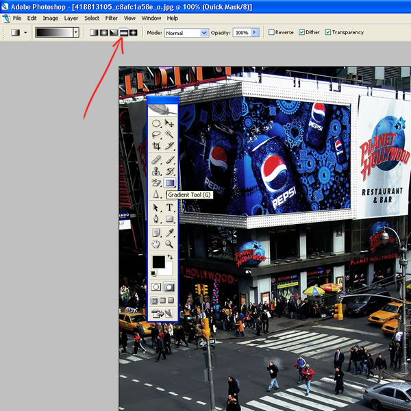
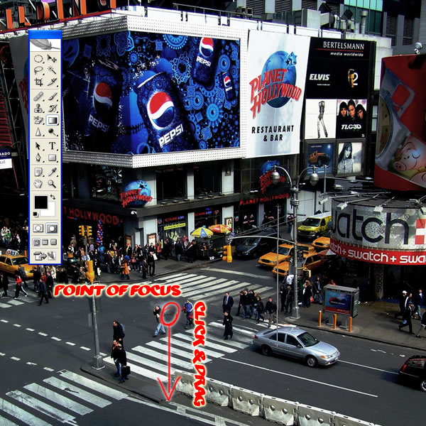
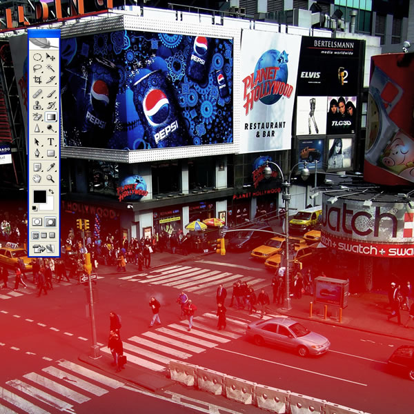
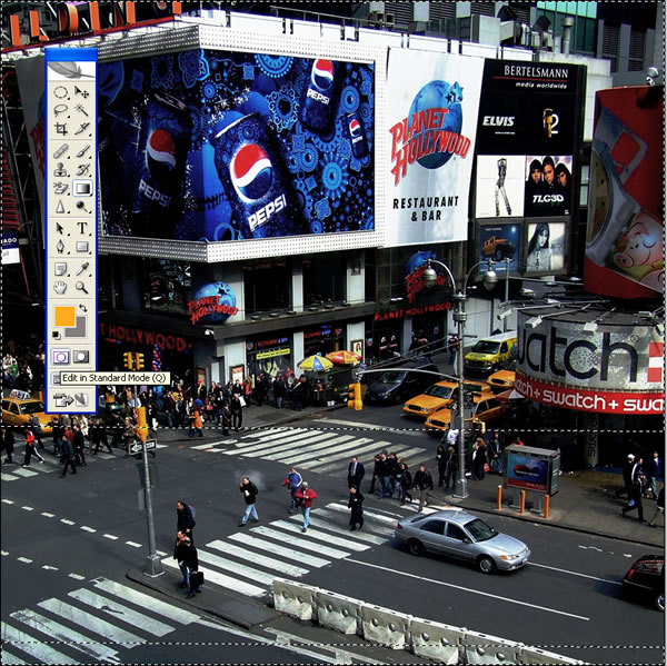
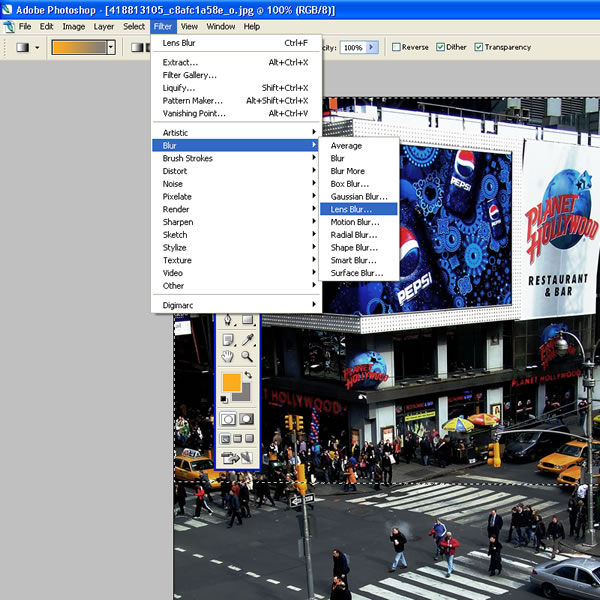
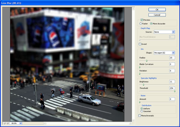

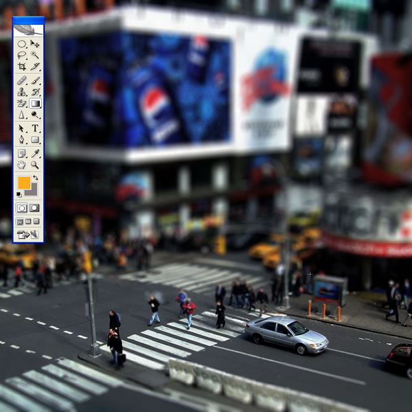
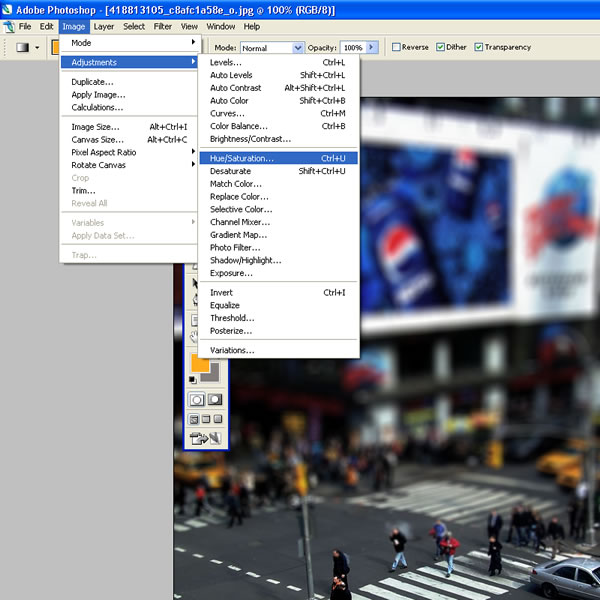
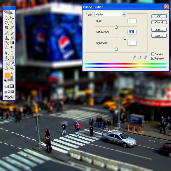
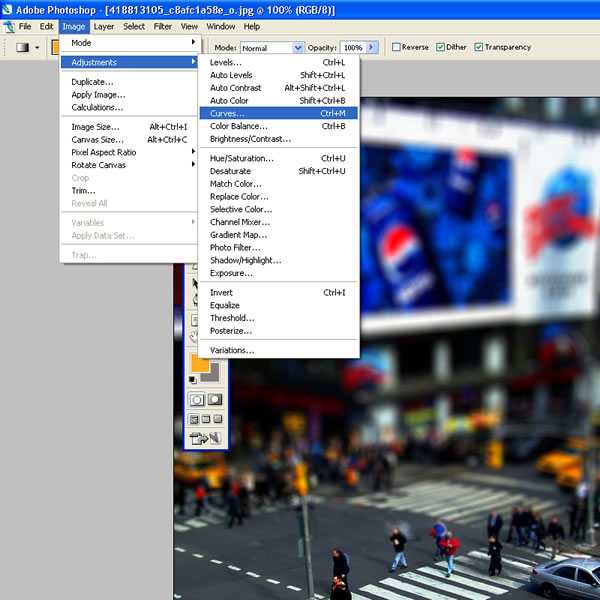

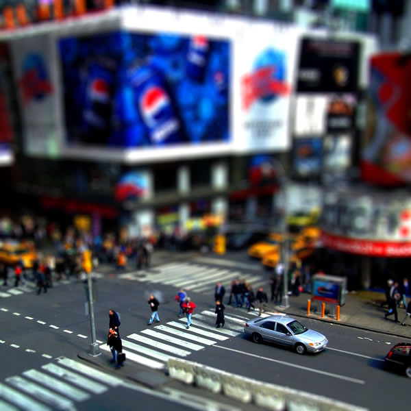
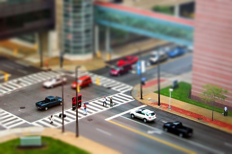

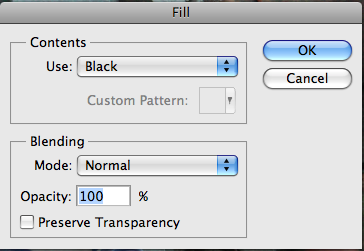
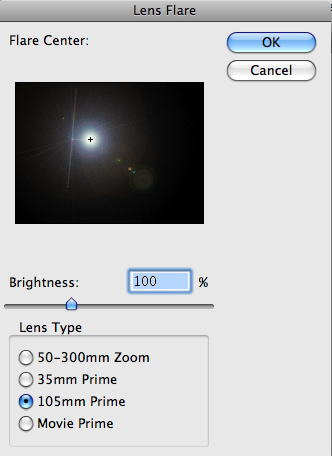
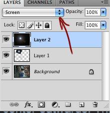

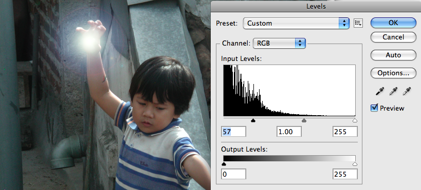
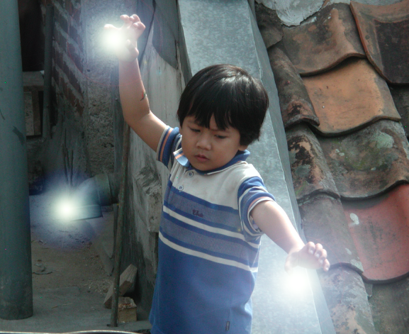

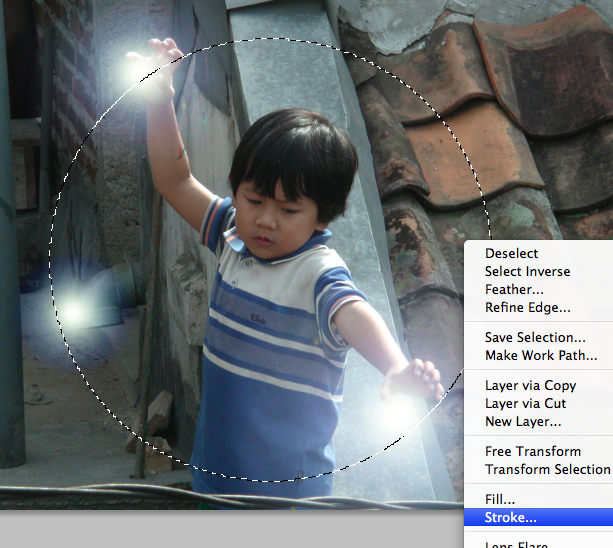
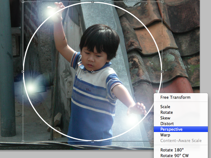
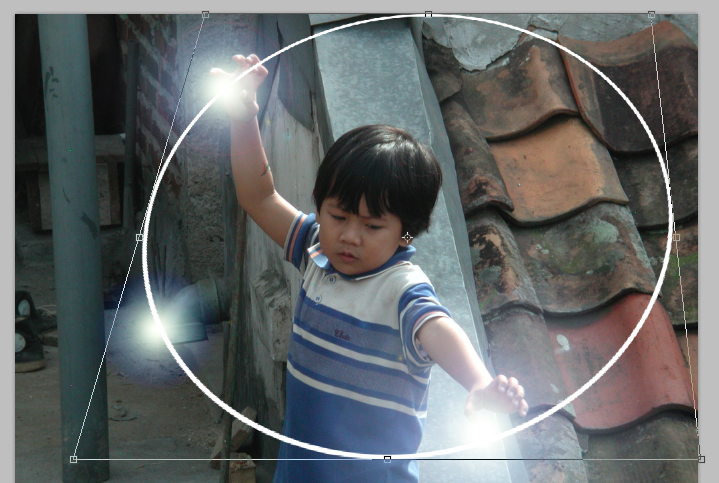

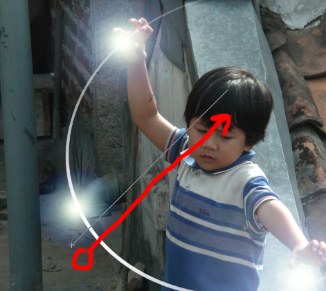

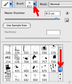
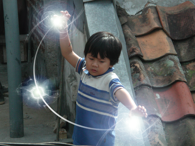
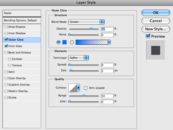
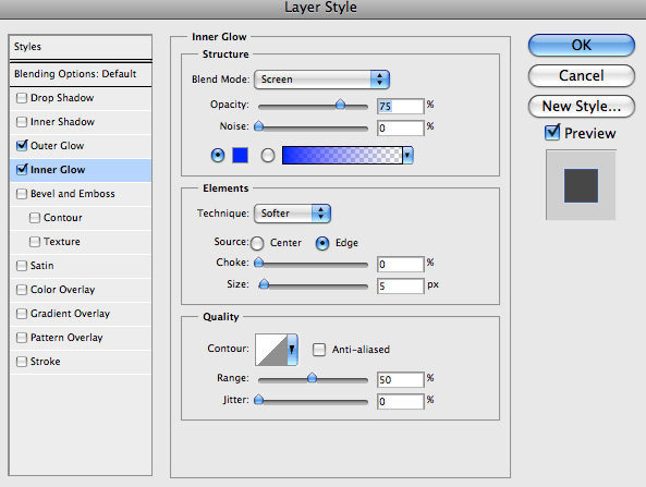
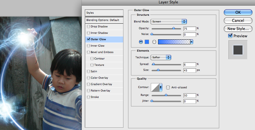
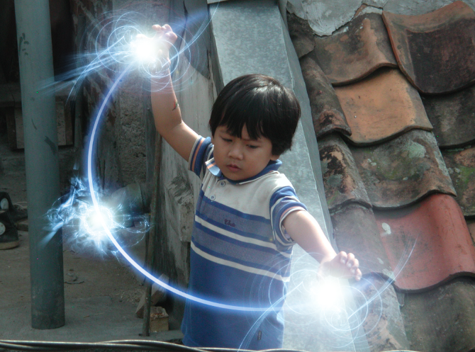
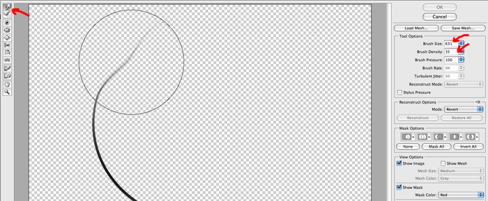
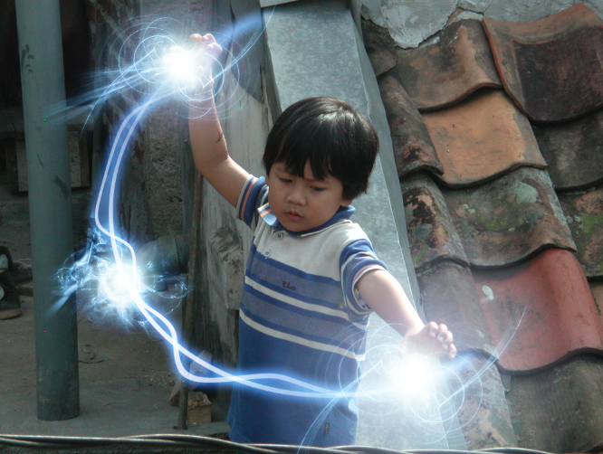
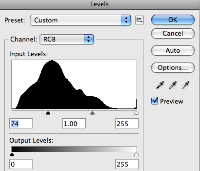
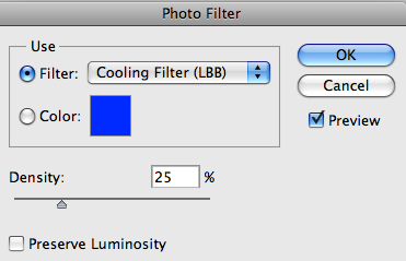
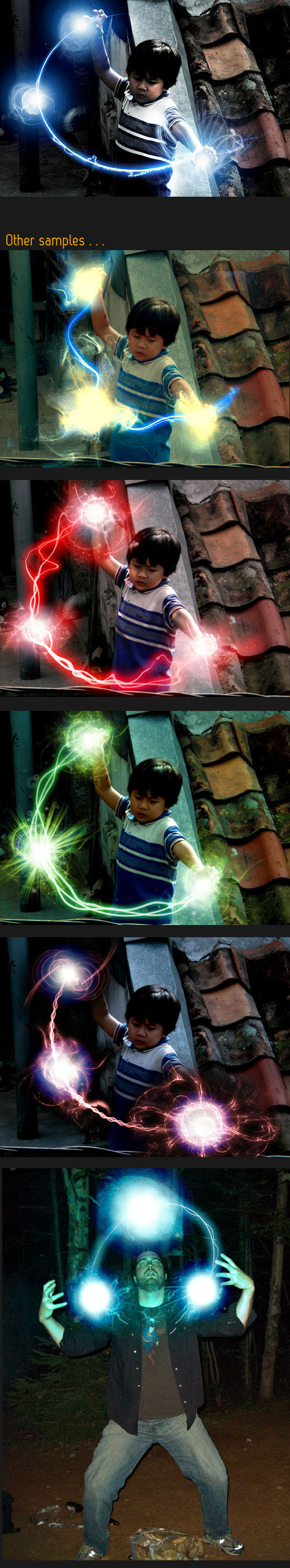
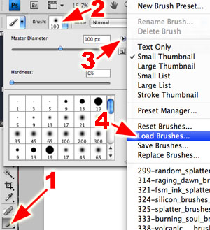
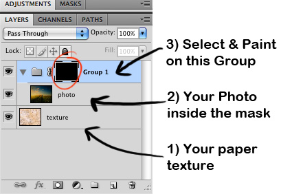
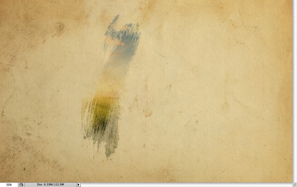
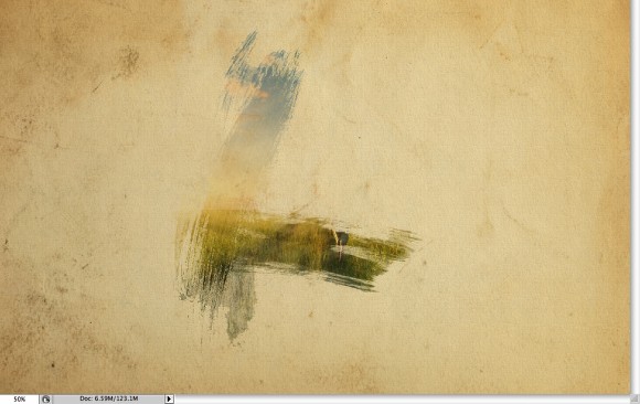
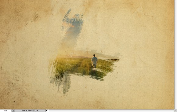
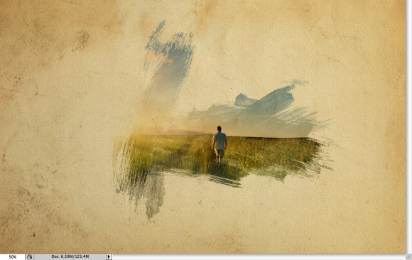
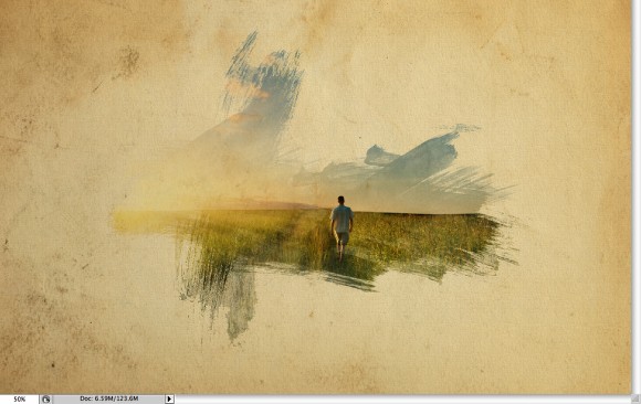
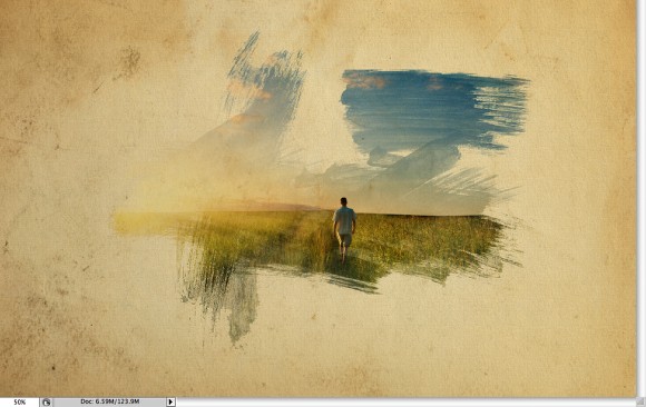
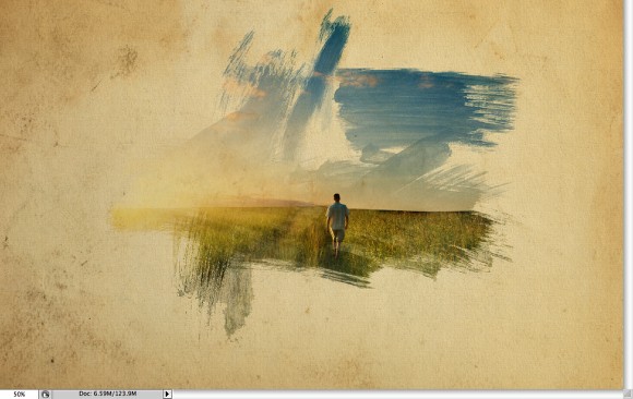
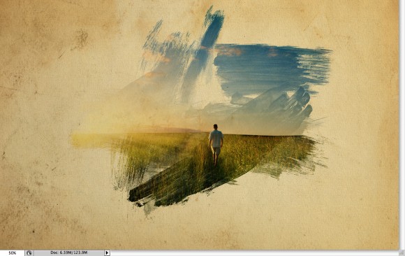

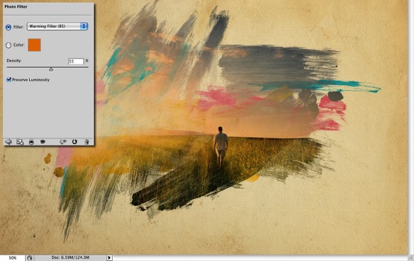
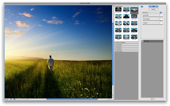
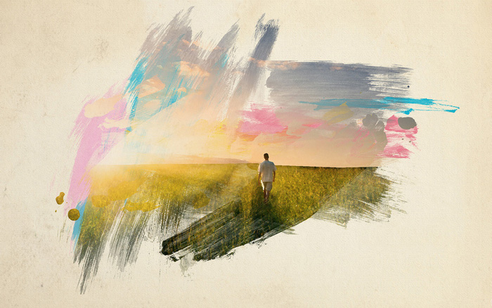
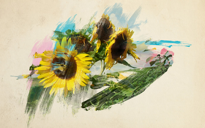


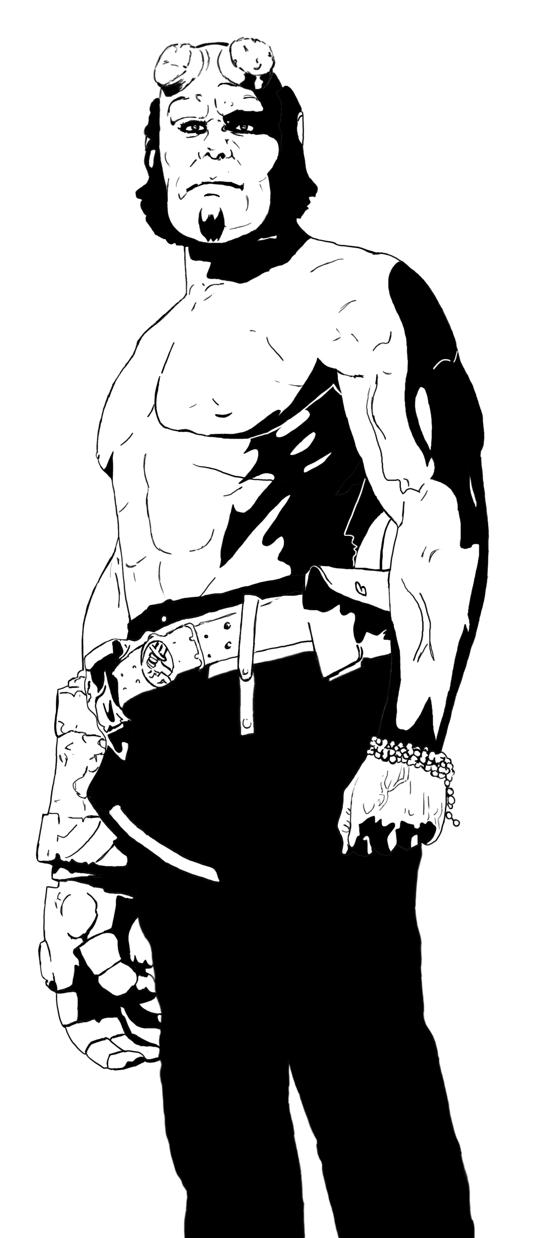