

Create a new document with size of 600 x 300 pixels and 72 dpi and fill it with color black.
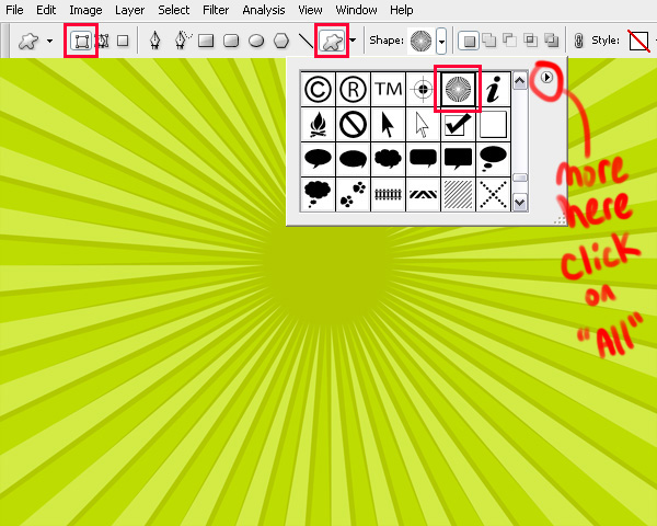
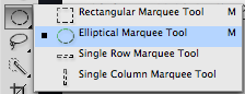
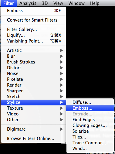
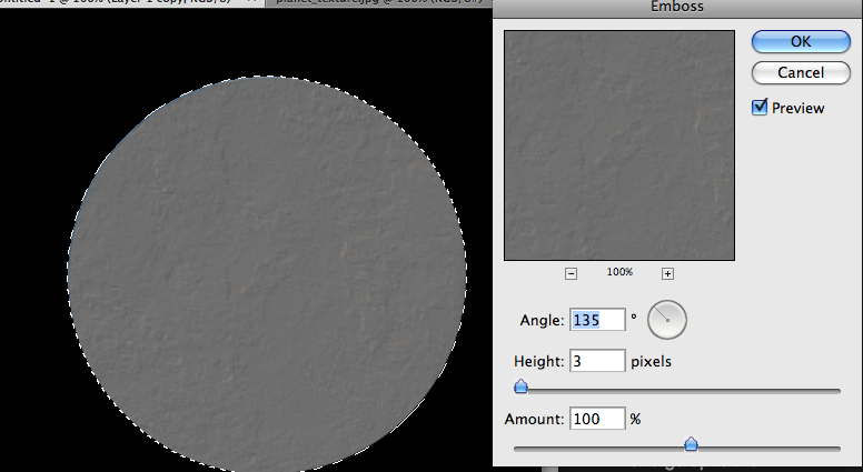
Now we are going to start creating our pattern. Select the Custom Shape Tool, go to Shape and if not loaded click on arrow on right side and select Ornaments. Select shape as seen on image below.

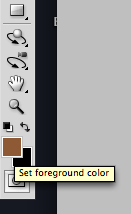
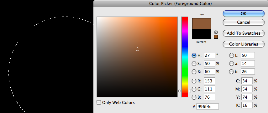
Select white color and create shape.

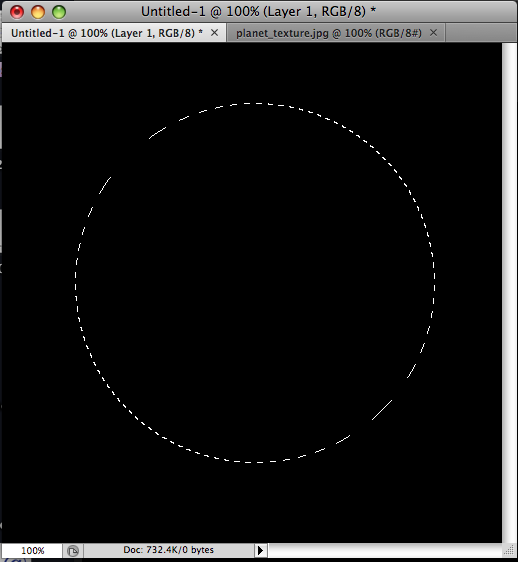
Rasterize this shape with Layer > Rasterize > Shape. After that select Rectangular Marquee Tool to create selection as seen on image below. You have to select only 1/4 of flower, this proportion is important for our future pattern.

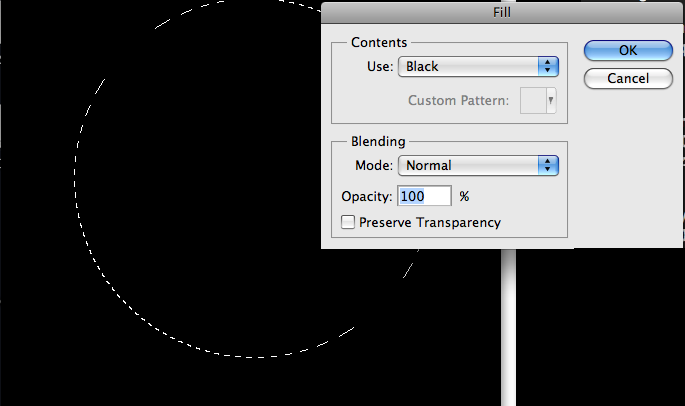
Invert selection by going to Select > Inverse and press Delete to clear selected area.

Remove selection width Select > Deselect (Ctrl+D) and select Custom Shape Tool to add another shape.

Add shape to the canvas.

Press Ctrl+T and rotate this shape about 45 degrees and move it a little bit below. Hold the Shift button when rotating the shape to get the exact angle of rotating object.

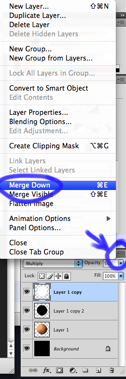
Select and merge both layers with shapes into one with Ctrl+E and duplicate new layer with Ctrl+J. Use Edit > Transform > Flip Horizontal to flip new layer horizontal and move it right like shown on image below.

Merge again both layers and after that duplicate again new layer with Ctrl+J. Use Edit > Transform > Flip Vertical to flip duplicated layer vertical and move it below like shown on image below.

Merge both layers together. Press Ctrl+T to reduce the size of shape created keeping Shift key pressed.

Now press Ctrl+A to select all on our canvas and press Ctrl+C to copy selected area. Go to File > New (Ctrl+N) to create a new document. Add 2 px more to width and height values presented there and change background to Transparent.
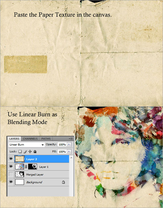
After document created, fill layer with color #003e16 and finally press Ctrl+V to paste copied shape to this document.

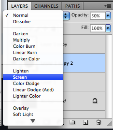
Change layer mode to Overlay and reduce Opacity to 40%.


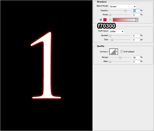
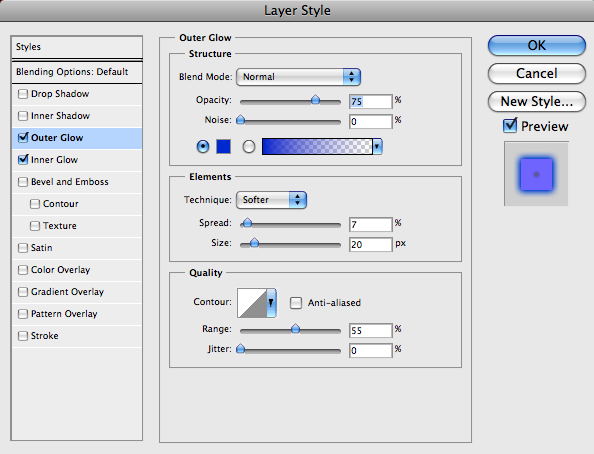
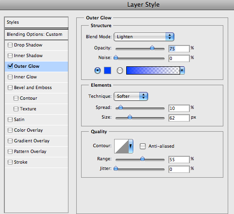
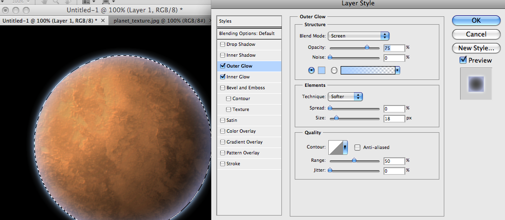
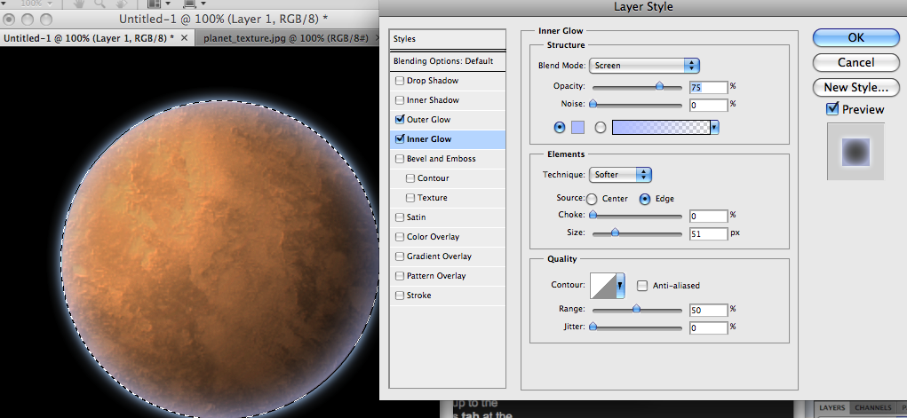
Go to Layer > Layer Style > Outer Glow and apply settings below.


Go to Edit > Define Pattern to save this image as pattern, give pattern a name and close current document without saving. After that you can create a new document of any size and fill it with our pattern for example.
Create a new document, select Layer > New Fill Layer > Pattern and select pattern created.


And we have a custom pattern created. But we can create a different pattern based on shape we created.
Go back to our main canvas and copy current shape three more times and arrange it as shown below:

Merge all four layers with shapes into one layer. Select Rectangular Marquee Tool to create selection like show below.

Press Ctrl+C to copy selected area. Go to File > New (Ctrl+N) to create a new document. After document created, fill layer with color #003e16 and finally press Ctrl+V to paste selection to this document.

Change layer mode to Overlay and reduce Opacity to 40%.


Go to Layer > Layer Style > Outer Glow and apply settings below.


Go to Edit > Define Pattern to save this image as pattern, give pattern a name and close current document without saving. After that you can create a new document of any size and fill it with our pattern for example.
Create a new document, select Layer > New Fill Layer > Pattern and select pattern created.

And now we have two different patterns created.
 Bam! You're done!
Source: photoshopstar
Assignment #26
Creepy Movie Poster Design:
This will show you how to create a simple yet effective movie poster with a photo and some typography.

First grab this house image and open it up in Photoshop. Now we want to duplicate the house twice, so push CTL+J twice. We are going to do this so we have the original just in case we make a mistake.
Take the top layer and go to filter>other>high pass and change to 8px. Change that layer's blend mode to overlay.

Click on the second layer (the house photo) and do CTRL+U to open up the hue/saturation. Drop the saturation all the way down to -100.

Now we want to go in and burn the bottom of the image and the sides where the trees are, so that when we bring it into our final document it will blend with the black.
The reason why we are burning it instead of using a black gradient is because the gradient would flatten the photo out. So pick the burn tool, choose a very large brush size with 0% hardness, and click and drag along the edges. Make sure the settings at the top bar are at set to 'Highlight' the maximum exposure.


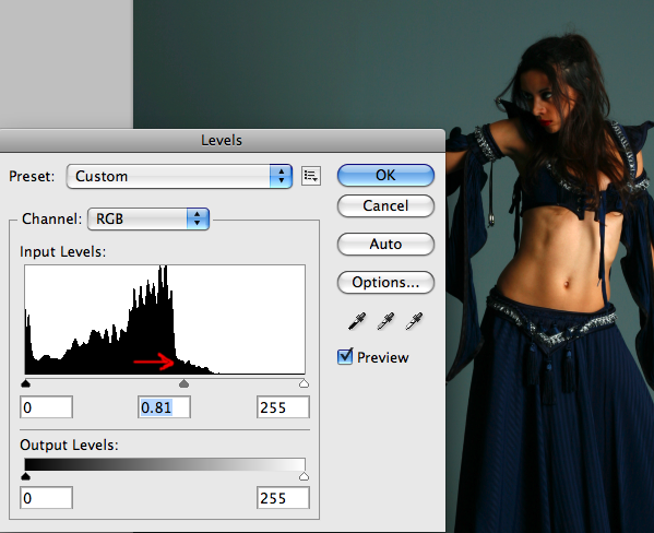
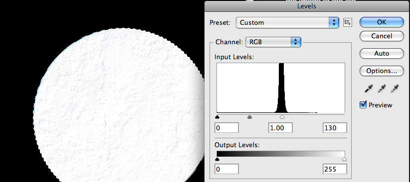
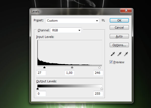
Using CTRL+L, open up the levels and adjust them as I have below. This is to adjust the contrast.

Select the top layer and merge it down with the next one.

Since this is a movie poster we are going to set it up as if we were going to print it. I am going to make a 6.5 x 10 in poster (this works best because of the size of the photo) with a dpi of 300 and RGB for the color.
Fill the document with black.

Bring the house into our new document. If you have to: Use CTRL+L, open up the levels and adjust the darkness level of the house to match yout background.

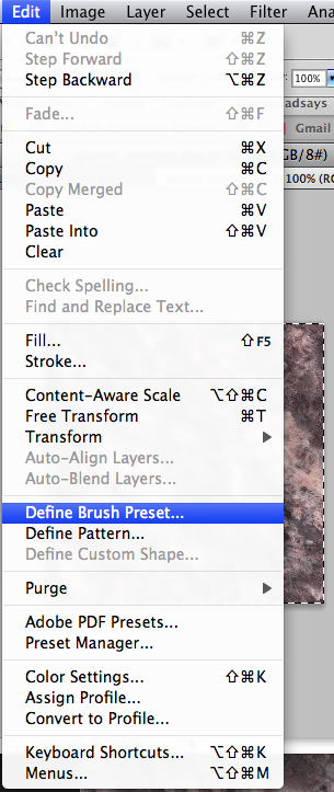
Now we are going to create a cloud brush to blend the edges of the house photo. Create a new document 1000x1000px (72dpi). Using the circular marquee tool, create a circle with a feather of 75px. Go to filter>render clouds.
Using CTRL+A to select the entire document then go to edit>define brush preset.

Go back to the poster document and take the brush that we just made and use it to paint on the edge of the house photos until the edges are gone, changing the opacity between 20 and 50% to get a smooth transition.

You want to give the house a little more contrast, so using CTRL+L, open up the layers and adjust like so for the house layer.

To get the bottom part of the poster information you can download the image text here: 
Save then open the above JPG file, select the entire image and copy it (Ctrl+A and CTRL+C) and go to your work file and paste each one into it. Re-position with the Arrow tool.

Using any font you'd like, type out the tagline at the bottom of the poster above the credits. "If bad people hurt someone you love, how far would you go to hurt them back?", or make up your own.

Now using the same font, create the headline. "The Last House on the Left"

You can go and download this blood/ink brush to add the subtle splatter on the title. Use red (foreground color) on the red letters and use white on the white letters. You can also change it to black and paint a few spots to give it a grungy-er look.
To make sure your tones stay consistent, make sure your document is set to RGB.
Go to filter>noise>add noise and change the setting to 15. That's it, you're done. Be sure to play around with it, us a different title, maybe a different photo. Maybe select certain layers and improve the contrast by pressing Ctrl+L and move the arroes inwards. Good luck!

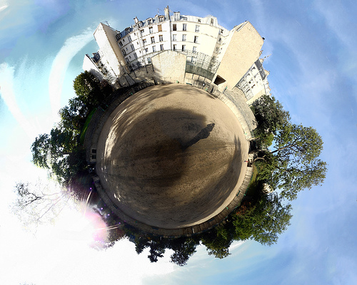
Looks cool, and it's easy to do! Let's get started.
When selecting a photo to start with you should keep the following things in mind:
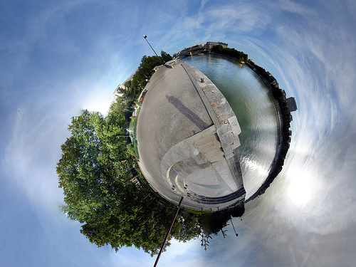
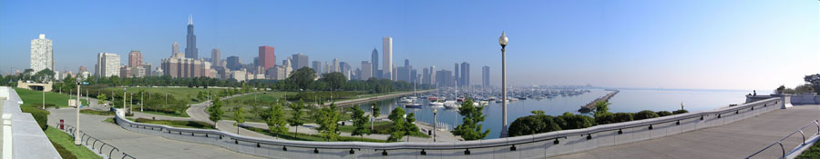
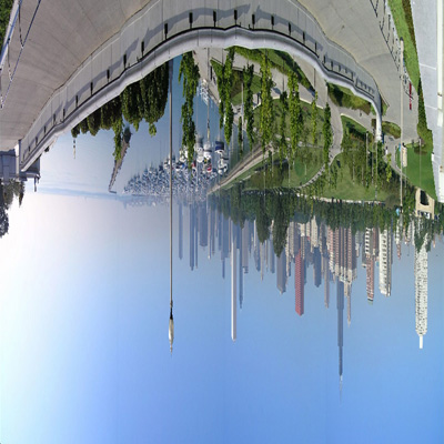
So let's start, here's one of a city landscape, not the best choice since the bottom portion has lots of random details, but it will do for now:
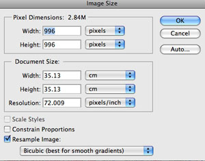
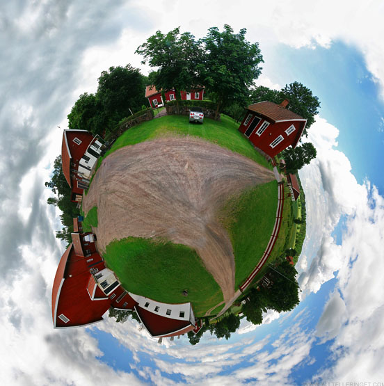
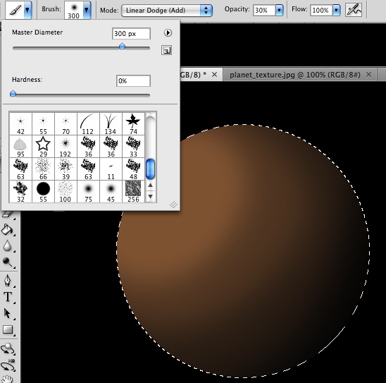
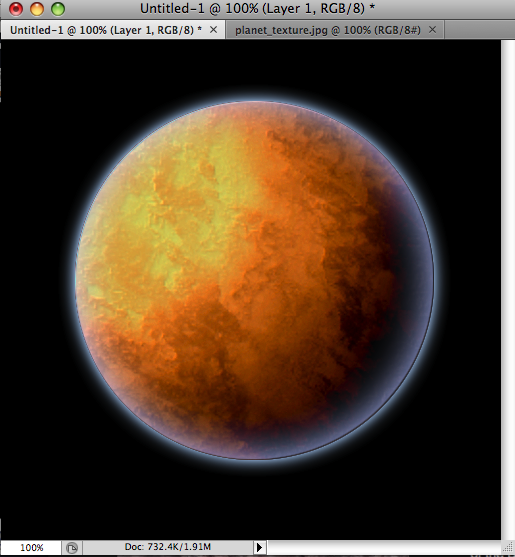
The first thing we need to do is prepare the image for the Polar filter. We do this by stretching the height of the image so that the image is a perfect square.
Select Image>Image Size from the menus. Uncheck 'Constrain Proporties' and set the "height" to the same value as your "width". Next, rotate the image 180 degrees. (Image>Rotate Canvas>180)
You should end up with something this.
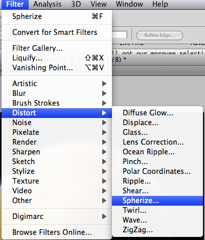
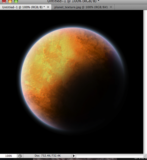
Next, we'll apply the Polar Filter to wrap our image into a sphere.
Choose Filter > Distort > Polar Coordinates from the menus and in the resulting dialog box, select the "Rectangular to Polar" setting.
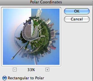
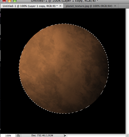
As you can see we're 90% of the way there!
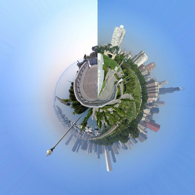
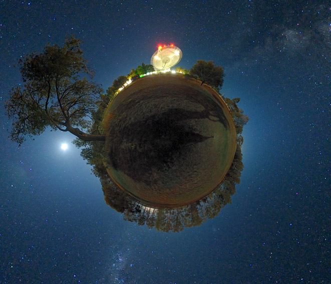
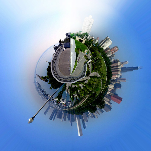
Easy cheesy, right? Now for some finishing touches...
The rest is just a little digital darkroom work: Rotate the planet to your liking, adjust the contrast and colors, clean up the sky and the edges where the left and right border of the image came together (the Clone Stamp, Healing Brush and the Dodge/Burn tools may be handy here).
If there's any ugly stuff happening at the center of the planet, the Clone Tool could help to patch things up, play around with it to make sure the center of the planet isn't too messy and that the sky does NOT have a seam in it. Once you've blended that stuff together... you're done!


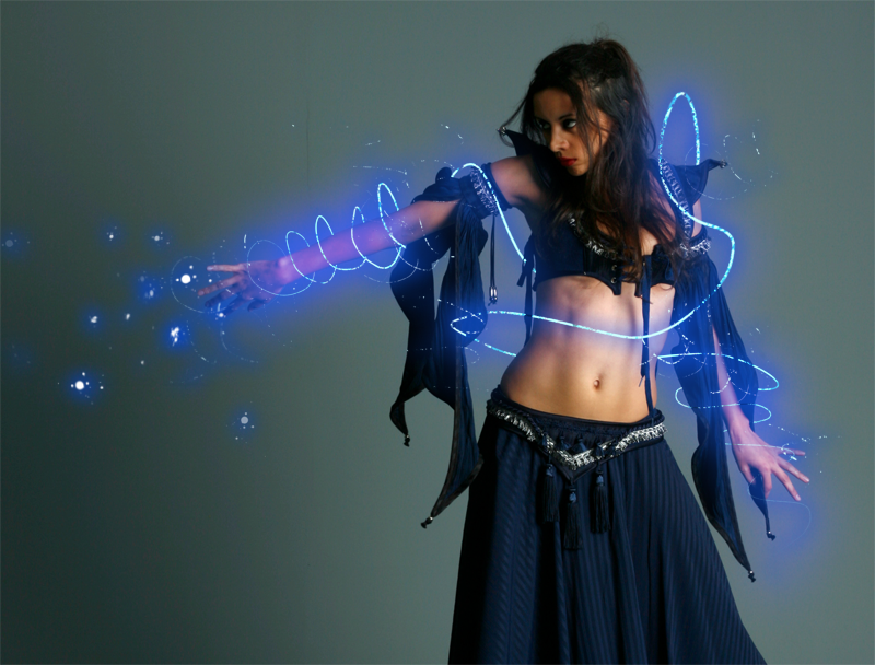


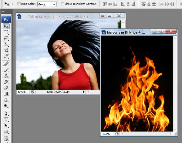
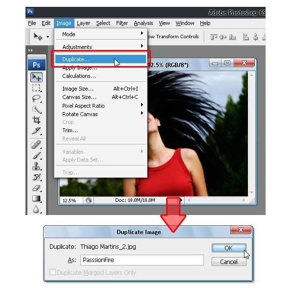
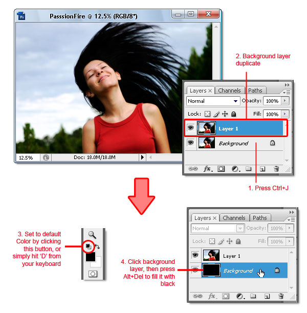
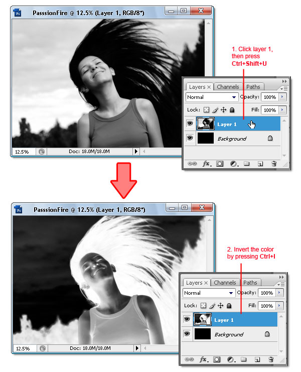
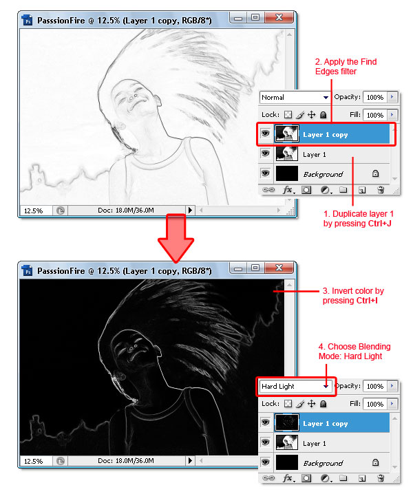
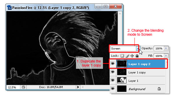
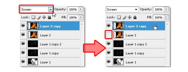
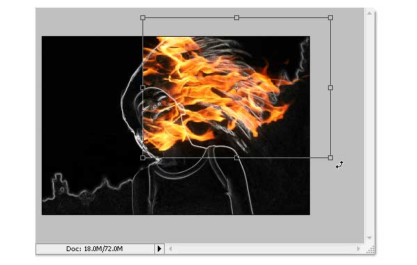
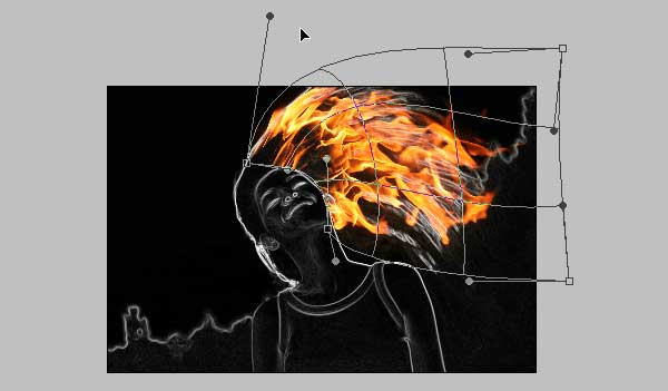
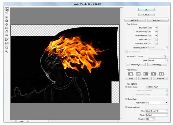
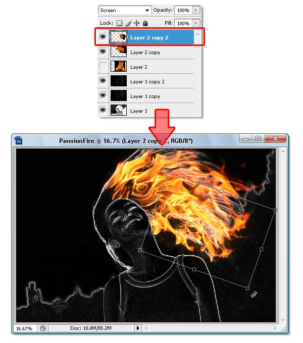
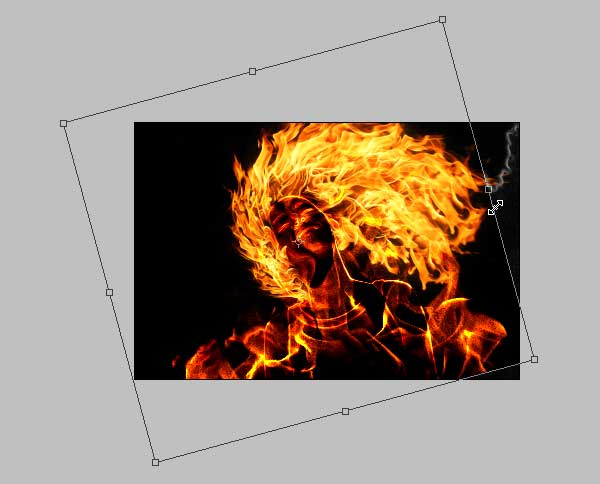
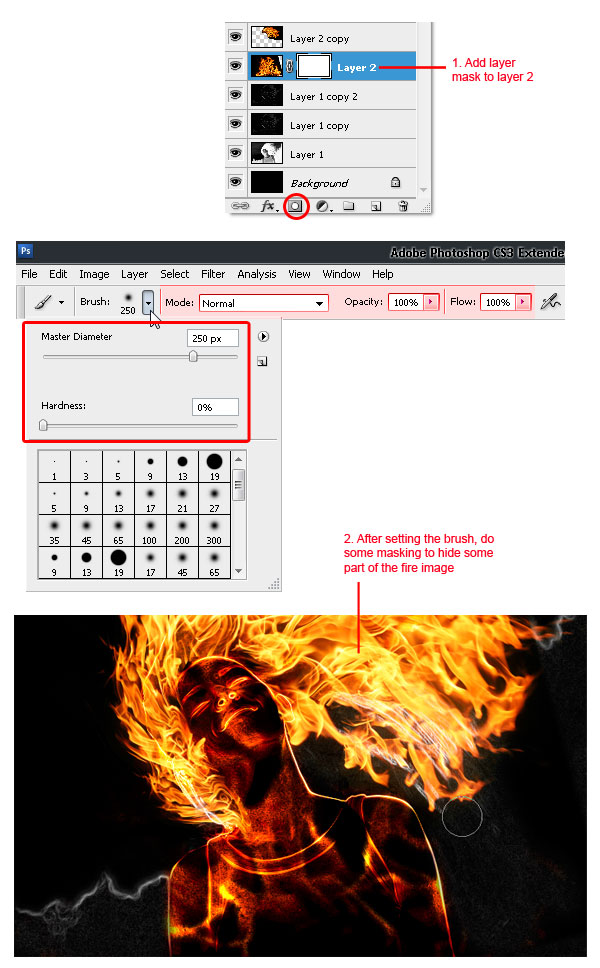
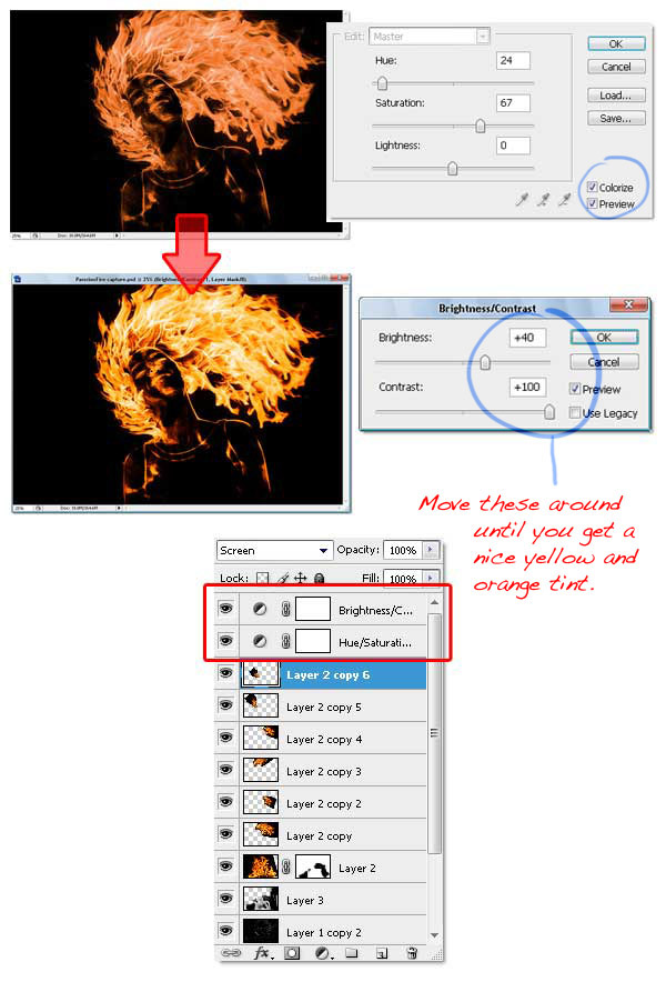
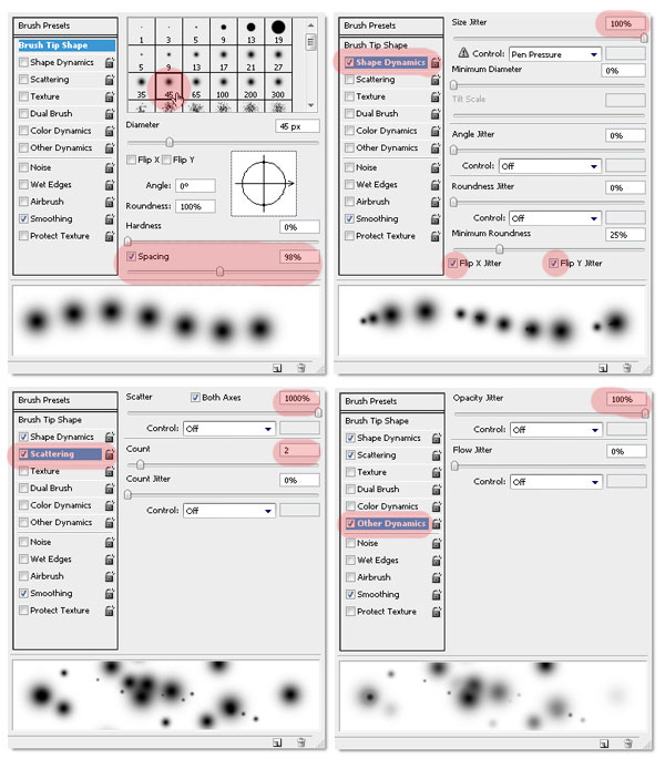
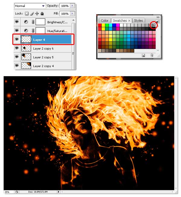
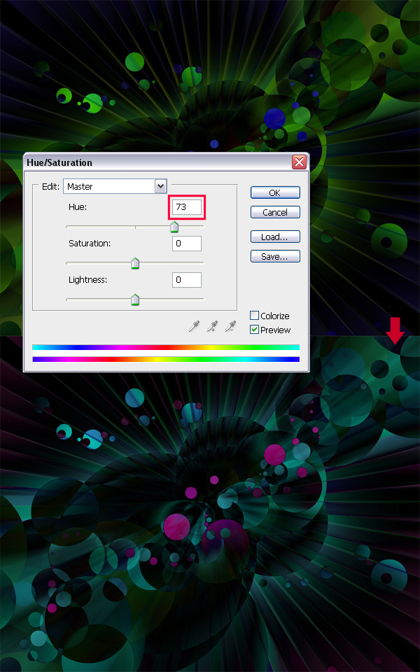
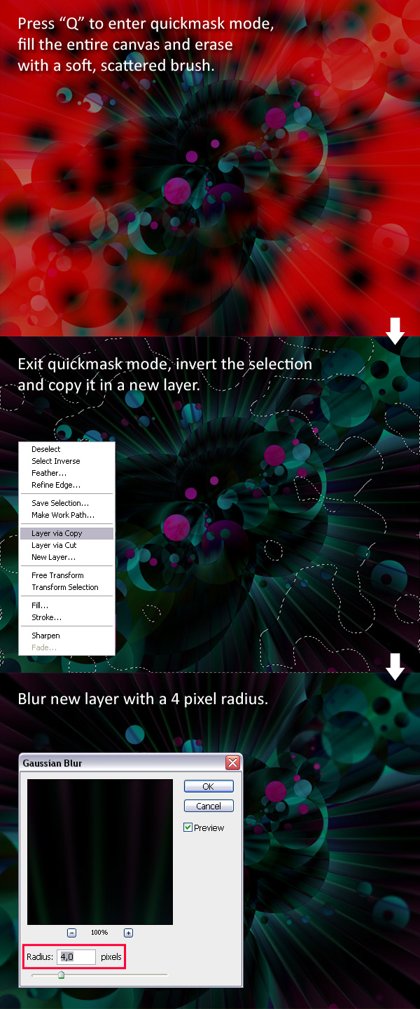
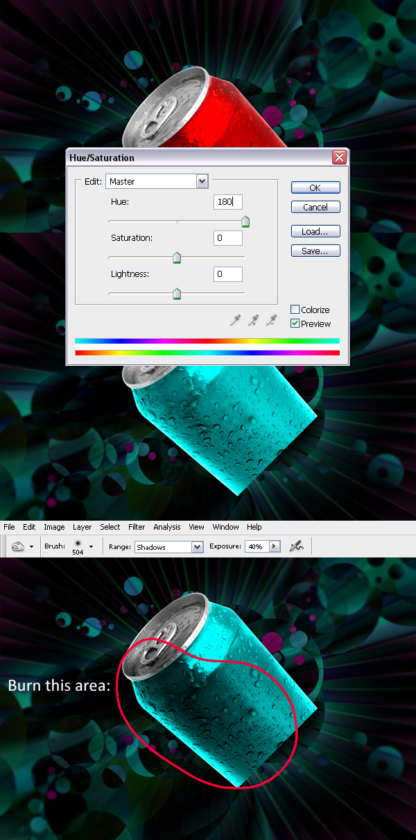
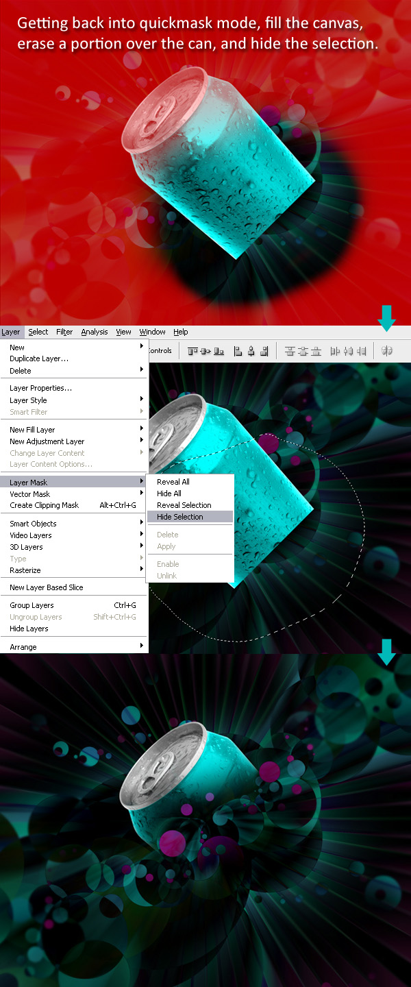
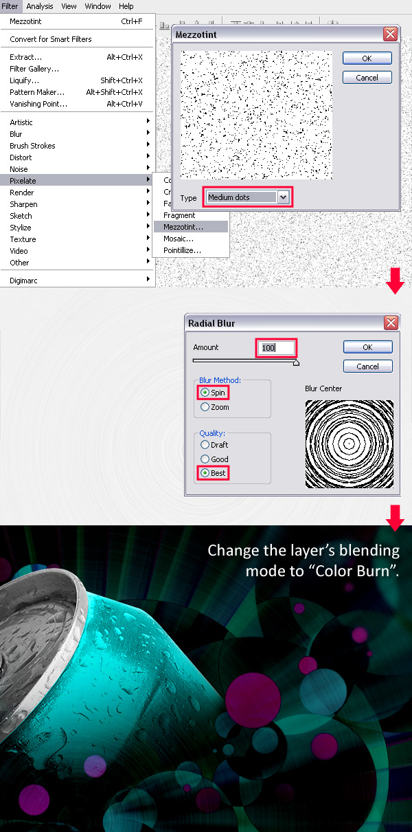
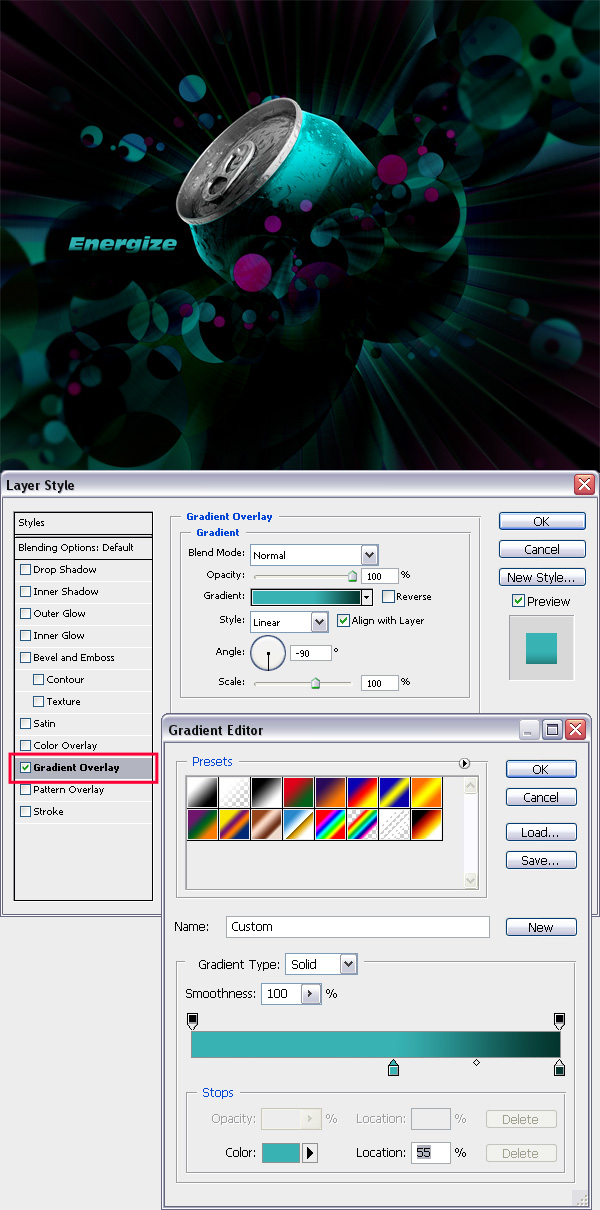
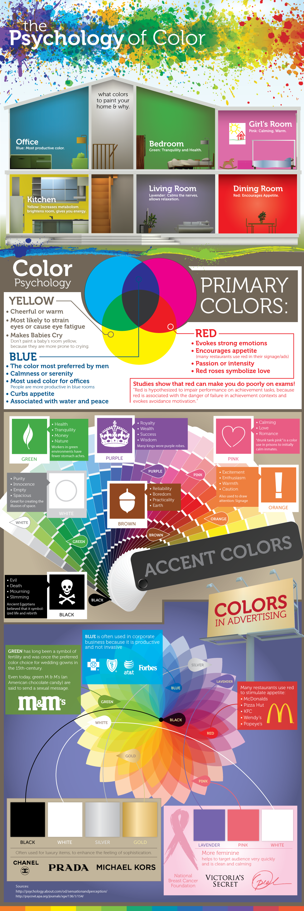
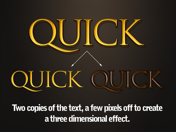
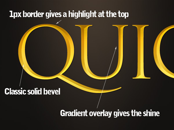
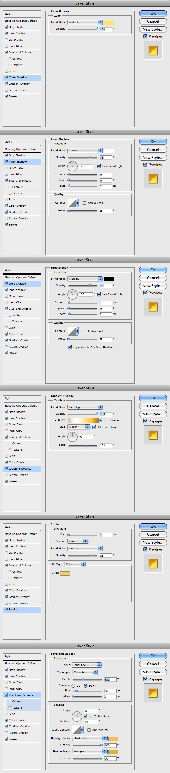
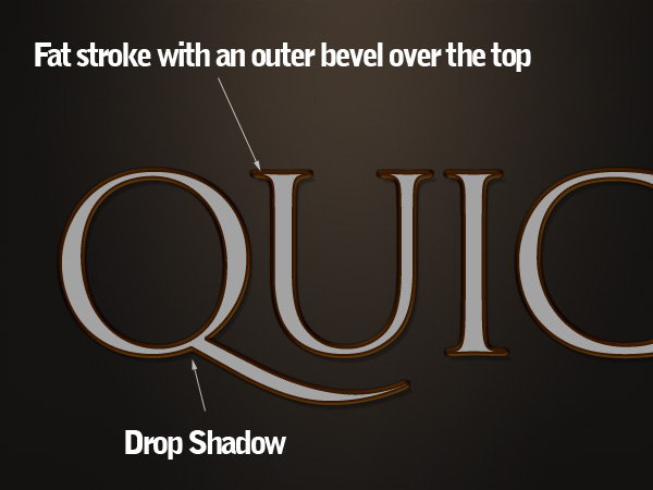
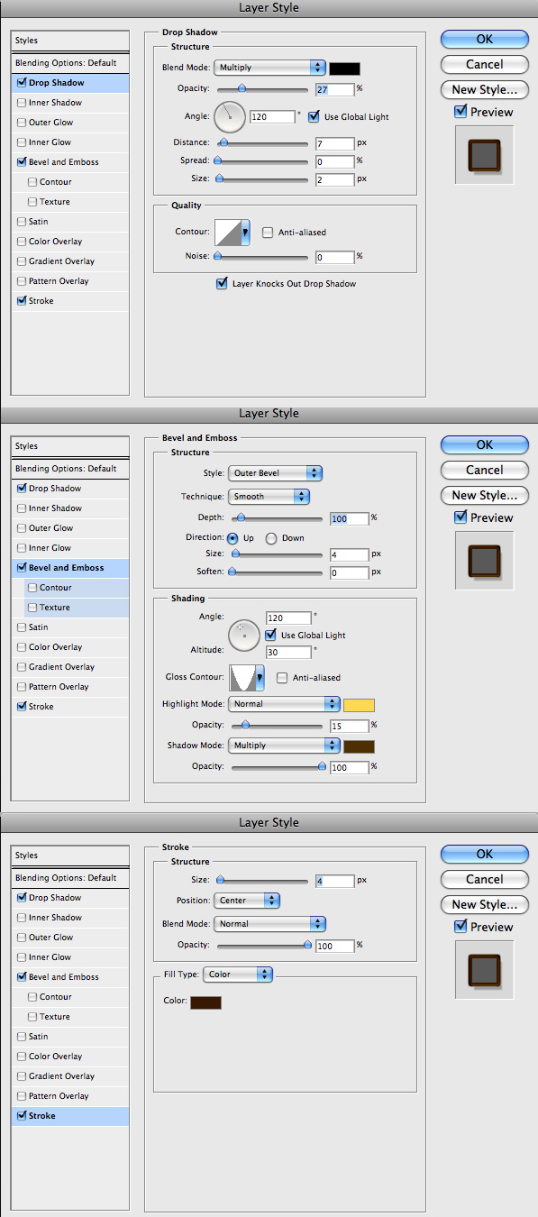
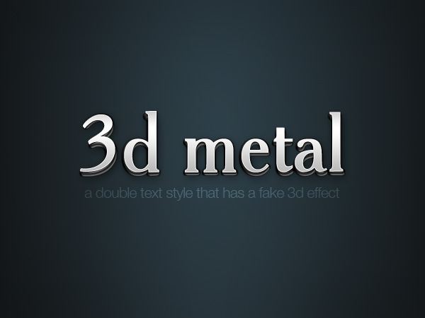
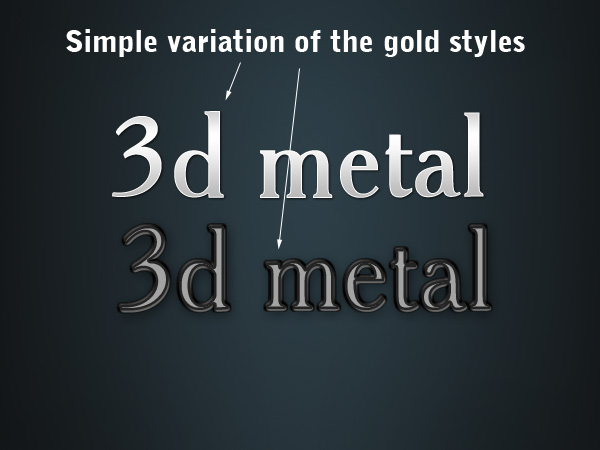
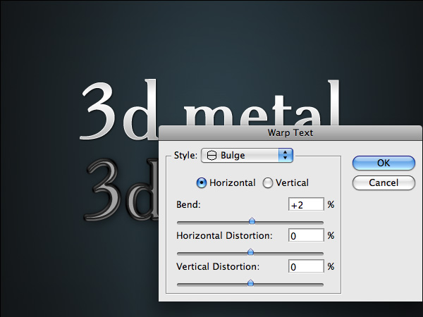
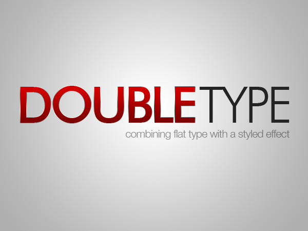
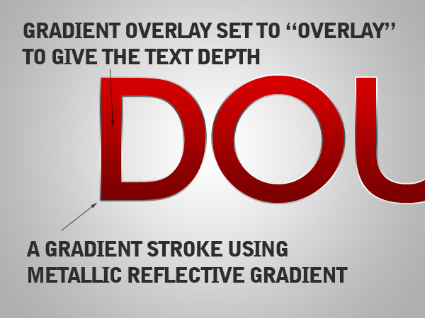
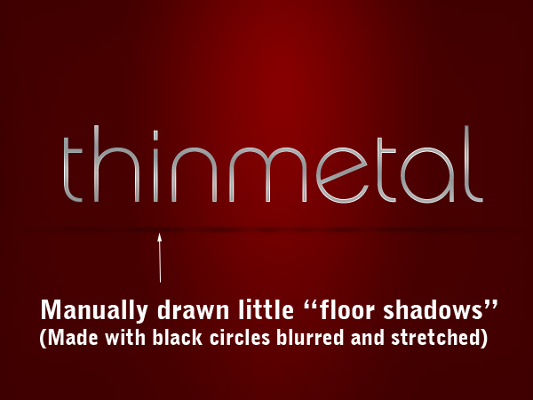
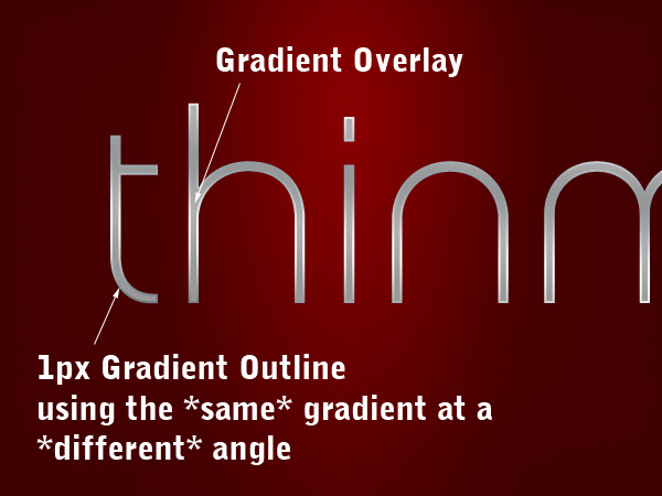
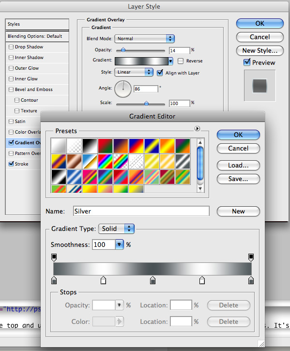
The image we are going to create is of a man with a textured face. The images I used for this were grabbed online. You will need to download them both (or you can find your own to use) Stone Texture - Download Open up the picture you want to add a texture to. On the layer above the image add the texture image (the stone texture). With the texture layer selected, change the layer blending mode to Hard Light. Add a mask to the texture layer. Use the mask so that the texture only affects the subject where needed. In this case, that would be the head and neck. The texture is currently a bit strong so I reduced the layers opacity to 44%. Look at the image and decide what parts of the subject dont need the texture. For this image I decided that the eyes, eye brows and lips don't need any texture. Paint these areas in black on the mask. I also decided that the very short hair on the top of the head only needed a hint of the texture showing. To do this I changed the brushes opacity to about 30% and then lightly went over the mask in black till it was faint enough to look right. Now that the texture is in the right place its time to sort out the colouring of the image. First i want to get rid of all the extra yellow on the face. To do this use a Photo Filter adjustment layer on the face picture. Selected deep blue and a Density of about 76%. Next I wanted to get rid of all the excess texture lurking in the shadow area of the image. You will want hints of it there, but most of it is not needed. Select your texture layers mask. Using a large soft black brush at about 30%, slowly hide the texture in the shadows till it blends in smoothly. I now want to make my texture grey scale. This is for 2 reasons. Firstly the colours are interfering with the face. Secondly it will help give the colder, stoney look that I want for this image. To do this create a Hue/Saturation adjustment layer above the texture layer. Make sure it only effects that layer by linking them (hold down alt and click between the texture layer and the adjustment layer so the adjustment layer indents). Then move the saturation slider all the way to the left. I also increased the lightness slightly. The image is now too red. Add a new Hue/Saturation layer above the face image. Select the Reds channel. Adjust the sliders till you get the look your after. In this case I wanted a fairly pale but natural tone. To finish of the texture I want certain parts of it to be more prominent, such as the cracks on the forehead. To do this duplicate the texture layer. Then make sure both textures are linked to the Hue/Saturation layer so they look as they do in the image below (Alt click between the 2 texture layers and then the top texture layer and the adjustment layer). Then use the mask on the copy of the texture layer to hide all but the cracks on the forehead and any other parts you want to stand out more. The final touches I did were: - Sharpened the main image layer (Filter > Sharpen > Sharpen) With this fairly basic method of adding textures you can create much more complex images. You dont always have to use Hard Light either. Try Soft Light, Overlay and any of the other Blend Modes to get the effect you want. The best way to get the look you want is trial and error. If you plan on becoming more of a serious Texture Artist, Graphic Designer, or Photoshop Image-Maker of any kind - See this guide for creating your own textures. For this project, you will be using these nice images to manipulate together... Once the file finishes downloading, extract the images out of the zip file onto your Desktop. Let's start with the first image, open and duplicate this image by using the Image > Duplicate... command from the top menu bar. In the Duplicate Image dialog box, you can name it anything you like, but to follow this tutorial reference, name it "PassionFire" and hit OK. By doing this, we kept the original image. Be sure to save. With the "PassionFire" image active, duplicate the "background" layer. Set the foreground and background color to black and white by pressing D on the keyboard. Click the "background" layer again and fill it with the foreground color ~ which is set to black (Edit > Fill...). See the image below. Reactivate "Layer 1," then press Ctrl + Shift + U to apply desaturate command. Now invert the color by pressing Ctrl + i. Your image should look like a film's negative now. Duplicate "Layer 1," then apply the find edges filter from Filter > Stylized > Find Edges. Next, invert the color by pressing Ctrl + i and change the Blending Mode to Hard light. There, your image now has contrast white line and a very dark background. To give the white line more contrast, duplicate the "Layer 1" copy then change the Blending Mode to Screen. Now we move to the second image. Open "image2", press Ctrl+A and Ctrl+C to select and copy it, and then go to your "PassionFire" image abd press Ctrl+V to paste. If the Paste profile mismatch dialog appears, just click OK to fix it. The fire image from "image2" should be in "Layer 2" now. Change its Blending Mode to screen, this will hide all the black colors in "Layer 2." If done right, your image should be similar to the one below. Duplicate "Layer 2" by pressing Ctrl + J. Make sure you use the Screen Blending mode, same as the original "Layer 2." Next, make "Layer 2" become invisible by hiding it from the layers panel. Click the "Layer 2 copy" to make it active, then use the Free Transform command ( Edit > Free Transform) to rotate and resize the fire image like shown below. Don't forget to press Enter when you're done transforming. Still in the same layer, now use the warp command (Edit > Transform > Warp) to bend the fire image - so it following the hair flow. Press Enter when done. See the example below as a reference. If you feel the result is not quite good enough, simply use the Liquify filter to fix it. I assume you already know how to use the liquify filter; the Forward Warp tool and Twirl Clockwise tool is the only tool I used to get this result (see image below). Duplicate the "Layer 2" copy, then use the Free Transform command to resize and rotate the fire image in the current layer. Don't forget to reposition the fire image too. Once you get this composition (see image below), hit Enter. Repeat the previous process to get the hair covered with fire. Just duplicate and modify the layer until you get all the hair part covered. If needed, use the Liquify Filter again. The end result of this process should look like the image below, notice how many layers are used. Okay, now activate "Layer 2" and make it visible again. Then Change the Blending Mode to Vivid Light. This step will colorize only the white line in the layer below it. Still in "Layer 2," apply the Free Transform command to resize and rotate the fire image like shown below. The purpose is to cover up the girl's body and hair with the fire texture. Press Enter when you're done transforming. We're gonna blur the fire image in "Layer 2," To do so, apply the Gaussian Blur filter from the Filter > Blur > Gaussian Blur menu. Fill the Radius around 10 to 15 pixels, then click OK when done. Blurring the fire image will cause its texture to blend smoother with the layer below it. Now add a layer mask to "Layer 2." Then use a soft round Brush tool with Opacity at 100%. Set the brush size according to your need, then just mask until the fire outside becoming hidden. See the process below. Sure we will remove the white line shown in the image (marked in red rectangle below). First, add a new blank layer below "Layer 2." Then simply paint it with black using the soft round brush tool. Now go to the top most layer (mine is: "Layer 2 copy 6"), add two adjustment layers which is Hue/Saturation and Brightness/Contrast. Careful not to change the layer adjustment order, or the color effect will be wrong. Below you can see the setting I used to complete this step, also pay attention to the adjustment layer order. By adding a Hue/Saturation adjustment layer, we unify all colors. The Brightness/Contrast adjustment layer brings more color contrast and makes sure the image color's looks like real fire. I'm sure you notice the fire sparks effect. I create it using the Brush tool with this simple setting. No special brush needed, but if you have one that will be useful then feel free to use it. Below you can see all the settings I used within the Brush palette, of course you can change the setting as you like. Just make sure the brush spatter enough and vary the size. Now to use the modified brush, create a new blank layer below the adjustment layers ( mine is named "Layer 4"). Choose 50% gray from the swatches palette, then you can start creating the fire sparks. Remember not to be monotone, resize the brush size if needed. I start using a big sized brush, then reduce it to smaller size (you can change brush size faster by pressing the bracket keys on the keyboard ). If you're not sure how to do this steps, just imagine where and how the fire sparks will flow if it was real fire. For me, imagining stuff is very helpful. To make it more interesting, create a new layer and change the Blending Mode to Screen. Then use a normal soft round brush (not the one we modified earlier), with an Opacity of 50%. Just click on the body, neck, and hair. I'm not sure how to explain this, but you can see the difference between the above and below images, keep clicking until it starts to look better, to your own discretion. And you're done! The first thing that you need to do is plan a color palette. But in order to choose your colors, you need to understand how the Difference Blending Mode works. It looks at the color information in each channel and subtracts either the blend color from the base color, or the base color from the blend color. This depends on which has the higher brightness value. Difference only works when transforming dark to light, and not light to dark. However, if you apply any type of blur to a difference layer, you'll get smooth gradients and dynamic lighting. Since the end result needs to be dark, choose bright colors that in combination with a radial blur will create gradients from light to dark. So begin by opening a new Photoshop document at 1600px by 1280px. Fill the background layer with this color: (#b1c900). Bring up your Custom Shapes Menu and select the Ray shape, as shown below. You can find it under the Symbols Folder. Then draw the first one right in the middle that is large enough to spread outside the canvas. Use this color: (#bddc01). As soon as you create the first one, duplicate it. Then rotate the copy so that it leaves just a thin line of the background. Then change it to this color: (#d3eb45). You should align them so that they match the image below. At this point, begin painting with a Regular Circle Brush at different sizes (large and 100% hardness level). Set your Brush Opacity to 60%, change the color to (#7a263e), and click individually while changing the size for each spot you make. By manually creating each spot, you have more control over your layout. Once you've created the first set, add a few spots on a separate layer with this new color: (#93133d). Next, make a new layer and add smaller spots with this color (#cdde67). Again, on a separate layer, paint even smaller spots with a slightly more saturated color: (#d9f14a). Now it's time to add some contrast by using a saturated version of the color that you used for the very first spots: (#93133d) To finish off the effect, create some small spots that follow the original layout, and others that fill the unused space of the canvas. Make sure to fade them out gradually as they approach the edge of the canvas. You don't want those to become distracting later. As a final touch, add a new color that will later be transformed into a vivid pink: (#7b2dc1). As pointed out before, the radial blur effect plays a crucial part in the overall image. Select all the shapes, spots, and background layers and press Ctrl+Shift+E to merge them together. After they are all merged, duplicate the layer. Name this new layer "radial blur". Then go to Filter > Blur > Radial Blur and insert the values shown below. You should now have two layers: the background layer that you recently merged together and its duplicated version that you named "radial blur." Select the "radial blur" layer and change its blending mode to Difference. You should now get a dark image with bright green and blue colors. It's not the hue that we want, so merge both layers together. Then go to Image > Adjustments > Hue/Saturation, or simply press Ctrl+U. Then change the Hue to 73. In this step you'll add some depth to the image that will guide the viewer's attention to the center of the design. Enter Quickmask Mode (Q), and use the Bucket Tool with the color set on black to fill the whole canvas. Next select the Eraser Tool, and add some scattering to it's preset. Now drag across the canvas while focusing on the center. As soon as you're done with that, exit Quickmask Mode (Q) again, and invert the selection by pressing Ctrl+Shift+I. Then right-click on the canvas while the Marquee Tool is selected. Then chose the Layer Via Copy option. As soon as you have the selection in a new layer, go to Filter > Blur > Gaussian Blur, and blur it by 4 pixels. At this point it's time to add the can. So download this image. Then cut it out with the Pen Tool or Lasso Tool (or click here to see different Extraction Methods you can use). Don't worry about the bottom, since you will only need the top. Once you have that done, position it in the center, and rotate it at a 45 degree angle. Then change the hue by 180. The use the Burn Tool to darken the lower left half of the can. Now you need to hide a part of the can in order to fade it into the rest of the photo. A simple layer mask should suffice. So enter Quickmask Mode again. Then fill the entire canvas with black. Erase the part that you want left out with a soft brush. After that, exit Quickmask Mode. Then go to Layer > Layer Mask > Hide Selection. You may also want to sharpen it at this point. To do so, go to Filter > Sharpen > Sharpen. Now if you'll look closely at the photo, you'll notice that it's simply too smooth. Rather than adding noise or grunge we'll just mimic brushed metal surface. First off, fill the canvas area with white. Then go to Filter > Pixelate > Mezzotint. Select Medium Dots and then apply the filter. Then set the layer's Blending Mode to Color Burn. In the final step is to add the title on the left side of the canvas. I used the simple "Energized" slogan. After typing it in, double-click on the layer, and use the layer style described in the photo below. And that's it! One energy drink ad ready to go! There are a lot of ways to make "gold" text. This one makes use of two layers with the exact same text on it. They are layered on top of each other with the bottom layer a few pixels down so that it gives an illusion of 3 dimenions. The font we're using here is Trajan—a very elegant typeface that suits gold text. First the top layer, which is made with the usual suspects—a bevel, a gradient overlay, and so on. Note the faint drop shadow that actually gets applied to the layer below it (which then has its own drop shadow). This is the layer that gives the depth to our letters. Notice that the interior bit is not important because it gets covered by our gold plating layer above. It uses an Outer Bevel on top of a fat Stroke to create the highlights. Then when we place the other layer on top they come together to make a lovely gold effect! There are a lot of ways to make "gold" text. This one makes use of two layers. This effect is actually just a variation on the gold text. As you can see below, we've again used the dual copies of the text, each with layer styles applied. Here I used a different Gloss Contour on the beveled text below, and of course everywhere we used a yellow shade in the last effect, I used a grey color here. To try something slightly different, I also applied a text warp. You can do this by clicking on to the text layer, selecting the Horizontal Type Tool (T) and then an icon appears at the top (shown below) that you click on. This gives the Warp Text dialog box. Now if you apply a Bulge to one of the layers, but not the other, you get a slight distortion that looks neat. This effect is much simpler and just relies on having two versions of the text, one styled and one not. I've used Futura as my typeface here. I believe I saw this effect on a movie poster once so I've used red the way they did, but it works just as well with other colors and combinations. All there is to do is apply two bits of layer styling: This effect works wonderfully for website designs. It's a very simple effect really, you just grab some text (typeface is DIN in this example, but any font will do) and give it a Gradient Overlay. Photoshop has some really nice Color Harmony gradients that you can add by clicking on that little arrow that points to the right on the Gradient Editor dialog box. The gradients it adds are the bunch at the bottom. If you choose one of those and set it to about 59% on white text, set on a dark background. This is the simplest way to make a metallic effect. It relies on the fact that when you see metal in real life, it's usually got lots of highlights and shadows, especially shinier, chromier type metals. So by using two copies of the same gradient at different angles you can make this effect happen really easily and give your text a metallic effect. It's best on a thin typeface because otherwise the interior of the text looks dull and flat (unless of course we added more styling, but then it wouldn't be super quick!) So first of all I decided to make my text ‘stand up' in this example. So just create a layer below your text and draw tiny circles of black below the points of each letter. Then blur them by going to Filters > Blur > Gaussian Blur and set it to about 2px. Then hit Ctrl+T and squash them vertically. Finally set them to about 30% Opacity so they are nice and faded out. For letters like the a and e where there is a larger area of the letter touching the ‘floor', you can use the transform tool to stretch the circle our horizontally. Finally I duplicated one of my circle shadows and stretched it waay out so that it went underneath the whole bit of text to make the overall shadow. Experiment and you should be able to create some neat little pools of shadow under the letters. Now the actual text is just a combination of a Gradient Overlay and a 1px Stroke that uses the same gradient. The gradient we use (and it's the same as in the Double Type effect above) is a metallic gradient that comes with Photoshop. You can add this to your gradients palette, using that little right arrow shown in the Gradient Editor below, then choose Metals and you should see it appear. The key here is to make sure the Angle on the overlay and the stroke is different. This is what creates the highlights on the text that you can see in the close up screenshot above. I also set the main overlay to just 14% Opacity over the top of some grey text so that it was a little faded out, but that's optional.
Healing Brush Tool (J)
This is a really useful tool. Mildly advanced. You can use this tool to repair scratches, specs and small imperfections on images. It works like the Brush tool. You choose your cursor size, then holding the [Alt/Opt] key, you select a nice/clean area of your image. Let go of the [Alt/Opt] key and paint over the bad area. It basically copies the info from the first area to the second, in the form of the Brush tool. Only, at the end, it averages the information, so it blends.

Clone Stamp Tool (S)
This is very similar to the Healing Brush Tool (see above). You use it the exact same way, except this tool doesn't blend at the end. It's a direct copy of the information from the first selected area to the second. When you learn to use both of these tools together in perfect harmony, you will be a Photoshop MASTA! (OK, maybe not a master, but definitely ready to move beyond basic tutorials.)
For more info on this technique and how to use these tools with masks to retouch photos with skin wrinkles and blemishes, go here.
For more info on enhancements go here.
See more samples of photo retouching and color correction here: 'Before-and-After'
Assignment #31
Texture Blending:

Man - Download


- Increased the contrast of the image as a whole (Image > Adjustments > Levels)
- Increased the reds in the eyes and slightly on the lips to make them stand out more (Sponge Tool)
Download this Guide to Manipulating & Applying Textures
It's a great way to keep certain things in mind when creating artwork or photo images.
Source: adamwignall
Assignment #32
Flaming Portrait Effect:
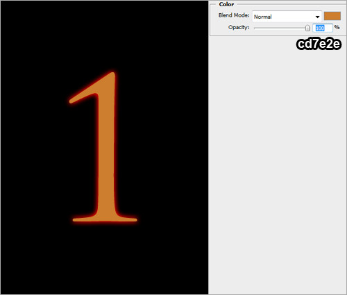
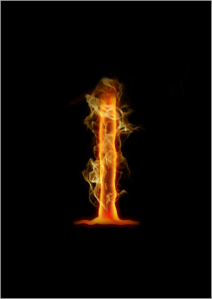
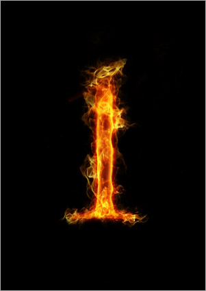
Step 1
DOWNLOAD Resources.
Step 2
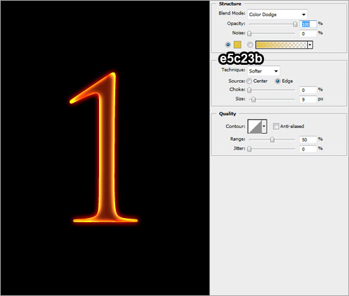
Step 3
Step 4
Step 5
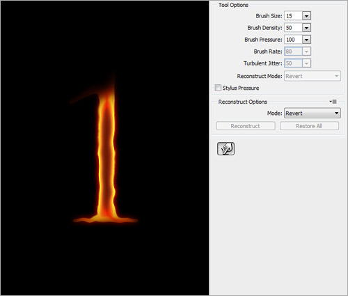
Step 6
Step 7

Step 8
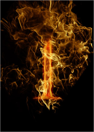
Step 9
Step 10
Step 11
Step 12
Step 13
Step 14

Step 15

Step 16
Step 17

Step 18
Step 19
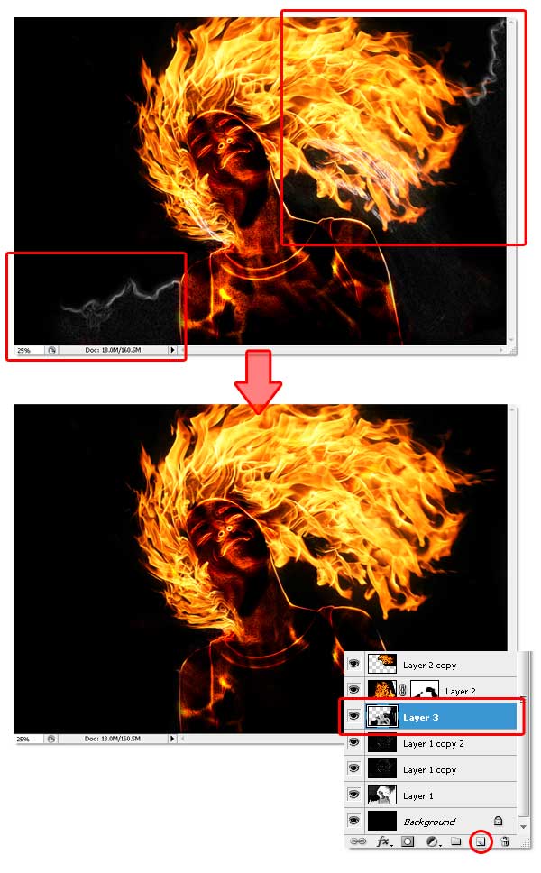
Step 20
Step 21
Step 22
Step 23
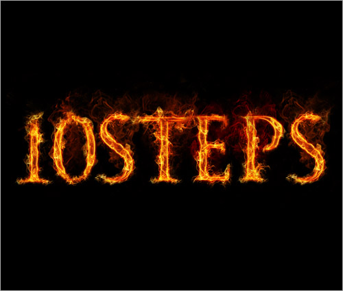
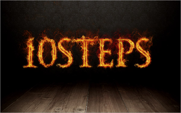
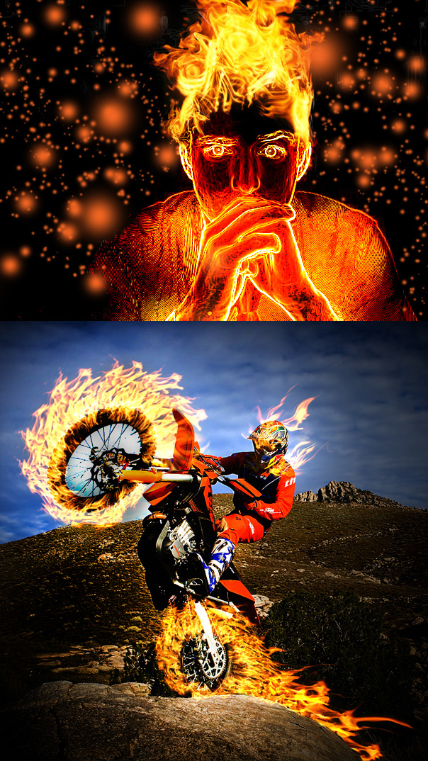
This same process can be applied to nearly any type of photo for some crazy visual effects:
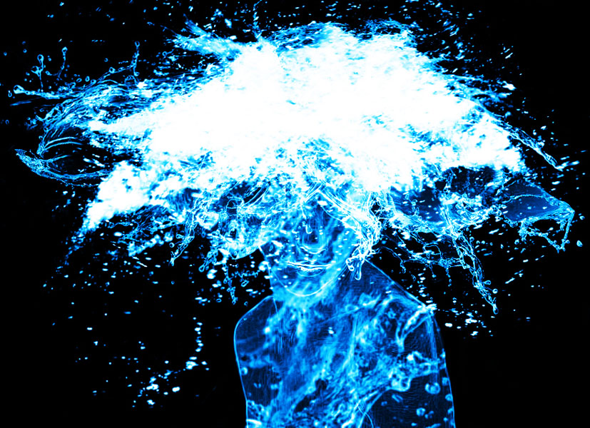
Here's the exact same method applied to another photo of a person using images of water splashes instead of fire:
Assignment #33
Energy Drink Advert:
Step 1

Step 2
Step 3
Step 4
Step 5
Step 6
Step 7
Step 8
Step 9
Step 10
Step 11
Step 12
Step 13
Final Result
Here's one final detailled look at the full potential of creating your own custom brushes:
-Download this Guide to Photoshop Brushes-
With some practice, this can open up many doors for some very cool and creative possibilities.
Source: psdtuts
Assignment #34
Background Layout Painting for Animated Series:
Here's samples of the finished work...
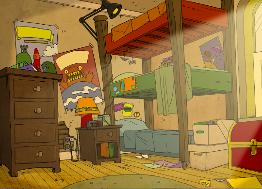
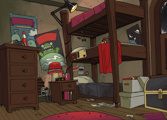
Download this image, and paint the layout anyway you wish, using ANY colors you'd like. Utilize any of the tools and techniques you've learned so far, you may add textures, shadows and lighting to the location design as well.
For some tips, take a look at this:
- Week 8 -
Assignment #35
Five Quick'n'Dirty Text Effects:
For all 5 of these mini-assignments, label them 35A, 35B, etc. for submitting them to the instructor.
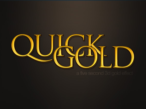
35A - Quick Gold Text
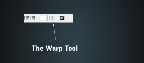
35B - 3D Metallic Text
35C - DoubleType
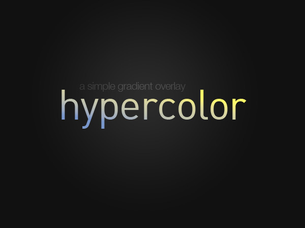
35D - HyperColor
35E - Thin Metal

That's it! Six nice and simple effects for text art with Layer Styles / Blending Options. Send all 5 as separate files to the instructor.
Assignment #36
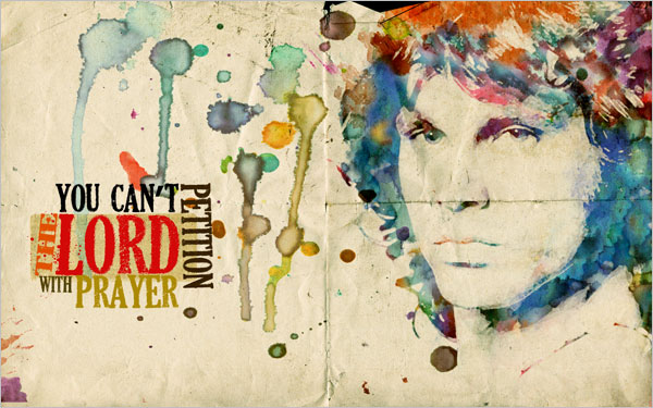
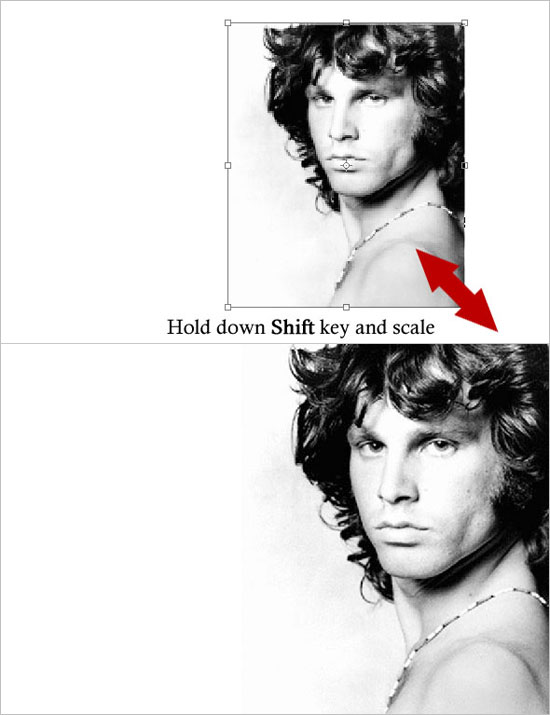
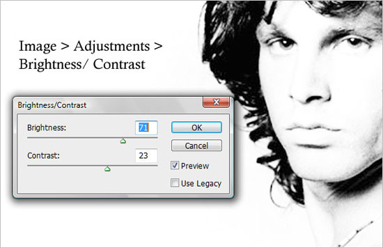
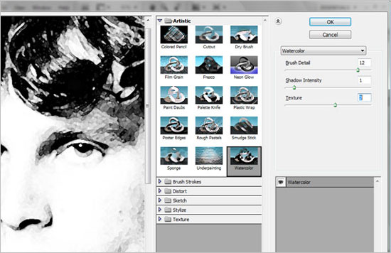
Watercolor Poster Design:
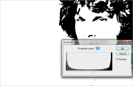
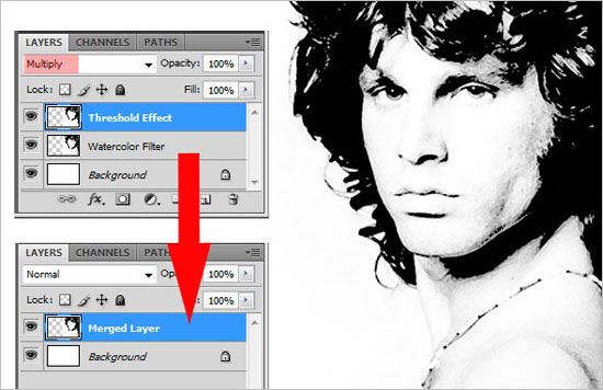
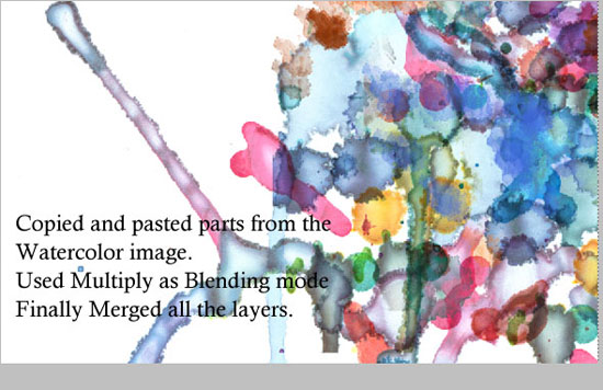
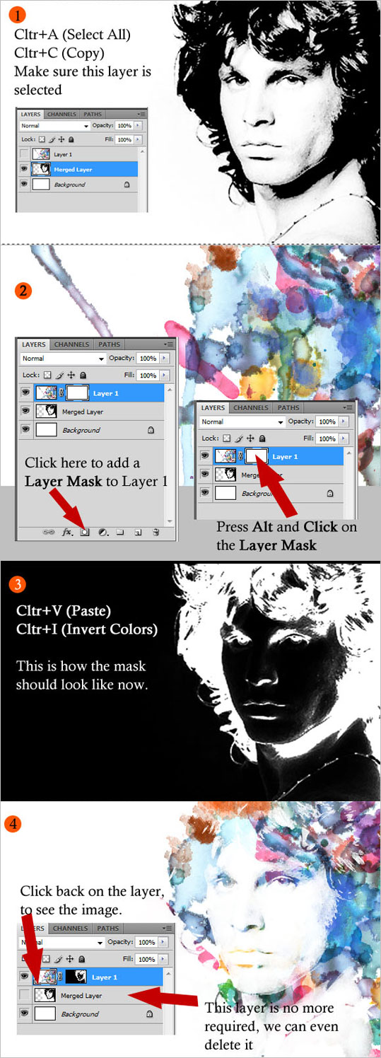
There are plenty of ways to create a Watercolor Effect in Photoshop. Some are very cheesy and you can easily tell that a simple filter has been used. In this tutorial, we will be using Layer Masking. It is one of the most fascinating and powerful Photoshop method, to use layer masks in your designs.

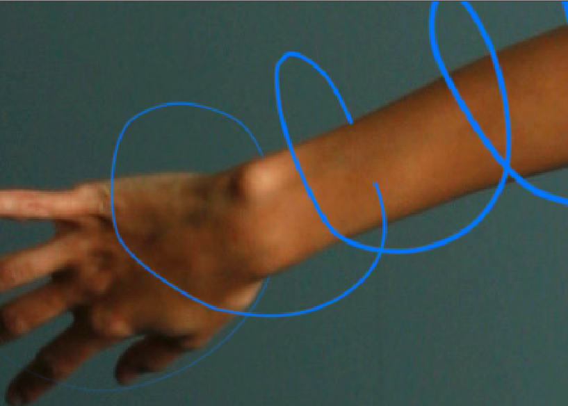
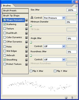
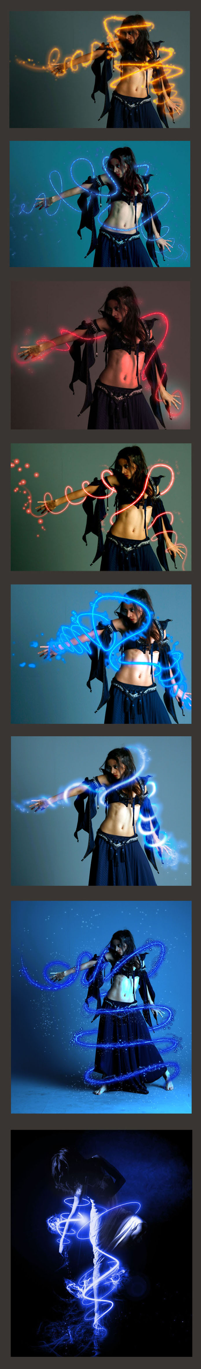
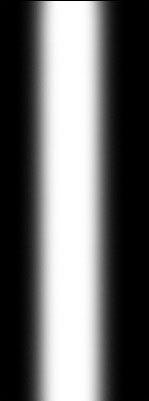
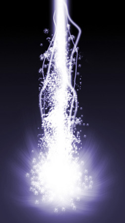
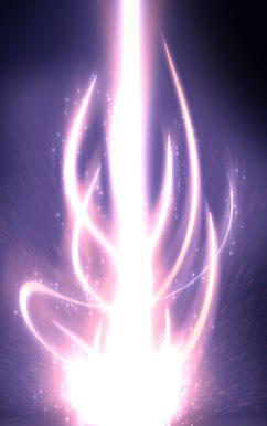
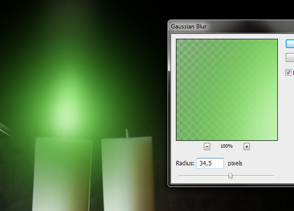
To start creating our energy beam, we first need to open up a brand new canvas. My canvas size is height: 400 pixels, width: 800 pixels, resolution: 72 dpi, color mode: RGB. Once you have your canvas open, fill it with a black color. Now that you have your background setup, create a new layer (Ctrl+Shift+N) and take out your brush tool. Set the brush diameter to 100px and set the hardness to about 10%. Draw a vertical line (Hold shift) down your canvas and you should end up with something looking similar to this.
Step 2 - Energy Beam Base
Now we are going to create the base of the energy beam. Select the brush tool again, but this time set your hardness to 0% and set the diameter to 400px. Once you have this larger brush selected, move it to the bottom of your image. Click twice and the base of your image to create a larger spread which will be the base of our energy beam.

Step 3 - Add Some Color
Now I am going to add some color to my energy beam. To do this, go to Layer -> New Adjustment Layer -> Color balance. I went for a nice yellow color and used the following setting (but you can chose ANY colors you wish):
Shadows: -20, -23, -34
Midtones: -31, +26, -11
Highlights: +50, +3, -44
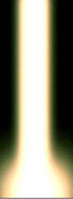
Step 4 - Start Smudging
Now we are going to start smudging our image. Select the Smudge Tool, and use the 59px Splatter brush from your brush menu. Click and drag from the bottom up to smudge your energy beam to look as if it is giving off light. Mine looks like this now.
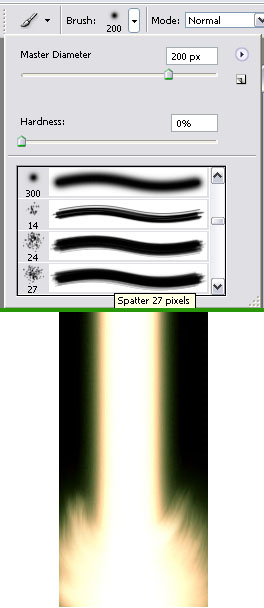
Step 5 - Side Flares
Create another new layer (Ctrl+Shift+N) and take out the 65px soft brush we used to create our vertical beam. On your new layer create three dots on the vertical part of your energy beam, one on the left and two on the right. Now take Smudge Tool and use the 59px splatter brush. Smudge these dots upwards as we did with the base of the energy beam. Your image should now look something like this.
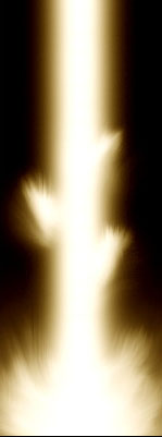
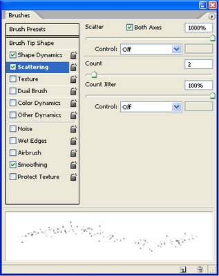
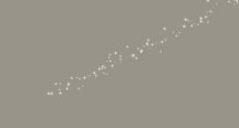
Step 6 - Add Some Spray
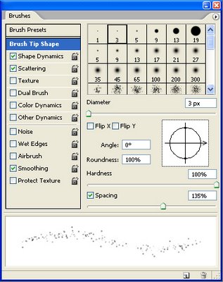
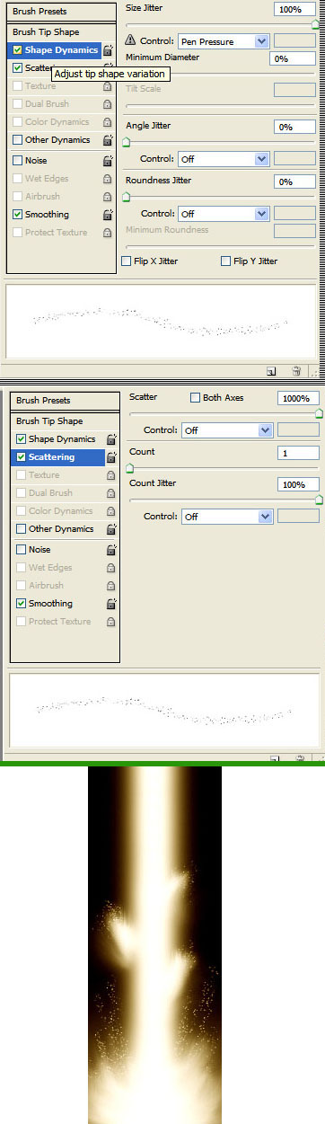
Now we are going to create a sort of energy spray coming off of the energy beam. To start, press F5 to open your brush preset editor. Now select the 2px brush and apply the settings shown in this image. Once you have this new brush set up, take out the Smudge Tool and select the 2px brush we just made. Now smudge the dots and the base layers, and you should have something like this.
Now using a small Smudge brush with a high Strength setting, you can add streaks coming out from the core, have fun with it, keep smudging, and keep altering the color hues until you're satisfied.
Different color correction, blur/outer glow effects on layers and different smudge settings and brushes can yield different results.
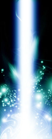

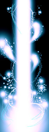
As an additional option, you can experiment with the Liquify Filter.
OPTIONAL: Make a few copies of the layer with the main white core beam, then go to Filter > Liquify and choose the top left button (Warp Tool) and then change the settings to increase the Denisty, Pressure, and Rate (on the far right side) then start to smudge some more crazy swirls!


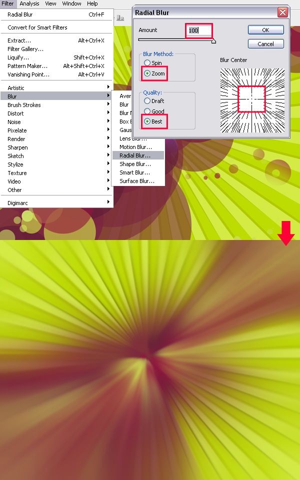
We need to start by making a new document in Photoshop. For this tutorial you should use the resolution that fits your screen - in this case 1680 x 1050 (72 dpi). Bring some rulers onto your canvas in the center.
Select some appropriate colors then drag a radial gradient in the middle of your document.
Forget how to make custom gradients? Go here.
Colors used here were #3d3b3c and #0e0d11.
Time to add a little detail to the background. Find and copy onto your canvas a nice, grungy texture. For this you can use paper, stone, abstract or whatever! A good place to start is CG Textures.
Or just use a texture of some metal scratches like this. Choose one and copy it into your canvas, resize it then mess with the layer mode and opacity/fill. I tried Color Dodge with a fill of 30%.
p>
Get another texture, this time you can use something random. Again mess with the layer mode and opacity, use whatever comes out nice & to your liking.

(rusty metal texture added)
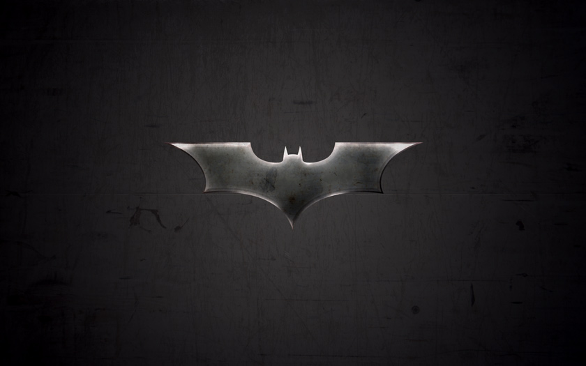
Time to get a nice bat logo for our wallpaper.
If you want, feel free to grab this version batman logo used for this tutorial: Download Batman Logo PSD. (Tip: There's two other logos in this file, you choose any one of them).
![]()
Now we want to make our bat logo (or whatever logo you wish to use) a bit more interesting. Let's try to come up with a decent metal effect. Let's start by lightning of the the logo a bit with - Image > Adjustments > Levels. Now, head into the blending options for your logo layer and apply the following TWO layer styles:

Remember: depending on what size document and logo you're working with, you may need to tweak those settings. Once you're done, you have a basic beveled effect:
![]()

Now, using the Dodge Tool with moderate settings (Highlights, 35%) do a little bit of dodge-work on the edges/corners of your logo.

Get out the Burn Tool again, using the same settings as before, darken the middle area of your logo a little more.

Now it's time for some more layer styles:
Again, depending on what sizes you're working with here, you may need to alter the inner shadow/inner glow settings.

Not bad now! As done before, create a new layer then merge it with the layer applied with the layer styles. After this, darken up your logo a little more using the levels feature (ctrl+i).

OK, we're done for that part, but we want to add a little more metal to the logo (next step).
Again, check out your texture resources and find some nice, rusty metal textures. To start with I used a ‘galvanized' metal texture.
Copy your texture to the canvas, resize it then crop it to the bat logo pixels (using a layer mask).

Now, time to mess with some layer modes. For the first galvanized metal texture layer I used Color Dodge with 40% fill, then I duplicated this layer and changed the layer mode to Overlay and left the fill opacity intact.

Not really noticeable, hey? Anyway, to finish off I added one more texture on top, with a large rusty bit at the top:

For this layer I used Linear Burn and 27% fill (please remember, all the textures used in this tutorial can be downloaded from CG Textures).
(click for larger version)
OK, to finish off with the bat logo I think we should add a shadow and also one of those cool light rays in the background. For the shadow, simply apply an Outer Glow layer style to the main layer.
For the ‘cool light ray' effect I was talking about, get one of your original bat logo layers (with one solid color) and apply Filter > Blur > Radial Blur with similar settings to these:

Now we have a cool blur like this:

I think a good idea for a better effect would be to make the shape slightly bigger before apply radial blur, so it stands out on the sides a little bit more. Anyway, after you're done with the radial blur, change the layer mode to Color Dodge and lower the fill if you think it necessary.

So, as you can see, on the left we have the final bat logo on top of the light ray in the background, and on the right is the final light ray with the layer mode changed.
You should keep adding your own stuff to the outcome though, as you'll always come across a better effect.
One idea is to create another light ray effect and place it on top of all the other layers, use a layer mode such as Overlay and erase away some of the inner area.

If you want a much darker outcome, you should continue adding textures on top of the whole document (not just the shape or the background, but the whole thing) and continue playing with layer modes, fills, layer masks, etc.
Don't forget the old trusty but crusty brushes either! Adding a dab of some destressd or textured brushed here and there can add a lot, ie: this set of splatter brushes, or even this set of grunge brushes..
Add some text, add more textures, more adjustment layers, etc. to shape the design to whatever you want.
Alternative sample with different color scheme and logo:
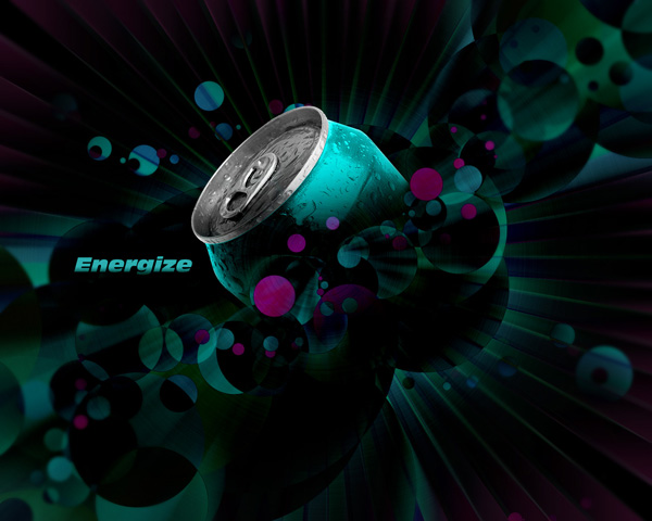
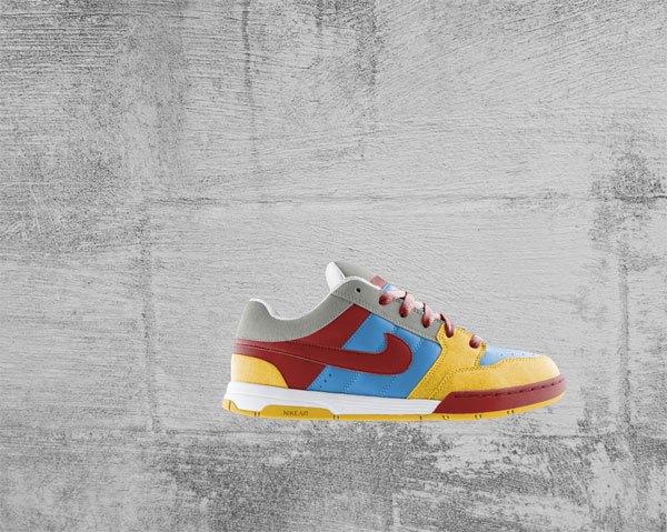
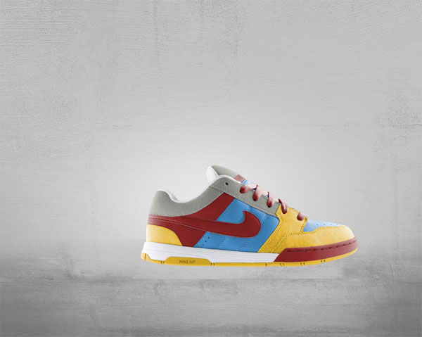
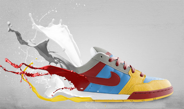
Here is the ad poster design we will create.
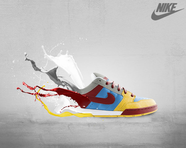
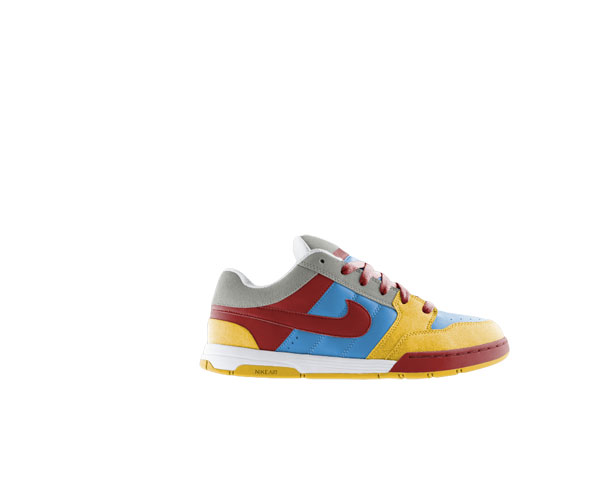
For this tutorial, I've chosen a classic Nike shoe. You can use any kind of product image and create the same effects. If you want to work with this particular shoe open it from the zip file you just downloaded. If you want to pick your own product make sure you extract it so that it is isolated on its own layer without a background.
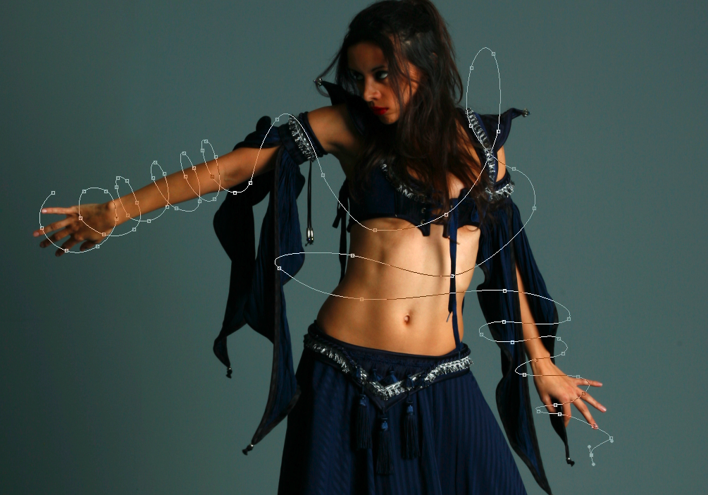
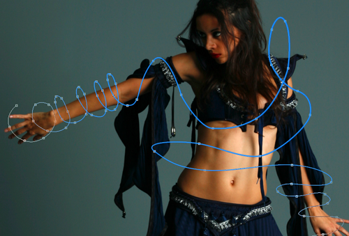
Once you've decided on the poster design's subject (i.e. what article of clothing, electronics or product you'll be featuring), Use the Pen Tool (P) in Paths mode to select around the edges of the shoe.
Press Ctrl(or Cmd on a Mac) + Enter to make a selection (or, in your canvas, right-click inside the path and then choose 'Make Selection' in the menu that appears), invert the selection (Select > Inverse) and hit Delete to remove its background. This process should isolate our subject for our product ad and prepare us for the next part.
Create a new document (Ctrl/Cmd + N) in Photoshop. Mine is 1000x800px with a white background.
Once your new PSD is created, paste in the shoe.
The focus of our work is the product (the shoe); this is why we will create a soft, unobtrusive background with the goal of making the piece focus into the subject.
Extract & Open the texture files from the zip file you downloaded, I picked the second one here, select it, and copy/paste it into your document with ypur product (Ctrl+A Ctrl+C go to your work file Ctrl+V).
Press Ctrl+T to activate the Free Transform command and reduce grunge texture's image size to fit our canvas.
Place the texture's layer between the shoe layer and the default white Photoshop Background layer.
Desaturate the texture by selecting its layer in the Layers Panel and pressing Shift + Ctrl/Cmd + U (or choosing Image > Adjustments > Desaturate).
After desaturating the texture, switch its layer's Blend Mode to Overlay. The background will now become completely white because it's overlaid into the white Background layer, but don't worry: we will fix this using blending options.
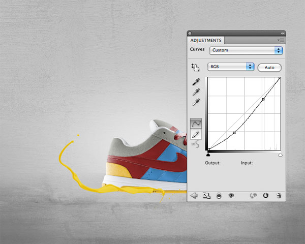
Right-click on the Background layer in the Layers Panel and select Blending Options. The Layer Styles dialog window will pop up. Here, add a grey (#b5b5b5) Color Overlay.
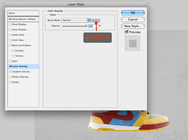
After you have added the Color Overlay layer style, reduce texture layer's Opacity to around 30%.
Tip: When you resize a texture, lots of small details will be lost. To enhance details on your texture, you can use the Sharpen filter (Filter > Sharpen > Sharpen) if you want.
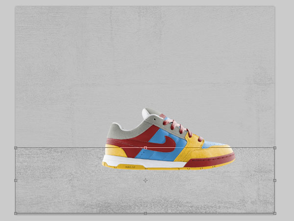
Now that we have a nice grungy background, let's create the floor for our subject. Duplicate the texture layer by right-clicking on its layer in the Layers Panel and choosingDuplicate Layer in the menu that appears.
Since the Blend Mode of the original texture layer is set to Overlay, we need to set the Blend Mode of the duplicated layer back to Normal.
Afterwards, Press Ctrl/Cmd + T to activate Free Transform and then drag down the top-center transform control to reduce the texture's height as if we are squashing it down - in this way, we are creating the idea of perspective.
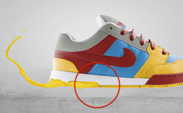
Next, grab the Burn Tool (O) from the Tools Panel to darken parts of the floor; in particular, we want to darken the bottom corners.

The floor is still too prominent - we want it to be more blended with the textured background. In this way, we give depth to the image and the floor looks less distracting. Use the Eraser Tool (E) to remove the top horizon (the top edge of the floor). Choose a large, soft brush with Hardness at 0% for your Eraser Tool.
Tip: If you prefer, use a layer mask and a black brush on the floor layer to achieve the same result.
To complete the floor, create a new layer on top of it, select a black, large, soft brush and paint over the corners to darken them. Afterwards, reduce the Opacity of this layer to 10%.
The aim of this step is to drive the viewer's attention to the center of our canvas where we've placed the product.
The background is almost complete. The last touch is a light effect behind the shoe. It's my habit to enhance subjects with light effects - it's a way to embellish the product and draw even more attention to it. Don't forget that the aim of an ad poster is to sell, so we have to do our best to increase the customer's desire to buy it. Even just a few details can make the difference between them looking longer or looking away quickly.
For the light effect, start by creating a new layer that is immediately above the background layers.
Then use a big, white soft brush and click once on the canvas with the Brush Tool (B) to create the light effect.
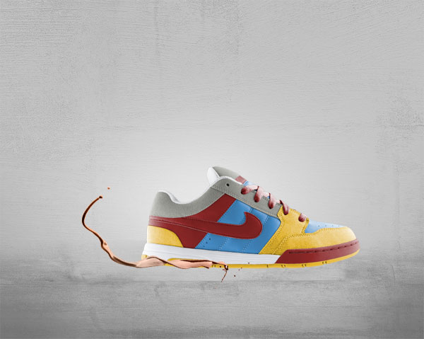
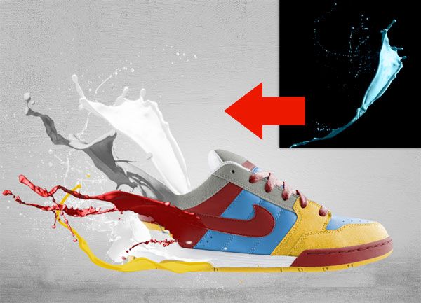
We will now integrate paint effects into our composition. We will place them on the back portion of the shoe, making it look like as if paint is melting the shoe (hence, "toxic paint").
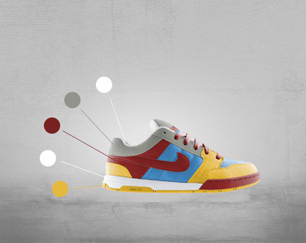
In order to achieve this result, we need to determine what colors to use by sampling parts of the shoe with the Eye Dropper Tool (I) and we also have to play with their colors to match shoe colors.
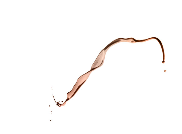
For this effect, you will need to extract the Paint Tossing Pack from the zip file downloaded earlier.
Let's start from the bottom of the shoe (the yellow area). The best option would be to find a paint effect with a simple horizontal-oriented shape. This one (which is part of the Paint Tossing Pack) is perfect for our needs:
Open this texture in Photoshop and double-click on the default white Background layer to unlock it.
Grab the Magic Wand Tool (W), select the white area by clicking on a white area in the canvas (which should automatically select all white areas), and hit Delete to remove the background. Drag the prepared shape into the main canvas.

Activate the Free Transform command (Ctrl/Cmd + T) to rotate and resize the paint shape. Position it on the yellow sole of the shoe.
Now we have to make the paint shape yellow; we will use two adjustment layers for this.
With the paint shape layer as the active layer in the Layers Panel, choose Layer > New Adjustment Layer > Gradient Map. In order to affect only the paint (and not all the layers that are below the Gradient Map adjustment layer), create a clipping mask (Layer > Create Clipping Mask) on the adjustment layer.
Set a color gradient going from a dark yellow (#e9c603) to a lighter one (#f3df71).

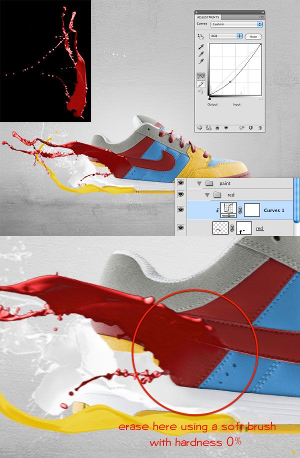
The paint's color is still too light, so use a Curves adjustment layer (Layer > New Adjustment Layer > Curves) to darken it a little bit so that it matches the yellow color of the sole of the shoe.
Finally, create a layer mask on the paint shape, grab a soft, black brush and then use the Brush Tool (B) to erase a small area on the right side of the paint shape so that it looks as if it belongs to the shoe.
Other "toxic paint" effects are created using the same method, but applying different adjustment layers.
For the white paint shape, I've applied a Black & White adjustment layer to desaturate the shape and a Gradient Map adjustment layer going from a light grey (#d7d7d7) to white (#ffffff) to color it.

For the red paint, I've chosen a red paint shape from the Paint Tossing pack that's rotated horizontally with Free Transform. To darken its color, I've applied a Curves adjustment layer.
For the grey paint, I've increased its brightness to 70 using a Brightness/Contrast adjustment layer (Layer > New Adjustment Layer > Brightness/Contrast). Secondly, I've added a Gradient Map adjustment layer going from a dark grey (#525252) to a lighter grey (#e6e6e6).

Finally, for the last paint effect, I've applied the same adjustment layer used for the Bottom White Paint.
Select the shoe layer and create a layer mask on it by clicking on the Add layer mask button at the bottom of the Layers Panel. Once the mask is created, you can use a black, soft brush for the Brush Tool (B) to erase parts of the shoe without losing any pixels (which is great if you want to modify your work, go back to its original state, or if you make a mistake - just delete the layer mask). This will create the illusion of the paints being continuously connected to the shoe.

Create a new layer below the shoe layer; we will add a soft shadow effect for the shoe on this layer. The best way is to grab a soft, black brush and paint at the bottom of the shoe.
Once you have painted the areas where the shadows are, decrease the layer's Opacity to reduce the shadow's prominence.
Create more shadows, but don't just use a single layer to create shadows. I suggest creating different spots on different layers. In this way, you have more control, you can create depth, and you can tweak individual shadow layers to produce interesting outcomes. For example, you can reduce the Opacity of each layer at different values so that the shadow looks more realistic.
The ad poster is almost complete. Colors interact in a way that I like. It's simple but vivid at the same time. It's also directed and focused, as a product ad design needs to be. Observing the current composition, I think there's nothing left to change.
What we can do better, though, is increasing the poster's color contrasts. To do this, create a new Gradient Map adjustment layer on top of all the other layers. Set the gradient to go from black to white and then switch the adjustment layer's Blend Mode to Overlay.
Finally, reduce the layer Opacity until you're satisfied with color contrasts in your composition, an Opacity value of 30%, seems to work well here.
To style it up a bit, just add the Nike logo (or ANY logo you wish), in this case I downloaded the blick logo on a white background, placed it in the document, set the layer to Multiply, and we're done.
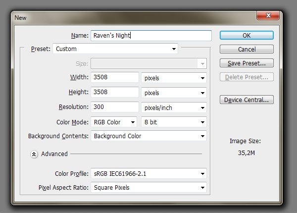
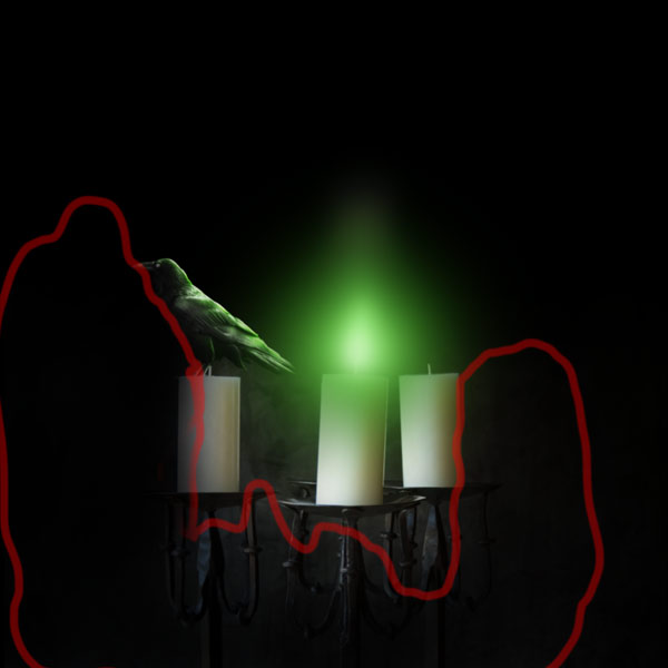
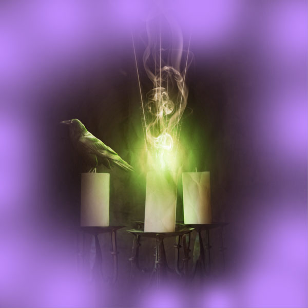
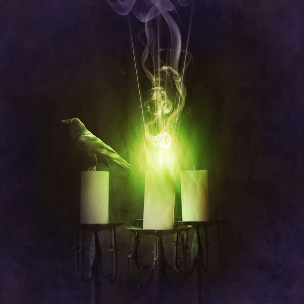
Okay, here we go! Open a new file (Ctrl + N) in Photoshop. Name it as you wish, Here's we'll name it "Raven's Night". Set the width and height to 3500px. As Background Contents- choose Background Color if you have black as your background color (press D to reset your foreground and background color to white and black). If you haven't, you can color it to black (#000000) later with the Paint Bucket Tool (G).
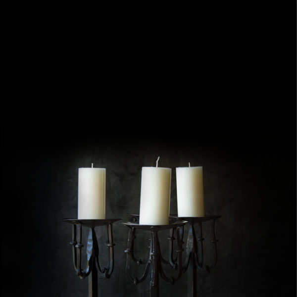
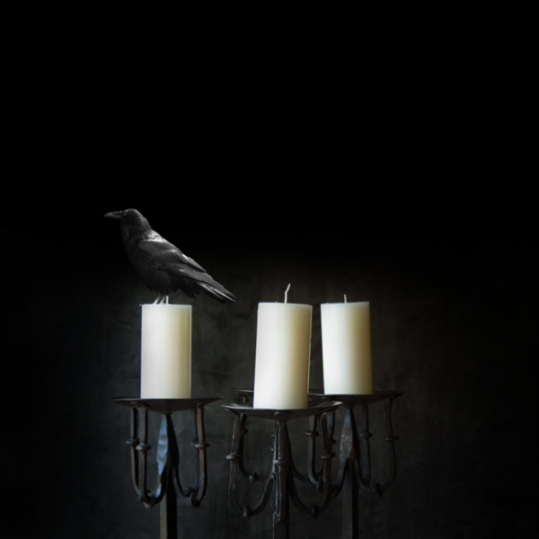
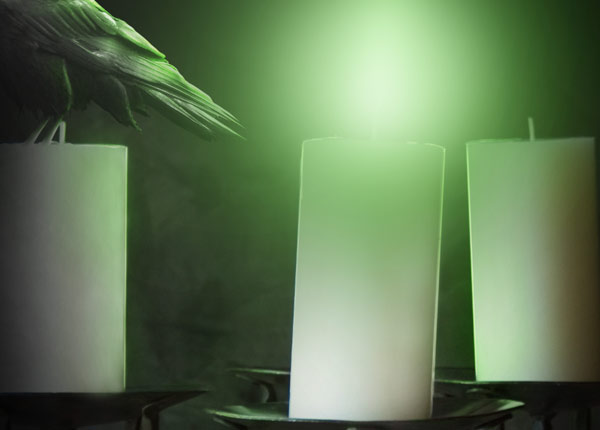
Open Candles against black wall in Photoshop.
In this image, press Ctrl + A or go to Select > All to select the whole canvas.
Then press Ctrl + C (or Edit > Copy). Go back to your main canvas (the one we named "Raven's Night") and press Ctrl + V to paste the candles image into it. Name this layer "candles".
Move this layer towards the bottom of the canvas using our Move Tool (V).
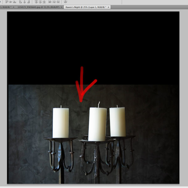
In the Layers Panel, press on the Add layer mask icon to add a layer mask to the candles layer. On this mask, we will erase some parts of the background with the Brush Tool (B) to fade it better with the black background.
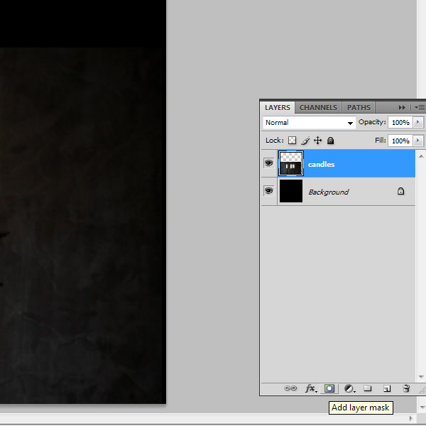
With the layer mask selected in the Layers Panel, use a soft brush tip with black (#000000) as your foreground to mask unnecessary parts. By this, I mean the edges of this image to make it more faded into our black background.
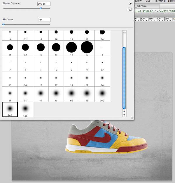
Here are brush settings that I have used:
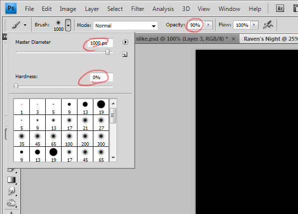
Tip: Later, you should reduce the brush Opacity and Master Diameter to make masking more precise. If you accidentally delete some parts accidentally, you can easily restore them using a white brush on the layer mask.
After masking, your image should look something like this:
The advantage of working with layer masks is that you can always tweak and improve the masking until you are satisfied with it, so you don't need to be perfectly precise.
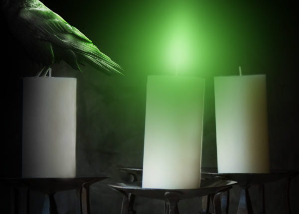
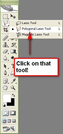
Open The Raven stock photo in Photoshop. Use the Polygonal Lasso Tool to cut it out from its background by tracing around it. Simply point and click with the Polygonal lasso tool.
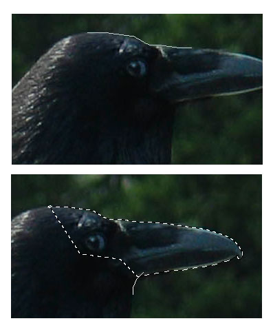
This can be a little tricky. Make sure you zoom in close. Click and drag and make lots of point-and-click to trace along the edges. When you double click it will make the selection by joining up with the very first point you made. Ctrl+Z to undo any mistake. Hold down SHIFT to ADD to the selection. Use the Space bar to click-and-drag to move around without having to use the scroll bars.
After you're done with cutting out the raven, you need to place it in the "Raven's Night" canvas. We will use the same technique as we did for placing the candles photo. Press Ctrl + C (Edit > Copy), switch to our main canvas, and then press Ctrl + V to paste the raven into your working composition. Name this layer "raven".
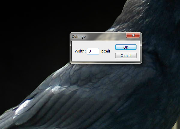
No matter how precise you cut out the object from the stock photo, there will always be some tiny flaws. In the "raven" layer, you will probably see a white edge in some places around the raven. You can remove it by choosing Layer > Matting >Defringe. Set the Width to 3px.
Here you go, the raven's edges look a bit better.
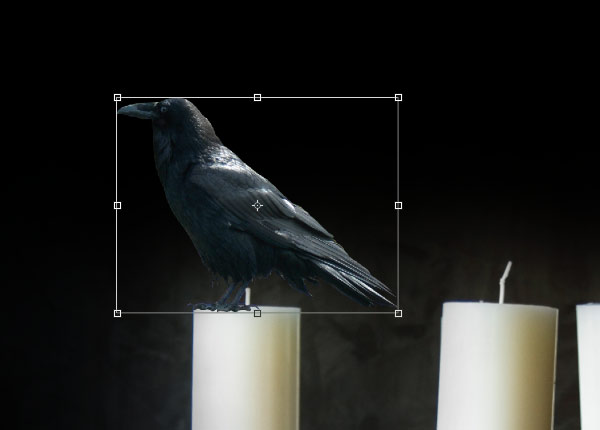
Now it is time to put the raven where it is supposed to be in the composition. Choose Edit > Free Transform or press Ctrl + T which should create a transform box around the subject (if not, make sure that Show Transform Controls in the Options bar is checked).
We will place our raven on the leftmost candle. Right-click inside the transform box and choose Flip Horizontal from the list of transform commands to make the subject flip to the left.
Now scale the raven by holding Shift and selecting one of the corner transform controls of the transform box. Move this handle towards the center while holding Shift to scale the raven proportionally.
Then when you are done, move it to the place where it is supposed to be- on top of the left candle.
When you are satisfied by the size and position, press Enter to apply the transformation.
Your raven probably still has some light parts that shouldn't be there - we can paint over them with black or a dark gray color to make them more obvious.
We will make this on a new layer. While holding Alt, press on the Create a new layer icon in the Layers Panel. Name this layer "improving raven" and check the Use Previous Layer to Create Clipping Mask option.
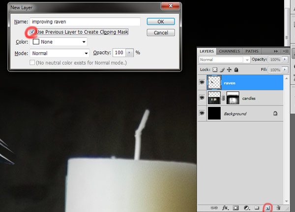
Select the Brush Tool (B). Use a soft brush as you did before, but this time, lower the Opacity option in the Options bar to approximately 50%.
Use black color and paint all places that have rough edges or that don't look blended into the scene. This depends on how precise you cut the raven out from its background earlier. Here is how my raven looks with and without the "improving raven" clipping mask so that you can see how well this technique does in blending in a superimposed item such as our raven.

I suppose difference is more than obvious, don't you think?
Now we can connect the raven with the candle so that it looks like she is stuck in the wax. While holding Alt, press on Create a new layer icon in the Layers Panel. Name this layer "wax", making sure that you select the Use Previous Layer to Create Clipping Mask option. This layer should be above the "improving raven" layer.
Select the Brush Tool (B) and use a soft brush tip with the Master Diameter set approximately at 15px and Opacity to about 40%. Note that you can (and should) always change these values during the process depending on where you are painting-these options affect the accuracy and harshness of your brush, so change it based on the area you are painting, as needed.
With the Brush Tool still as your active tool, press Alt to temporarily switch to the Eyedropper Tool (very nice and handy trick for when you are painting). Pick some color from the candle near the raven's claws. Paint with this color on the "wax" layer.
You should pick up a few different colors during this process to achieve better results.

You can probably notice that the raven has some kind of blue cast. It would be better if it is black since ravens are usually black. We can do this by desaturating the raven. To start, select the "raven" layer. Afterwards, choose Image > Adjustments > Desaturate or just use the keyboard shortcut for this action (Ctrl + Shift + U).
Here is our scene so far.
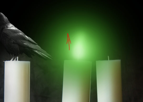
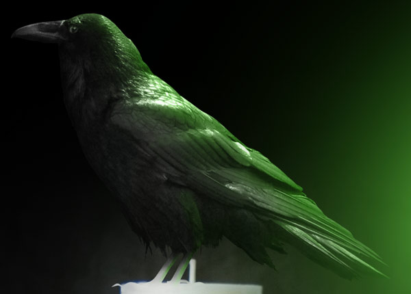
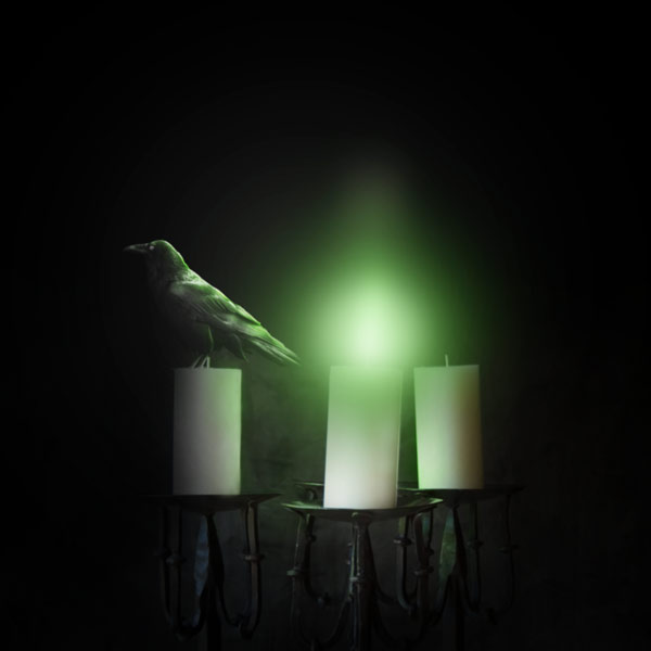
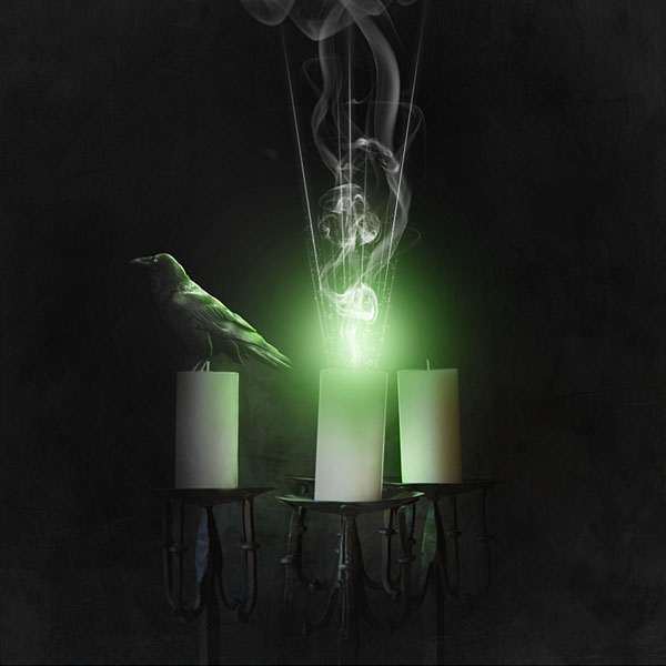
We are done with the raven for now. Let's bring some life to our scene by adding light to the candle. We will do that only with the center candle.
Make a new layer above the "raven" layer and its clipping mask layers. Name this layer "Flame".
Set a green color as your Foreground color.
Select the Brush Tool (B). Set your Opacity to 60% and Master Diameter to something big like 1400px.
Click just once in the center of your scene, above the center candle.
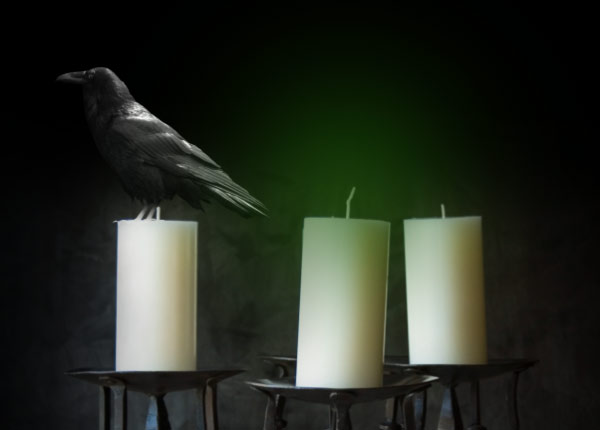
We are going to do this several times, reducing the brush size incrementally and changing the green color to a lighter shade.
Reduce the Master Diameter of the brush to 1,200px while keeping the opacity the same. Also, change your green foreground to a slightly lighter green.

Again, click just once in the center of the color spot you previously made.
Next, reduce the brush size to 1000px and another slightly lighter green color.
Again, click on the spot you previously made.
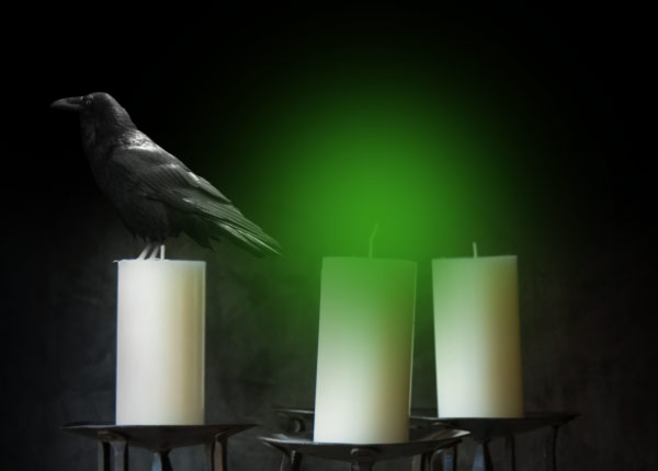
Reduce the brush size to 800px and choose this color:
Click once in the center of color spot you previously made.
Reduce the brush size to 600px and choose a lighter green (you probably get the picture of what we're doing now).
Press once in the center of color spot you previously made.
Reduce the brush size to 400px, choose a lighter green, and click on the center of our glow.
Reduce the brush size to 250px, choose a lighter green, and click on the center of our glow.
Reduce the brush size to 200px, and this time, also reduce Opacity to 30%. Choose another green color and click on the center to apply the paint stroke.
Reduce brush size to 150px and select a very faint green color and click on the center.

Change brush size to 1000px and press once in the center of color spot you previously made with same color to lighten up the whole flame.

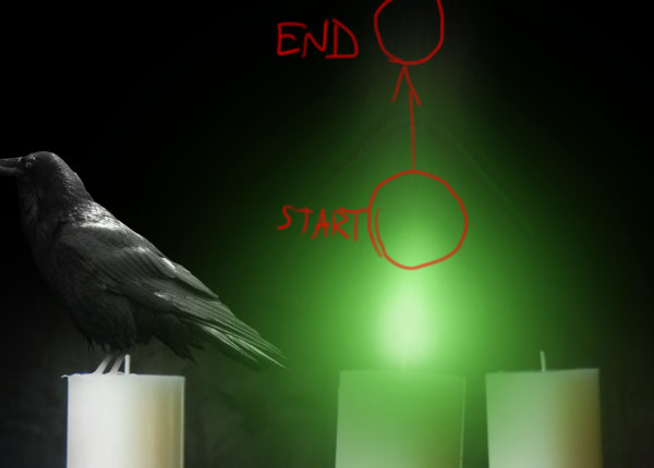
We can make the flame look a bit less like a circle with the Smudge Tool, which is one of the best tools that can do what we want. Select the Smudge Tool from the Tools Panel and set its Strength to 36%, Master Diameter to 250px, and Hardness at 0%.

First, we can smudge the bright center a bit towards the top with an upwards motion. Set your brush size to 250px and drag it from the center of flame upwards.
Now set the brush size to 600px and smudge upwards from an area above the flame highlight.
Now it is obvious that this flame is not so super smooth, so we should blur it using Filter > Blur > Gaussian Blur.
As you can notice, our flame is now much smoother after applying the filter.
The green flame from the candle should cast its light to other objects around it. We will start with adding some lights on the raven. First, get on the "wax" layer. While holding Alt, press on the Create a new layer icon in Layers Panel. Name this layer "lighting" and check the Use Previous Layer to Create Clipping Mask option. Afterwards, set this new clipping mask layer's blending mode to Color.
Pick the Brush Tool (B) and use a soft brush with approximately 20% Opacity. Select a green color as your foreground color.
Paint with this color on the raven on places that the candle's green flame should cast a light onto it.
Now it would be nice to add some highlights to raven. While holding Alt, click on the Create a new layer icon in the Layers Panel. Name this layer "raven highlights" and select the Use Previous Layer to Create Clipping Mask option. Set this layer's blend mode to Overlay.
Select white as your foreground color and afterwards use a soft brush with Opacity set to 22% and Master Diameter to 15px.
Paint the lightened area, mostly on the right side of the raven. Also, paint with a white color on the raven's eye to lighten it up a bit and make it a bit more prominent.
After you are done with that, duplicate the layer to achieve even more lighting. You can also paint some areas on the left side with a black color to darken them a bit.
Now we should shade our image a bit to achieve a more dramatic effect. Make a new layer above the "flame" layer and name it "shading".
Select the Brush Tool (B) and set black (#000000) as your foreground color.
Use a big value for the brush diameter; I used approximately 1000px, but you should change this a few times during the process depending on the area you are painting on. Also, set the Opacity option to something low-around 20% is a good value.
Paint around the flame area to fade it better to our dark background.
Below, you can see the areas where I painted with black (marked in red).
Light from the middle candle should also be cast on the other two candles. The biggest problem here is that the light is coming from the left on our original candles stock photo.
It should be that way on the right candle, but the left candle should be lightened on its right side. So let's fix that!
In the previous step, we already darkened the candle on the left side, but now we should lighten it on the right side. To start, make a new layer under the "flame" layer and name it "candle lighting". Use the Brush Tool with a soft brush and with the Opacity set to approximately 20%.
Pick some light color from the candle with the Eyedropper Tool to set your foreground color and paint with it on the right side of the candle.
Tip: I suggest turning off the visibility of the "flame" and "shading" layers while doing this step so that you can pick good colors. I started with this off-white/light gray color, but I changed it a few times while painting.
Try to keep the right edge as sharp as possible. I suggest using small brush sizes. If it will look too blurry, you can erase it a bit with the Eraser Tool (E), setting the hardness to approximately 50% or even more.
Using a light color, paint on the right side of the middle candle a bit to remove the hard shadow it has.
Now it is time to add green light reflections to the candles. First, try to think of where that light from the candle should fall on the other objects. Make a new layer above the "candle light" layer and name it "reflected light". Switch its blending mode to Color. Select the Brush Tool and use the same green color as we used in Step 10.
We will also be using the same brush settings: set Hardness to 0% and approximately 20% Opacity. Use some smaller brush sizes: I used between 20px to 150px depending on the size of the area I needed to paint.

Now it is time to bring more attention to the focus of our image. We will do that by lightening it up a bit to achieve more contrast.
Make a new layer above the "shading" layer and name it "focus". Select the Brush Tool with 30% opacity and size of 600px.
Use a white color and paint one spot in the highlighted area of the flame. Now change the brush size to 2500px and set the opacity to 10%.
Paint one spot and try to have its center between the raven and candle flame. Duplicate this layer and set its blending mode to Overlay. Now you should have something like this:
Now we should lighten the edges of the left and right candles a bit as we did with our raven.
Make a new layer above the "flame" layer and name it "light edges". Set the mode to Overlay.
Use a soft brush with a size of 4px and Opacity to 20%. Paint lines on the right edge of the left candle and on the left edge of right candle.
Tip: If you do not use a graphics tablet, it would be useful to hold Shift and click with the brush once on top of the candle and once again on bottom of the candle to make a straight line. You can also paint the middle candle a bit to give it more definition.
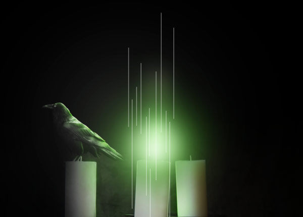
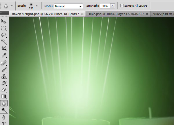
Let's spice up our cool photo manipulation scene. Light effects would give a new dimension to your work. To start making more light effects, make a new layer above the "focus" layer and name it "lines".
Set the foreground color to white (#ffffff) and pick the Line Tool (U) from the Tools Panel. I have used these settings:
Draw few vertical lines of different lengths while holding Shift to ensure that they are straight.
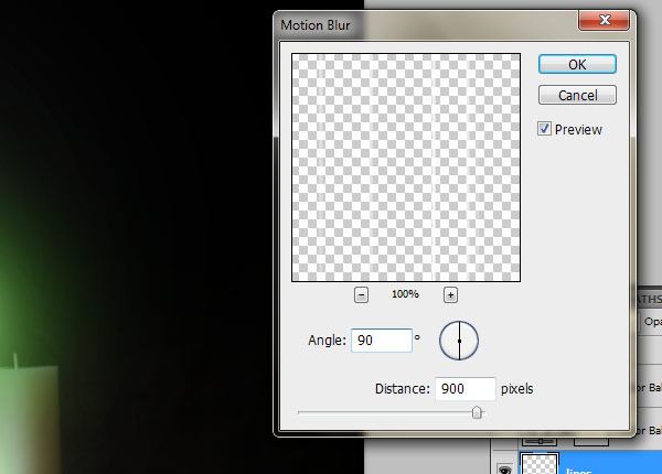
Choose Filter > Blur > Motion Blur and use these settings:
Now you need to transform your lines a bit. Press Ctrl + T to activate the Free Transform command and start transforming the lines to make them varied.
Right-click on a line, and then pick Perspective from the list of transform commands.
While holding Shift, move the upper left transform control towards the left, and then move the lower left control towards the right. We are changing their angle so that it looks like they are radiating from the center of the green flame.

Move the lines upward so they start from the candle's flame. If needed, you can use the Eraser Tool (E) to erase some unnecessary lines that go under the candle flame.
Now duplicate the layer with lines and go to Filter > Blur > Gaussian Blur with the Radius set to about 15.8px.
We should now blur the lines in some parts that are close to the candle flame to make the transition a bit softer and smoother. Select the Blur Tool from the Tools Panel and set its Hardness to 0% and Strength to 50%.
On the "lines" layer, blur parts closest to the candle with the Blur Tool.
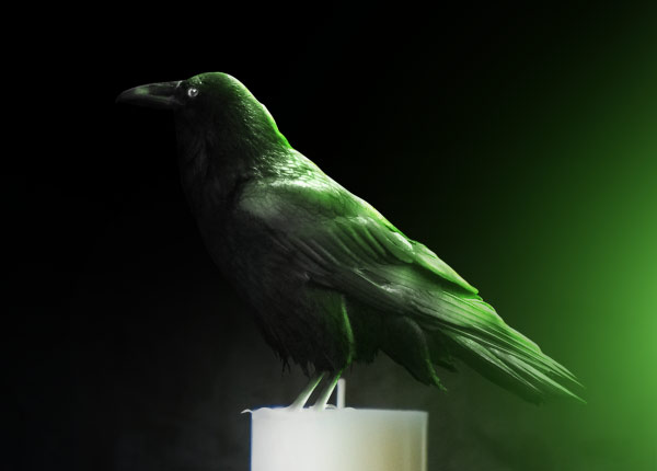
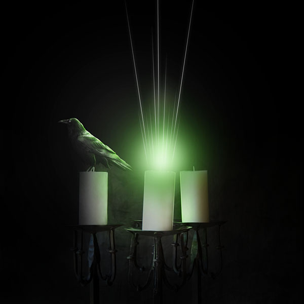
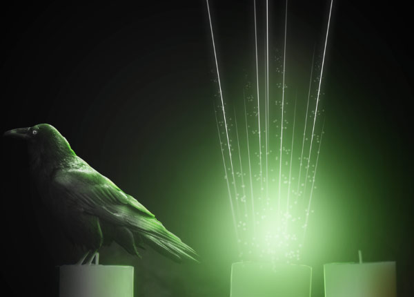
Let's preview our work:
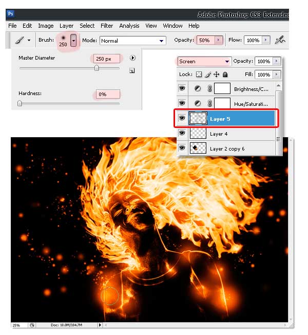
We can add some sparkles to the flame to give it another interesting component. Make a new layer above the "lines copy" layer and name it something intuitive like "sparkles".
Select the Brush Tool and in the Brushes Panel (Windows > Brushes or hit F5), set your options to:
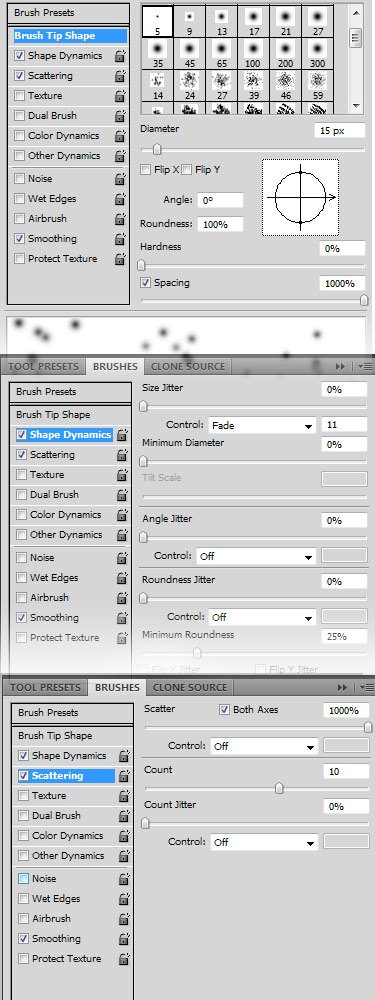
Paint with the brush a few times from the lightest area towards the top of the scene. Set this layer's blending mode to Soft Light. Now you should have something like this on the light area:
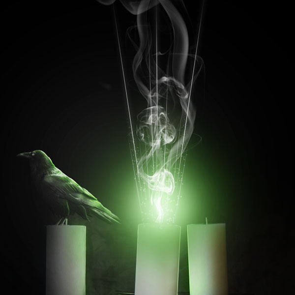
By now your second zip file has finished downloading, go ahead and extract then open the stock photos of smoke from the raven2.zip file, there's many to choose from so go through them all and pick about of your favorite ones.
Select the entire canvas (Ctrl + A) and then copy and paste each one it into our working file. Name these layers "smoke1", "smoke 2",and so on, and put them above the "sparkles" layer.
Desaturate the smoke layers by pressing Ctrl + Shift + U on each one. Set its mode to Screen. Press Ctrl + L or choose Image > Adjustments > Levels.
Use these settings to make the smoke a bit more contrasted:
Select the Eraser Tool (E) and erase hard edges on the bottom of the "smoke" layer.
Press Ctrl + T to activate the Free Transform command. Drag one of the corner handles while holding Shift to downsize the smoke a bit so it fits better into the light flame.
Erase some parts of the smoke to make it more interesting and to fade it better into the background.
You can also copy this smoke layer and transform it a bit, or add some other smoke imagery to make the scene more smoky.
I added a few more smoke images, set their mode to Screen, desaturated them, fixed contrast with Levels adjustments (Image > Adjustments > Levels or Ctrl + L), transformed them and erased some parts. I encourage you to experiment and make your own smoke effects. Mine looks like this:
Now that we have spiced up our candle a bit with lighting effects, let's try to add a textured and aged look to our scene. Textures works nicely with dark images, they add an extra flavor to them.
We will start by adding textures on the edges of our work. Open <1>mediterranean paint texture (the deep golden yellow texture); in Photoshop and copy and paste it into your working file.
Place this texture above all layers and name it "texture" and then press Ctrl + Shift + U to desaturate it.
Change its mode to Screen and Opacity to approximately 25%.
Press Ctrl + T and drag one of the corner transform controls to scale up this layer. Upsizing an image will cause it to lose quality, but since this is a texture that does not need to be extra sharp, it is fine, and in fact, desired.
Add a layer mask to this layer. With the layer mask selected, choose the Gradient Tool (G) from the Tools Panel and use these settings:
Make sure black is your foreground color and then drag on the canvas a few times to erase the texture from the middle of the scene. You can also use the Eraser Tool (E) to improve your texture masking. Try to keep the texture only on the dark background and erase it from everything else.
Now we will add another texture. Open brown paper texture in Photoshop. Copy and paste it to working file. Name it "texture2" and set the blending mode to Overlay.
Put this layer above the "texture" layer.
Use the Move Tool (V) to place this texture right at the middle of canvas. Further transformations aren't necessary.
Add a layer mask, and with the layer mask active in the Layers Panel, press Ctrl + Shift + I to invert mask to black to mask the whole texture.
Afterwards, select the Gradient Tool (G), use white (#ffffff) as your foreground color and drag once from the center to make it visible in areas around the candle flame.
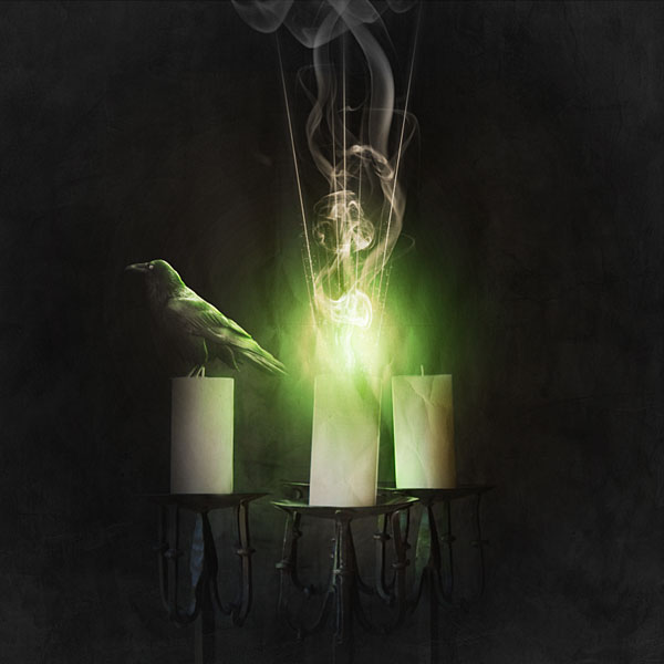
Isn't that cool? You can see how textures can bring life and an added interesting element to your work. Feel free to experiment with different textures and blending modes to achieve different results.
It seems like we are almost done (and we are). The only thing that is left to do is making some good colors for our dark scene. I don't want to make the scene too colorful of a piece since it is supposed to be dark and mysterious, but I will add a bit of color to it to give it another appealing element.
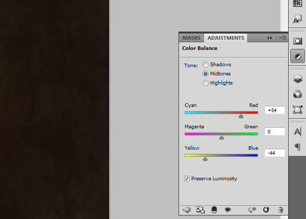
In the Layers Panel, press on the Create new fill or layer adjustment icon. Be sure to make this adjustment layer above all of our existing layers.
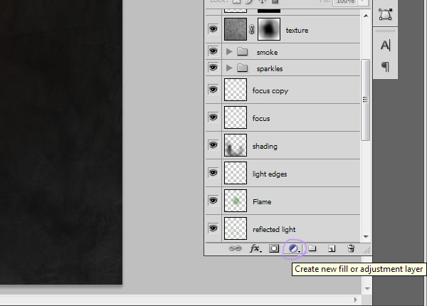
From the list of adjustment layers, select Color Balance and use the following settings:
Now create a new layer above the Color Balance adjustment layer and name it "purple edges". Select a purple color like this one:
Paint with this color using a large, soft brush tip around the edges of your canvas to achieve something like this:
Set the blending mode of this layer to Hue. Duplicate this layer and set the blending mode to Overlay. Reduce the opacity to approximately 25%.
Now we should make the focus of our scene (the green flames) a bit more eye-catching. Make a new layer and name it "center glow". Set the mode to Overlay and its Opacity to 36%.
Then select a green color like this one:
Select the Brush Tool (B) with Opacity at 100%, Hardness 0% and brush size to something large like 2500px.
Click once in the middle of the canvas (above the flame) to apply the brush stroke.
Now change the foreground color to a yellow.
Use a brush size of about 1200px and click once above the flame to make it more yellow.
Voila! You are done!
Create a new file with a width of 3000 px and a height of 3000 px at 300 dpi (Dots per Inch). Background Contents should be Transparent.

First off, let's open the Premade background in Photoshop. We will be using the clouds on this stock image so we will need to transfer it to our main canvas.
Click on this "premade_11" background and press V to activate the Move Tool. Click the image and drag it to the main canvas, or just hit Ctrl + A, Ctrl + C to select and copy it, then paste it into your working file.
Once you have it there, press Ctrl + T to activate the Free Transform command and scale the image so that it's the same size as our canvas.

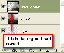
Now we're going to duplicate that layer to make it look more like a stormy sky where the light comes from only one direction. Press Ctrl + J to duplicate the layer.
Then we are going to flip this layer horizontally to erase the overcast part of the sky. Making sure the duplicated layer is the layer you're currently on in the Layers Panel, choose Edit > Transform > Flip Horizontal.
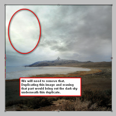
After transforming, click on the duplicate layer and erase the overcast sky.
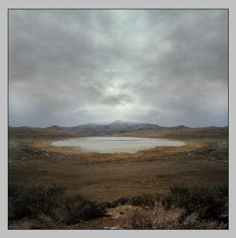
In this step, we will be creating a sky scene that's dark and gloomy-"tempestuous" is the best way I can describe it. But first, we should fix the viewer's focus on the center of the image because that will be our source of light and where our subject will be placed. Additionally, the cloud formations here greatly resemble that of a stormy sky.
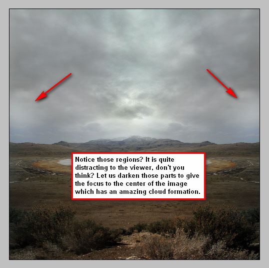
Let's create a new layer by pressing the shortcut combination, Ctrl + Shift + N, or by clicking on the Create a new layer button in the Layers Panel.

Be sure that the newly created layer is above all the existing layers. Name that layer "black1" for organization purposes.
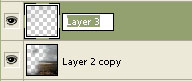
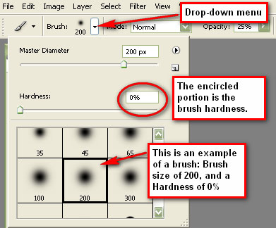
To paint the sky, press B to activate the Brush Tool (B).
Set its Brush options to the following:
Note that the brush's hardness can be found on the Option bar, in a drop-down menu.
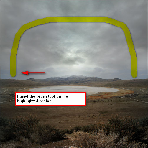
Paint the regions that are outside of our main source of light. The effect is like a vignette, but only applied to the top portion of the scene where the sky is.
If you're into photography, you're probably familiar with the Graduated Neutral Density (GND) Filter that is used to darken the sky, while leaving the brightness of the foreground unchanged. We will mimic that effect here. Create a new layer for our GND effect and name it "GND".
We shall brush the top region of the sky once again. Set your brush options to the following:

Tip: If the darkness isn't to your liking, change it by adding another brushing layer. Create a new layer (name it "black2" to keep our work organized), then apply another stroke or two on the top part of the sky.
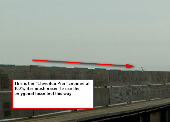
For our foreground, we will be using the Clevedon Pier image. Open the file from the batch you downloaded and copy/paste it to our main canvas.
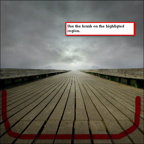
We need to remove the lampposts and the image's sky. To do that, we will be using the Polygonal Lasso Tool (L).
To accurately separate the sky and the lampposts from the pier, we can zoom in to the image by pressing Ctrl + + (to zoom out, press Ctrl + -) and use the Polygonal Lasso Tool to precisely select the section that we need. I would recommend setting the zoom level to 100%; the higher the zoom level, the more accurate it is to cut out the area that we need.
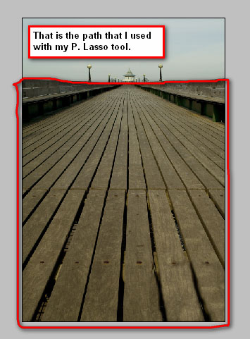
After creating the lasso selection, use the Move Tool (V) to drag the pier without its sky and lampposts to the main canvas.
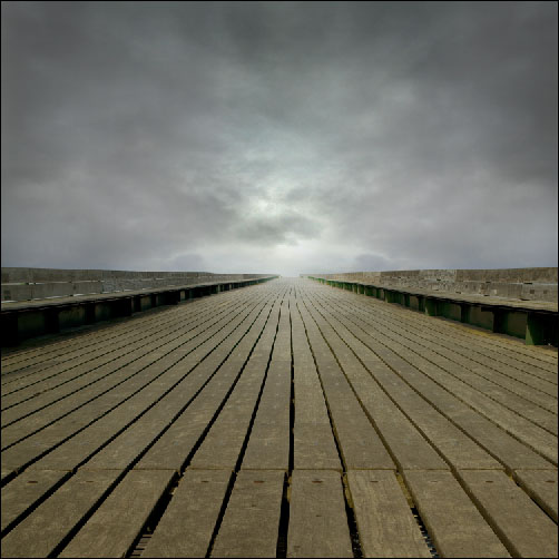
Press Ctrl + T to activate the Free Transform command and then scale the object to make it fit our canvas.
Earlier we talked about altering the image to fix our viewer's focus, we'll continue to work on that in this step.
Start by creating a new layer and name it "black on floor".
We will be creating a half-vignette for our floor. Activate your Brush Tool (B) and set its values to:
After the shadows have been applied, let's add some dramatic light; create a new layer, name it "Light" and put it under the Clevedon Pier layer to make the light come from under the bridge. We will be treating the light on Clevedon Pier light in another layer.
Use your Brush Tool (B) and use these values to amplify the light in the center of the image:
Make sure that you are using a white foreground color (#ffffff).


Now for the Clevedon Pier layer, let us create a new layer and name it "Light2". Put it on top of the pier's layer and set its values to:
Brush it on the same spot as we did in the "Light" layer.
To further enhance that light, we will be using the Dodge Tool (O) to brighten up parts of the pier that will be hit by the light.
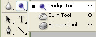
Set the Dodge Tool's options to:
Use the Dodge Tool to paint light on the part of the bridge where our light is.
Now we will be incorporating our subject. Extract and open the New Boots/Side pose stock photo in Photoshop.
Isolate the subject from its background using the Polygonal Lasso Tool to select around the subject, once you're done selecting the woman, Select > Reverse, then hit delete to remove the background.
After you've separated the subject from its background, deselect everything and use the Move Tool (V) to move the selected subject to our main canvas, just like with the other stock photos.
Use the Free Transform command (Ctrl + T) to the size the subject as shown in the image below.
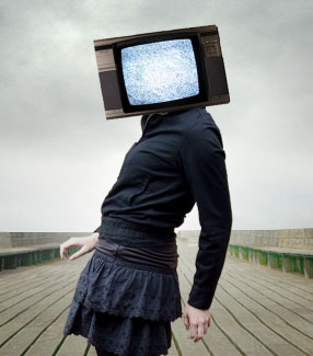
Now that the model is all set in our scene, it's time that we put the TV on her head. Extract and open the Old Tv stock photo and drag it to our main canvas.
Position the TV on top of the subject's head, making sure that the Old Tv layer is above our subject's layer.
Notice that in the stock image, the background is a solid white. You may use the Polygonal Lasso Tool, but I would recommend saving time and effort by using the Magic Wand Tool (W) to quickly select the white parts of the stock photo with a click of a button-you can activate the tool by pressing W.
With the Magic Wand Tool (W) chosen, left-click on the white area surrounding the TV. This will automatically select the white area. Just hit the Delete key to remove the white area around the TV.
Let us transform the TV to fit the girl's head. But before we do that, we need to erase the subject's head using the Eraser Tool (E).

A TV that is turned on is much better than a TV that is turned off. Therefore, we will put some white noise on it. Extract and open the <1>White Noise 2 stock image in Photoshop. Move it to our main canvas, just like we've done with the other stock images. Scale and rotate the stock image using the Free Transform command (Ctrl + T). The result should be similar to this:
To enhance the effect, you may want to brighten up the white noise by creating a new layer on top of it and use a white brush (#ffffff) on the center of the White Noise 2 image.
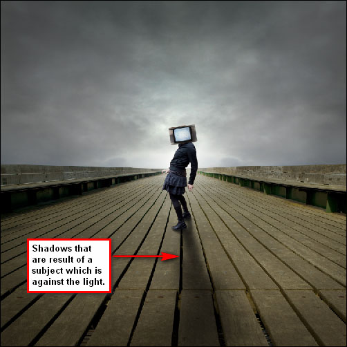
Now it's time to add shadows to our subject. Note that the subject is positioned against the light, so we would have to darken the image a bit and create stronger shadows.
Let's create a new layer and name it "Shadow". Then let's put that layer underneath the subject's layer so the paint won't smother the girl's outfit.
Now, activate the Brush Tool (B). I used a variety of round brushes on this for two reasons. The first reason is that a single brush throughout the whole process would make it more difficult because we'd have to erase the excess paint. The second is that it would be hard to spread paint accurately over a specific area with just one brush. So keep switching master diameters as you paint the shadows.
You can use any brush size as long as it makes a good shadow, although I would recommend using a brush size of 200 px, with the opacity around 18% and with the hardness set to 0%.
Paint the shadows as displayed below.
Note: we will not "burn" or darken the girl's outfit yet because we will be using adjustment layers and filters to come up with that effect later down the process.
When a subject stands against the light, some details of that subject will be lost due to the intensity of that light-this is referred to as glare. We will be adding a glare effect to our subject to make the lighting realistic in our photo manipulation.
We'll use the Eraser Tool (E) to add glare. Activate the Eraser Tool by pressing E, then erase the parts that are intensely hit by the light.
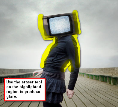
The result of using the Eraser Tool should be similar to this:

To give the image a dark and eerie tone, we'll use fill layers to add some gloomy colors. Go to Layer > New Fill Layer> Solid Color or click on the Create new fill or layer adjustment button in the Layers Panel (as shown below) and choose Solid Color in the contextual menu that appears.
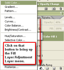
Use a very dark blue color (#000119) for the solid color fill. The new fill layer will appear in our Layers Panel, showing the color of the fill layer that we've chosen.
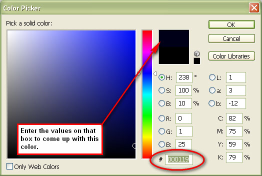
Notice that our scene has gotten a slightly yellow hue. We don't want it that way, so let's decrease the opacity of the fill layer to 30% and set its blending mode to Exclusion.
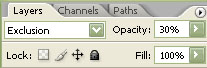
Create a new solid color fill layer again, but now use a brownish-orange color (#5c4011).
Set the blending mode of the new fill layer to Soft Light, and reduce the opacity to 70%.
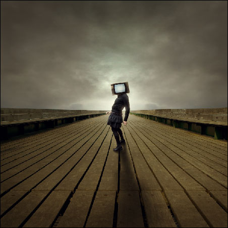
Now we need to create a new adjustment layer to increase the image's luminosity. Choose Layer > New Adjustment Layer > Gradient Map or click on the Create new fill or layer adjustment button in the Layers Panel (as shown below) and choose Gradient Map in the contextual menu.
Use the Black, White gradient preset for the gradient map.
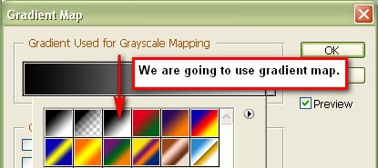
Then set the blending mode of the adjustment layer to Luminosity and bring the opacity down to 30%.
Now let's give the image a cool atmospheric color using a Curves adjustment layer. Choose Layer > New Adjustment Layer > Curves or click on the Create new fill or layer adjustment button in the Layers Panel (as shown below) and choose Curves.
When the curves adjustment layer dialog window appears, click on the gray eyedropper, which will allow you to sample a part of the image to set the gray point of the curves. When you click on a specific part of the image using the gray point eyedropper, the image's white balance will change. Take a sample somewhere on boardwalk right beside the subject.

To give our scene a more somber feel, we need to use a cool color over the image. Let's create another adjustment layer: Photo Filter. Click on the Create new fill or layer adjustment button in the Layers Panel (as shown below) and choose Photo Filter.
Once the Photo Filter dialog window opens, choose Deep Emerald in the pull-down menu for Filter.
Make sure that the filter's density is set at 25% and that the Preserve Luminosity option is checked.
Now adjust the color balance of the photo to come up with our intended atmosphere. We'll do this with yet another adjustment layer: Color Balance. Like before, click on the Create new fill or layer adjustment button in the Layers Panel (as shown below) and choose Color Balance.
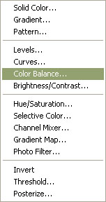
Use the settings shown below for the Color Balance adjustment layer:
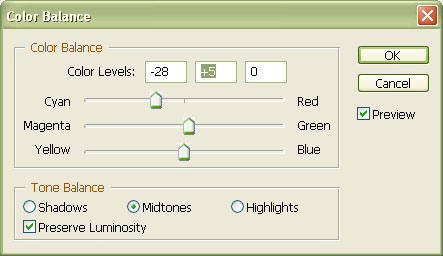
Guess what? We'll be adding another Curves adjustment layer to give the image a cooler white balance. Just like before, choose Layer > New Adjustment Layer > Curves or click on the Create new fill or layer adjustment button in the Layers Panel (as shown below) and choose Curves. Use the gray point sampler and click on the leg of our subject to get a sample.
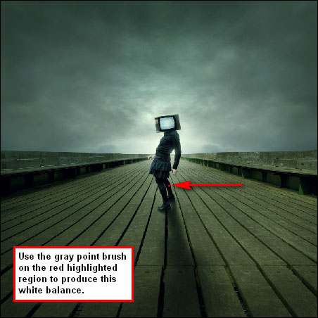
We will be adjusting the saturation to make the image look gray and less greenish. Create a new adjustment layer and pick the Hue/Saturation from the menu. Set the option values of the Hue/Saturation adjustment layer to:
We're getting close to the finish line! Let's increase the contrast of our scene. Choose Image > Adjustments > Brightness/Contrast or click on the Create new fill or layer adjustment button in the Layers Panel (as shown below) and choose Brightness/Contrast.
Once in the Brightness/Contrast dialog window, set Contrast to +10.
You can sharpen and bring out more details in your composition by going to Filter > Sharpen > Smart Sharpen. Set the values of the Smart Sharpen filter to:
And also, check the More Accurate box.
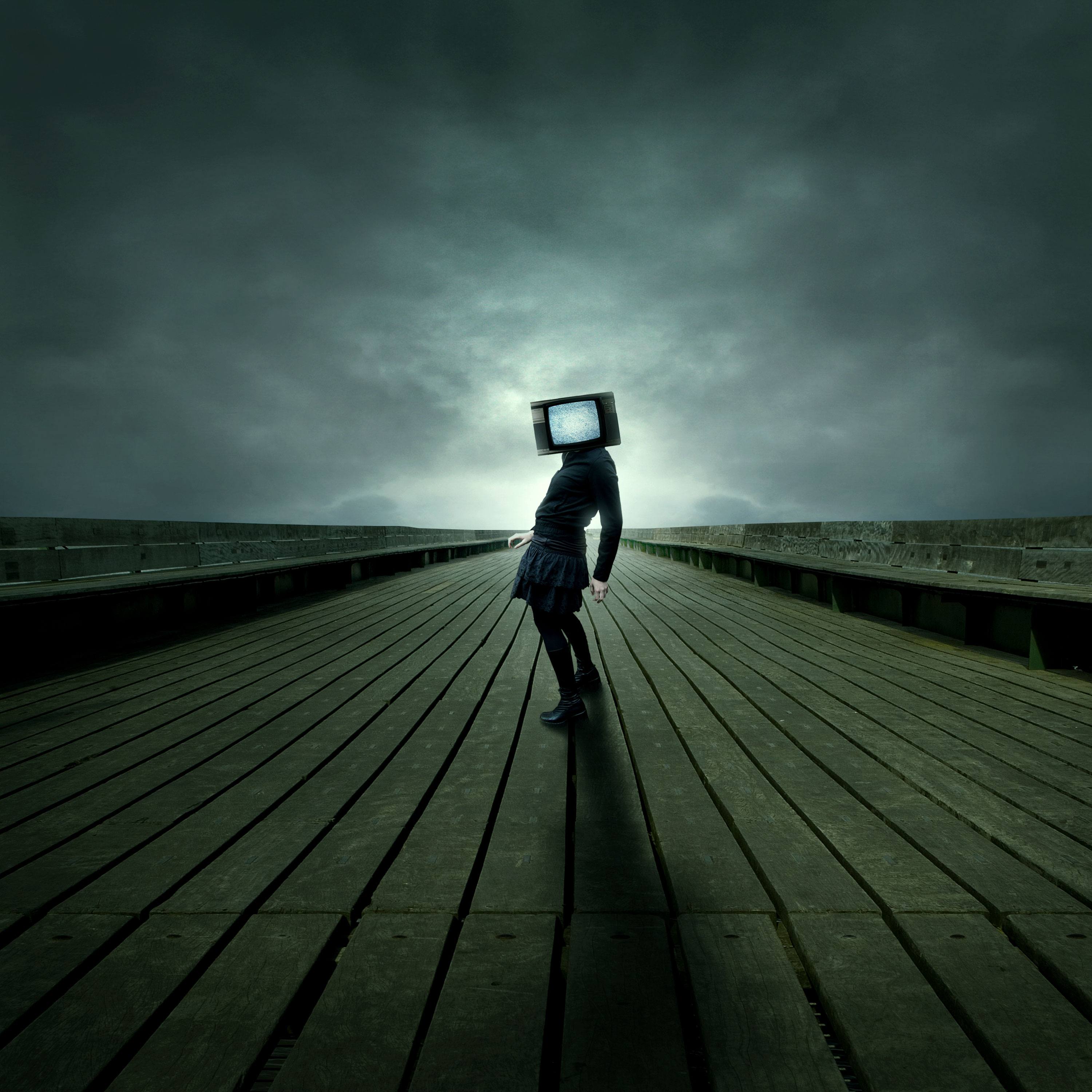

The following images were used in the making of this tutorial, right click and save the link for each one:
WingsOpen all the images. Create a new document (600X700px).
Copy & Paste in a rough looking texture into your new document. Stretch your texture to fit your canvas perfectly, and then call this layer 'background texture'.

Now go to Image>Adjustments>Hue/Saturation. Reduce this layer's saturation to -80.

Now go to Image>Adjustments>Levels and apply the settings shown below. Reduce the layer's opacity to around 20%.


Now paste in a photo of the clouds, and place them at the top of your canvas. Remove the original sky background using the magic wand tool > click on the sky, hit Delete, and repeat the process. This leaves only the cloud. Then duplicate this layer, and go to edit>rotate>rotate 180 degrees. Move this rotated cloud to the bottom of your canvas. Then merge these two layers together, and call the merged layer 'clouds'.

Now change your 'clouds' layer's blend mode to 'hard light'. Then duplicate this hard light layer and merge the two layers together. Reduce the opacity of this merged layer to 85%. Then go to Image>Adjustments>Desaturate to grayscale the layer.

Now select one texture from the ones you downloaded and paste it onto a new top layer. Save these texture files for yourself for later, you might need them.
Then change this layer's blend mode to 'multiply' and reduce it's opacity to 20%. Go to Image>Adjustments>Hue/Saturation and reduce your saturation to -85. If you feel that it's necessary, go to Filter>Sharpen>Sharpen, just to really bring out the details of the texture.


Now create a new layer called 'color gradient overlay'. Drag a linear gradient down vertically across your canvas. You can see the gradient that I used below. Then change this layer's blend mode to 'soft light'.


Now create a new layer called 'gradient fade'. Use your rectangular marquee selection tool to create a thin, rectangular selection. Make sure the "Transparency" setting is activated. Choose these settings:
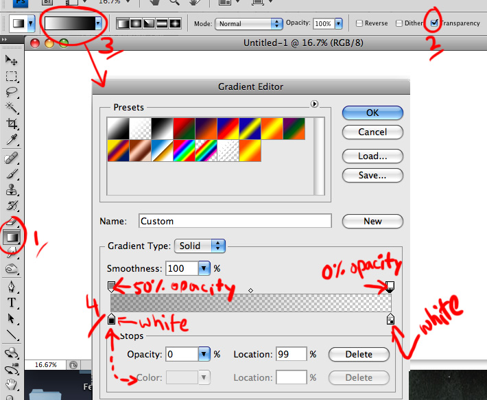
It can be tricky to just click and drag the gradient tool inside of the selection box.
Then fill this selection with a white to transparent linear gradient (going across the narrow width of the selection).
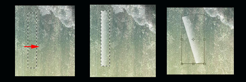
Then change this layer's blend mode to 'overlay'. Go to Edit>Transform>Rotate and rotate the gradient to fit nicely across the top clouds in your canvas.

Now duplicate this layer twice, moving each duplicate to a different part of your canvas, and rotating it, to make the gradients positioning appear random. Finally, merge all of your 'gradient fade' layers together, and use a large, soft eraser brush at a low opacity to erase their harsh edges (letting the end of each shape fade naturally into the main background).

Now paste in an image of a girl jumping. This image will be quite time-consuming to cut out, but it's worth spending the extra time to get a good cut out. You can use either the lasso tool or pen tool to cut out your woman. Once you paste it into your main project file, you may notice that it does not appear, make sure it is on the top layer, and if it's still not visiible, it simply means it's pasted outside the canvas. Zoom out, take the Move Tool and click in the empty grey area from the bottom right side of the screen and drag towards the top left side of the screen to bring the image into view. The re-size it (Ctrl+T).

Go to Image>Adjustments>Levels and apply the settings shown below:

Now go to Image>Adjustments>Color Balance and apply the settings shown below. This should help your woman blend better with your background.


Now go to Image>Adjustments>Hue/Saturation and reduce your woman's saturation to -25.

Now cut out a photo of a bird wing, and paste this over your woman, joining the wing to her back. I also rotated the wing to make the angle more realistic, and went to Filter>Sharpen>Sharpen to bring out the detail of the wing, as the original photo was a little blurred.
Click here to see different Extraction Methods you can use.
Now use your eraser brush, and smudge brush, to gently blend the wing into the woman's back. Then reduce your wing layer's opacity to 0%, and use your lasso tool to cut away parts of the wing that are overlapping the woman's hair. Then, with your hair selection in place, bring the wing layer's opacity back up to 100%, and hit delete. This will give the impression that the woman's hair is in front of the wing.

Now go to Image>Adjustments>Levels and apply the settings shown below. This will make the wings more intense.


Go to Image>Adjustments>Color Balance and apply the settings shown below:


Now duplicate your wing layer, and move the duplicate below your 'woman' layer. Go to edit>transform>rotate and rotate it so that it appears to be behind/beneath your original wing. Then go to image>adjustments>brightness/contrast and reduce your brightness to -60, and your contrast to -40.

Now select your original wing layer and go to blending options. Apply a subtle drop shadow (settings below), in order to help give your piece depth.


Now paste in a photo of a feather. In this example, the feather has a plain black background. There is far too much detail in the feather to cut it out using the magic wand, or pen tools, so we must use the color range tool.
First hide all layers apart from your feather layer. Then go to select>color range. And choose 'reds' and your color range. This will select only the red parts of your layer (i.e.: your feather).
Now hit 'OK' and then copy/paste your selection onto a new layer called 'feather'. I wanted to make my feather slightly more bold, so I duplicated this layer, and merged it down with the original.


The feather is obviously the wrong color to match the rest of our piece, so I go to Image>Adjustments>Hue/Saturation and apply the settings below:

Then I go to Image>Adjustments>Levels and apply the settings below:

To finish up, duplicate your feather layer MANY times, and resize/rotate each feather (with Ctrl+T), to give the impression that feathers are falling from the wings. To create a cool perspective, make the feathers that are nearer to you much larger, and apply a gaussian blur effect. Apply a lesser blur to those feathers in the 'mid range' of perspective, and no blur to the smaller feathers that are nearest to the angel's wings.

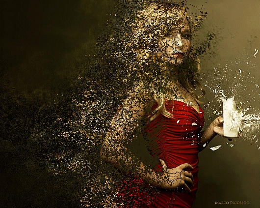
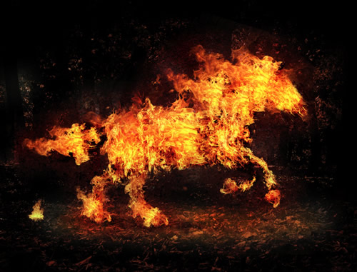
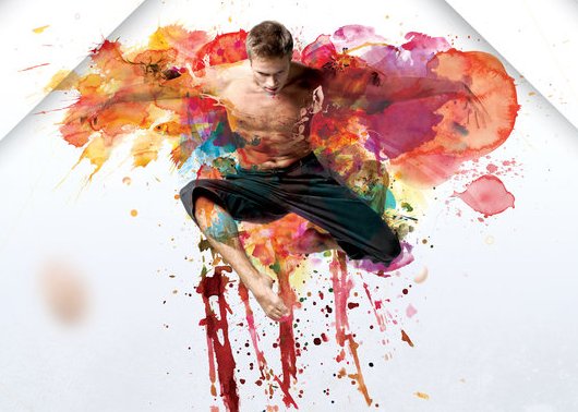

Some nice, visual ideas you can learn from:

by: Mathijs Vissers


by: Humanot

by Sorin Bechira and Adrian Labos

by Design Ranch

by: SeedVibe Design

by REACTOR


by: Edustries


by JS3 Design

by: emrah serdaroglu

by Light PLague


by: Matthew James


by Design Ranch


by: Jason Woan

by Depux


by: Fuelhaus


by: Matthew Inman

by: Muku Studios


by Ethan Martin


by: Richard Cardona

by: John Leschinski

by: studio RVOLA

by: Thomas Champion

by: LiFT Studios


by: Baris Celebi

by: Alex ElChehimi

by: deskfolio.com

by: Ahmed Murtaza

by: [gb] Studio


by: Cihan


by: Romi Dumitrescu

by: Versátil

by: Jungle it!


by: Four Players

by: SolarisMedia.net

by: Lukáš Strnadel

by: Miguel Reyes


by: Ben Falk

by: Davier Interactive
Take your time, create whatever personal business card you would like.
If you ever want to print your business cards and have them mailed to you (50 cards for about $30), you can go here: moo.com
This is where I get my cards printed, you can get full size or mini cards. It's probably the best price you can get for high-quality cards.
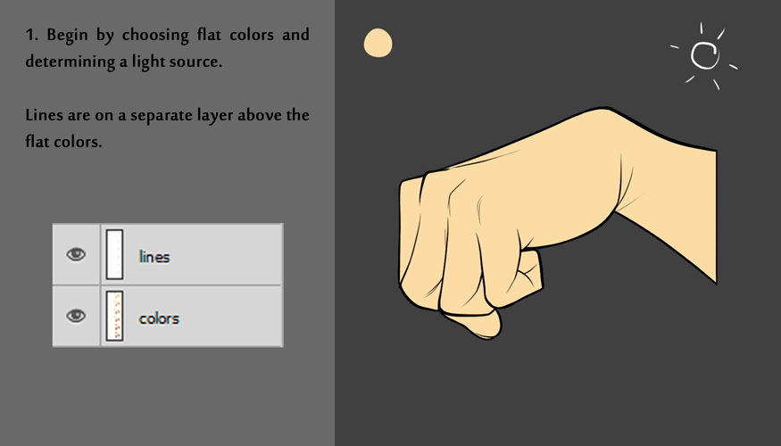
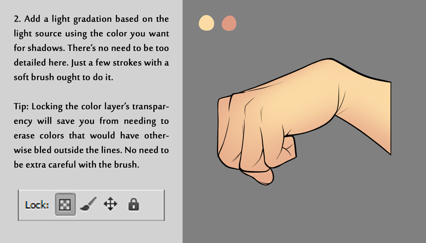
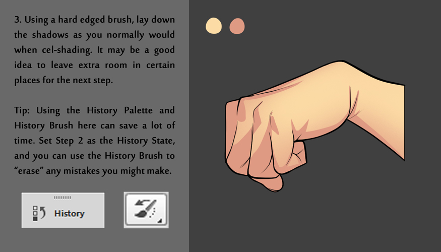
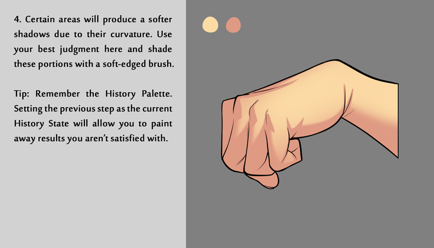
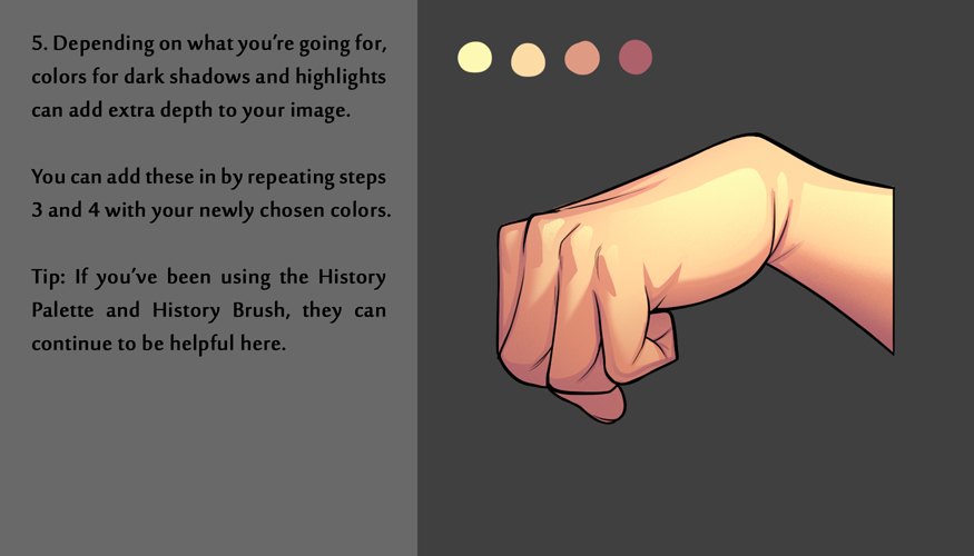
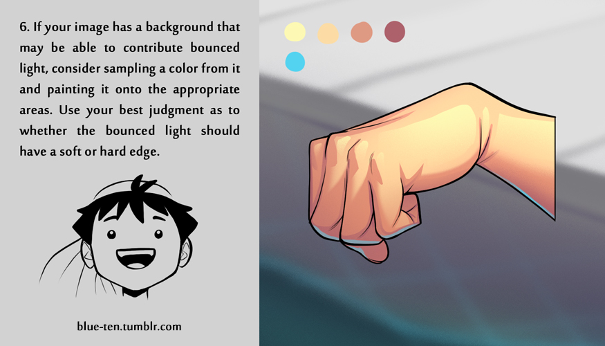
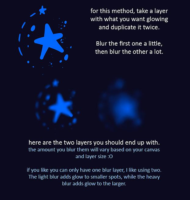
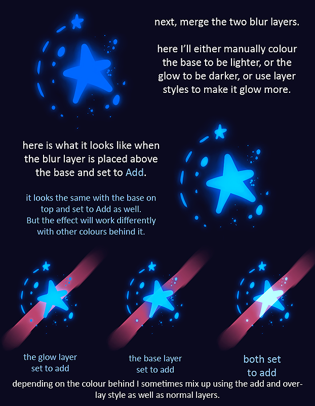
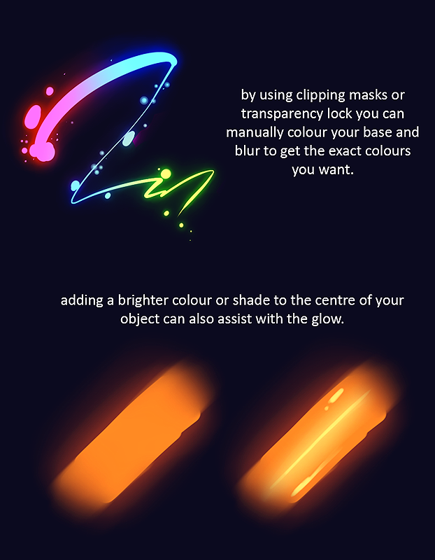
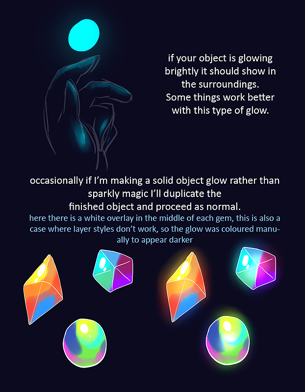
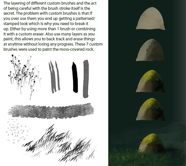


Color combinations are used to create a pleasing arrangement to the reader's eye, and to attempt to elicit a certain mood. Most of the time, this is done at a subconscious level, and when done correctly, will advance the story in a proper manner. There are a number of rules when using color that can be explained in full detail in the Color Theory post.
In comics, complementary colors are used to produce tension and also to produce harmony, depending on the response you are attempting to create. I have included this colour wheel by Don Jusko - his Real Color Wheel theory teaches the idea that darkened, shadowed colors achieve a neutral dark tone rather than a flat black devoid of any hue. This wheel was created for print/paint in order to take advantage of realistic color created under certain light conditions found in nature, and eliminates the use of black to create shadows (which makes your colors muddy and dull.)

For the greatest vibrancy of colour, use its direct complement (the pure colour directly across from it on the wheel). Note: Jusko's wheel is quite different from the traditional color wheels you have seen. His complements are direct optical inverses of one another. If you are uncomfortable with this method, use the traditional wheel which relies on black to create shades.

Another method of effective color combination comes from the use of analogous colors. These colours are found beside one another on the colour wheel, and when used together, help to amplify moods. For example - using a combination of BLUE/BLUE GREEN/GREEN could create a feeling of doubt, mystery or an eerie, creepy effect - this is why it is commonly used in horror films and images.
There are also discordant color combinations, monochromatic (single-color), triadic (triangular equidistant on wheel) and more which you can use to add emphasis to your panels.

We've all heard of cool and warm colors - but how do they work within comics? Well, similar to painting and color composition in drawing and photography, a cool colour palette within a comic panel will evoke a feeling of despair, sadness, melancholy, etc. At the same time, these tones will also slow down the pace of the story in that particular scene.
In these panels, Peter Parker reflects on some memories of Gwen Stacy while he's cleaning out some stuff in his attic and coming across her picture.

To the untrained eye, you may have sensed a feeling of regret and reflection, coldness and emptiness - and it wasn't merely the dialogue that evoked that feeling. The shades of blue and dramatic shadows helped intensify that feeling. Color is used to play upon the subconscious of readers. We associate colors with feelings - and feelings are also associated with temperature. Anger, excitement, intensity, love, and happiness are associated with warmth and heat. Sadness, anguish, lonliness, despair, regret and misery are associated with cooler temperatures.
This temperature effect helps the colorist control the mood of the reader - if it is a tense action moment, perhaps the scene will have more reds and oranges to heighten the urgency. But a dramatic, sad scene like the one illustrated above will make use of subdued, cooler hues like blues and purples.
Determine the mood within the panel, and choose the right color to amplify it. Being subtle in pencils, inks and dialogue works some of the time - but effective color can really drive home the point.
Now I'll show you how color can enhance this direction. Look at this panel from Skaar: Son of Hulk, and see where the focal points of each panel are.

The huge yellow blast behind Skaar in the first panel draws emphasis to that particular area on the panel. It is an intense scene with a number of active elements on the page - a chasm opening up, rocks being smashed and flying about, all from Skaar pounding the ground. You could easily emphasize one of the wrong elements and have the scene be interpreted differently. In this example, the emphasis is on the power of Skaar's impact. By using a fiery yellow blast, it also elevates the feeling of action and strength.
If you look at the last panel, you see the emphasis is on the red figures in the background. Their anger and rage is intensified with the red and yellow fiery tones. If you couldn't tell they were pissed from the line drawings, you can sure figure it out now.
Another effect used on this page is saturated colors - in the second panel, the figures in the background are of lesser importance, so their colors are muted and desaturated. Meanwhile, in the foreground, Skaar's leg appears much more prominent, partially because of the stronger line weight, but also because of the deeper, saturated color. The same effect is seen in the third panel - except this time, the background figures are prominent, and the foreground figures are subdued.
As I mentioned earlier, color can be used to evoke feelings at a subconscious level through temperature and experiences from past associations. Another method of playing upon subconscious thought is through the use of polarization and dominance. Visually, the boldest color scheme is the primary color triad of RED-YELLOW-BLUE. Secondary to that is GREEN-ORANGE-VIOLET, and beyond that is the tertiary scheme of the in-between colors (YELLOW-GREEN, BLUE-VIOLET, RED-ORANGE etc)
Here's an interesting observation you may not have noticed. Check every major superhero you know, and look at their color palette.
Captain America - Red and Blue
Spiderman - Red and Blue
Iron Man - Red and Yellow
Superman - Red, Yellow and Blue
Shazam - Red and Yellow


Now compare that to typical villains:
Doctor Octopus - Green
Dr. Doom - Green
The Hobgoblin - Green and Orange
The Green Goblin - Purple and Green
Parallax - Orange and Green

Notice a pattern? The heroes are often outfitted in the dominant primaries, while their evil counterparts are in secondary colors. This subconscious color scheme forces you to believe that the hero is the most dominant. I'll bet some of you didn't notice that. Now, this isn't a cemented rule, but you can try that effect out in order to accentuate the main character in your next story.
Smaller details such as warm glows, refracted light, mists and hazes, and environmental effects can also increase the dramatic effects in your panels. For example,

this image of Batman standing amongst the shadows shows the city of Gotham in a brooding, mysterious blue-grey haze. There is additional contrast to the focal point (Batman) where a cool bluish-white glow surrounds the hero. This intensifies the dark background and makes the city look even more sinister.

In this image, the warm glow of the sun casts a number of warm colors this sullen warrior. The front of the character has been washed with cooler tones, perhaps to bring out an evil side, but the colored highlights from the light source in the rear create contrast through some subdued complementary juxtaposition (red-oranges-yellows / blue-green-purples). In addition to the glow of the scorching sun, there are some wisps of mist in the chasm behind the main character, creating depth and separation of the foreground and background elements.
When you have your idea in place. Create a new document in Photoshop and fill it with black. Use a small soft brush to draw a few stars in the background. Change the brush size between 1 and 4 pixels.
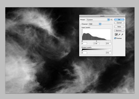
Find a stock photo of some thin and whispy clouds using the keywords cirrus or cirrostratus. Desaturate the image in Photoshop, then set the black point using the Levels window to render the whole sky black. Change the blending mode to Screen at 12%.
Find another stock photograph, this time you'll need some kind of texture. A rock texture will make a great looking life-supporting planet with the moss representing the land mass, search for some on Google-Images. Draw a circular marquee over the whole area and copy into a new document.
Go to Filter > Distort > Spherize and set the Amount to 100%. The distortion of the shape creates a three dimensional appearance to give the basic form of a planet.
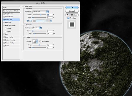
Paste the planet into the main document, then begin adding some layer styles. Start with an Outer Glow using a light blue, adjust the blending mode to Linear Light then change the glow amount and opacity to form a soft and thin atmospheric glow around the planet.
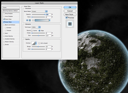
Next, add an Inner Glow. Use a slightly darker blue and give the glow a larger size so it softly spreads inwards.
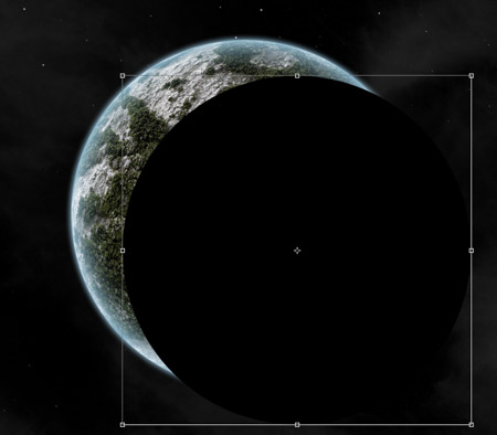
Hold CTRL (CTRL for Windows) and click the thumbnail of the planet layer in the Layers window to load the selection. Fill this selection with black on a new layer, then move it to reveal a portion of the planet.
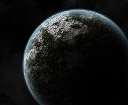
Add a large Gaussian Blur to transform the black circle into shading on one side of the planet. Scale up the shadow to alter the amount of light and shadow.
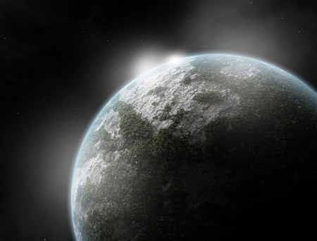
Dab a few spots of white over the lighter side of the planet using a soft brush. Change the layer's blending mode to Overlay.
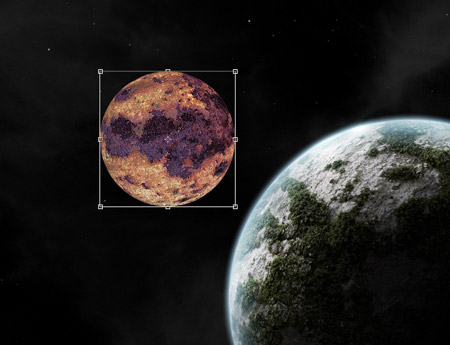
Use the same steps to form a nearby moon. Instead of a rock texture, this time search for a rusty surface texture image.
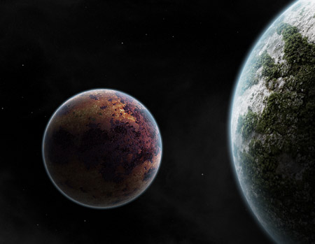
When creating the shadows and highlights, remember to keep the position of the light source in mind and position the shading appropriately.
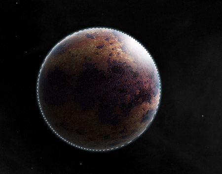
Load a selection of the moon from the Layers palette and erase the highlights and shadows that extend beyond the edges of the moon.
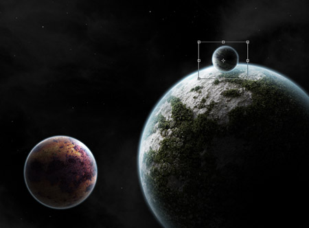
Continue adding moons and planets to lay out the scene. I've added another small moon orbiting the planet.
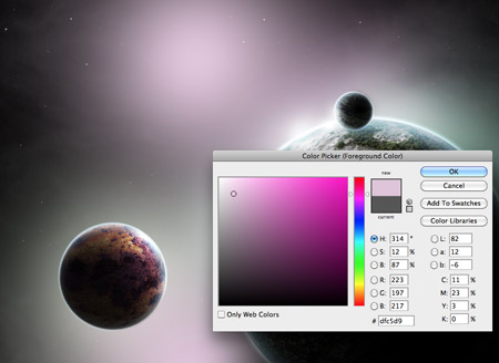
Let's begin brightening up the scene with some awesome nebulas! Dab some pastel shades of pink and green across the document on a layer above the clouds, but below the planet and moons.
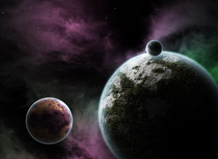
Change this layer's blending mode to Color Dodge to allow the colours to interact with the cloud layer, creating a beautiful galactic atmosphere.
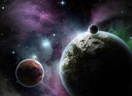
You can't get any more realistic than a photograph, so find a stock image of a real nebula taken through a telescope. Find an image that features cool blues and has a field of bright stars already present in the scene. Paste it into the document and change the blending mode to screen to allow this shot to also interact with our digital nebula.
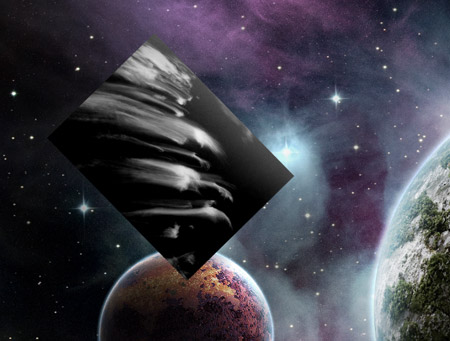
Find a stock photograph of some more cirrus clouds. Give them the same treatment by desaturating the image and darkening the levels.
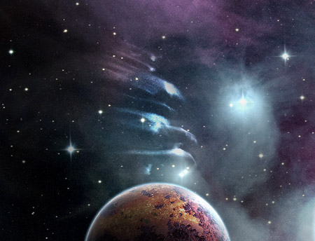
Change the blending mode of the clouds layer to Color Dodge and tone down the opacity to 80%. We now have a series of meteoroids.
Hunt down another stock image, this time featuring a bright lens flare. Cut out the flare and paste it into the main document.

Darken the sky behind the flare to black, then change the blending mode to Screen to render the black area transparent.
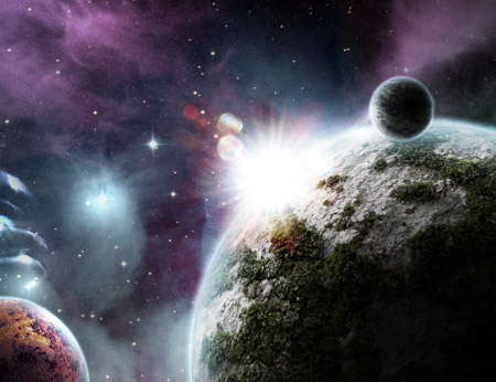
Move the flare into position so it's just creeping over the edge of the planet. Duplicate the layer to double the intensity of the light source.
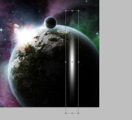
Dab one spot of white using a soft brush. Press CTRL+T and stretch the shape vertically.
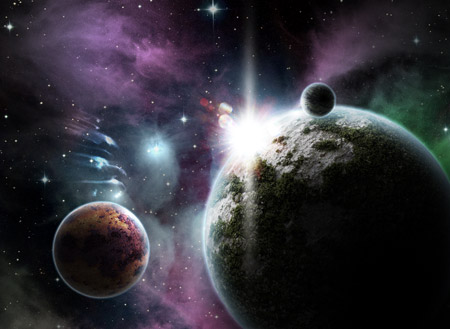
Position this long brush stroke over the light source to generate yet another subtle lens flare. Adjust the opacity to around 80%.
Add a new black layer over the whole design, then erase out the centre. Scale up the layer slightly to form a vignette. Change the blending mode to Overlay.
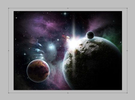
Here's another approach for a similar space scene creation, in this tutorial you can have two variations, check out both versions below. Remember to click on the image to see the full-scale versions of them. The planets' reflections will be fully adjustable depending on how you want to set up your scene. At the end, we will look at a few quick ways to give the image a completely different look.
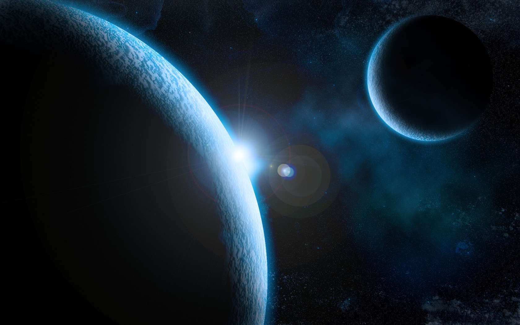
Let's get started!
1. To start, let's go and grab that downlaoded rust texture and open it up in Photoshop.
2. We are going to start off by creating our large planet. So, choose the Elliptical Marquee Tool in the Tools Panel and create a circle (holding down Shift to keep a perfect circle) that fills up as much of the area as possible without going off the edges of the document.
3. We want to put that area beneath the circular marquee selection onto a new layer. Press Ctrl + J to duplicate the selection; this should automatically put the selected area onto a new layer.
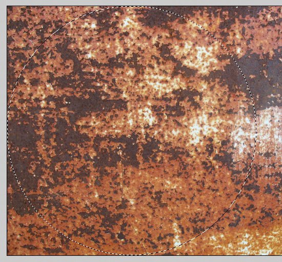
4. We can go ahead and hide the original texture layer (click on the layer visibility icon on the left of the layer - it looks like an eye). Now, duplicate the circle layer we just made by pressing Ctrl + J. Go to Filters > Sketch > Bas Relief and use the settings that I have below - this will give us more of a planet texture.
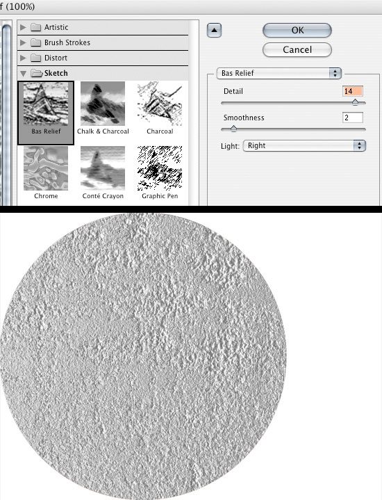
5. Ctrl + click on the circle texture layer to select it. Go to Filter > Distort > Spherize and change the amount to 100%.
6. Add the Spherize filter to the layer we just added the Bas Relief filter to as well.
7. Move the texture layer above the Bas Relief layer and change the texture layer's Blend Mode to Overlay.
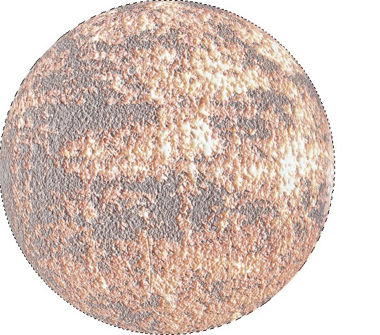
8. Now, we want our planet to have a little more contrast to it and we want it to be darker. Go into the Image > Adjustments > Levels (Ctrl + L) and adjust the Levels as I have it below.
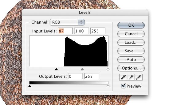
9. Change our Background layer to black (#000000) before we go any further.
10. We are now going to merge the two layers of our planet. To do this, Ctrl + click to select both layers, then click on the Link layers icon at the bottom of the Layers Panel to link both layers. Then, select the top layer and choose Layer > Merge Down or simply press Ctrl + E to merge them together into one layer.
11. Now, we want to create a new group to put our planet in. Click on the Create new group icon (it looks like a folder) at the bottom of the Layers Panel. Once you create the group, drag your planet layer into it.

12. Now that we have our planet in our group, we are going to add some layer styles to the to it.
13. Start by clicking the Add a layer style icon at the bottom of the Layers Panel and choosing on Outer Glow. Change your settings as I have them below (the color used is #3EB9F9).
14. Now, add an Inner Glow layer style with the settings I have below using the same color as the Outer Glow layer style above (#3EB9F9).

15. Click on the planet group to make it the active layer, and then click on the Add layer mask icon (bottom of the Layers Panel). Inside the planet group, Ctrl + click on the planet layer to get a marquee selection around it and then fill the mask layer we just created with black (#000000) using Edit > Fill (Shift + F5). You should have ended up with just the Outer Glow layer style showing through.
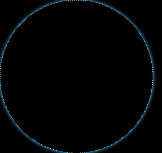
16. To give our planet a glowing edge on one side, we want to move the mask. To do this we are going to click on the mask, then click on the Link layer icon in between the layer and the mask to unlink them. We can now move the mask layer using the Move Tool (V) without moving everything else.

17. Lets go and give our mask a blur so there isn't such a defined line. Click on the mask layer, and go to Filter > Blur > Gaussian Blur. Change the blur's Radius option to 50px.
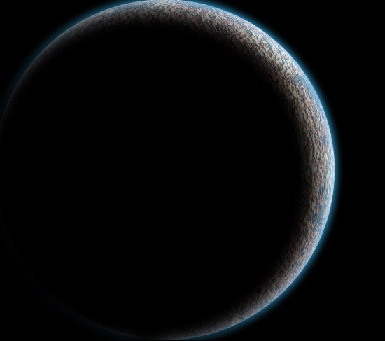
18. The planet looks pretty good but we want to get rid of the rust color and give it more of a "blue-ish" look to blend it in with the glow. To do this we are going to click on the planet layer and open up the Hue/Saturation Image Adjustment dialog box by pressing Ctrl + U; alternatively, you can get to the Hue/Saturation Image Adjustment dialog box by choosing Image > Adjustments > Hue/Saturation.
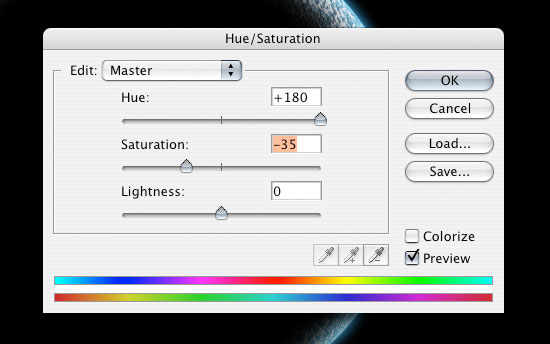
Here is what our planet should look like now.
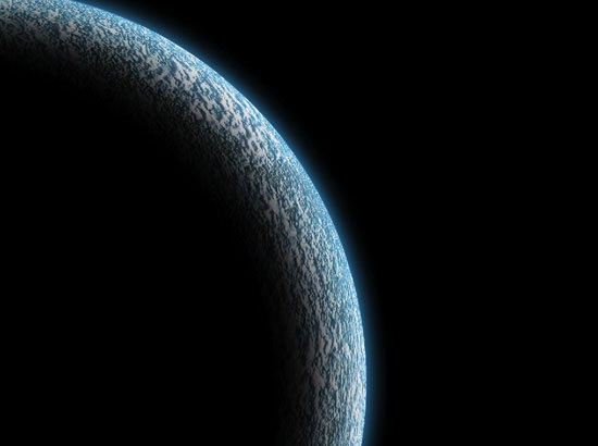
19. Now that we have finished our first planet, we can create a new document (Ctrl + N) in Photoshop to set up our scene. I'll create my new document with the canvas dimensions set at 1680px by 1050px.
20. Fill the background of the new Photoshop document with black (#000000) and bring in the planet. First, link the planet group and the mask together by Ctrl + clicking on them in the layers and clicking on the Link layers icon (or right-click and choose Link layers). Then, drag the layers into the new Photoshop document; this will duplicate the layers into the new document. I reduced the size of the planet to about 95% for a better fit which you can do using Edit > Transform > Scale (but do what you think looks best).
21. We are going to add some stars in our background. So first, create a new layer (Ctrl + Shift + N) and place it below the planet group.
22. Go to Filter > Noise> Add Noise. Make sure that the Monochromatic option is checked and the Amount option is at about 30%.
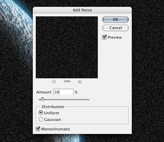
23. To get less white noise and more of a star look, we are going to adjust the Levels by going to Image > Adjustment > Levels (Ctrl + L) and changing the levels so they are something like what I have below. This will give us a higher contrast and make a lot of the noise go away.
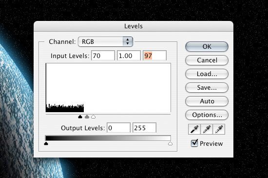
24. We don't want the stars to go in front of the black part of our planet, so add a layer mask to the stars layer. Ctrl + click on the planet layer to create a marquee selection around it, switch to the newly added layer mask, and then fill the selection with black (#000000) on the mask using Edit > Fill (Shift + F5).
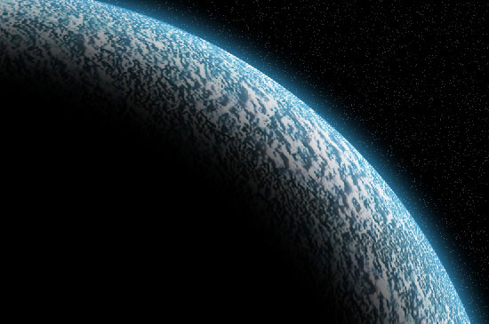
25. To get more of a spacey feel, we are going to go and grab the grunge paper texture from Zen Textures. Open the texture in Photoshop and bring it into our canvas.
26. Use the Free Transform Tool (Ctrl + T) to rotate and resize the texture so that it fits the canvas. Remember to hold down Shift when you are resizing the texture to maintain the proportions of the texture image.
27. Once we have the texture sized, we want to invert the texture image's color using Image > Adjustments > Invert (Ctrl + i). Then we are going to open up our Levels dialog box (Ctrl + L) to lower the amount of white in the texture. Drop the Opacity of this layer to somewhere around 45% for now.

28. Repeat Step 24 (adding a layer mask) to get rid of the star texture that is in front of the planet.
29. We'll leave the texture as it is for now and we'll add a light source coming from just behind the planet. To start, create a new layer (Ctrl + Shift + N), and bring it up the Layers Panel so it is at the top of all the layers. Using the Polygonal Lasso Tool, create a rough star-like shape, something like I have below.

30. Go into Filter > Blur > Radial Blur and change the Amount option to 100 and press OK to apply the filter. This isn't quite going to do what we want it to, so we want to apply the filter again. We can do this easily by pressing Ctrl + F, which reapplies the most recent filter you've used, in this case the Radial Blur filter.
31. Now we want to go to Filter >Blur > Gaussian Blur with the Radius option set to 20px.
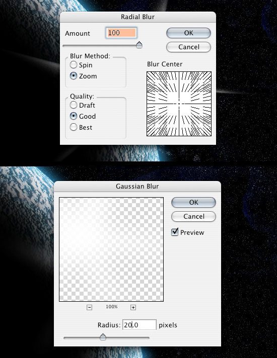
32. We want to duplicate the white area layer (Ctrl + J) and rotate the duplicated layer using the Free Transform option (Ctrl + T) until you get something like what I have below.

33. Select one of the white light source layers-the one that is lowest in the Layer Panel-and add a Color Overlay to it by clicking on the Add a layer style icon at the bottom of the Layer Panel and choosing Color Overlay. Use a light blue color (#3EB9F9). You can use the Free Transform Tool to adjust the size and angle of this layer. Also, consider adjusting the Opacity option of the Color Overlay to one that suits your tastes. I brought the sides of mine in and moved it behind the planet a little more. After you're satisfied with the light source, move these two layers under the planet.
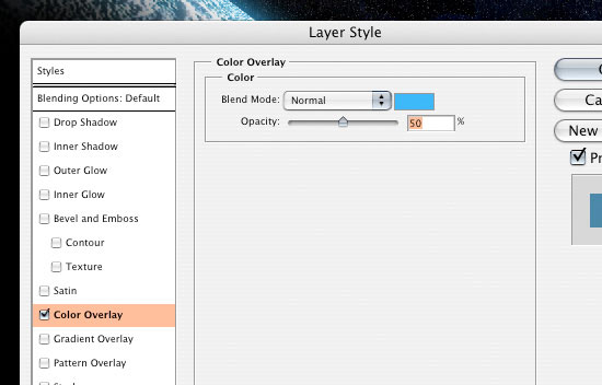
34. We are going to add a Lens Flare. To do this, we need to create a new layer, fill it with black (#000000) using Edit > Fill (Shift + F5), and then bring it to the top of all the layers.
35. Hide that newly created black layer temporarily (click on the Eye icon beside it, which toggles the layer's visibility) so that we can set up some Guides for determining where the Lens Flare will be placed.
36. Bring a Guide from the top ruler and the left ruler (press Ctrl + R to show and hide the rulers) so it makes sort of a crosshair at the middle of our glare. You can toggle your Guide's visibility by pressing Ctrl + ;. Setting up guides allows us to precisely place the Lens Flare.
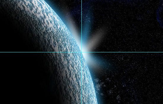
37. Toggle the visibility of the black layer back on, and go to Filter > Render > Lens Flare. Try to line up the lens flare so that it is right at the intersecting point of the Guides we set up.
38. So that our lens flare matches the rest of our image, let's adjust the Hue/Saturation. Press Ctrl+ U to open the Hue/Saturation dialog box and adjust the color of the Lens Flare using the settings below.
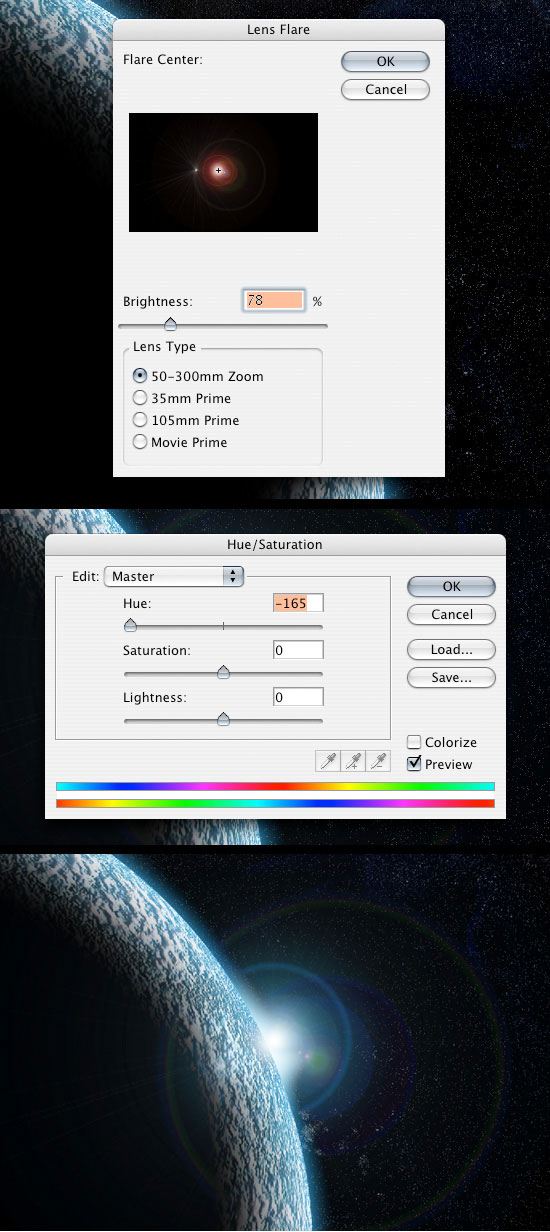
39. Now, we are going to create a smaller planet. Repeat Step 2 - 18 with a smaller circle. Since you're already familiar with the process of creating a planet by now, why don't you play around with the settings and options to experiment with different effects and textures? Also, don't forget to add the planet to the star and star texture masks that we did in Step 15 so that the stars aren't coming through.
40. When you're done creating the smaller planet, place it into our space scene Photoshop canvas.

41. Now that we have both our planets, we are going to add some "space dust". To start, choose your Lasso Tool from the Tools Panel and change the Feather option (in the Options Bar) to 100px.
42. Draw an organic, cloud-like shape in the middle of the two planets. It doesn't have to be perfect and if you have any sharp corners, the 100px feather will smoothen them out.
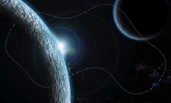
43. Create a new layer (Ctrl + Shift + N) behind everything except the stars and background texture. Set your foreground color to black (#000000) and background color to white (#FFFFFF) then go to Filter > Render > Clouds.
44. Add a Gradient Overlay layer style by double-clicking on the newly created layer to open up the Layer Style dialog box and then checking the Gradient Overlay box. Create a cool blue color gradient with various hues and adjust your settings like I have below.
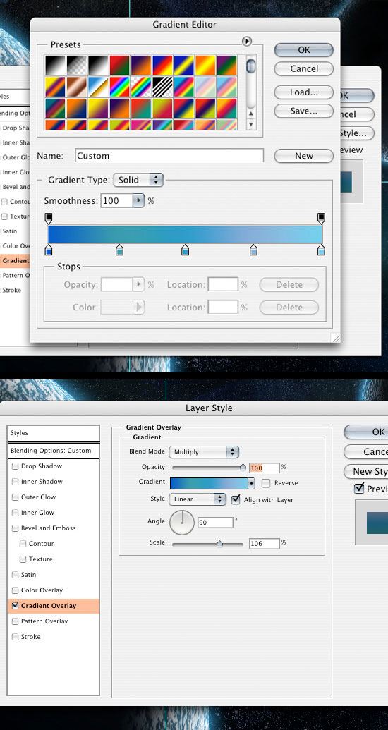
45. We are going to add a layer mask (click on the Add layer mask icon at the bottom of the layers panel) to the cloud layer because if you have some of the clouds showing in front of either one of the planets, we want to get rid of it.
46. Choose the Brush Tool (B) from the Tools Panel, and then using a black (#000000) foreground color, start painting away the parts of the clouds that we don't want.
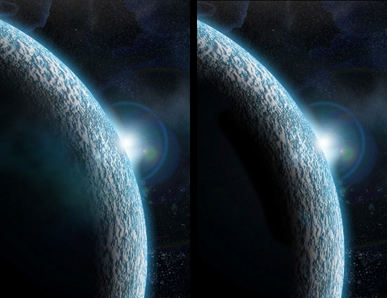
47. Now we are going to add some reflection from the light onto our planets; let's start with the smaller one. Ctrl + click on the small planet layer to create a marquee selection around it.
48. Create a new layer at the top of the small planet group and fill it with a light blue color using Edit > Fill (Shift + F5); use a color that's something like #88D6FC. Since our group already has the mask, the blue fill will be applied to it as well. Drop the opacity of this new layer down to 40%.
49. To get a bright highlight, we're going to recreate the marquee selection on the small planet by Ctrl + clicking on the layer. Then create another layer (Ctrl + Shift + N).
50. Choose the Brush Tool (B) again with the Diameter option set to about 100px, Opacity option 20%, and Hardness option to 0%. Start painting in the front part of the planet that is facing the light source with a white color (#FFFFFF). You should get something like what I have below, something pretty subtle, but still noticeable.

51. We are going to start giving our big planet a reflection as well. So first, like in the preceeding steps, we are going to create a new layer in the big planet group and fill with a blue color (#88D6FC) or something similar. Drop the opacity down of this layer to 70%.

52. Lets get rid of some of the blue reflection because the light reflection is going to be right around the light source. To do this, we are going to add a layer mask.
53. After adding the layer mask, set your foreground color to white (#FFFFFF) and background color to black (#000000). Now choose on the Gradient Tool (G) and set the gradient type option to Reflected Gradient (second to last gradient option). Click and drag the gradient from the middle of the light source down to the bottom of the canvas. This should get rid of the blue tint that is on the top and bottom of the big planet.

54. Just as with the other planet, we are going to make a white area where the largest amount of highlight will be. Ctrl + click on the planet and create a new layer. Start painting with our same sized brush as in Step 50. Your reflections should look something like what I have below where it doesn't go too far around the planet and is brighter at the light source than the smaller planet.
55. I didn't really like the lens flare as I continued to work on the scene, so I adjusted it to get something a little better and more visible. The brightness of the new Lens Flare is set at 80% and at 105mm Prime instead of the 50-300mm Zoom that it was at before.

56. I'm going to go back to the background texture for the stars. Now that we have it in with everything else, Drop the opacity down to 30%. Using the mask that has already been applied to our background star texture, start painting away with our 20% opacity brush the "white-ish" areas at the bottom left because they look a little out of place. I'm not going to get rid of the areas completely, just dropping the opacity of them down some.

57. Now, we are going to put in some brighter stars to make the background pop a little bit. Create a new layer above the star texture layer and choose the Brush Tool (B) in the Tools Panel. Change the settings of the brush so that the Opacity option is at 100%, the brush's Diameter is at about 5px, and the Hardness is at 0%.
58. Place a few dots/stars around the document in between the planets using white (#FFFFFF) as your foreground color.
59. Now, we are going to add some layer styles to the stars. First, add an Outer Glow layer style. Adjust the settings something as I have them below, using the color #3EB9F9. This will give our stars a nice subtle glow.
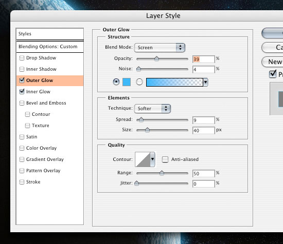
60. Nest, we'll add an Inner Glow layer style. This will give our stars a blue tint, while still maintaining the white center to give them a bright glowing look.
61. Drop the opacity of the layer down to 70% to blend them into the background a little. We don't want them to look unnaturally bright or stand out too much.
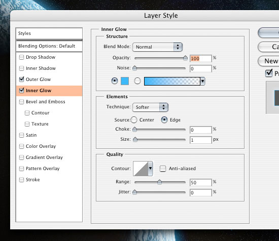
62. Now, let's add a Photo Filter adjustment layer to make everything the same tone/color so it all blends well. Click on the Create a new fill or adjustment layer icon at the bottom of the Layers Panel (it's usually the fourth icon from the left) and choose Photo Filter. You can play around with the different filters until you get something you like. I used a Cooling Filter with the Density option set at 21%.

63. You may want the scene to have an aged, retro look. To do this, we need to hide the Photo Filter adjustment layer temporarily (click on the eye icon to toggle the layer's visibility off). Add a Hue/Saturation adjustment layer using the same method as adding a Photo Filter adjustment layer. Drop the Saturation option down to -50. Now go into our Photo Filter adjustment layer and change the Filter option to Sepia.
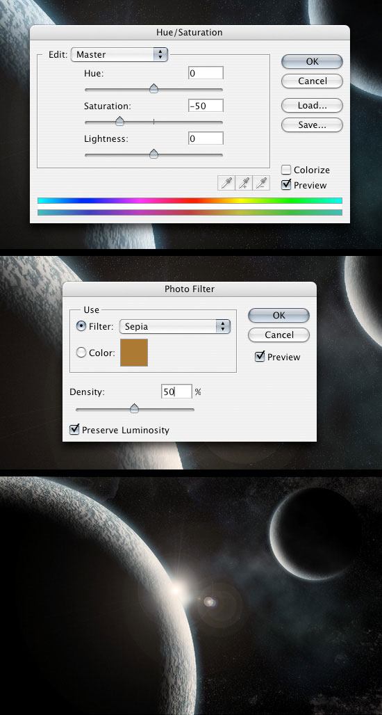
So there we have it, a planet made from just textures and Photoshop with two possible outcomes.
Create a new Photoshop document. Minimum size of Height: 2000 pixels, Width: 1000 pixels, at 72 dpi, RGB color format.
Follow the tutorial steps below to create the faint background stars. Again, depending on the size you choose the numbers may not work exactly as shown in the image samples, play around with all the settings at every step to get the effect you want, this whole tutorial is very general, it's up to you to create the space scene the way you want.
Create monochromatic noise
Image >> Adjust >> Brightness/Contrast. Play with settings until you get a result similar to above.
Repeat the first step
Repeat the brightness/contrast adjustment again, repeat these two steps repeatedly, 6-8 times tends to provide a nice dense yet realistic star field.
Create a new layer with a black background and add the difference cloud filter. Filters >> Render >> Difference clouds. Make sure to have your foreground and background colors to black/white which will give you the constrasty 'vain-like' effect. Press CTRL-F to repeat the filter multiple times until it looks detailed.
Set the new cloud layer to the blending mode of Screen and set the Fill or Opacity to around 33.
Merge the two layers together so you are left with only one. Then using the dodge and burn tools I simply used a round soft brush to paint values higher and lower to make things more dynamic.
Add a colorized hue layer and select a color you would like to work with this will adjust the gray tones to new monochromatic tones. You may also choose to create multiple hue layers and mask them in order to vary the colors. Once finished merge all these layers to the bottom one.
Using the color dodge tool with a small soft brush start very small ( around 2 or 3 pixels ) and click repeatedly until the are is white, make the brush slightly bigger, and press a few less times, make the brush bigger and repeat until it appears glowing.
Create a new document, I'm using my computer screen's resolution (1440x900 pixels). Add a new Layer and fill it with any color then go to Layer>Layer Styles> Gradient Overlay. You can add a gradient layer as well, I simply prefer the Layer Styles.

Create a new layer and fill it with white, then go to Filter>Render>Lighting Effects. Change the style to RGB lights. Use Negative 60 for the Intensity, Narrow 96 for the focus, and for the other options keep the same.

Lets add some blur, go to Filter>Blur>Gaussian Blur. Use 80 pixels for the Radius. The last thing here will be change the Blend Mode to Overlay. Doing that the RGB color will be hardly visible but later on with the other layers it will work ;)

Creating Stars in Photoshop is something really easy. Create a new layer, fill it with black, and change the Blend Mode to Screen. After that go to Filter>Noise>Add Noise. Use 10% for the Amount, Gaussian for the Distribution and select Monochromatic. You will have a layer full of noise, then to create the start just change the levels of the layer, go to Image>Adjustment>Levels. For the Input Levels use 65, 1.00, 99. Doing that you will increase the black so just the bigger dots will appear, also you will increase the white, making the dots that appear brighter.

Now that we have the stars and the colors and some colors lets create the Nebula. To do that create a new layer and go to Filter>Render>Clouds. Make sure that your color were black and white for the background and foreground. Then just add some Layer Styles to do that go to Layer>Layer Style. First over the Blending Options, change the Blend Mode to Overlay. After that select Gradient Overlay. use Overlay for the Blend Mode and for the colors use a Cyan, Green, Yellow, and Red. Also change the Angle to 130º and the Scale to 49%.

First, lets create a new layer and fill it with black, however, this time, add this layer in front of the background and beneath the other layers: (Stars and Nebula). Now go to Filter>Render>Lens Flare. This effect might be the most overused ever, like some people even say that using it you wil turn your design in an amateur piece. For me it's a nice filter and, if you use it right, it will give a nice touch to your image. For the settings use 100% Brightness and use 105mm Prime for the Lens Type.

On two new layers, create two black circles which will become planets.
With a planet selected take a round soft brush and press and drag along the outside of the selection which will fill in the lit side. Continue to play around with this, it takes careful lighting to get the desired effect.
Select each planet and save it as a new selection for use later when merged with our bottom layer. Now merge the planets with the bottom layer.
Now with the layers merged its easier to use the color dodge tool to brush the edge of the planets making them 'glow'.
Use the lens flare filter and set the flare point to the lit point of the planet which adds nice depth to the image. More textures, more layers, more star clusters, more details, more lighting effects, comets, rings around the planet, go crazy. These techniques will get you heading in the right direction, the rest is up to you.
With a couple more hours of work with layers, masks and filters, you could end up with something like this:

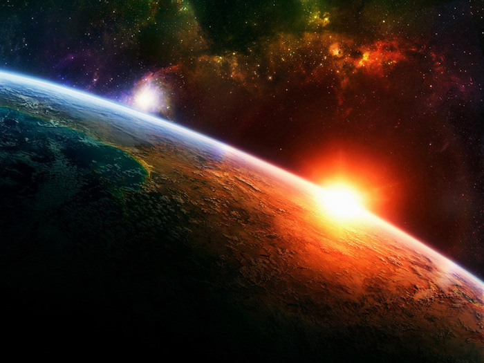
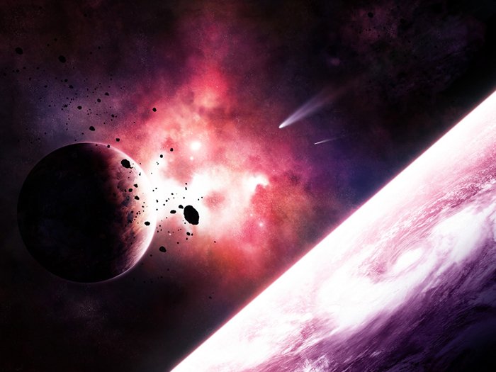


All the photos I've used in the tutorial below are here. You may (and should) use your own photograph of a city, find one online, the more hi-res the better. Either way once the zip file downloads, extract all the files out of the ZIP file, you can browse through the images and install the Brushes into your Photoshop.
Find and open the city image (in the zip file you just downloaded or which ever one intend to use), and save it under a different name (your name & assignment #). The first thing to do in order to achieve the appearance of the deserted, empty city, is to remove all signs of life, like people and lights. Use the Clone Stamp Tool and Brush Tool, which we'll be useful for finishing the details. Both tools should be soft-edged and have a size of 5 to 10 pixels.

Now, in order to create the appearance of destruction, several actions need to be taken. First, change the appearance of the dark, blue banner (center-left of the image). Use the Brush Tool to erase most of the gold letters, and use the Clone Stamp Tool to remove the lower part of the banner.

Open the flag image, and separate the flag from the background. Go to Select > Color Range to select all the blue pixels and press Delete. Use the parameters as in the image below.

Select the Eraser Tool (large size and hardness set at 0%) and remove the side part of the flag.

Finally, make the image monochromatic (Image > Adjustments > Black & White).

Place the flag onto the surface of the main image. Use the Move Tool to move the layer into the appropriate position and the Eraser Tool to remove the unnecessary pixels.

Then go to Image > Adjustments > Levels and set up as shown below.

Use the following tools to finish the work here: Clone Stamp Tool, Eraser Tool, Brush Tool, Burn Tool, and Dodge Tool.

Also select the Brush Tool and treat all other banners and flags in a similar way.

Transform the windows now. Use the Brush Tool to remove some of the glass and alter the details. Apply some transformations with the Polygonal Lasso Tool (L) and Move Tool if you want to.


Review the whole main image looking for areas where changes need to be made. When transforming the details, first mark them using the Polygonal Lasso tool, and subsequently cut out, paste in as new layers and transform them with the Move Tool. Use the Brush Tool during the process, if necessary.


The last stage of creating an impression of destruction is removing flowers from the street. Paint all the flowers over with black, using the Brush Tool. Make up the missing parts of the flower pots with the Clone Stamp Tool, and add the shadows using the Burn Tool.

Now we need to work on the textures. Create a new layer and go to Filter > Vanishing Point to apply the texture 1 onto the surface of asphalt. If you don't know how to use this filter, I recommend you read Alvaro's tutorial Getting to Grips with the Vanishing Point Filter before starting this step.


Change the Blending Mode of the layer to Multiply. Select the Eraser Tool and remove the unnecessary parts of the texture.

Finally place texture 2 onto the sidewalks in the same way.

Overlay texture 3 over the buildings, in the way similar to the sidewalks and street, but do not use the Vanishing Point filter.


The last texture to be overlaid on the street surface is the grass texture. Contrary to the previous ones, in this case set the Blending Mode to Overlay.


Now we will use a large number of stock photos. They will help make our image more detailed and interesting. Place the images of the can, the can 2, the banana skin, the old newspaper, the grass, the bushes, the bushes 2 and the plants in the document, resize them and erase the backgrounds.

Select the Burn Tool and apply some shadows.

Next select the Brush Tool, change its Blending Mode to Color. Alter and adjust the new elements so that they coexist better with the texture and color of the main image.

With a Brush Tool already selected, change its Blending Mode back to Normal and add the settings in the Brushes Panel as shown below.

Paint some blades of grass, trying to make this as realistic as possible.

Go to Image > Adjustments > Hue/Saturation using the settings below.

At the end, use the Brush Tool, Burn Tool and Blur Tool in order to add more flora, and make the image more appealing and consistent.

Select the Burn Tool and add some hard shadows on all the walls.

Use the Brush Tool with the Blending Mode set to Color to add some
green smudges.

Change the Blending Mode of the Brush Tool back to Normal once again, and add the settings in the Brushes Panel, as shown below.

Using a green color for the brush, add some flora on all the buildings.

Use the Burn Tool and Dodge Tools to make highlights and shadows. This will enhance the effect of three-dimensionality.

Add some green and flora on cars, boards and flower pots using the same methods. Look at the third image to see all the successive small steps of working on the white road sign.


Import the photo of the clouds into the document and place it in the bottom part of the image.

Next add a Mask to the Layer. Use the Pen Tool or the Magic Wand Tool to make a selection on the sky, next go Select > Inverse and Fill the selected area (of a mask, not an image) with black (using the Paint Bucket Tool).

Go to Image > Adjustments > Black & White and use the default settings.

Use the Burn Tool and the Dodge Tool to change the contrast of the clouds, if you want to. Finally, select Brush Tool to paint the clouds with a new hue. First set the brush to a big size (about 150 pixels), hardness set to 35%, and Blending Mode set to Color, and use some pastel shades.

Without changing any of the brush settings, add some warm colors to the buildings and streets. At this point, your image should look like the one below.

Download the Birds Brushes set and open them in Photoshop. Add a few birds in the sky using a proper size.

Now it's time to add final effects to your image. At this moment you must have only one layer. Simply save your work as a JPG or go to Layer > Flatten Image to do that. Next go to Image > Adjustments > Levels and add the settings represented in the image below.

Last but not least go to Filter > Render > Lighting Effects and set up as shown.

Well done! You've now seen the whole process of turning an image of a lively city into a state of decaying ruins.


Any photoshopped image must start with a great source. Ruins are no exception. For my H2H with Norrit, we were limited to Non-American, Non-European cities. I chose Hong Kong. Ideally, you want a city with a recognizable landmark or building. This can get tricky, as your contest may have 18 New York entries and 20 from Paris. So, be aware that whatever city you choose may be duplicated. Impirnt your own style on whatever city you choose.
After selecting a city, find a picture that displays a good view of the features you want to destroy. I would suggest using only images greater than 1024x768 in size. Using a tiny source image for this contest will make things very difficult when it comes time to put in detail.
Here is our source image, a small crop for tutorial purposes:
Let's talk for a moment about the source pictures for our destruction. I can almost guarantee you that typing "ruins" into Google will get you nothing better than the Parthenon or the Pyramids. While these are certainly ruins, they don't offer much help to those of us who have to ruin modern buildings. Modern materials require modern ruins. So, here is a quick list of words that will bring us modern destruction:


Creating the destruction and rubble is perhaps the most time consuming bit of work.
The first thing I'll show you is creating false structure. This is not always necessary, but it can add a sense of realism. Let's create some struts for the Bank of China building. I came across a picture on the net of this building under construction, so I have a good idea of what the insides looked like.
Grab a rubble pick to make our struts. This'll do:
Then, cloning from the rubble, create strips. These are the floors of the building. Copy these until you have a good amount, then rotate and place over the Bank like so:
Pay close attention to the angles when creating false structure. You want it to match as closely as possible to the angle of the building.
Next, eliminate a portion of the struts. This is where you get to be creative. Try to think as you are doing it what consequences your actions have. If you erase a floor here, the mass from the floor must have fallen somewhere, right? Maybe it took out a floor below. Maybe it just landed on the floor below, depositing rubble. Be creative, but don't be completely random. It's an interesting balancing act between chaos and structure.


To access them, go to Window > Actions.
There are tons of actions out there. It's a slippery slope, though. If you install too many you will be bogged down and spend all of your time playing with actions. My recommendation is to install these sets of actions. These have some nice and easy-to-use automated steps to enhance photos or add some cool effects. Here's a good how-to for installing them in these actions, and get familiar with them. After that, if you feel you need more, go for it. There's tons online, jut search for 'Photoshop Actions'
Here's what this set offers:
I'll be working with this picture of a dog.

This picture is SOOC (straight out of the camera). I'll be applying a few actions to it just so you get the general feel.


To execute an action, make sure the Actions palette is visible. If it isn't go to Window > Actions. Click once on the action you want to use in the actions palette, then click play at the bottom of the actions palette. Let it do it's thing and BOOM... it's like a whole new picture. Notice the new layer that was created in the layers palette. If you don't like the action, simply trash that layer by dragging it to the trash bin.
Quick tip: if the action is "too much" you can take the opacity down in the layers palette. Just make sure you have the correct action layer selected in the layers palette.
You can also mix actions to get the look you want. For example, on the next picture I used Boost (40% opacity), Colorized (61% opacity), and Warmer (100% opacity).

In short, actions are the bomb diggity. Like, totally.
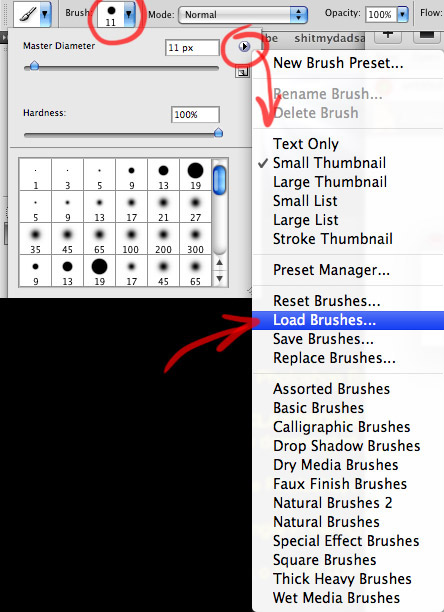
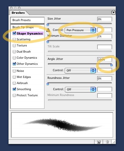
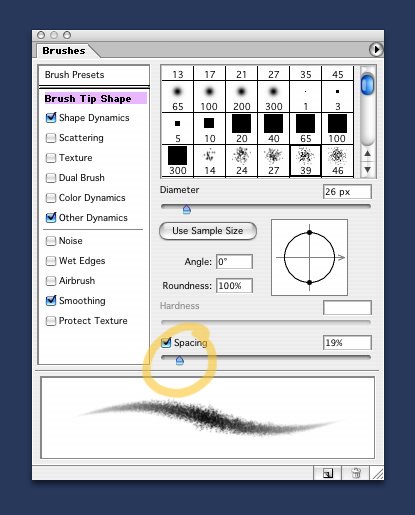
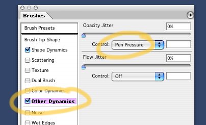


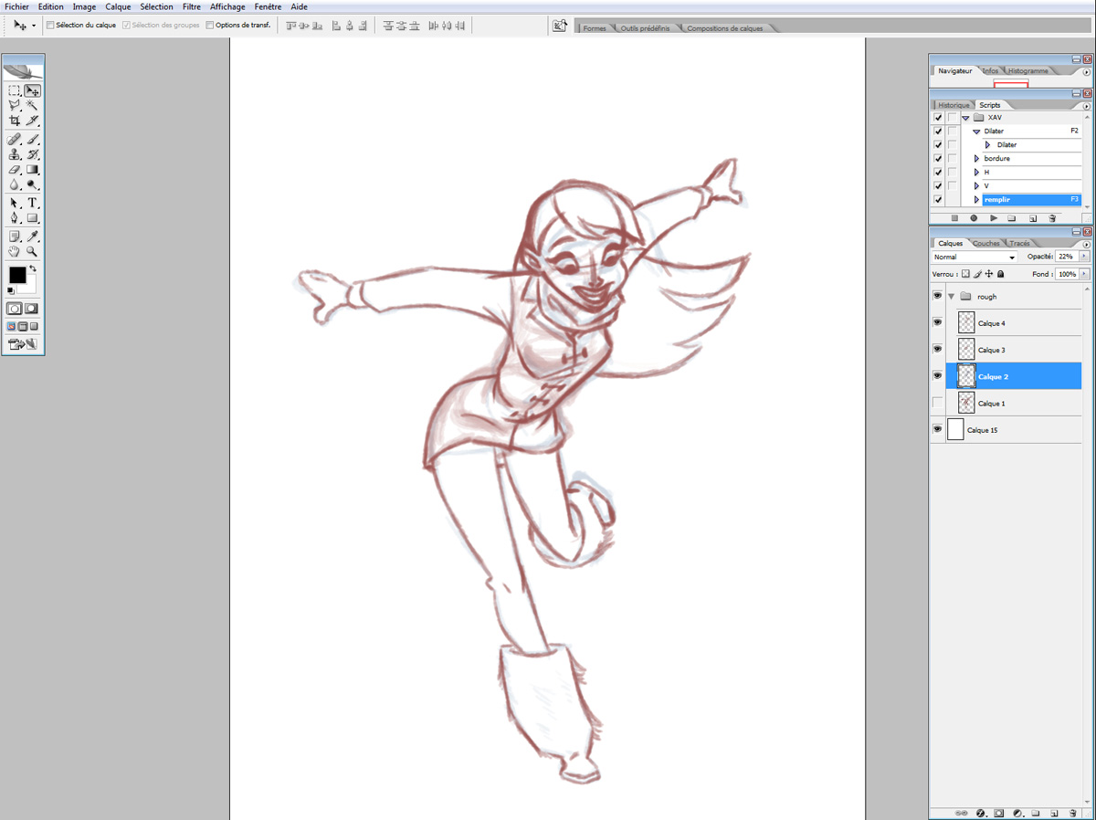


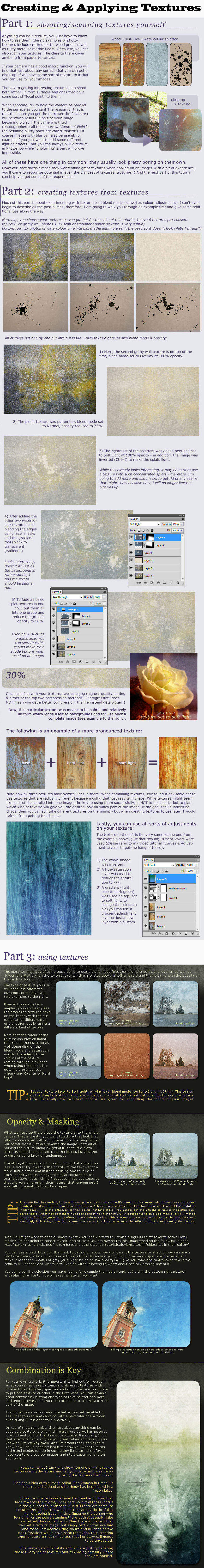
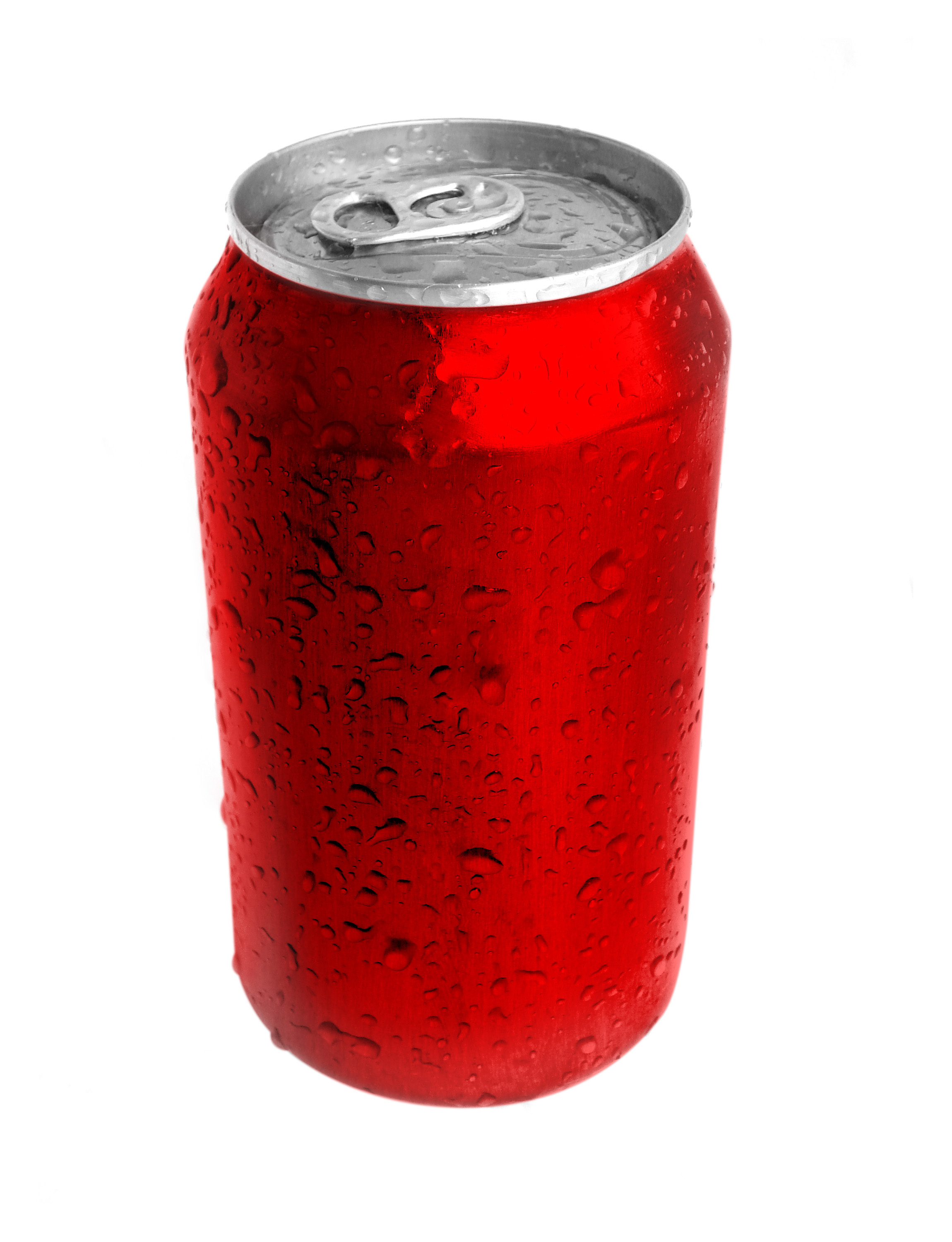
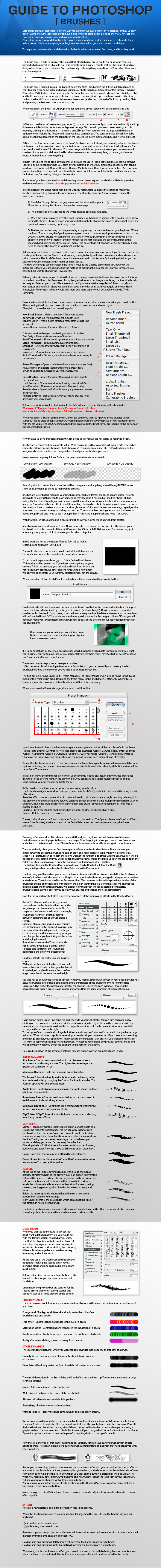