


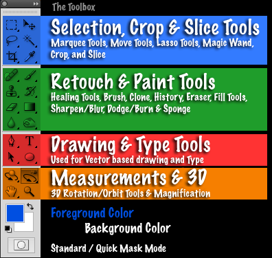


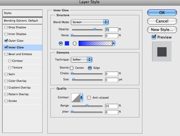
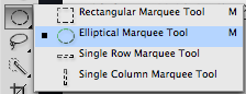
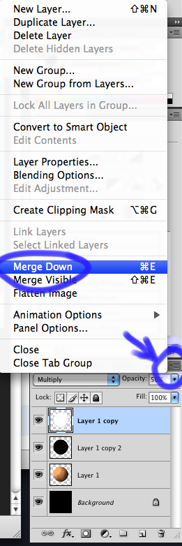
Photoshop CS4, like earlier versions, comes with so many tools that if Adobe tried to display them all at once, the Tools panel would need its own scroll bar. So instead, Adobe has grouped many related tools together, with one tool in the group visible in the Tools panel and the others hidden behind it. Whenever you see a tool in the Tools panel with a small arrow to the bottom right of the icon, it means there are additional tools behind it waiting to be selected, and if you click and hold your mouse button down on one of these tools, a fly-out menu will appear showing you the additional tools. For example, by clicking and holding on the Rectangular Marquee Tool at the top of the Tools panel, a fly-out menu appears giving me access to the Elliptical Marquee Tool, the Single Row Marquee Tool and the Single Column Marquee Tool. Simply move your mouse cursor over the name of the tool you want, then release your mouse button to select it:

Click and hold on the other tools in the Tools panel to see all of the tools available to us in Photoshop CS4.
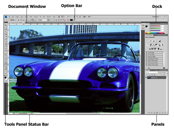
Directly related to the Tools panel is the Options Bar at the top of the screen. On a Windows system, the Options Bar is located below the Menu Bar. On a Mac, it's located below the Application Bar which is new to Photoshop CS4. We'll look at the Application Bar in a moment.
Your Options Bar may look different from mine, and that's because it always changes to display options for whichever tool you current have selected. Here, the Options Bar is displaying options for the Move Tool:
If I select the Crop Tool from the Tools panel, the Options Bar changes to display options for the Crop Tool:
And if I select the Type Tool, we see options displayed for the Type Tool:
Every tool has its own set of options which will always be available in the Options Bar.
Along the right side of the screen in Photoshop CS4 is where we find the Panels column (panels were known as palettes in earlier versions of Photoshop). Panels give us access to all kinds of commands and options for working on our images, from organizing layers and viewing individual color channels to choosing colors, stepping back through history states, working with text, viewing information about our images, and so much more. Most of the panels in Photoshop CS4 are the same ones that have been available in earlier versions of Photoshop, but some, like the Adjustments Panel, are brand new to CS4:

By default, only a handful of panels are displayed on the screen to begin with, but you can access any of Photoshop's panels at any time simply by choosing the one you want from the Window menu up in the Menu Bar. A checkmark beside a panel's name means it's already open on the screen. Selecting a panel that's already open will close it. A couple of the panels listed below are available only in the Extended version of Photoshop CS4, but most are available in the Standard version:

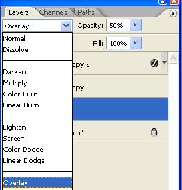
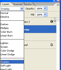
To keep things organized and save screen space, most of Photoshop's panels are grouped in with other related panels. This is known as a panel group, if you didn't already guess that on your own. For example, the Layers, Channels and Paths panels are grouped together by default. To select the panel you want from the group, simply click on the panel's name tab at the top:

All panels come with various options and commands that are specific to that panel. You can access these options by clicking on the panel's menu icon in the top right corner. Unfortunately, it's not the most obvious thing on the screen and many Photoshop users don't even know it's there, but you should click on each panel's menu icon to see what options and commands are available for it:

In the top right corner of the screen is an option that allows us to quickly select from various workspaces, either ones that are built in to Photoshop CS4 or custom workspaces we've created ourselves. Workspaces allow us to set up different panel arrangements, menus and even keyboard shortcuts for different tasks. For example, you may want certain panels open when editing images and other panels open when painting with Photoshop's brushes or when working with type. Workspaces allow us to set up the screen any way we want, save it, and then quickly select it again any time we need it! Photoshop CS4 comes with several built in workspaces. The Essentials workspace is selected by default but you can access the complete list of available workspaces, including any custom ones you've created, by clicking on the word Essentials and selecting a new workspace from the list that appears:

The largest and most obvious interface element in Photoshop is the document window. The document window is where we view our images and where we do all of our editing work:

Document windows in Photoshop do much more though than simply display the image. They also tell us quite a few things about the image. At the top of the document window, you'll find the name of the image, followed by the current zoom level, the color mode, and the current bit depth:

You'll find even more information at the bottom of the document window. In the bottom left corner is the zoom level once again, followed by the current file size of the image, which includes the size with all layers intact and the size if you were to flatten the image. If you click on the right-pointing arrow, then choose Show, you'll see a whole list of details about the image you can view, including the document dimensions, color profile, and even which tool you currently have selected from the Tools panel:

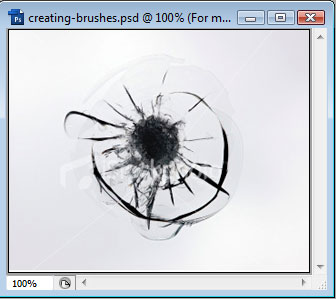
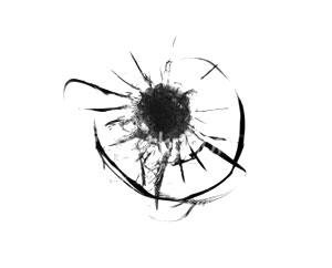
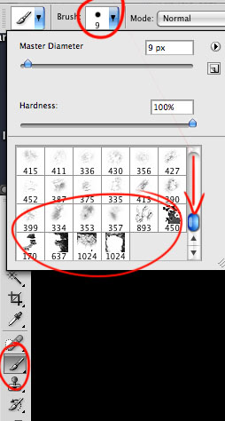
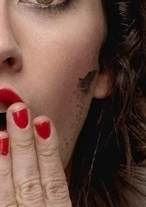
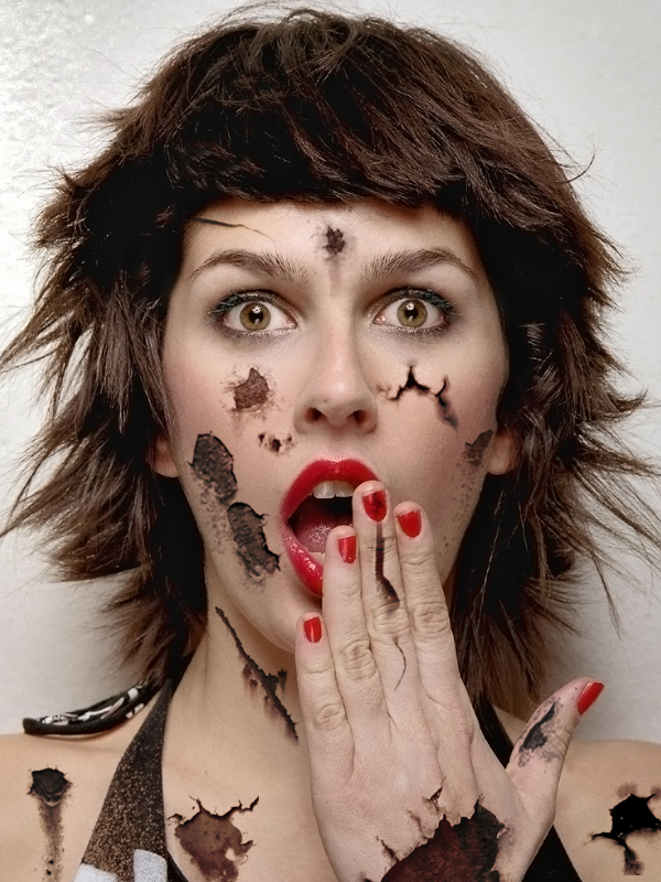
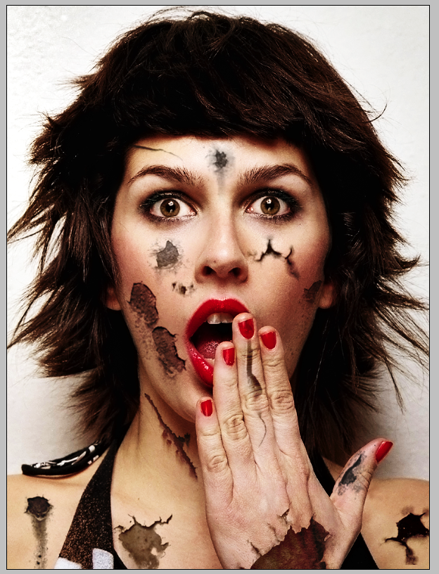
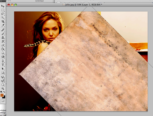
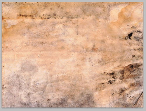
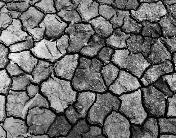
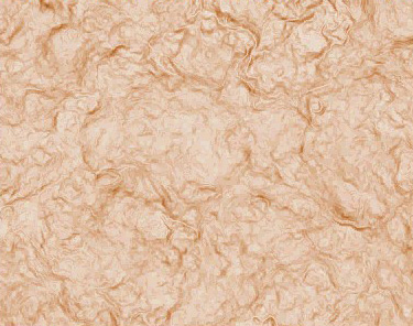
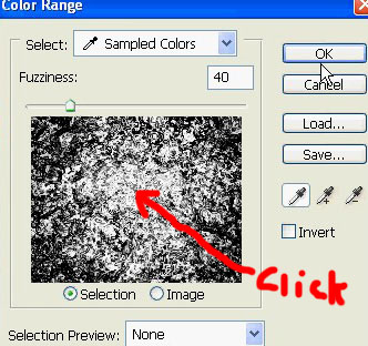
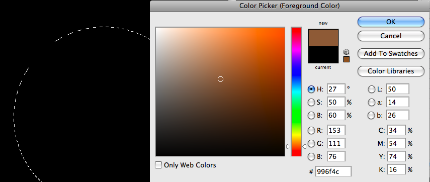
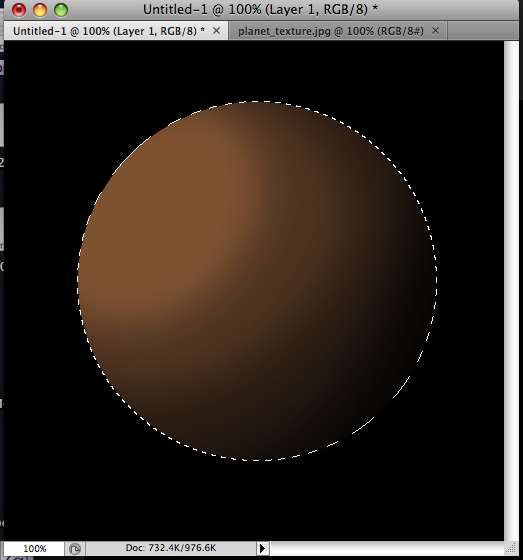
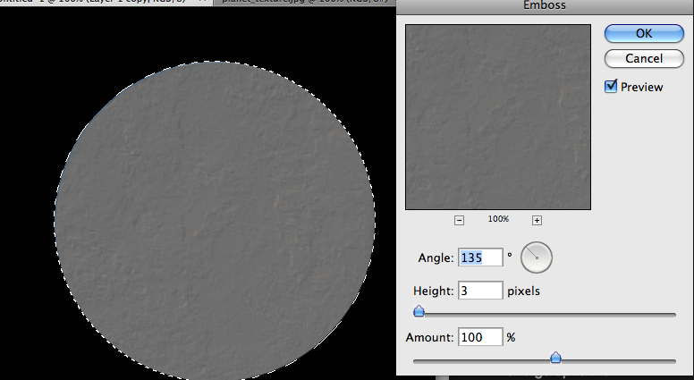
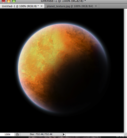
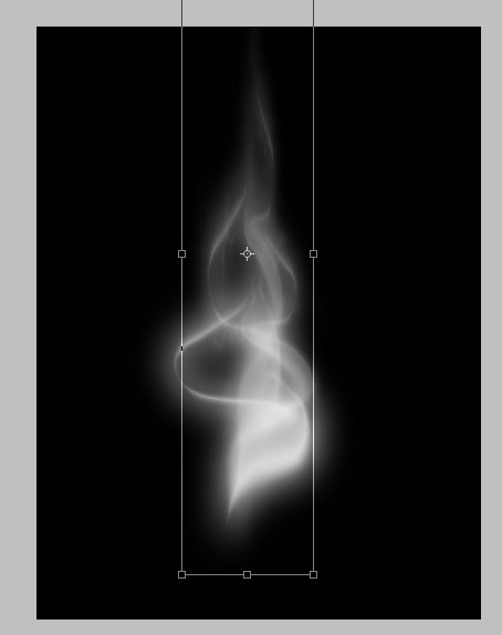
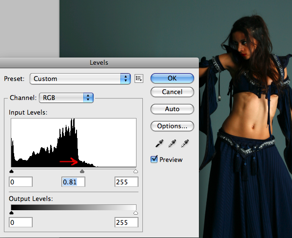
Now the aim here is to create a black and white image, with the correct contrast to make a successful brush. First, goto Image > Adjustments > Desaturate. This will remove all color from the image:
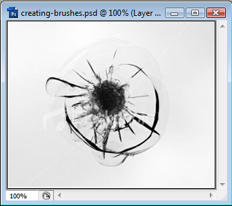
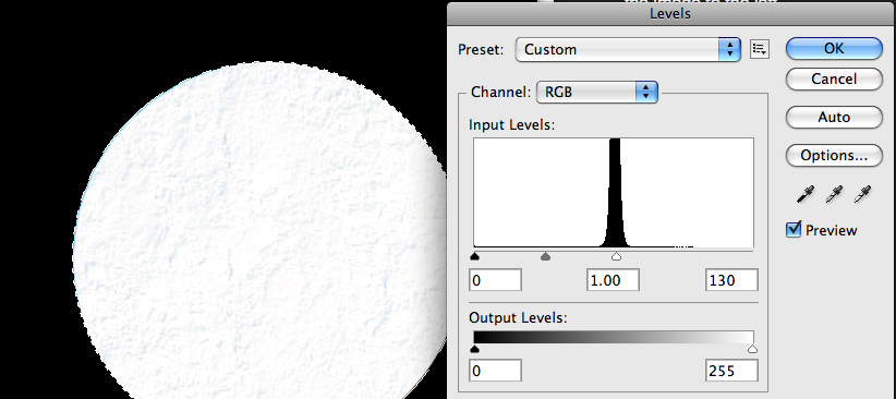
Next, goto Image > Adjustments > Levels, and adjust the slider to get rid of the colored background. We can still leave all the small details like the small cracks.

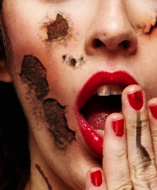
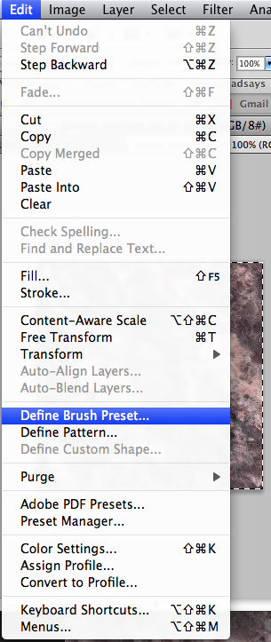
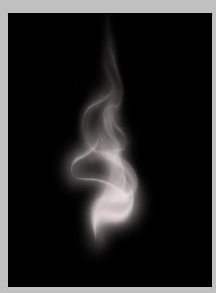
Next, press Ctrl+A or goto Select > All, then goto Edit > Define Brush Preset. This will bring up a box for us to name the brush:

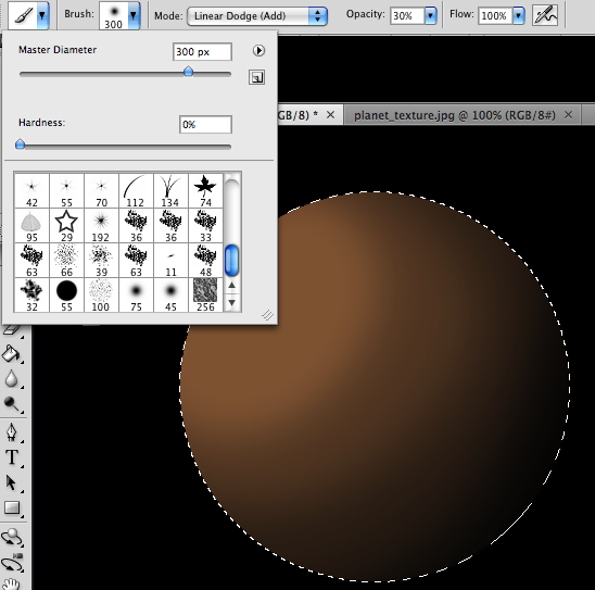
Give it a name and PhotoShop will add the brush to the currently selected brush set. So if you choose the brush tool, and then goto the different brushes by clicking on the drop-down menu at the top, you should see the brush we just added at the bottom of the list.

We will have to make sure we save this brush set if we want to keep our custom brush, because if we do not, our custom brush will be lost when we change brush sets.
To save the brush set, we click on the small arrow (![]() ) at the top-right of the brushes drop-down, and then choose Save Brushes. We will then be prompted for a filename. Once saved, you can load the brush set in the same way as you would any other - from this menu.
) at the top-right of the brushes drop-down, and then choose Save Brushes. We will then be prompted for a filename. Once saved, you can load the brush set in the same way as you would any other - from this menu.
Now to use our brush we simply select it from the list and paint on our canvas !


In this tutorial, we are going to use a Clipping Mask to place an image inside a shape.

In Photoshop, start a new document. Let's begin with a document size of 800 x 600 with a white background. Our goal is to place a picture of aspen trees inside a leaf shape (ultimately you can use any shape or any photo you'd like). To set up a clipping mask, we place the shape below the image. Let's draw the shape first.
Create a new layer (Layer > New Layer). Now, under the rectangle tool, select the Custom Shape Tool. From the Tool Options bar across the top, click on the down arrow next to the Custom Shape. This opens up the Shapes Panel.

Select Custom Shape
To find a leaf shape, click on the Shapes Panel Menu (arrow at top right of panel) and select Nature to see the nature shapes.

Select Nature Shapes
Select a leaf from the Nature Shape panel.

Select Leaf Shape
In the new document window, click and drag with the shape tool to create the leaf shape. Let's rotate this leaf. To do this, select Edit/Free Transform (ctrl-t) and click and drag to the right outside the bounding box area to rotate the leaf to the right.

Draw and Rotate Shape
Now that we have the shape, let's open the image that we want to place inside the shape. After opening the image, move the image into the new document with the move tool (by clicking and dragging on the image) and place the image over the leaf shape.

Place Image over Shape
The layers palette indicates that the image is placed above the shape layer. At this point we cannot see the shape in the new document window since the image is covering up the leaf shape.

Layers Palette

Image Over Shape
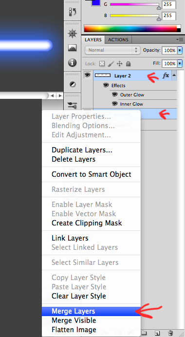
The next step is to create the clipping mask which will place the image inside the leaf shape. To do this, make sure the active layer is the image layer and click on the layers palette menu to select Create Clipping Mask.

Create Clipping Mask
This immediately places the image inside the shape below it:

Image Inside Leaf Shape
The layers palette indicates a clipping mask by moving the image to the right and placing a down arrow to the left of the image:

Repeat the steps above to create a second leaf. The only difference in the second leaf is that the leaf is rotated to the left instead of the right. When completed, the layers palette shows the two clipping masks:

Layers Palette
Our final image looks like this:
In the example below, text is used instead of a shape. When placing images inside text, be sure to use a font that has significant width.

Image Inside Text
Clipping masks are non-destructive. This means we can remove the clipping mask if we change our mind. To remove a clipping mask, select the clipping mask layer (the image layer). From the layers palette menu (click on the three lines at the top right of the layers palette), select Release Clipping Mask. This will remove the clipping mask and the entire image will now be visible.
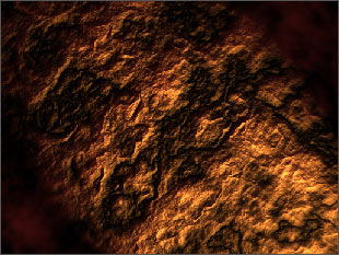
For this project, I used these nice images that suits for the manipulation...
DOWNLOAD Resources.
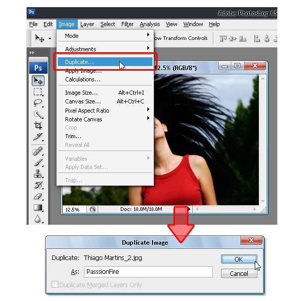
Once the file finishes downloading, extract the images out of the zip file onto your desktop. Let's start with the first image, open and duplicate this image by using the Image > Duplicate command from the menu bar. In the Duplicate Image dialog box, you can name it anything you like, but to follow this tutorial reference, name it "PassionFire" and hit OK. By doing this, we kept the original image. Be sure to save.
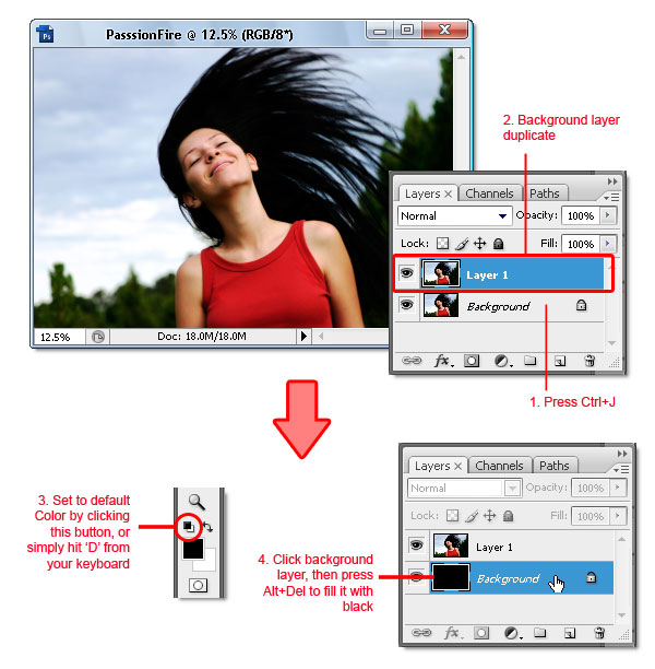
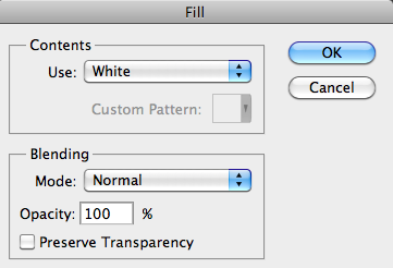
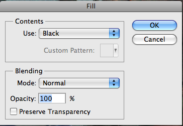
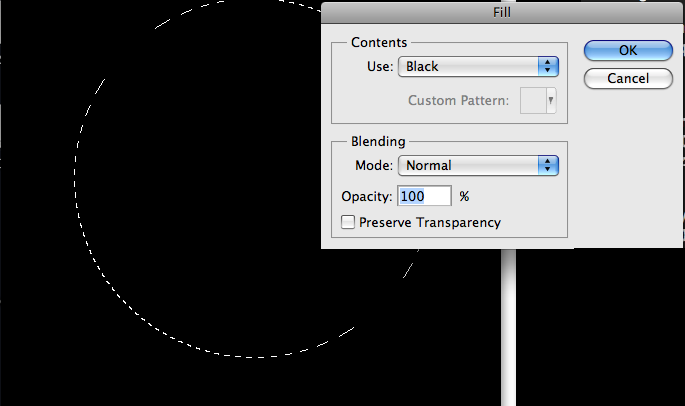
With the "PassionFire" image active, duplicate the "background" layer. Set the foreground and background color to black and white by pressing D on the keyboard. Click the "background" layer again and fill it with the foreground color ~ which is set to black (Edit > Fill...). See the image below.
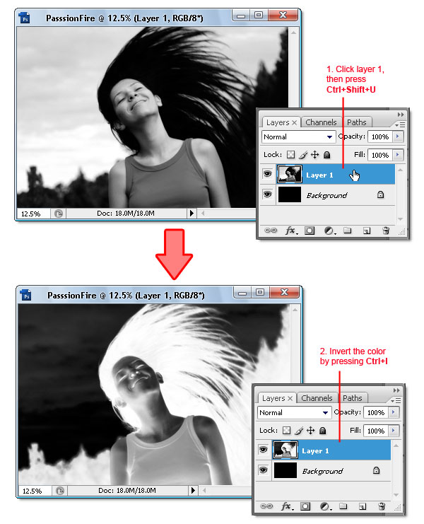
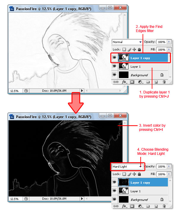
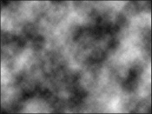
Reactivate "Layer 1," then press Ctrl + Shift + U to apply desaturate command. Now invert the color by pressing Ctrl + i. Your image should look like a film's negative now.
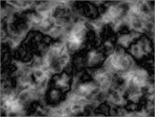
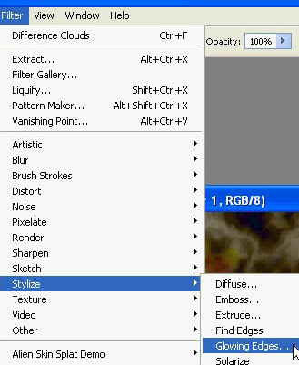
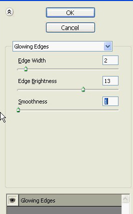
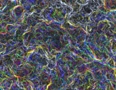
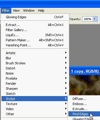
Duplicate "Layer 1," then apply the find edges filter from Filter > Stylized > Find Edges. Next, invert the color by pressing Ctrl + i and change the Blending Mode to Hard light. There, your image now has contrast white line and a very dark background.
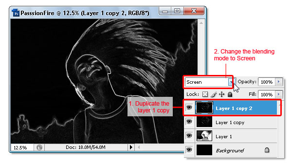
To give the white line more contrast, duplicate the "Layer 1" copy then change the Blending Mode to Screen.
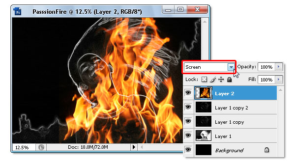
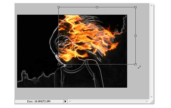
Now we move to the second image. Open "image2", press Ctrl+A and Ctrl+C to select and copy it, and then go to your "PassionFire" image abd press Ctrl+V to paste. If the Paste profile mismatch dialog appears, just click OK to fix it.

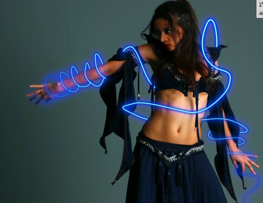
The fire image from "image2" should be in "Layer 2" now. Change its Blending Mode to screen, this will hide all the black colors in "Layer 2." If done right, your image should be similar to the one below.
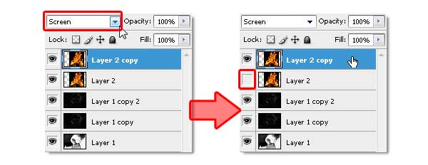
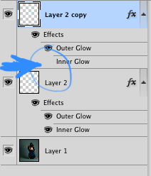
Duplicate "Layer 2" by pressing Ctrl + J. Make sure you use the Screen Blending mode, same as the original "Layer 2." Next, make "Layer 2" become invisible by hiding it from the layers panel.
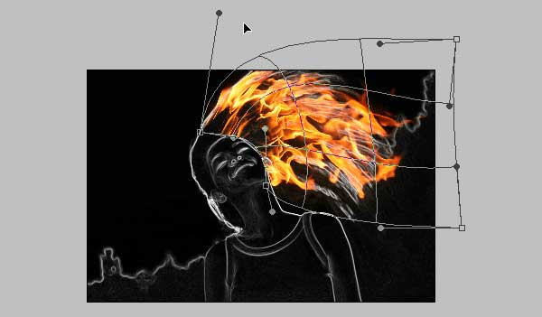
Click the "Layer 2 copy" to make it active, then use the Free Transform command ( Edit > Free Transform) to rotate and resize the fire image like shown below. Don't forget to press Enter when you're done transforming.
Still in the same layer, now use the warp command (Edit > Transform > Warp) to bend the fire image - so it following the hair flow. Press Enter when done. See the example below as a reference.
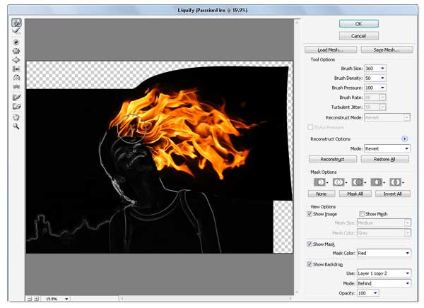
If you feel the result is not quite good enough, simply use the Liquify filter to fix it. I assume you already know how to use the liquify filter; the Forward Warp tool and Twirl Clockwise tool is the only tool I used to get this result (see image below).
Duplicate the "Layer 2" copy, then use the Free Transform command to resize and rotate the fire image in the current layer. Don't forget to reposition the fire image too. Once you get this composition (see image below), hit Enter.
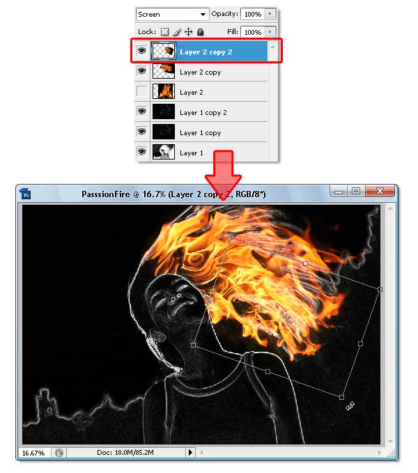
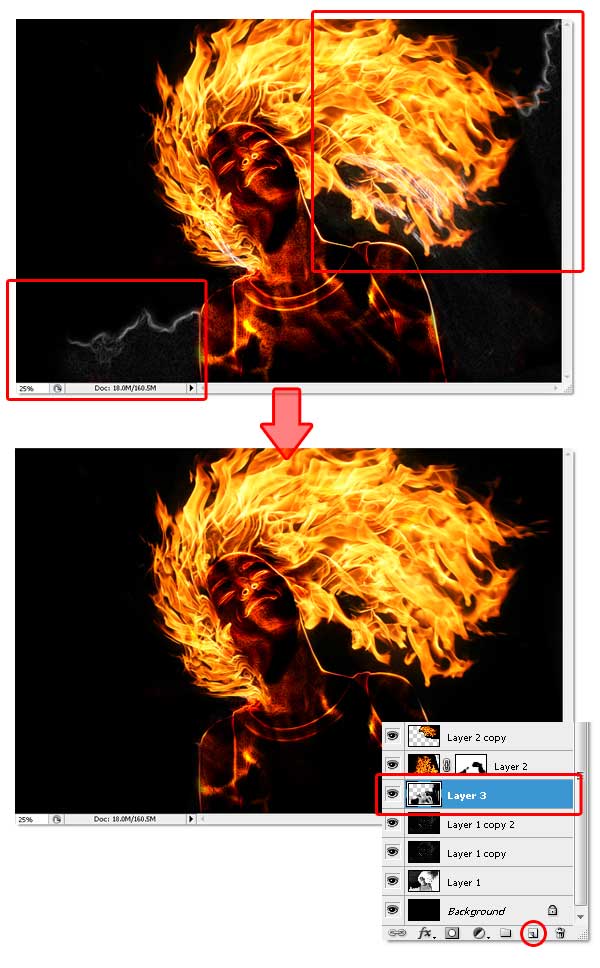
Repeat the previous process to get the hair covered with fire. Just duplicate and modify the layer until you get all the hair part covered. If needed, use the Liquify Filter again. The end result of this process should look like the image below, notice how many layers are used.

Okay, now activate "Layer 2" and make it visible again. Then Change the Blending Mode to Vivid Light. This step will colorize only the white line in the layer below it.

Still in "Layer 2," apply the Free Transform command to resize and rotate the fire image like shown below. The purpose is to cover up the girl's body and hair with the fire texture. Press Enter when you're done transforming.
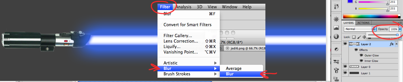
We're gonna blur the fire image in "Layer 2," To do so, apply the Gaussian Blur filter from the Filter > Blur > Gaussian Blur menu. Fill the Radius around 10 to 15 pixels, then click OK when done. Blurring the fire image will cause its texture to blend smoother with the layer below it.

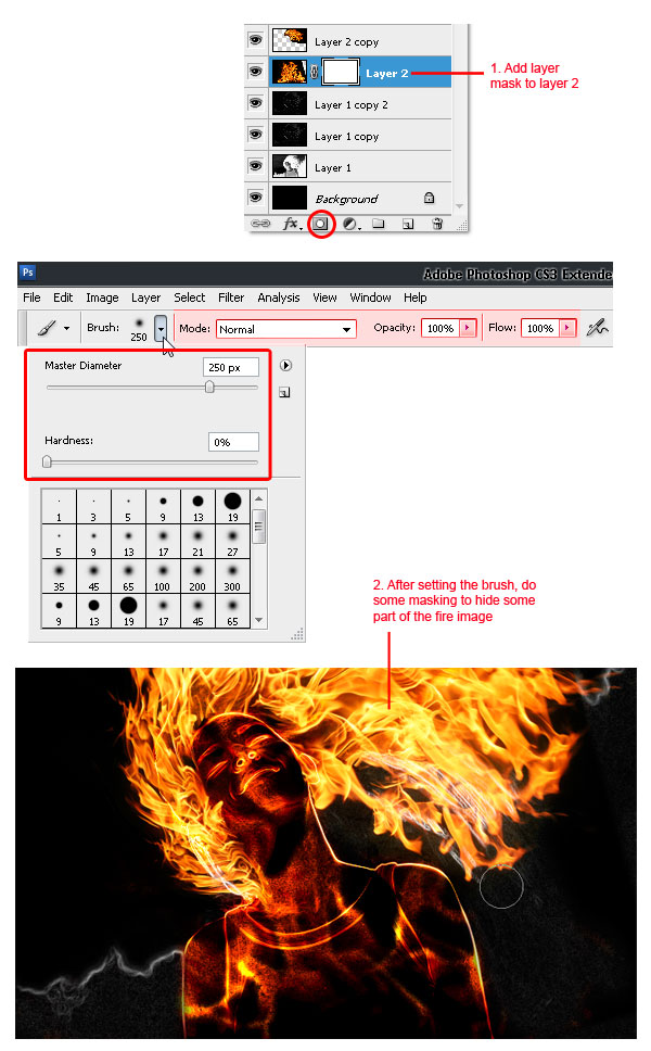
Now add a layer mask to "Layer 2." Then use a soft round Brush tool with Opacity at 100%. Set the brush size according to your need, then just mask until the fire outside becoming hidden. See the process below.
Sure we will remove the white line shown in the image (marked in red rectangle below). First, add a new blank layer below "Layer 2." Then simply paint it with black using the soft round brush tool.
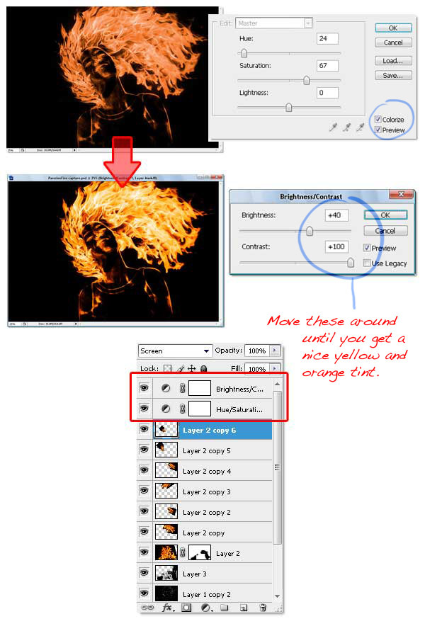
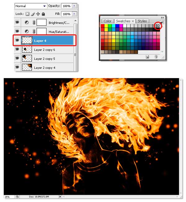
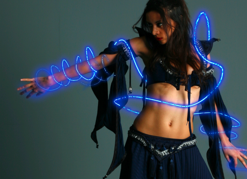
Now go to the top most layer (mine is: "Layer 2 copy 6"), add two adjustment layers which is Hue/Saturation and Brightness/Contrast. Careful not to change the layer adjustment order, or the color effect will be wrong. Below you can see the setting I used to complete this step, also pay attention to the adjustment layer order.
By adding a Hue/Saturation adjustment layer, we unify all colors. The Brightness/Contrast adjustment layer brings more color contrast and makes sure the image color's looks like real fire.
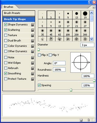
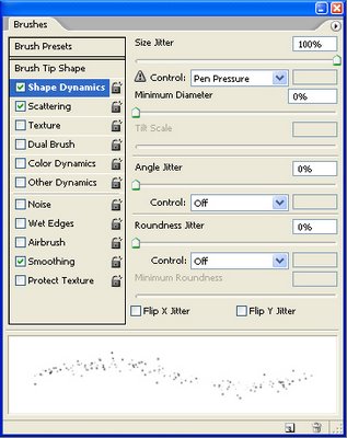
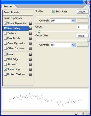
I'm sure you notice the fire sparks effect. I create it using the Brush tool with this simple setting. No special brush needed, but if you have one that will be useful then feel free to use it. Below you can see all the settings I used within the Brush palette, of course you can change the setting as you like. Just make sure the brush spatter enough and vary the size.
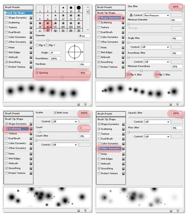
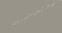
Now to use the modified brush, create a new blank layer below the adjustment layers ( mine is named "Layer 4"). Choose 50% gray from the swatches palette, then you can start creating the fire sparks. Remember not to be monotone, resize the brush size if needed. I start using a big sized brush, then reduce it to smaller size (you can change brush size faster by pressing the bracket keys on the keyboard ).
If you're not sure how to do this steps, just imagine where and how the fire sparks will flow if it was real fire. For me, imagining stuff is very helpful.
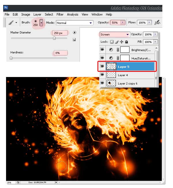
To make it more interesting, create a new layer and change the Blending Mode to Screen. Then use a normal soft round brush (not the one we modified earlier), with an Opacity of 50%. Just click on the body, neck, and hair. I'm not sure how to explain this, but you can see the difference between the above and below images, keep clicking until it starts to look better, to your own discretion.
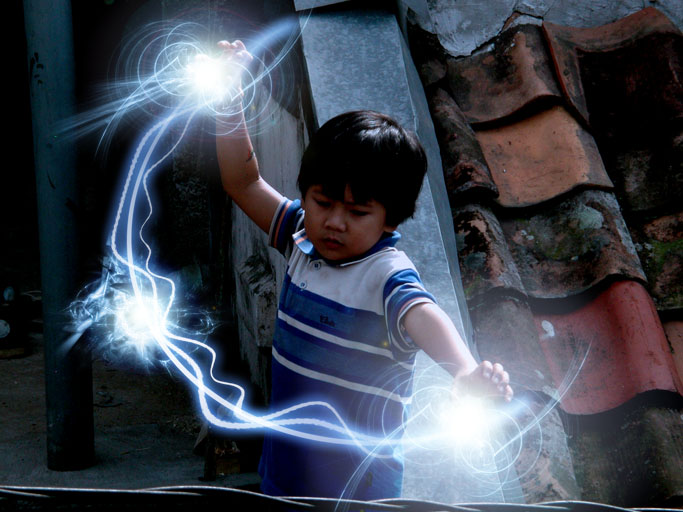
And you're done!

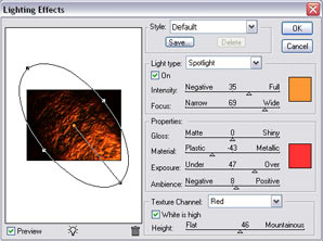

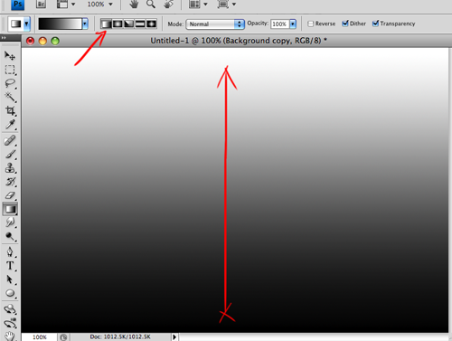
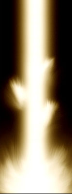
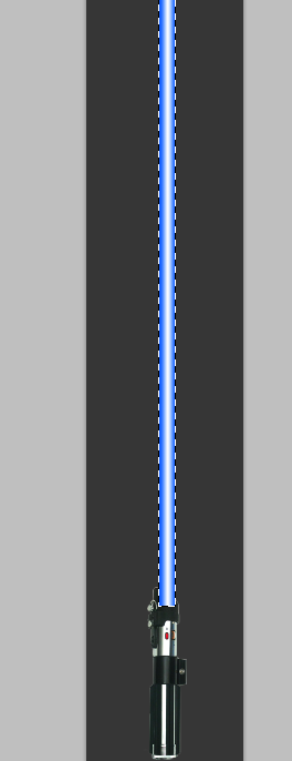
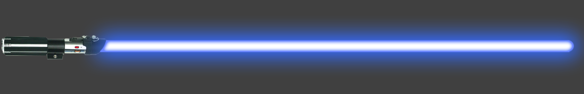
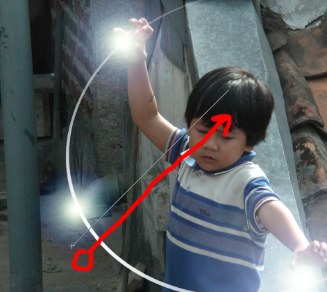
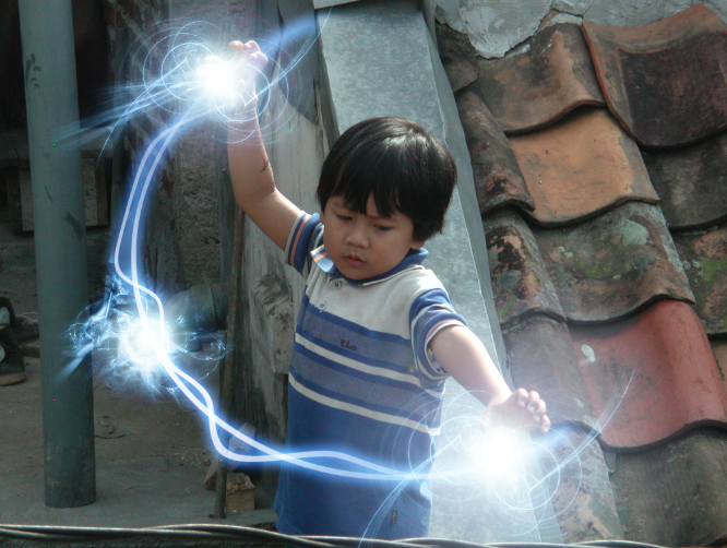
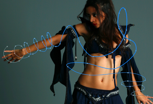
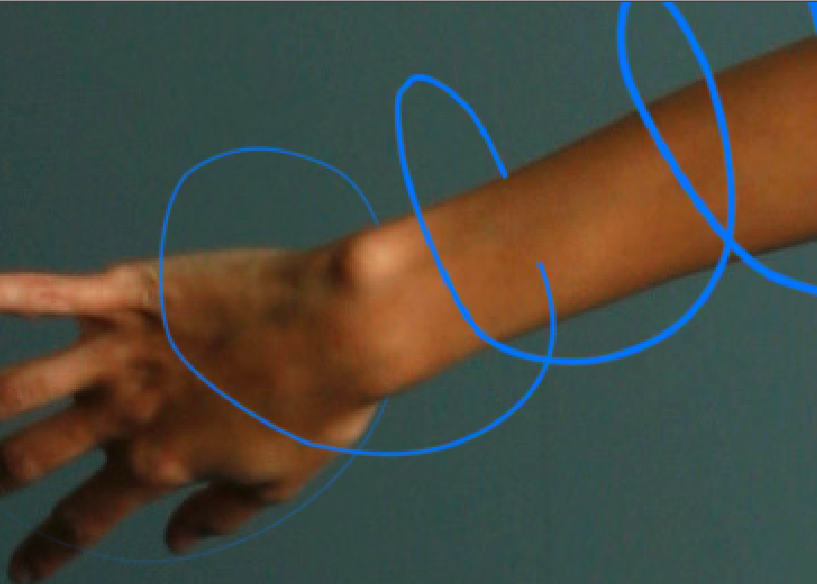
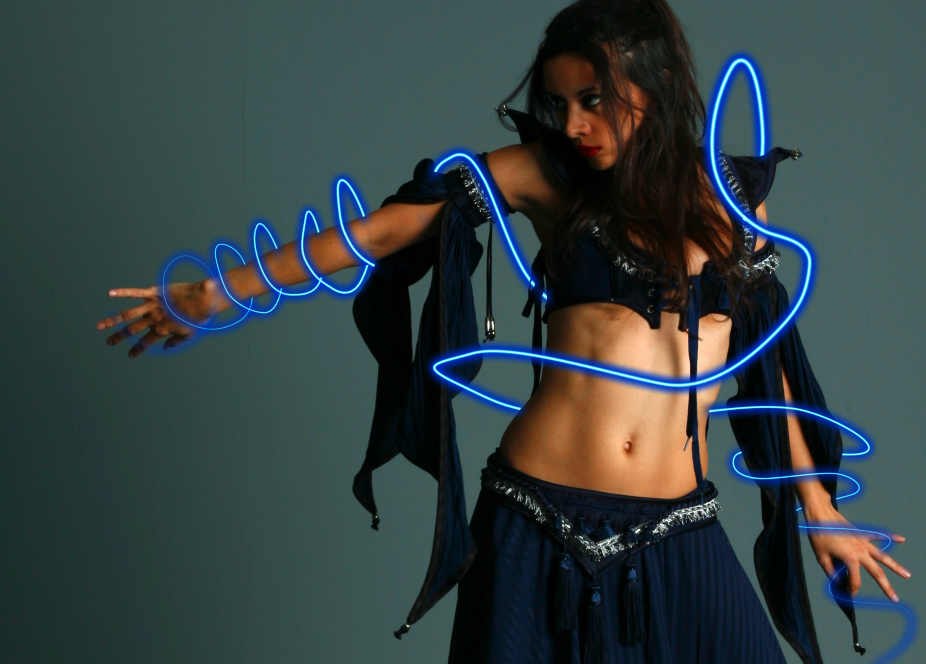
To start creating our energy beam, we first need to open up a brand new canvas. My canvas size is 300px X 800px. Once you have your canvas open, fill it with a black color (#000000). Now that you have your background setup, create a new layer (Ctrl+Shift+N) and take out your brush tool. Set the brush diameter to 100px and set the hardness to about 10%. Draw a vertical line (Hold shift) down your canvas and you should end up with something looking similar to this.
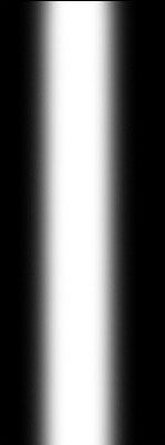
Step 2 - Energy Beam Base
Now we are going to create the base of the energy beam. Select the brush tool again, but this time set your hardness to 0% and set the diameter to 400px. Once you have this larger brush selected, move it to the bottom of your image. Click twice and the base of your image to create a larger spread which will be the base of our energy beam.

Step 3 - Add Some Color
Now I am going to add some color to my energy beam. To do this, go to Layer -> New Adjustment Layer -> Color balance. I went for a nice yellow color and used the following setting (but you can chose ANY colors you wish):
Shadows: -20, -23, -34
Midtones: -31, +26, -11
Highlights: +50, +3, -44
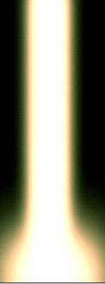
Step 4 - Start Smudging
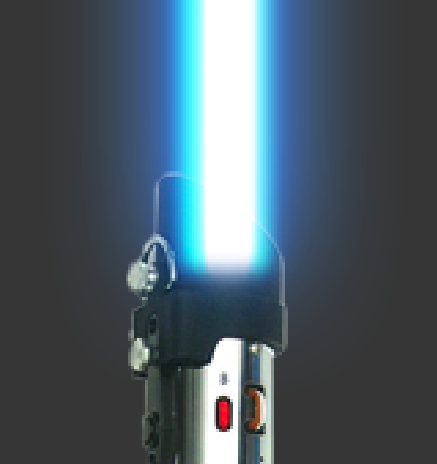
Now we are going to start smudging our image. Select the Smudge Tool, and use the 59px Splatter brush from your brush menu. Click and drag from the bottom up to smudge your energy beam to look as if it is giving off light. Mine looks like this now.
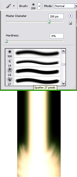
Step 5 - Side Flares
Create another new layer (Ctrl+Shift+N) and take out the 65px soft brush we used to create our vertical beam. On your new layer create three dots on the vertical part of your energy beam, one on the left and two on the right. Now take Smudge Tool and use the 59px splatter brush. Smudge these dots upwards as we did with the base of the energy beam. Your image should now look something like this.
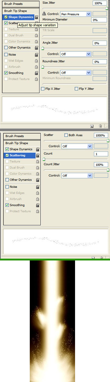
Step 6 - Add Some Spray
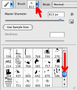
Now we are going to create a sort of energy spray coming off of the energy beam. To start, press F5 to open your brush preset editor. Now select the 2px brush and apply the settings shown in this image. Once you have this new brush set up, take out the Smudge Tool and select the 2px brush we just made. Now smudge the dots and the base layers, and you should have something like this.
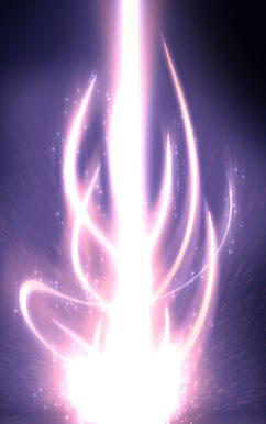
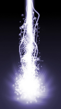
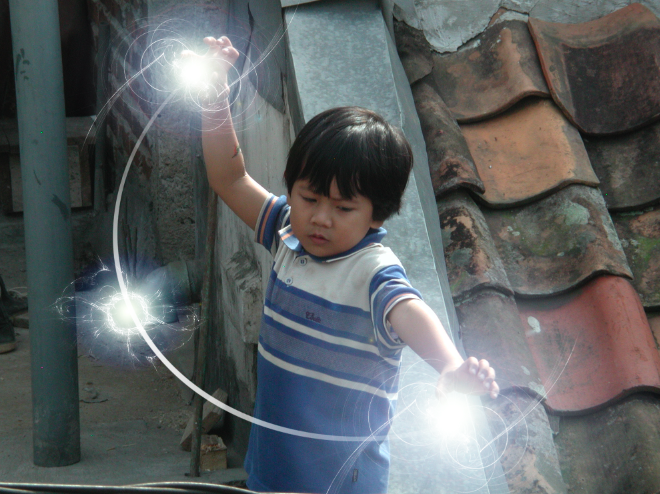
Now using a small Smudge brush with a high Strength setting, you can add streaks coming out from the core, have fun with it, keep smudging, and keep altering the color hues until you're satisfied.
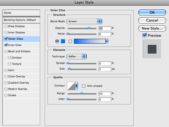
Different color correction, blur/outer glow effects on layers and different smudge settings and brushes can yield different results.

In addition you can go crazy with the Liquify Filter (Filter > Liquify) and choose the top left button (Warp Tool) and then change the settings to increase the Denisty, Pressure, and Rate (on the far right side) then start to smudge some more crazy swirls!
Ok, first step is pretty straight forward. All we are going to do is open Photoshop, and create a new canvas ( File > New ) and I am going to create a canvas 640px wide by 300px high.
We are going to add a background colour, so using the Paint Bucket tool (Shown below) we are going to simply click on the background layer with our selected colour. I am going to use a shade of dark red as my background colour:

Step 2 - Creating our type
We are now going to select the Horizontal Type Tool, which is the big "T" in the tools panel (Circled Below), we could also hit the "T" on our keyboard to select it. This will add an array of options at the top of the screen where you customize your font. I'm going to select the font "Coolvetica" (you can choose any bol and thick font, like arial black or impact), set it to about 172px in size and in the colour white.

Step 3 - Rasterising our type
Now we have our type set up, we are going to make it raster rather than vector (which it is currently in) - Raster means it can't be scaled without pixelisation basically. We do this by going to the layers panel, right clicking on our type layer and clicking " Rasterise Type" from the list.

Step 4 - Erasing the edges
Now we have our raster type on the canvas, we can start it edit its form directly. We need to select the "Eraser tool" from the tools menu ![]() - Eraser or press "E" on our keyboard. Then our tool menu will change at the top of the screen. We need to select the "Oil Pastel Large" brush.
- Eraser or press "E" on our keyboard. Then our tool menu will change at the top of the screen. We need to select the "Oil Pastel Large" brush.

We now need to just erase the edges of our type by clicking on our type layer and erasing around the type itself.

We can change the brush, and get a more varied effect, or even create your own brushes to erase with!

Step 5 - Adding effects
We can just as easily add grunge to the type now, instead of erasing it. So I'm going to select the "Brush Tool" from the tools tab (Or press B on the keyboard) and selecting a rough brush from the list. I'm going to use a variation of brushes from the predefined ones in Photoshop.

We could also look at rotating our type slightly to add a more random effect. We can do this by selecting the transform rotate tool from the menu " Edit > Transform > Rotate" then rotating slightly to add that more random look, hit Enter on your keyboard to apply the transformation
Step 6 - Finalizing your type
Now we have our grunge type, its time to experiment! Now experimentation is the best way you can learn Photoshop, you can play with the tools and filters to really create some masterpieces or monsters! Don't be afraid to experiment, have fun with it. For some spray paint / splatter brushes you can use, download the set here.
Click here to see how to install new brushes.


 Other versions:
Adjustments is a quick and accurate way to edit any picture or image by simply clicking on one of the Adjustment options shown on it.
You will be able to edit the colors, saturation, levels, channels, mix colors, add gradients and whatnot from a single interface. You'll be able to easily change the adjustment settings, hide/show a specific adjustment layer, quickly add clipping masks in order to apply an Adjustment to a single layer or several layers depending on your needs, and much more. The following is a reference guide for any user level, and helps you to better understand this fantastic tool.
First of all, lets see what we are talking about. Open Photoshop and check the Workspace selector at the top-right of the window. You'll see several options, where you can add your very own. A quick way to show the Adjustment tools is by selecting the option Essentials. Another way is just going to Window > Adjustments, either way is fine. You'll see the Adjustment panel then, in the panels area, at the right side of the workspace.

The Adjustment Panel shows two main areas, the first one with three rows of several filter layers, and a second one with several presets for the Adjustment Layers. At the bottom-right there's a button that is used to enable/disable a clipping mask in order to apply the Adjustment only to one layer, or apply it to several layers below when the clipping mask is disabled.

Once you select any of the Adjustments, you'll see the Settings options on the panel, you can enlarge the panel if that works better for you. Besides you can easily toggle the visibility of the Adjustment, reset the default settings or even discard the Adjustment Layer.
To add another Adjustment layer click on the arrow at the bottom left of the panel, that will take you to the list, if you want to go back to the current Adjustment Click on the arrow pointing backwards. Well, that's enough with the panel itself, let's try the power of the Adjustment Layers.

The first in line is the Brightness and Contrast adjustment. This is one of the simplest adjustments and yet very powerful. You can add it by clicking on the Brightness and Contrast icon on the Adjustments Panel.
You can simply edit the tonal range of an image in a very smart way. See the examples below, just move the sliders to adjust your desired settings. If you check the Use Legacy box, Photoshop will only increase/decrease each pixel's brightness value, that's why it isn't recommended.

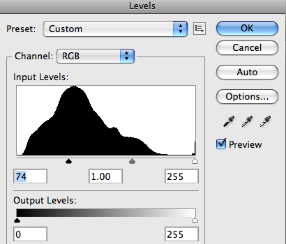
Who doesn't know about Levels? One of the most used Adjustments in Photoshop. You will be able to easily adjust the color and tonal range by dragging three sliders: one for the dark tones, another for the midtones (gamma) and the last for the highlights.
To add a Levels Adjustment just click on the Levels icon in the Adjustments Panel and edit the settings as you wish. You can always go back to the Default values as shown in image 2.1 below. Or even customize your desired settings by dragging the sliders, 2.2 shows a dark enhancement dragging the dark slider to the right and 2.3 shows how to highlight the image by dragging the white slider to the left. 2.4 and 2.5 show how to increase/decrease the levels of Black and White.
At 2.6 you can see several presets of the Levels adjustment, you can choose any of them and modify it later, 2.7 shows an example of Increase Contrast. Finally you can edit the levels of each channel (Red, Blue, Green) separately, 2.8 shows a dark enhancement of the Red Channel. Besides, you can always click on the Auto button for an automatic correction.

In both Levels and Curves adjustments there are three little eyedroppers. They are pretty useful to neutralize some colors in the histogram, by electing any of them and clicking anywhere on your image you'll be setting a black, gray or white point respectively to auto adjust the colors.
In the images below you can see how the black point is set by clicking on a dark gray area of the image (a), since the clicked zone isn't 100% black the image turns a little bit darker. Then by setting the gray point I'm clicking somewhere over a window (b) that will neutralize the window color for midtones, as the window is a little bit blue, Photoshop will neutralize the blue tone on the entire image making it more red/yellow/orange. Finally, by setting the white point somewhere over a highlighted wall (c), the image turns a little bit brighter. Is a good practice to start with the neutral gray eyedropper.

Curves adjustments is a must-know filter for any Photoshop user. It basically lets you adjust points throughout the tonal range of an image (from shadows to highlights) you can adjust as many point as you want (with Levels you can only adjust three).
To add a Curves adjustment, just click on the icon on the adjustment panel. The first thing you'll see is a line, because the tonal range is represented as a straight diagonal baseline, as shown in the image 3.1 below. The horizontal axis represents the input levels and the vertical the output levels.
Then you'll need to add some points to the curve and play with them (3.2). As shows the image 3.3 below you can select only one of the color Channels by choosing it form the select list above the curves graphic. When you're editing a single channel the points above the baseline increase the intensity of the color, and the points below the baseline make the color a little bit gray, or less intense.
Besides you can easily use the eyedroppers to set the black, gray and white points respectively (images 3.4 to 3.6) this process will modify the baseline for each color. Anyway you can always click the Auto button to make your job easier but less accurate.

The fourth filter on the list is Exposure, add it by clicking over the icon on the Adjustments Panel. This is a pretty simple filter actually, basically it allows you to adjust the exposure levels by adjusting three sliders, Exposure, Offset and Gamma (4.1).
Exposure will adjust the highlights of the image without effecting the dark shadows. Offset will adjust the midtones and Gamma will adjust the dark tones without modify the highlights. This filter is pretty useful when you're editing or even creating HDR pictures.

The Vibrance Adjustment is an easy way to edit the color saturation. Add it by clicking on the Vibrance icon on the Adjustment Panel. This adjustment increases the saturation of less-saturated colors more than the colors that are already saturated. This filter is really useful when you're editing skin colors.

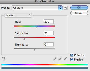
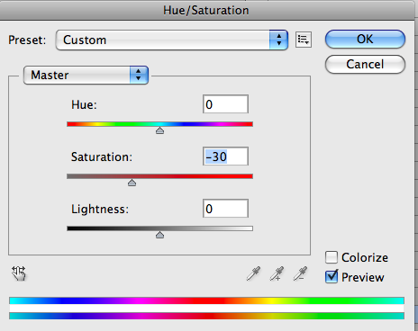
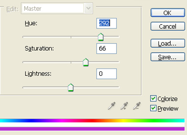
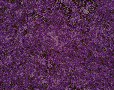
Another must-know Adjustment, Hue/Saturation lets you adjust the hue, saturation, and lightness of a specific range of colors in an image or simultaneously adjust all the colors on it. Add it by clicking on the Hue/Saturation icon on the Adjustments Panel.
To adjust all the colors at the same time select Master on the color list and then move any of the three sliders. The Hue slider changes the color itself (6.2). The Saturation slider modifies the amount of the color, less saturated color means a more gray image (6.3, 6.4). The Lightness slider adjusts the amount of black/white of the image (6.5, 6.6).
The image 6.8 below shows the colors list, which means that you can edit only one color channel and adjust the hue/saturation/lightness values only for that channel (6.8). Finally there's a check box named Colorize, check it if you want to colorize a grayscale image. For full color images I recommend the Photo Filter Adjustment, that we'll see shortly.

You'll notice there are three eyedroppers below the sliders in the Hue/Saturation panel. To make them work you must select a color channel first, the Yellow channel in the following example. Use the first eyedropper (a) to select a base color range, e.g. somewhere over the sand, then play with the sliders. Following select the next eyedropper to Add a color range to the editable range (b).
Finally, you'll notice in the following example that the girl's skin tone became almost red because of the adjustments. In order to fix it select the last eyedropper to delete or remove a color from the editable range of the face skin tone on the example. The final result is at the bottom of the image below (d). Useful isn't it?

The seventh on the list is the Color Balance adjustment. Add this filter by clicking on its icon in the Adjustment Panel. This adjustment changes the overall mixture of colors in an image for generalized color correction. It basically adds something like a tint over the Shadows, Midtones and Highlights of the image.
By default the filter shows the Midtone colors' mix in 0 (See image 7.1 below) you can move the sliders to paint the midtones. I painted the midtones a little bit yellow (7.2). Do the same with the Shadows and Highlights, as shown in the images 7.3 and 7.4 of the example. I've painted the shadows red and the highlights a little bit blue.

Maybe one of my favorites, the Black & White adjustment allows you to create quick and beautiful grayscale images. Add this filter by clicking on the B/W icon on the Adjustments Panel. This filter allows you to maintain full control over how individual colors are converted.
Select the Default mode to create an automatic black and white image, or chose one of the many presets. Click on the auto Button to automate the adjustment. Besides you can mark the Tint checkbox and colorize the grayscale image.

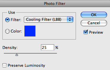
This Adjustment is just like if you put a color filter in front of the camera lens. Add it by clicking on the Photo filter icon in the Adjustment Panel. The are are several presets based on standards (see 9.1 below), increase/decrease the filter's density to adjust the color intensity. Image 9.2 shows a warming filter by using an orange tone, and 9.3 shows a cooling filter by using a blue tone. You can easily customize a color filter by selecting the color radio button and selecting a color from Photoshop's color picker.

This Adjustment makes it easy to create high quality tinted or grayscale images. Add it by clicking the Channel Mixer icon in the Adjustments Panel. On the Adjustment Panel, select an Output channel as shown in the image 10.1 below. You'll see the slider associated to the selected channel is 100%, then you can modify the color values by using the sliders (see 10.2).
You can work with other channels as well, for example on the image 10.3 the Blue channel is selected. There's a color enhancement over the image's blue areas (like the sky), as shows images 10.4 and 10.6 below. You can click over the Monochrome checkbox to edit the channels in grayscale mode. This is very useful to create advanced grayscale images, or apply a custom tint to an output channel or choose any of the several grayscale presets (10.5).

This is the simplest adjustment ever, but yet so useful. Click on the Invert icon in the Adjustments Panel and you'll see the image's colors inverted (like a negative).

Posterize is a rapid way to adjust the number of tonal levels. Add this Adjustment by clicking on the Posterize icon in the Adjustments Panel. The Posterize works this way, you chose a Levels' value, e.g. 5 (see the image 12.1 below) that means the image will have 15 colors, 5 for red, 5 for green and 5 for blue. The higher the levels, the better the better quality the image.

This adjustment converts any picture into a two color (black and white) image. Add this adjustment by clicking on its icon in the Adjustments Panel. How it works? You specify a Threshold Level, all the pixels darker than that level will turn into black and all the pixels lighter into white.

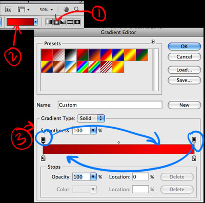
The Gradient Map adjustment maps the grayscale range of an image to the colors of a custom gradient fill. To add it click on the Gradient map icon in the Adjustment Panel.
The way this adjustment works is really simple, one of the sides of the gradient replaces the dark areas of the image, the other side replaces the highlights, and all the middle tones of the gradient replaces the midtones of the original image, just as examples 14.1 and 14.2 show below. Click the Dither checkbox to add random noise in order to make the gradient smooth. Click on the Reverse checkbox to invert the colors of the gradient (14.3).

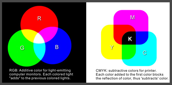
With this adjustment you can modify the amount of a primary color selectively without affecting the other primary colors. This filter works extremely well on CMYK images, but it works on RGB as well. Add it by clicking on the Selective Color icon in the Adjustments Panel.
As you can see on image 15.1 below, there are fields to select the channel. Adjust the CMYK colors percentage and select Relative or Absolute adjustment, for example on image 15.3 the Cyan color is selected and I increased its amount of Black in order to make the sky darker. That looks fine because the Absolute option is selected. The Absolute value adds the exact percentage to the color channel. The Relative option, as shown in image 15.4 is less dramatic since it changes the existing amount of the CMYK colors by its percentage of the total.

Obviously this is only the the tip of the iceberg of the unlimited power of this panel. Since each Adjustment Layer has all the properties of a Layer in Photoshop, you can change its Blending Mode, Opacity, Mask it, or even combine several Adjustment Layers to create outstanding results.
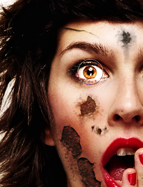
Now that you know the power of Adjustment Layers, download
this image.
And play around with the settings to increase the vibrance, levels, contrast, color saturation, etc. You can even use the sponge tool...
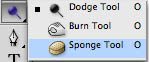 to accentuate the lips and eyes, do whatever you'd like to enhance the photo.
As an additional option you can to learn the method shown
here, it's about other filters that help in enhancing and sharpening photos.
The final product could look something like this:

Using layer styles is a great way to get some nice looking effects with text. This tutorial will show you two simple ways you can use layer styles as well as some other simple steps to spice up your text or logo. Here's a logo for a design firm, you can type up any name or title you wish.

Lets create a document, any size will work. I'm using 620px x 300px. Now lets pick a dark red and use the paint bucket to fill in the background.

Now create a new layer with ctrl + shift + n and let's get a lighter red color.

Now we are going to create a gradient. Click on the gradient tool and make sure you are using a the radial setting.
Edit the gradient and reverse the colors, then you'll be able to create the circular gradient.
Create a small gradient in the middle of the document. Now using Ctrl + t, we are going to stretch the gradient out past the document and move it up, as shown below. This will be the background for our image.

Now lets put in some text. For this I'm using ITC Franklin Gothic Heavy (Arial Black or Impact will do nicely too), all caps. I've found that a bold font with all caps will work best for this type of project. Use your foreground color as the color for the text.

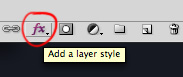
Lets go into our layer styles and choose Drop Shadow.
Change the settings to something like they are below. If you have a different sized document your settings are going to be different, if so, adjust so it looks like the image below.

Now go into the layer styles again and this time we are going to go into the Stroke options. Set your stroke options up like below. If your text font and size is much different then this Denis Design sample then just keep adjusting until it looks like the image below.

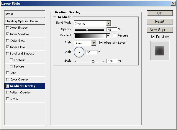
Finally go back into your layer styles and change your gradient overlay and bevel and emboss to the settings below, adjusting for different document sizes.

Now lets give the text a shadow on the ground in front of it. First create a new layer, now get your square marquee tool, click and drag a box in front of the text and fill it with black.

Now go to filter>blur>Gaussian blur. Change your settings like I have them. If you have a different sized document, make it look like I have below.

Stretch the blurred box you just made so it goes past the text both the sides and move it up some.

This is how your text should look. Now lets move on to the next.

Repeat steps 1a-3a

Lets create some text, the font I'm using is Museo Sans 500, but you can use any sans serif font like Helvetica, Arial Bold, , or anything like that. Grab a yellow-orange color for the font.

Go into your layer styles and lets go to the bevel and emboss settings. Create a bevel with thses settings.

Now go into the gradient overlay settings of the layer styles. Choose these settings.

Finally go into the drop shadow settings of the layer styles and change your settings to something like I have below.

You should end up with something like this.


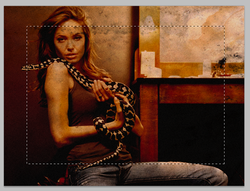
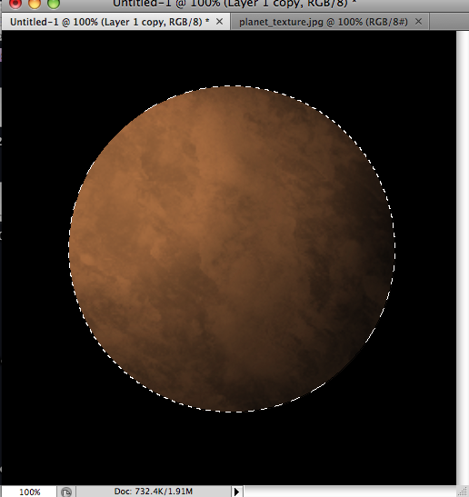
I'll be working on the 2nd image. Based on that image, start a new document 800x800, or whatever size you want, you can crop it later.
Now open up the mud image, do a CTRL+A to select all, then press CTRL+C to copy, then go to the new document you just created and press CTRL+V to paste the image.
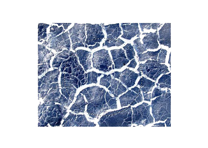 Click to view larger image
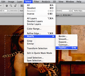
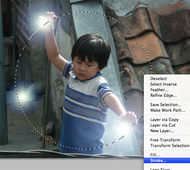
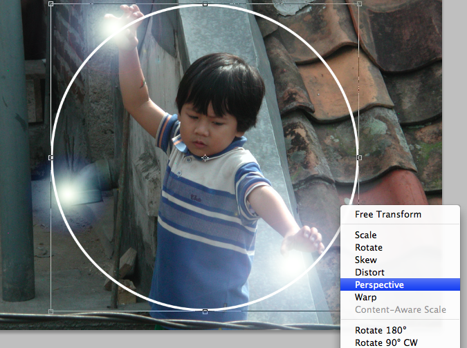
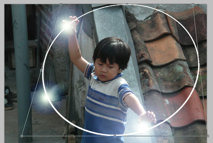
 Now go to Select->Inverse,
Then hit Delete so you are left with a circle from the mud image.
DO NOT DESELECT YET.

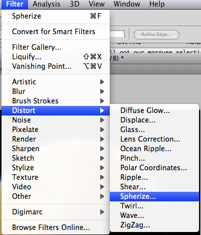
Now go to Filter->Distort->Spherize. Set amount to 100%. Then do it again, this time, 50%. You can now deselect.
Now lets fill the background layer (the layer underneath the mud layer) with black.
Then go to Layer->Flatten Image
Now go to Filter->Sharpen->unsharp Mask.
Amount: 500%. Radius: 1.7px. Threshold: 122 levels


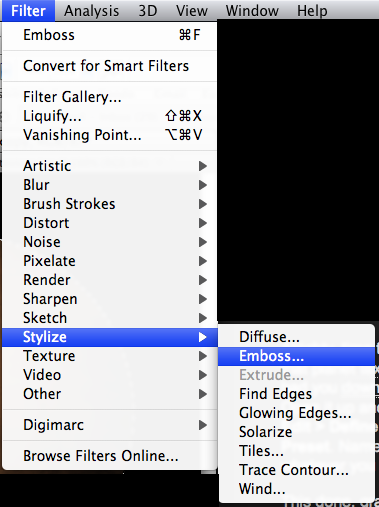
Apply: Filter->Stylize->Wind
Method: Wind. Direction: From the right. Hit CTRL+F to re-apply.

Go to: Image->Rotate Canvas->90CCW.
Finally, apply Filter->Distort->Polar Coordinates.
Options: Rectangular to Polar.


Open Photoshop and create a new document. Dimensions: 1920x1200. After that select the background layer, duplicate the layer, select the duplicated layer and go to Layer>Layer Style>Grandient Overlay. Use #150b06 and # 321c0f for the gradient colors, Radial for Style and Normal for Blend Mode.

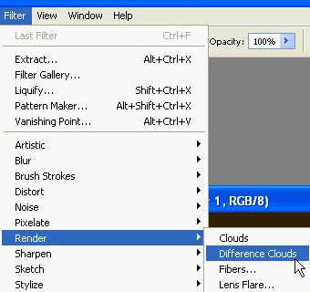
Create a new layer and go to Filter>Render>Clouds. Make sure that the colors were black and white for the foreground an background.

Change the Blend Mode of the Clouds layer to Color Dodge.

Select the Eraser Tool (E). Use a regular brush. Change the Hardness to 0% and use a big size. Now erase some areas, just leave the center like the image bellow.

Place the logo and align it in the center of the document.
If you'd like, you can grab ANY logo from the internet (preferably a black and white one), and isolate the logo for the purposes of this assignment, here's a tip on how to dog out the logo from the image: Extraction Methods.
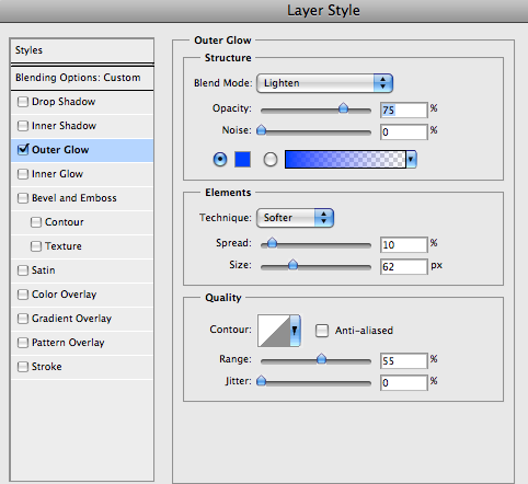
Once you've placed your logo, go to Layer>Layer Styles>Outer Glow. Use #fffde2 for the color, Color Dodge for the Blend Mode, 80% opacity, 18% for the Spread and 18 pixels for the Size. That will create a nice glowing logo.

Find some photos of fire sparks... or you can download the image I used here.

Cut an area of the image and paste it in your document. Rotate and resize it (Ctrl+t) to fit with the symbol. After that change the Layer's Blend Mode to Screen.

Now go to Image>Adjustments>Levels. Increase the black and a bit of the white of the image. That's necessary to match the colors of the image with the backgournd.

Go to Edit>Transform>Scale, reduce the size of the streaks. Then go to Edit>Transform>Warp. Move the grid to make the streaks follow the symbol.

Go to Image>Adjustments>Hue and Saturation. Increase the Saturation and the Hue. Reduce the Lightness.

Duplicate the sparks layer. Go to Edit>Transform>Flip Vertical. Then resize it and adjust the position like the image below.

Copy another art of the original Photo and paste it in your document. Repeat the steps 8, 9, and 10.

Repeat again the Steps 8,9, and 10 to create a tail to the symbol, like the image below.

Now lets create some stars, I have explained this in other tutorials so I won't spent too much time again. Basically just create a new layer and fill it with black. Make sure you have black and white for the background and foreground colors. Then go to Filter>Noise>Add Noise. Use Gaussian for, 15% Amount, and Monochromatic. Then change the layer's Blend Mode to Screen, then ZOOM in to 100% and go to Image>Adjustments>Levels. Increase the black and white levels until you get nice stars. Then you can just repeat the same steps again in this same layer, ZOOM out when you're done.


We need to start by making a new document in Photoshop. For this tutorial you should use the resolution that fits your screen - in this case 1680 x 1050. Bring some rulers onto your canvas in the center.
Select some appropriate colors then drag a radial gradient in the middle of your document.
Forget how to make custom gradients? Go here.
Colors used here were #3d3b3c and #0e0d11.
Time to add a little detail to the background. Find and copy onto your canvas a nice, grungy texture. For this you can use paper, stone, abstract or whatever! A good place to start is CG Textures.
Or just start with a texture of some metal scratches like this. Choose one and copy it into your canvas, resize it then mess with the layer mode and opacity/fill. I tried Color Dodge with a fill of 30%.

Get another texture, this time you can use something random. Again mess with the layer mode and opacity, use whatever comes out nice & to your liking.

(rusty metal texture added)
Time to get a nice bat logo for our wallpaper.
If you want, feel free to grab this version batman logo used for this tutorial: Download Batman Logo PSD. (Tip: There's two other logos in this file, you choose any one of them).
![]()
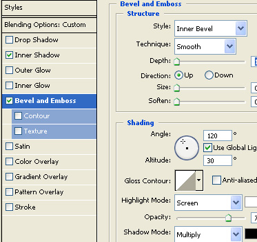
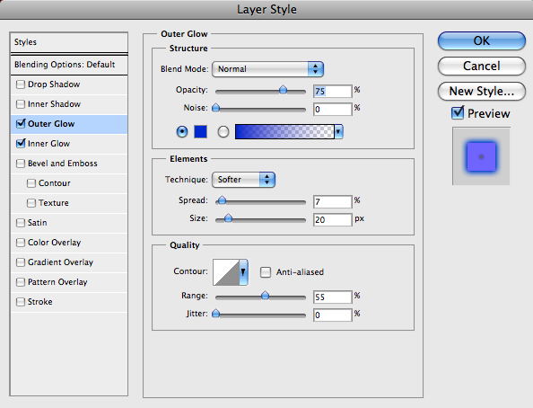
Now we want to make our bat logo (or whatever logo you wish to use) a bit more interesting. Let's try to come up with a decent metal effect. Let's start by lightning of the the logo a bit with - Image > Adjustments > Levels. Now, head into the blending options for your logo layer and apply the following TWO layer styles:

Remember: depending on what size document and logo you're working with, you may need to tweak those settings. Once you're done, you have a basic beveled effect:
![]()
OK, not looking so great... yet!
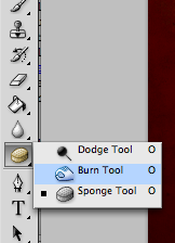
Create a new layer (layer > new > layer) then merge this layer together with your logo layer, this will apply the layer styles to the pixels so we can start afresh. Find and get out the Burn Tool, set the settings to low (Midtones, 30%) and do a little bit of burning on the inside of the logo.

Now, using the Dodge Tool with moderate settings (Highlights, 35%) do a little bit of dodge-work on the edges/corners of your logo.

Get out the Burn Tool again, using the same settings as before, darken the middle area of your logo a little more.

Now it's time for some more layer styles:
Again, depending on what sizes you're working with here, you may need to alter the inner shadow/inner glow settings.

Not bad now! As done before, create a new layer then merge it with the layer applied with the layer styles. After this, darken up your logo a little more using the levels feature (ctrl+i).

OK, we're done for that part, but we want to add a little more metal to the logo (next step).
Again, check out your texture resources and find some nice, rusty metal textures. To start with I used a 'galvanized' metal texture.
Copy your texture to the canvas, resize it then crop it to the bat logo pixels (using a layer mask).

Now, time to mess with some layer modes. For the first galvanized metal texture layer I used Color Dodge with 40% fill, then I duplicated this layer and changed the layer mode to Overlay and left the fill opacity intact.

Not really noticeable, hey? Anyway, to finish off I added one more texture on top, with a large rusty bit at the top:

For this layer I used Linear Burn and 27% fill.

(click for larger version)
OK, to finish off with the bat logo I think we should add a shadow and also one of those cool light rays in the background. For the shadow, simply apply an Outer Glow layer style to the main layer.

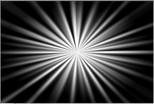
For the 'cool light ray' effect I was talking about, get one of your original bat logo layers (with one solid color) and apply Filter > Blur > Radial Blur with similar settings to these:

Now we have a cool blur like this:

I think a good idea for a better effect would be to make the shape slightly bigger before apply radial blur, so it stands out on the sides a little bit more. Anyway, after you're done with the radial blur, change the layer mode to Color Dodge and lower the fill if you think it necessary.

So, as you can see, on the left we have the final bat logo on top of the light ray in the background, and on the right is the final light ray with the layer mode changed.
You should keep adding your own stuff to the outcome though, as you'll always come across a better effect.
One idea is to create another light ray effect and place it on top of all the other layers, use a layer mode such as Overlay and erase away some of the inner area.

(additional light ray effect on the right, as explained above)
If you want a much darker outcome, you should continue adding textures on top of the whole document (not just the shape or the background, but the whole thing) and continue playing with layer modes, fills, layer masks, etc.
Don't forget the old trusty but crusty brushes either! Adding a dab of some destressd or textured brushed here and there can add a lot, ie: this set of splatter brushes, or even this set of grunge brushes..

(add some text, add more textures, more adjustment layers, etc.)
Now you're done.
Extract this set of 84 awesome brushes, it's a big file so start downloading now!
Open Photoshop and create a new document, Dimensions: 1920x1200 pixels.
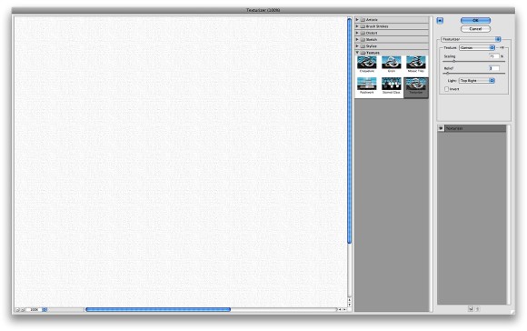
Add a new layer, fill it with white then make sure you have black and white for the foreground and background colors. Then go to Filter>Texture>Texturizer. Use Canvas for the Texture, 75% for the Scaling, 3 for the Relief and for the Light choose Top Right. Click OK.
Go up to Layer > Merge Visible
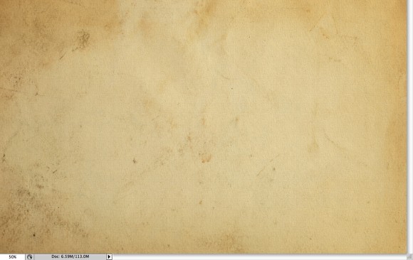
Let's add a nice texture. You can use the image of your choice it could be parchment paper for example. If you'd like, you can download a stained paper image from here.
Place the image in the document on top of the other layers. After that, change the Opacity to 75%. Go up to Layer > Merge Visible
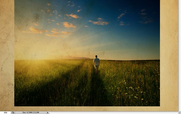
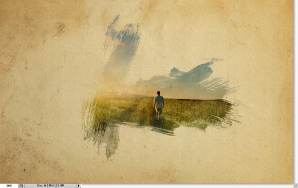
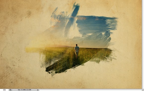
Now let's place an image in our document. I'm using a photo of a guy walking in the field found from GoogleImages. You can use any photo you'd like, one you've taken yourself or anything you can grab from online that works well for this sort of effect.
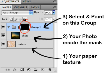
The image has to go above the texture layer. With your photo layer still selected, go to Layer>Group Layer. The layer of the image will be inside a folder in the Layer Palette. Select the folder and go to Layer>Layer Mask>Hide all.
The image is hiding because of the mask. So now, let's use some Watercolor Brushes. Install the brushes you downloaded earlier.If it's still downloading, then wait until it's done, then unzip and extract the files... while you're still waiting, you shoudl check out this awesome cartoon: TISM
So select one of the watercolor brushes and them white for the color and paint on the layer mask of the "Group 1". You will notice that the image will start showing.
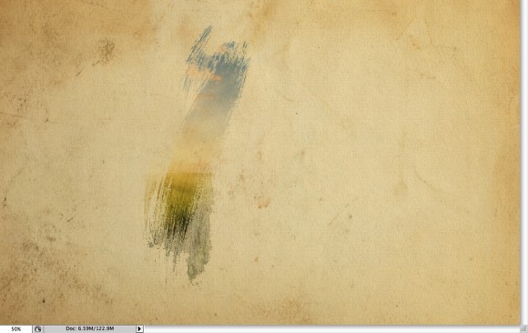
Pick another Brush and paint again.
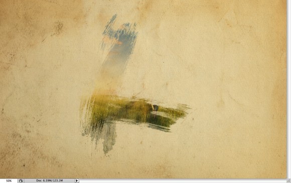
Keep painting untill you can see the image without losing the brush splatters.
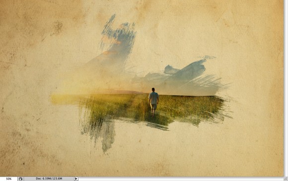
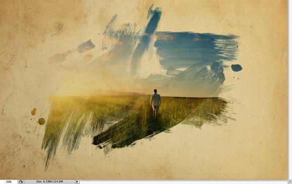
Now add another layer, this time beneath the Folder that the image is in. Then again using the watercolor brushes paint over the layer using colors like: pink, blue and yellow. Use the image below for reference.

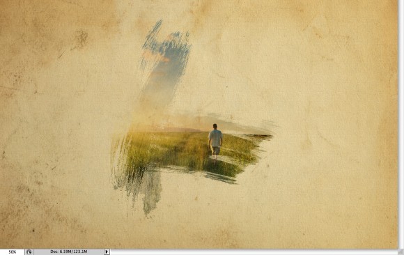
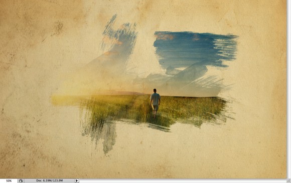
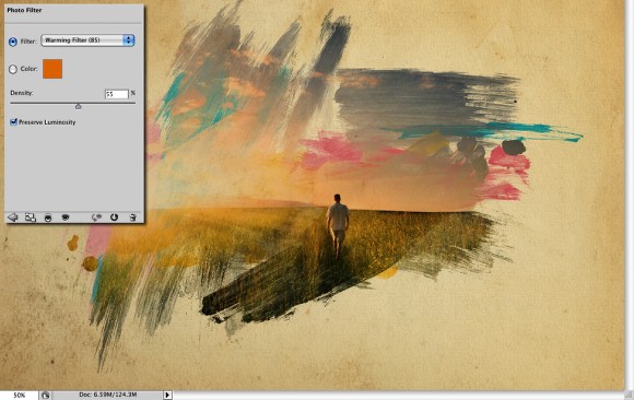
Let's just adjust the color of the image. Select the image and go to Image>Adjustment>Photo Filter. Select Warming Filter (85) and 55% for the Density. Also select the Preserve Luminosity option.
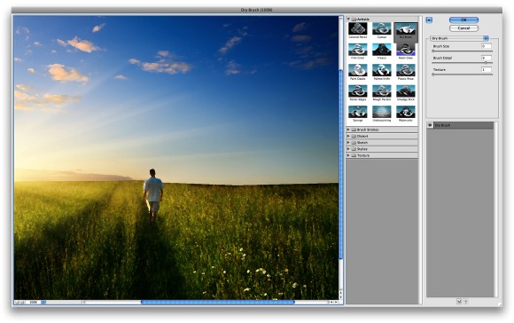
Select the photo image and go to Filter>Artistic>Dry Brush. Use 0 for the Brush Size, 9 for the Brush Detail and 1 for the Texture.
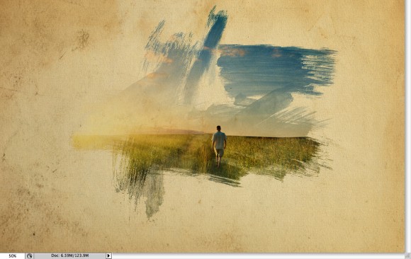
Just place your logo, graphic, or photo and that's it. You will have a cool effect and super simple to accomplish and redo. Use it for website headers to create a nice painted style, and, of course to create posters. Also you can reduce the opacity of the paper texture. I reduced it to 50% (then added a white colored layer underneath of it), that way we can drive the viewer's attention to the watercolor effect.
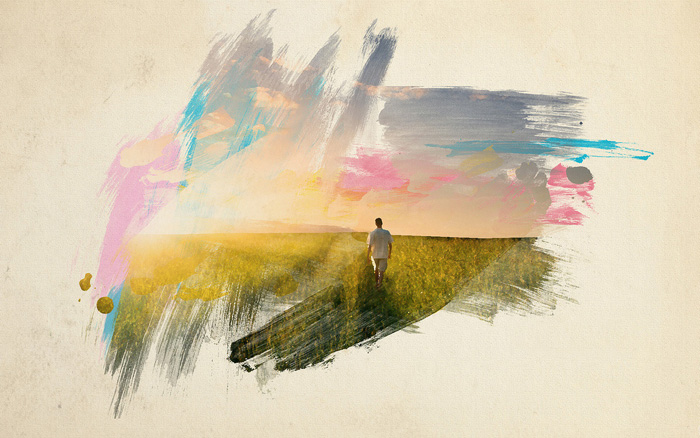
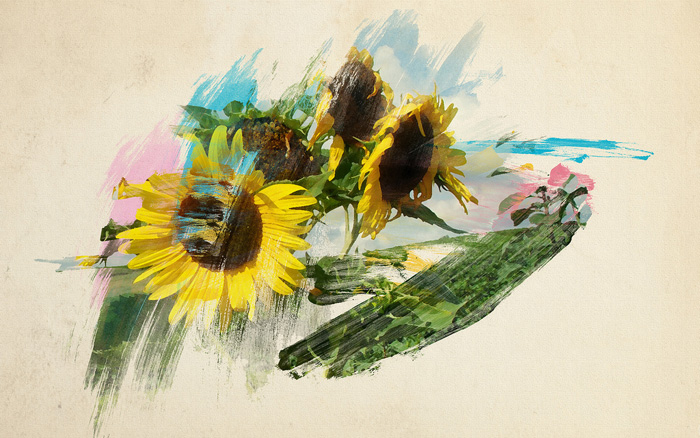
You can swap different images as well, like the one below.


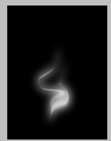
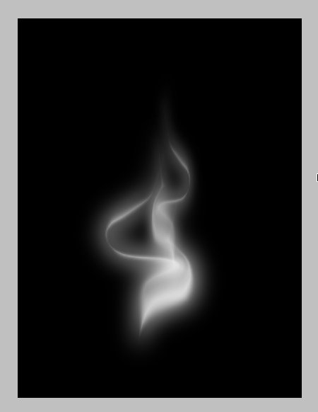
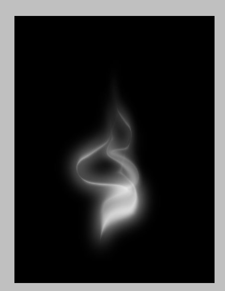
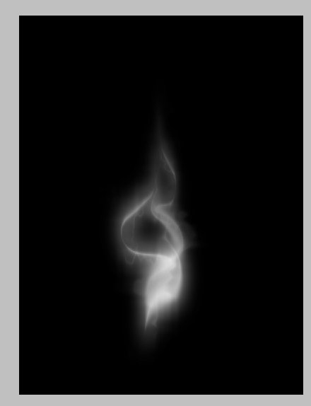
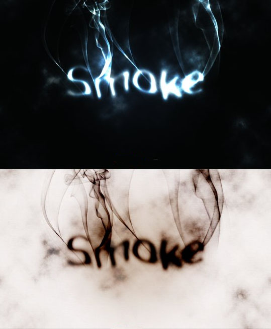
In this tutorial I will show you how to create a smoke typography effect playing with some brushes and adjustment layers. It's a fairly straight-forward tutorial, have fun with it and don't be afraid to put your own twist on it as you go.
Open Photoshop and create a new document, I used 1920x1200 pixels. Then apply a gradient, you could fill it with a gradient or apply a Layer Style (same effect either way). I used the layer style here, Gradient Overlay.
Use Radial for the Style and #07090a - #202b35 for the colors. This will create a very subtle blue circular gradient for the background.

Add some text in white. Make it big, but not too big, leave some room for the smoke to come later.
Right click on the text layer and choose Rasterize.
Then go to Filter>Blur>Motion Blur. Use 90 degrees for the Angle, and 40 pixels for the Distance.

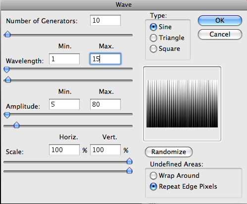
Now go to Filter>Distort>Wave. use 3 for the Number of Generators, 10 and 346 for the Wavelength, and 5 and 35 for the Amplitude.

Go to Filter>Blur>Gaussian Blur. Use 10 pixels for the Radius.
Then change the layer's Blend Mode to Color Dodge.
Now duplicate this layer, then change the layer's Blend Mode to Overlay.
Press Ctrl+u to modify the color tint > Click on the Colorize box.
Change the settings to Hue: 220, Saturation: 50, Lightness: -50
You will get a nice light effect.

Make sure you have black and white for the background and foreground colors, create a new layer on top of the others and go to Filter>Render>Clouds, then change the Blend Mode to Color Dodge and go to Layer>Layer Mask>Reveal All. With a very soft brush, 0% hardness and black color, hide some areas of the clouds layer. Use the image below for reference.

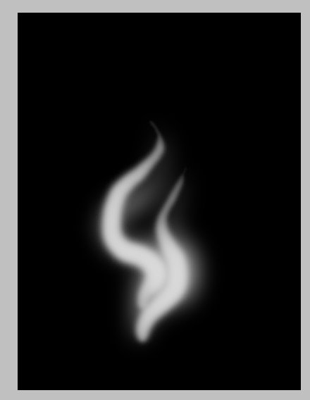
Create a new Folder on the Layers' Palette. Change the folder's Blend Mode to Color Dodge and add a new layer in it. Now download, install, and pick a Smoke Brush from this batch . Select white for your foreground color and paint over some letters. If you think the brush is not bright enough, just click twice (without moving the cursor).

Paint a few more smoke fumes from various brushes to look something like the image below.

Create a new layer beneath the other layers but in front of the Background layer. Fill this layer with black and go to Filter>Texture>Texturizer. Use 100% for the Scaling and 4 for the Relief. Use these settings - Texture: Canvas and Light: Top. That will add a nice texture to the image but you will need to change the layer's opacity to 10%.

Go to Layer > Merge Visible. Then go to Layer>New Adjustment Layer>Invert. You will get a very nice effect, like burning paper. If you prefer the previous version, that's cool, just Ctrl+Z to undo, either one works well.

First grab this house image and open it up in Photoshop. Now we want to duplicate the house twice, so push CTL+J twice. We are going to do this so we have the original just in case we make a mistake.
Take the top layer and go to filter>other>high pass and change to 8px. Change that layer's blend mode to overlay.

Click on the second layer (the house photo) and do CTRL+U to open up the hue/saturation. Drop the saturation all the way down to -100.

Now we want to go in and burn the bottom of the image and the sides where the trees are, so that when we bring it into our final document it will blend with the black.
The reason why we are burning it instead of using a black gradient is because the gradient would flatten the photo out.

Using CTRL+L, open up the levels and adjust them as I have below.

Link the top two layers and merge them together.

Since this is a movie poster we are going to set it up as if we were going to print it. I am going to make a 6.5 x 10 in poster (this works best because of the size of the photo) with a dpi of 300 and CMYK for the color.
Fill the document with black.

Bring the house into our new document.

Now we are going to create a cloud brush to blend the edges of the house photo. Create a new document 1000x1000px (72dpi). Using the circular marquee tool, create a circle with a feather of 75px. Go to filter>render clouds.
Using CTRL+A to select the entire document then go to edit>define brush preset.

Go back to the poster document and take the brush that we just made and use it to paint on the edge of the house photos until the edges are gone, changing the opacity between 20 and 50% to get a smooth transition.

I want to give the house a little more contrast, so using control + L, open up the layers and adjust like so for the house layer.

To get the bottom part of the poster you can go to this movie's home page (http://thelasthouseontheleft.com/) and scroll down to the bottom and save the logo images at the bottom.
Open each of these logos, Select the entire image and copy it (Ctrl+A and CTRL+C) and go to your assignment and paste each one into it. Re-position with the Arrow tool.

Using any font youd like, type out the tagline at the bottom of the poster above the credits. "If bad people hurt someone you love, how far would you go to hurt them back?", or make up your own.

Now using the same font, create the headline. "The Last House on the Left"

You can go and download this blood/ink brush to add the subtle splatter on the title. Use red (foreground color) on the red letters and use white on the white letters. You can also change it to black and paint a few spots to give it a grungy-er look.

Go to filter>noise>add noise and change the setting to 15. That's it, you're done. Be sure to play around with it, us a different title, maybe a different photo. Good luck!

"The Polar Panorama Effect" takes a panoramic (or landscape) photo and uses the Polar Coordinates filter of Photoshop CS to create a circular image that seems to wrap the panorama around a planet.


Looks cool, and it's easy to do! Let's get started.
When selecting a photo to start with you should keep the following things in mind:
We're going to go through two examples: the first uses a simple panorama, the second a landscape shot that we'll crop before proceeding.
It's simplest to work with a 360 degree panorama, so let's start with this panorama shot of San Francisco taken from the Coit Tower:

 The first thing we need to do is prepare the image for the Polar filter. We do this by stretching the height of the image so that the image is a perfect square.
Select Image>Image Size from the menus. Uncheck 'Constrain Proporties' and set the "height" to the same value as your "width". Next, rotate the image 180 degrees. (Image>Rotate Canvas>180)
You should end up with something like the image to the right.
 Next, we'll apply the Polar Filter to wrap our image into a sphere.
Choose Filter > Distort > Polar Coordinates from the menus and in the resulting dialog box, select the "Rectangular to Polar" setting.
(If you're using The Gimp the command is Filters > Distorts > Polar Coords.)
As you can see we're 90% of the way there!:

Easy cheesy, right? Now for some finishing touches...
The rest is just a little digital darkroom work: Rotate the planet to your liking, adjust the contrast and colors, clean up the sky and the edges where the left and right border of the image came together. (The clone stamp and healing brush may be handy here.) That's it, we're done!

Planets work best when created using panoramas, but for this second example we'll use the following landscape photo of San Girgio Maggiore Island in Venice. Islands are especially well-suited for planetization because the left and right edges of the images are easy to match up-you only have to make sure the horizon is level.

Because we're not starting with a 360 degree panorama, we'll need to do some extra work before we can follow the steps above.
First we've gotta crop and straighten the image to make the horizon absolutely horizontal. Using the cropping tool of PhotoShop we can do both in one step:
First, we must ensure that our crop selection is parallel to the horizon. Choose the crop tool and select a flat rectangular area of the photo. Move the cursor just outside of an edge of the selected area so that the cursor changes to two arrows pointing left and up. Click the mouse button and you can rotate the cropped area.
By moving the top border of your selection to the horizon of the photo you can inspect the rotation closely. Move and rotate the crop selection until the top border and your horizon are parallel, but don't crop your photo yet.

Now we want to make sure the left and the right borders of the image fit together. Look for areas on the right and the left where the buildings have the same height:

Move the right and left borders of your selection so that the edges will match up. Finally, adjust the top and bottom of your selection so your waterline is roughly in the middle of the cropped photo:

Double-click your image to commit the crop and you're ready for the transformation! Just follow steps 1-3 as in the example above.
Here's the final result:


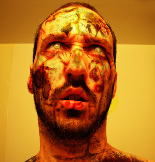
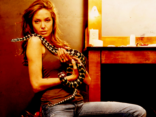
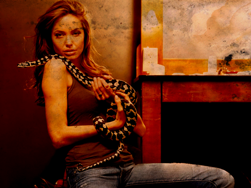
The image we are going to create is of a man with a textured face. The images I used for this were grabbed online. You will need to download them both (or you can find your own to use) Stone Texture - Download Open up the picture you want to add a texture to. On the layer above the image add the texture image (the stone texture). With the texture layer selected, change the layer blending mode to Hard Light. Add a mask to the texture layer. Use the mask so that the texture only affects the subject where needed. In this case, that would be the head and neck. The texture is currently a bit strong so I reduced the layers opacity to 44%. Look at the image and decide what parts of the subject dont need the texture. For this image I decided that the eyes, eye brows and lips don���t need any texture. Paint these areas in black on the mask. I also decided that the very short hair on the top of the head only needed a hint of the texture showing. To do this I changed the brushes opacity to about 30% and then lightly went over the mask in black till it was faint enough to look right. Now that the texture is in the right place its time to sort out the colouring of the image. First i want to get rid of all the extra yellow on the face. To do this use a Photo Filter adjustment layer on the face picture. Selected deep blue and a Density of about 76%. Next I wanted to get rid of all the excess texture lurking in the shadow area of the image. You will want hints of it there, but most of it is not needed. Select your texture layers mask. Using a large soft black brush at about 30%, slowly hide the texture in the shadows till it blends in smoothly. I now want to make my texture grey scale. This is for 2 reasons. Firstly the colours are interfering with the face. Secondly it will help give the colder, stoney look that I want for this image. To do this create a Hue/Saturation adjustment layer above the texture layer. Make sure it only effects that layer by linking them (hold down alt and click between the texture layer and the adjustment layer so the adjustment layer indents). Then move the saturation slider all the way to the left. I also increased the lightness slightly. The image is now too red. Add a new Hue/Saturation layer above the face image. Select the Reds channel. Adjust the sliders till you get the look your after. In this case I wanted a fairly pale but natural tone. To finish of the texture I want certain parts of it to be more prominent, such as the cracks on the forehead. To do this duplicate the texture layer. Then make sure both textures are linked to the Hue/Saturation layer so they look as they do in the image below (Alt click between the 2 texture layers and then the top texture layer and the adjustment layer). Then use the mask on the copy of the texture layer to hide all but the cracks on the forehead and any other parts you want to stand out more. The final touches I did were: - Sharpened the main image layer With this fairly basic method of adding textures you can create much more complex image. You dont always have to use Hard Light either. Try soft light, Overlay and any of the other modes to get the effect you want. The best way to get the look you want is trial and error. Load these custom Tree Brushes and Tree Brushes 2. Now choose #ff0000 as our Foreground color and type some text with the Horizontal Type Tool (T) using the settings shown below and choose a very very bold font to type out the text with. I'm using a red color just to create some contrast with the black background and the white effects that will come next.
Now double-click on the Layer thumbnail (or go to Layer > Layer Style > Stroke...) and choose #ff0000 for the color and set the Stroke at 15 pixels. This way we're making the text more rounded and fatty to avoid rough edges. Create a New Layer by clicking Ctrl + Shift + N, then pick the Brush Tool (B), right-click with your mouse and finally load the new sets of Brushes by clicking on the little black arrow (look below). After choosing Load Brushes... browse to your Presets folder and then to the Brushes folder to load the Brushes. Load the two sets we previously downloaded, as we're going to need some variety to create the ice effect. Before beginning the work with Brushes, let's see how to modify the Angle of the Brush selected because it's essential for the next steps. Press F5 to open the Brushes Window: using the Angle option you can rotate the Brush you're using. Allow the Smoothing option for a softer Brush. Now click near the red area of the letters, everything which happens outside of that area is not important, and we can erase it later. Use your creativity to make something which should look like cracks in the ice - you have a lot of Brushes available to work with. The Angle and Size settings allow you to set and rotate the Brushes; uncheck the Spacing box to have more control when you're painting the ice cracks. For every letter create a new Layer hiding the one you've already made, so it's easier to look at what's happening in the red area. Always give a name to layers, as it's easier to keep them organized. During the making of the ice effect it's important to use more linear Brushes to create the main shape of the letters and some bigger ones for the deeper cracks. Convert the "ICE" Layer (the red one) into a Smart Object (Right-click > Convert to Smart Object). Then Ctrl-click on this Layer's thumbnail to select it completely and apply a Layer Mask to the other Layers. Create a New Layer, call it "extra" and with a tree brush draw some extra ice into the red letters using the settings below (F5). Use the Brushes near the borders to make it look more three-dimensional. Help yourself by selecting the three letters so you can paint directly where you need to. Now go to the Blending Options of every ice layer (the white ones) and apply the settings shown below. These features are very useful also to colorize layers. We'll use a very light blue color (#c9eaf1) in the Outer Glow options to create some halo around the letters and inside to make it look frozen. Using the Inner Glow option we'll create a glow effect. Apply a value around 10% of noise to make it look more crispy. Select the "I" letter of the "ICE" layer, then go to Select > Modify > Contract... > 25 pixels. Then click OK. Create a new layer ("Layer 1") and press Alt + Delete to fill the selected area; use full black (#000000). Then Deselect and go to Filter > Blur >> Gaussian Blur... 15 pixels. Do the same for the other letters applying always the same Blur. Name these black Layers with "black E, C, I" and set their Opacity to 40%. Then create a New Adjustments Layer and go to Levels. Applying the settings shown below, from here they will influence the whole image. Ctrl-click on the "ICE" layer to select it and then create a new layer and call it "gradient." With a white to transparent gradient draw the bottom to the top. We're drawing some light from the bottom. Set the Opacity to 40%. Hide the "Background" layer (which is black) and select one letter with the Rectangular Marquee Tool. Go to Edit > Copy Merged then Press Ctrl + V. Do the same also for the other two letters and name the layers with the corresponding letter. Then you can hide all the other layers because from now on we'll work on these new ones, but keep the old ones because they can always be useful. Right-click on the thumbnail layers and Covert them to Smart Objects. Now Ctrl-click on the "ICE" layer and go to Select > Modify > Contract... by 35 pixels. Apply this Selection as a Layer Mask to every letter. Don't worry if the masking is covering all three letters. Select the Layer Mask thumbnail and go to Filter > Blur > Gaussian Blur... 25 pixels. Do this to all the "I," "C," and "E: layers. This process is useful to create some darker areas inside. Below is how it should look like. Press Ctrl + L on the Layer Mask to Open the Levels and reduce the darkness (value 30). This way the Layer Mask become lighter showing more of the ice inside. Duplicate the "I," "C," and "E" Layers, Right-click on the Layer Mask > Apply Layer Mask. Finally Merge them. Hide all the rest and create a new layer. Let's start making the snow now. Pick the Brush Tool (B) and choose a normal circle brush. Then apply the settings shown below in the Brush Windows (F5). Create a new layer and paint the snow increasing and decreasing the brush size. Select the "Ice" layer and press Ctrl + T. Then click on the Warp icon and choose the Shell Upper with Bend set to 11%. Change the settings of the brush with these new ones. Start to paint the snow leaving some slightly darker areas. Paint the snow on top of the letters. We can work on one single layer now. After you've done this, retouch the corners and edges with the Eraser Tool (E) using a soft brush. Create a new layer on top and begin to paint some snow near the base of the letters using the same brush, with the same settings as before. Leave some little darker areas. Clean the edges using the Eraser Tool (E) with a soft brush. Create a New Layer above the snow on the letters and start painting with a black (#00000) Brush to create shadows. Let's suppose the light comes from the top. Make some bigger shadows where there are humps. Create a new layer on top and paint some shadows using the same brush. These are the shadows of the letters. Apply this Inner Glow to the shadows just made. Add some more falling snow on a new layer on top. Now select the snow on the top and Duplicate it by dragging the thumbnail to the New Layer Icon. Do the same with the letters and the snow on top of them. Merge these two layers to make the reflection. Press Ctrl + T, then Right-click > Flip Vertical. With the Gradient Tool (G) draw on the Layer Mask a vertical black to transparent gradient. Hold the Shift key to keep it vertical. Then apply some Motion Blur: Angle 0�� and Distance 20 pixels. Do the same as before for the falling snow layer: Duplicate, Flip Vertical, add a Gradient Mask, and apply a Motion Blur. Create a new layer behind the letters and draw a horizontal white line with a brush (always holding the Shift key). Set the Size to 15 pixels and the Hardness to 80%. Set the Opacity of the layer to 90%. Create a new layer behind the reflections and draw a white to transparent Gradient starting from the line drawn in the previous step. Also add 70% Gaussian Noise by going to Filter > Noise > Add Noise. This is the actual situation: every effect on his own layer. Now Create a new layer, then go to Image > Apply Image... and click OK. Call this new layer "ICE IMAGE" and Duplicate it. Now we can hide all the rest, we'll be working a bit on sharpening and increasing the definition. Duplicate this layer again and apply a Gaussian Blur of 0,3 pixels just to smooth everything. Then go to Filter > Other > High Pass and apply the following settings. Again, create a new layer by going to Image > Apply Image... and click OK. Set it to Overlay and 30% for Opacity. Draw a circle on a new layer with the Elliptical Marquee Tool. Go to Select > Inverse. Go to Edit > Fill: Black, then Deselect with Ctrl + D. Now go to Filter > Blur > Gaussian Blur, and set it to 25 pixels. This gives some sort of vignet effect. And here's the final outcome! The first thing that you need to do is plan a color palette. But in order to choose your colors, you need to understand how the Difference Blending Mode works. It looks at the color information in each channel and subtracts either the blend color from the base color, or the base color from the blend color. This depends on which has the higher brightness value. Difference only works when transforming dark to light, and not light to dark. However, if you apply any type of blur to a difference layer, you'll get smooth gradients and dynamic lighting. Since the end result needs to be dark, choose bright colors that in combination with a radial blur will create gradients from light to dark. So begin by opening a new Photoshop document at 1600px by 1280px. Fill the background layer with this color: (#b1c900). Bring up your Custom Shapes Menu and select the Ray shape, as shown below. You can find it under the Symbols Folder. Then draw the first one right in the middle that is large enough to spread outside the canvas. Use this color: (#bddc01). As soon as you create the first one, duplicate it. Then rotate the copy so that it leaves just a thin line of the background. Then change it to this color: (#d3eb45). You should align them so that they match the image below. At this point, begin painting with a Regular Circle Brush at different sizes (large and a00! hardness level). Set your Brush Opacity to 60%, change the color to (#7a263e), and click individually while changing the size for each spot you make. By manually creating each spot, you have more control over your layout. Once you've created the first set, add a few spots on a separate layer with this new color: (#93133d). Next, make a new layer and add smaller spots with this color (#cdde67). Again, on a separate layer, paint even smaller spots with a slightly more saturated color: (#d9f14a). Now it's time to add some contrast by using a saturated version of the color that you used for the very first spots: (#93133d) To finish off the effect, create some small spots that follow the original layout, and others that fill the unused space of the canvas. Make sure to fade them out gradually as they approach the edge of the canvas. You don't want those to become distracting later. As a final touch, add a new color that will later be transformed into a vivid pink: (#7b2dc1). As pointed out before, the radial blur effect plays a crucial part in the overall image. Select all the shapes, spots, and background layers and press Ctrl+Shift+E to merge them together. After they are all merged, duplicate the layer. Name this new layer "radial blur". Then go to Filter > Blur > Radial Blur and insert the values shown below. You should now have two layers: the background layer that you recently merged together and its duplicated version that you named "radial blur." Select the "radial blur" layer and change its blending mode to Difference. You should now get a dark image with bright green and blue colors. It's not the hue that we want, so merge both layers together. Then go to Image > Adjustments > Hue/Saturation, or simply press Ctrl+U. Then change the Hue to 73. In this step you'll add some depth to the image that will guide the viewer's attention to the center of the design. Enter Quickmask Mode (Q), and use the Bucket Tool with the color set on black to fill the whole canvas. Next select the Eraser Tool, and add some scattering to it's preset. Now drag across the canvas while focusing on the center. As soon as you're done with that, exit Quickmask Mode (Q) again, and invert the selection by pressing Ctrl+Shift+I. Then right-click on the canvas while the Marquee Tool is selected. Then chose the Layer Via Copy option. As soon as you have the selection in a new layer, go to Filter > Blur > Gaussian Blur, and blur it by 4 pixels. At this point it's time to add the can. So download this image from stock.xchng. Then cut it out with the Pen Tool. Don't worry about the bottom, since you will only need the top. Once you have that done, position it in the center, and rotate it at a 45 degree angle. Then change the hue by 180. The use the Burn Tool to darken the lower left half of the can. Now you need to hide a part of the can in order to fade it into the rest of the photo. A simple layer mask should suffice. So enter Quickmask Mode again. Then fill the entire canvas with black. Erase the part that you want left out with a soft brush. After that, exit Quickmask Mode. Then go to Layer > Layer Mask > Hide Selection. You may also want to sharpen it at this point. To do so, go to Filter > Sharpen > Sharpen. Now if you'll look closely at the photo, you'll notice that it's simply too smooth. Rather than adding noise or grunge we'll just mimic brushed metal surface. First off, fill the canvas area with white. Then go to Filter > Pixelate > Mezzotint. Select Medium Dots and then apply the filter. Then set the layer's Blending Mode to Color Burn. In the final step is to add the title on the left side of the canvas. I used the simple "Energized" slogan. After typing it in, double-click on the layer, and use the layer style described in the photo below. And that's it! One energy drink ad ready to go! To begin with your creation the only thing we need is a texture to use it on the planet, it doesn't need any special texture, just a regular rusty texture will do it. Now that you have the texture, use the Elliptical Marquee Tool (M) to make a circle and create layer mask, leaving only the part that I will use to make the planet. Holding Ctrl click on the layer mask just to get the selection of the circle again, click on the texture layer and apply Filter > Distort > Spherize (100%) you should get something like this: Create a new layer and use that same trick to select the circle again ( hold Ctrl and click on the layer mask of the texture layer) paint the selection of the new layer in any color you want, and set the Fill to 0%. Go to Layer > Layer Style and apply Inner Shadow, Outer Glow, and Inner Glow. These are the setting I used: As you play with the settings you can chose the color you want and other settings that will effect on the look of y our planet, this is what I got so far. To see better the results go to the background layer and paint it black. Now with the Elliptical Marquee Tool (M) make a circle smaller than the planet that will be the shadow on the planet. Apply Filter > Blur > Gaussian Blur 10.0 and set the layer Fill to 85%. Also to give a better even look I want to go back o the texture layer and apply Image > Adjustments > Desaturate (Shift+Ctrl+U) you can have it any color you want to give a better look to your planet. Now on the background layer apply Filter > Render > Lens Flare. Chose the one that adapts better for the color and look of your planet and apply on the side where the light should be coming from. This is how your layers should look like when you get to this point. Now that you know how to make a planet you can use your imagination and work more around it. This tutorial can have two variations, check out both versions below. Remember to click on the image to see the full-scale images of them. The planets' reflections will be fully adjustable depending on how you want to set up your scene. At the end, we will look at a few quick ways to give the image a completely different look. Let's get started! 1. To start, let's go and grab that downlaoded rust texture and open it up in Photoshop. 2. We are going to start off by creating our large planet. So, choose the Elliptical Marquee Tool in the Tools Panel and create a circle (holding down Shift to keep a perfect circle) that fills up as much of the area as possible without going off the edges of the document. 3. We want to put that area beneath the circular marquee selection onto a new layer. Press Ctrl + J to duplicate the selection; this should automatically put the selected area onto a new layer. 4. We can go ahead and hide the original texture layer (click on the layer visibility icon on the left of the layer - it looks like an eye). Now, duplicate the circle layer we just made by pressing Ctrl + J. Go to Filters > Sketch > Bas Relief and use the settings that I have below - this will give us more of a planet texture. 5. Ctrl + click on the circle texture layer to select it. Go to Filter > Distort > Spherize and change the amount to 100%. 6. Add the Spherize filter to the layer we just added the Bas Relief filter to as well. 7. Move the texture layer above the Bas Relief layer and change the texture layer's Blend Mode to Overlay. 8. Now, we want our planet to have a little more contrast to it and we want it to be darker. Go into the Image > Adjustments > Levels (Ctrl + L) and adjust the Levels as I have it below. 9. Change our Background layer to black (#000000) before we go any further. 10. We are now going to merge the two layers of our planet. To do this, Ctrl + click to select both layers, then click on the Link layers icon at the bottom of the Layers Panel to link both layers. Then, select the top layer and choose Layer > Merge Down or simply press Ctrl + E to merge them together into one layer. 11. Now, we want to create a new group to put our planet in. Click on the Create new group icon (it looks like a folder) at the bottom of the Layers Panel. Once you create the group, drag your planet layer into it. 12. Now that we have our planet in our group, we are going to add some layer styles to the to it. 13. Start by clicking the Add a layer style icon at the bottom of the Layers Panel and choosing on Outer Glow. Change your settings as I have them below (the color used is #3EB9F9). 14. Now, add an Inner Glow layer style with the settings I have below using the same color as the Outer Glow layer style above (#3EB9F9). 15. Click on the planet group to make it the active layer, and then click on the Add layer mask icon (bottom of the Layers Panel). Inside the planet group, Ctrl + click on the planet layer to get a marquee selection around it and then fill the mask layer we just created with black (#000000) using Edit > Fill (Shift + F5). You should have ended up with just the Outer Glow layer style showing through. 16. To give our planet a glowing edge on one side, we want to move the mask. To do this we are going to click on the mask, then click on the Link layer icon in between the layer and the mask to unlink them. We can now move the mask layer using the Move Tool (V) without moving everything else. 17. Lets go and give our mask a blur so there isn't such a defined line. Click on the mask layer, and go to Filter > Blur > Gaussian Blur. Change the blur's Radius option to 50px. 18. The planet looks pretty good but we want to get rid of the rust color and give it more of a "blue-ish" look to blend it in with the glow. To do this we are going to click on the planet layer and open up the Hue/Saturation Image Adjustment dialog box by pressing Ctrl + U; alternatively, you can get to the Hue/Saturation Image Adjustment dialog box by choosing Image > Adjustments > Hue/Saturation. Here is what our planet should look like now. 19. Now that we have finished our first planet, we can create a new document (Ctrl + N) in Photoshop to set up our scene. I'll create my new document with the canvas dimensions set at 1680px by 1050px. 20. Fill the background of the new Photoshop document with black (#000000) and bring in the planet. First, link the planet group and the mask together by Ctrl + clicking on them in the layers and clicking on the Link layers icon (or right-click and choose Link layers). Then, drag the layers into the new Photoshop document; this will duplicate the layers into the new document. I reduced the size of the planet to about 95% for a better fit which you can do using Edit > Transform > Scale (but do what you think looks best). 21. We are going to add some stars in our background. So first, create a new layer (Ctrl + Shift + N) and place it below the planet group. 22. Go to Filter > Noise> Add Noise. Make sure that the Monochromatic option is checked and the Amount option is at about 30%. 23. To get less white noise and more of a star look, we are going to adjust the Levels by going to Image > Adjustment > Levels (Ctrl + L) and changing the levels so they are something like what I have below. This will give us a higher contrast and make a lot of the noise go away. 24. We don't want the stars to go in front of the black part of our planet, so add a layer mask to the stars layer. Ctrl + click on the planet layer to create a marquee selection around it, switch to the newly added layer mask, and then fill the selection with black (#000000) on the mask using Edit > Fill (Shift + F5). 25. To get more of a spacey feel, we are going to go and grab the grunge paper texture from Zen Textures. Open the texture in Photoshop and bring it into our canvas. 26. Use the Free Transform Tool (Ctrl + T) to rotate and resize the texture so that it fits the canvas. Remember to hold down Shift when you are resizing the texture to maintain the proportions of the texture image. 27. Once we have the texture sized, we want to invert the texture image's color using Image > Adjustments > Invert (Ctrl + i). Then we are going to open up our Levels dialog box (Ctrl + L) to lower the amount of white in the texture. Drop the Opacity of this layer to somewhere around 45% for now. 28. Repeat Step 24 (adding a layer mask) to get rid of the star texture that is in front of the planet. 29. We'll leave the texture as it is for now and we'll add a light source coming from just behind the planet. To start, create a new layer (Ctrl + Shift + N), and bring it up the Layers Panel so it is at the top of all the layers. Using the Polygonal Lasso Tool, create a rough star-like shape, something like I have below. 30. Go into Filter > Blur > Radial Blur and change the Amount option to 100 and press OK to apply the filter. This isn't quite going to do what we want it to, so we want to apply the filter again. We can do this easily by pressing Ctrl + F, which reapplies the most recent filter you've used, in this case the Radial Blur filter. 31. Now we want to go to Filter >Blur > Gaussian Blur with the Radius option set to 20px. 32. We want to duplicate the white area layer (Ctrl + J) and rotate the duplicated layer using the Free Transform option (Ctrl + T) until you get something like what I have below. 33. Select one of the white light source layers-the one that is lowest in the Layer Panel-and add a Color Overlay to it by clicking on the Add a layer style icon at the bottom of the Layer Panel and choosing Color Overlay. Use a light blue color (#3EB9F9). You can use the Free Transform Tool to adjust the size and angle of this layer. Also, consider adjusting the Opacity option of the Color Overlay to one that suits your tastes. I brought the sides of mine in and moved it behind the planet a little more. After you're satisfied with the light source, move these two layers under the planet. 34. We are going to add a Lens Flare. To do this, we need to create a new layer, fill it with black (#000000) using Edit > Fill (Shift + F5), and then bring it to the top of all the layers. 35. Hide that newly created black layer temporarily (click on the Eye icon beside it, which toggles the layer's visibility) so that we can set up some Guides for determining where the Lens Flare will be placed. 36. Bring a Guide from the top ruler and the left ruler (press Ctrl + R to show and hide the rulers) so it makes sort of a crosshair at the middle of our glare. You can toggle your Guide's visibility by pressing Ctrl + ;. Setting up guides allows us to precisely place the Lens Flare. 37. Toggle the visibility of the black layer back on, and go to Filter > Render > Lens Flare. Try to line up the lens flare so that it is right at the intersecting point of the Guides we set up. 38. So that our lens flare matches the rest of our image, let's adjust the Hue/Saturation. Press Ctrl+ U to open the Hue/Saturation dialog box and adjust the color of the Lens Flare using the settings below. 39. Now, we are going to create a smaller planet. Repeat Step 2 - 18 with a smaller circle. Since you're already familiar with the process of creating a planet by now, why don't you play around with the settings and options to experiment with different effects and textures? Also, don't forget to add the planet to the star and star texture masks that we did in Step 15 so that the stars aren't coming through. 40. When you're done creating the smaller planet, place it into our space scene Photoshop canvas. 41. Now that we have both our planets, we are going to add some "space dust". To start, choose your Lasso Tool from the Tools Panel and change the Feather option (in the Options Bar) to 100px. 42. Draw an organic, cloud-like shape in the middle of the two planets. It doesn't have to be perfect and if you have any sharp corners, the 100px feather will smoothen them out. 43. Create a new layer (Ctrl + Shift + N) behind everything except the stars and background texture. Set your foreground color to black (#000000) and background color to white (#FFFFFF) then go to Filter > Render > Clouds. 44. Add a Gradient Overlay layer style by double-clicking on the newly created layer to open up the Layer Style dialog box and then checking the Gradient Overlay box. Create a cool blue color gradient with various hues and adjust your settings like I have below. 45. We are going to add a layer mask (click on the Add layer mask icon at the bottom of the layers panel) to the cloud layer because if you have some of the clouds showing in front of either one of the planets, we want to get rid of it. 46. Choose the Brush Tool (B) from the Tools Panel, and then using a black (#000000) foreground color, start painting away the parts of the clouds that we don't want. 47. Now we are going to add some reflection from the light onto our planets; let's start with the smaller one. Ctrl + click on the small planet layer to create a marquee selection around it. 48. Create a new layer at the top of the small planet group and fill it with a light blue color using Edit > Fill (Shift + F5); use a color that's something like #88D6FC. Since our group already has the mask, the blue fill will be applied to it as well. Drop the opacity of this new layer down to 40%. 49. To get a bright highlight, we're going to recreate the marquee selection on the small planet by Ctrl + clicking on the layer. Then create another layer (Ctrl + Shift + N). 50. Choose the Brush Tool (B) again with the Diameter option set to about 100px, Opacity option 20%, and Hardness option to 0%. Start painting in the front part of the planet that is facing the light source with a white color (#FFFFFF). You should get something like what I have below, something pretty subtle, but still noticeable. 51. We are going to start giving our big planet a reflection as well. So first, like in the preceeding steps, we are going to create a new layer in the big planet group and fill with a blue color (#88D6FC) or something similar. Drop the opacity down of this layer to 70%. 52. Lets get rid of some of the blue reflection because the light reflection is going to be right around the light source. To do this, we are going to add a layer mask. 53. After adding the layer mask, set your foreground color to white (#FFFFFF) and background color to black (#000000). Now choose on the Gradient Tool (G) and set the gradient type option to Reflected Gradient (second to last gradient option). Click and drag the gradient from the middle of the light source down to the bottom of the canvas. This should get rid of the blue tint that is on the top and bottom of the big planet. 54. Just as with the other planet, we are going to make a white area where the largest amount of highlight will be. Ctrl + click on the planet and create a new layer. Start painting with our same sized brush as in Step 50. Your reflections should look something like what I have below where it doesn't go too far around the planet and is brighter at the light source than the smaller planet. 55. I didn't really like the lens flare as I continued to work on the scene, so I adjusted it to get something a little better and more visible. The brightness of the new Lens Flare is set at 80% and at 105mm Prime instead of the 50-300mm Zoom that it was at before. 56. I'm going to go back to the background texture for the stars. Now that we have it in with everything else, Drop the opacity down to 30%. Using the mask that has already been applied to our background star texture, start painting away with our 20% opacity brush the "white-ish" areas at the bottom left because they look a little out of place. I'm not going to get rid of the areas completely, just dropping the opacity of them down some. 57. Now, we are going to put in some brighter stars to make the background pop a little bit. Create a new layer above the star texture layer and choose the Brush Tool (B) in the Tools Panel. Change the settings of the brush so that the Opacity option is at 100%, the brush's Diameter is at about 5px, and the Hardness is at 0%. 58. Place a few dots/stars around the document in between the planets using white (#FFFFFF) as your foreground color. 59. Now, we are going to add some layer styles to the stars. First, add an Outer Glow layer style. Adjust the settings something as I have them below, using the color #3EB9F9. This will give our stars a nice subtle glow. 60. Nest, we'll add an Inner Glow layer style. This will give our stars a blue tint, while still maintaining the white center to give them a bright glowing look. 61. Drop the opacity of the layer down to 70% to blend them into the background a little. We don't want them to look unnaturally bright or stand out too much. 62. Now, let's add a Photo Filter adjustment layer to make everything the same tone/color so it all blends well. Click on the Create a new fill or adjustment layer icon at the bottom of the Layers Panel (it's usually the fourth icon from the left) and choose Photo Filter. You can play around with the different filters until you get something you like. I used a Cooling Filter with the Density option set at 21%. 63. You may want the scene to have an aged, retro look. To do this, we need to hide the Photo Filter adjustment layer temporarily (click on the eye icon to toggle the layer's visibility off). Add a Hue/Saturation adjustment layer using the same method as adding a Photo Filter adjustment layer. Drop the Saturation option down to -50. Now go into our Photo Filter adjustment layer and change the Filter option to Sepia. So there we have it, a planet made from just textures and Photoshop with two possible outcomes. Create a new Photoshop document. Minimum size of Height: 2000 pixels, Width: 1000 pixels, at 72 dpi, RGB color format. Create monochromatic noise Image >> Adjust >> Brightness/Contrast. Play with settings until you get a result similar to above. Repeat the first step Repeat the brightness/contrast adjustment again, repeat these two steps repeatedly, 6-8 times tends to provide a nice dense yet realistic star field. Create a new layer with a black background and add the difference cloud filter. Filters >> Render >> Difference clouds. Make sure to have your foreground and background colors to black/white which will give you the constrasty 'vain-like' effect. Press CTRL-F to repeat the filter multiple times until it looks detailed. Set the new cloud layer to the blending mode of Screen and set the Fill or Opacity to around 33. Merge the two layers together so you are left with only one. Then using the dodge and burn tools I simply used a round soft brush to paint values higher and lower to make things more dynamic. Add a colorized hue layer and select a color you would like to work with this will adjust the gray tones to new monochromatic tones. You may also choose to create multiple hue layers and mask them in order to vary the colors. Once finished merge all these layers to the bottom one. Using the color dodge tool with a small soft brush start very small ( around 2 or 3 pixels ) and click repeatedly until the are is white, make the brush slightly bigger, and press a few less times, make the brush bigger and repeat until it appears glowing. On two new layers, create two black circles which will become planets. With a planet selected take a round soft brush and press and drag along the outside of the selection which will fill in the lit side. Continue to play around with this, it takes careful lighting to get the desired effect. Select each planet and save it as a new selection for use later when merged with our bottom layer. Now merge the planets with the bottom layer. Now with the layers merged its easier to use the color dodge tool to brush the edge of the planets making them 'glow'. Use the lens flare filter and set the flare point to the lit point of the planet which adds nice depth to the image. More textures, more layers, more star clusters, more details, more lighting effects, comets, rings around the planet, go crazy. These techniques will get you heading in the right direction, the rest is up to you. Tilt shift lenses focus on a single part of the photo and shift (blur) the surrounding area to create an optical illusion of miniaturized scenery. Real tilt shift lenses are quite expensive, but a similar effect can be achieved by using Photoshop after you take the photo. Tilt shift photographs create an optical illusion that makes scenes appear as if they are actually miniature models (like your uncle's train set). The outer edges are blurred which tricks the eye into perceiving everything in the unblurred parts as miniature. There is a Flickr group dedicated to this technique. It's a fun post processing trick - and it's quite easy to reproduce. Not just any photo will work right for a Photoshop tilt-shift job. In general, you want your photo to be taken from a high vantage point, head-on shots don't work very well. For this example we'll use this shot. Our Starting Photo If we look at a tilt-shift photo, we see that part of the effect is a blurring effect. We can accomplish this using the Quickmask tool. So press Q on your keyboard to enter Quickmask mode. Now, choose your Gradient tool, set it to "Reflected Gradient", and make a mask that looks something like this: The Quickmask Don't worry about keeping it straight or anything like that, most tilt-shift photography doesn't work in right angles as there is a person behind the camera, not a shift-constrained mouse. But at the same time, don't go putting it at a 45 degree angle. Now, press Q again to exit Quickmask mode. This will leave you with a selection. Go to Filters > Blur > Lens Blur (if you are using any version of Photoshop before CS2, you can alternately go to Filters > Blur > Gaussian Blur, though the effect won't be quite as strong.) to bring up your lens blur settings. You can feel free to play around with the settings until you get your desired result. I ended up going with these settings: And this leaves you with: The Result Not bad, but it still doesn't look all that hot. What else can we do? Since we want the photo to look like it was taken of a scale model, we want to intensify the light a little bit. As scale models are smaller than their physical counterparts, light reacts differently with them. We will do this using the Brightness/Contrast and Curves adjustment layers. Again, feel free to play around, and use these settings as a guideline: And the result: The Result Not bad... but now it's a bit too vibrant for the look we want. Well, that's fixed easily. Duplicate our base layer (before the adjustment layers), bring it to the top of our layer list, add a moderate Gaussian Blur (around 7.3 px), set the mode to color about 50% Opacity. Crop as you'd like, and end with something like: And that about does it. If you'd like to view some more tilt-shift fakery photos, check out this flickr photopool for more awesome examples.
Here's what we'll be creating. Click on the image for a full preview. Create a new canvas in Photoshop, we'll be working on a 250 x 180 mm sized canvas in RGB mode at 300 dpi. This is important because the values for filters that work on pixel sizes will need to be amended if you're working on a different sized canvas. In Photoshop select the Gradient Tool (circled) and click the Gradient Editor (circled) on the Options Bar (Window > Options) to edit the gradient. Change the two colour values as in the screen grab, you'll need to click the little colour tab and the rectangle marked 'Color'. Enter the two values in the field marked '#' in the Color window that pops up. Change to a Radial gradient in the Options bar and draw from the center outwards. Select the Horizontal Type Tool and a font you want to use. I've gone with a classic, if not overused, sans serif font called Avant Garde. I then did a version using Century (a serif font), which worked a lot better. Type in SHINY and then go to Layer > Layer Style > Gradient Overlay and set up as in the Photoshop screen grab. Then add a Stroke and an Inner Shadow layer style to the text using the screen grabs as guides. It's also worth mentioning that I had to reduce the Kerning in the 'N' and the 'Y' to even out the spacing. Create a new layer beneath SHINY, then select both SHINY and the new layer and go to Layer > Merge Layers. This will cause Photoshop to rasterize both the text and the Layer Styles so that we can build more Layer Styles on top. There's possibly a better way to do this though simply rasterizing the text layer will not do this, not in CS2 anyway. Then add a Gradient Overlay Layer Style as shown in the screen grab. Repeat the layer merging process and add another Gradient Overlay (with the black and 50% black). Once again, repeat the merge process so there are no editable Layer Styles left on your text. Your text should look something like the screen grab. Duplicate SHINY (Layer > Duplicate Layer) and apply an 8 pixel Gaussian Blur filter (Filter > Blur > Gaussian Blur) to the copy. Make sure the original is above it in the Layers palette. Duplicate SHINY (the un-blurred layer) and go to Filter Blur > Radial Blur. Set it to Zoom, Best quality and apply at 100%. Set start point to be centered at the bottom in relation to your text. The zoom isn't quite the right size for our needs. Go to Edit > Free Transform to bring up the Free Transform bounding box. Hold shift whilst manipulating the corner points to constrain the aspect ratio. Then add a Smart Sharpen (Filter > Sharpen > Smart Sharpen). Add a Layer Mask (Layer > Layer Mask > Reveal All) and erase the parts you don't need using the Eraser Tool as set up in the screen grab. Rename this layer ZOOM_BLUR. Duplicate ZOOM_BLUR and set the copy's Layer Blend Mode to Multiply. CTRL+Click on ZOOM_BLUR's Layer thumbnail (not the Mask thumbnail), this will create a selection from it. Then go to Select > Inverse Selection. Create a new layer beneath ZOOM_BLUR and call it FILL_LIGHT and fill it with White. Apply the same Gradient Layer Style (don't do the Inner Shadow or Stroke) as you did for the text in Step 3. Create a Layer Mask and use the Eraser Tool to delete any unwanted areas. I find you get better results by reducing the Opacity of The Eraser Brush to around 30% and repeatedly chipping away at the mask so it blends. Use the screen grab as a guide. Finally, reduce the Layer's Opacity to 50% and move it below SHINY in the Layers Palette. Select the Line Tool. Set it to Shape Layers on the Options Bar, with an 8 pixel Weight. Draw in a white Line. Use Rectangular Marquee Tool to mark off a rectangle spanning the length of the line you just made. Select the Paintbrush Tool and set up a big soft-edged brush. Take the Flow down to 21 and start to draw in some glow, making more passes over the edge that connects with the line. Use the Screen Grab as a guide. Select this layer and the line layer and merge them. Rename this layer TWINKLE and apply a Gaussian Blur (Filter > Blur > Gaussian Blur) as in the screen grab. Use the Eraser Tool (set up as in the screen grab) to delete the hard edges. Duplicate TWINKLE and move it parallel. Duplicate it again and use the Free Transform Tool to rotate (90 degrees), resize and reposition. Create a new layer and fill it with black. Go to Filter > Render > Lens Flare and set up as in the grab. Try and center the flare so all the elements line up on top of each other. Adjust the Levels (Image > Adjustments > Levels) to knock out unwanted glow and increase the center. Then go to Image > Adjustments > Desaturate. Select your four associated layers (TWINKLE and its two duplicates and the lens flare) and group them, call the group STAR. Use the Free Transform Tool to rotate, resize and reposition the star. Make duplicates of the STAR group and rotate, resize and reposition. As each element of the STAR group is on its own layer you can tweak each part of the star until you're happy. Create a new layer beneath all your STAR groups and call it GLOW. Select the Brush Tool and set up as in the screen grab, then draw some extra glow behind each star picking a brush size to match. Group all your image layers (except the background) together and call it SHINY. Duplicate this group and go to Edit > Transform > Flip Vertical. Create a Layer Mask for the group (Select the Group and go to Layer > Layer Mask > Reveal All) and use the Gradient Tool, set to Linear with white and black colours to mask off the bottom, creating a reflect effect. Reduce the Layer Opacity to around 50%. Now go grab your favourite old paper textures. These ones from bittbox are pretty good. I used paper2.jpg, pasted it into the document and moved it to the top of the layer palette. Change the Layer Blend Mode to Multiply. It looks too dark currently so go to Layer > New Adjustment Layer > Levels, check the box marked 'Use Previous Layer To Make Clipping Mask' and set up as in the screen grab. To increase the texture, duplicate the paper layer, desaturate and set it's layer Blend Mode to Hard Light. Drop the layers Opacity down to 58%. Select ALL of your layers and merge them together. Put this new layer at the top of the layers palette (we'll keep the originals just in case). Duplicate this layer and desaturate it. Then go to Image > Adjustments > Invert. Apply a 40 pixel Gaussian Blur, turn the layer Blend mode to Overlay. Add a Levels Adjustment Layer (Layer > New Adjustment Layer >Levels) as in the screen grab. Go to Mode > Grayscale. Select Flatten in the pop-up window. Then go to Mode > Bitmap and follow the screen grabs to deal with the Bitmap and Halftone Screen pop-up windows. Once it has been applied, select the entire canvas and load it onto the clipboard (CTRL+C). Go to your History palette (Window > History) and click back to just before you changed to Grayscale Mode. Then paste the copied bitmap layer and move it to the top of the Layers palette. Select the Magic Wand Tool and un-check the Contiguous box on the Options bar. Use the wand to select any patch of white on the bitmap layer, then delete all the white. Change the bitmap layers blending mode to Soft Light and it's opacity to 80%. Then tweak the opacities of your other three final layers as shown in the screen grab. These should be your merged art layer, the copy which was desaturated, inverted & blurred and the Levels Adjustment layer. The copied art layer should also be set to Overlay. That's mostly it... But if you want to get the proper 'old look' then get yourself some dirty/grunge brushes and paint in a final layer of scuffs and dirt (like these). Don't use white but a creamy off-white such as #ddc8b3 as your foreground colour and enlarge the brush a lot. This will add to the aged feel. It's worth creating a new layer to draw on and experiment with your brushes. This will show you how to create a text with clouds, using brushes and a few other interesting light effects. Create a new document in Photoshop, I used 1920x1200 pixels for the size. Then using the Layer Style,
With the Horizontal Type Tool (T) type CLOUDS, all caps. I used Helevtica Ultra Light. It's important that you use a very light font (something thin like Arial Narrow) because we will concert it to a path later. After that go to Layer>Rasterize>Type. That will rasterize the layer, then in the Layer Palette, hold the Command(mac)/Control(pc) key and click on the thumbnail of the layer. That will create a marquee selection from the text.
With the marquee selection from the previous step, go to the Path Palette and click on the icon Make Work Path from the Selection (1). Then Save the path so you can use it later on. You can do that by clicking on the icon that is on the top right icon (3) and click Save Path.
With Direct Selection Tool (A)
Now we need to create a very fun and fluffy cloud brush. Go to Window>Brushes. Select a regular and very soft brush. Select the Shape Dynamics, Texture and Other Dynamics. For the Texture, it is very important that you change the scale every time you change the brush tip scale.
Healing Brush Tool (J)
This is a really useful tool. Mildly advanced. You can use this tool to repair scratches, specs and small imperfections on images. It works like the Brush tool. You choose your cursor size, then holding the [Alt/Opt] key, you select a nice/clean area of your image. Let go of the [Alt/Opt] key and paint over the bad area. It basically copies the info from the first area to the second, in the form of the Brush tool. Only, at the end, it averages the information, so it blends.

Clone Stamp Tool (S)
This is very similar to the Healing Brush Tool (see above). You use it the exact same way, except this tool doesn't blend at the end. It's a direct copy of the information from the first selected area to the second. When you learn to use both of these tools together in perfect harmony, you will be a Photoshop MASTA! (OK, maybe not a master, but definitely ready to move beyond basic tutorials.)
For more info on this technique and how to use these tools with masks to retouch photos with skin wrinkles and blemishes, go here.
- Week 9 -
Assignment #30
Texture Blending:

Man - Download


- Increased the contrast of the image as a whole
- Increased the reds in the eyes and slightly on the lips to make them stand out more
Assignment #31
Ice Text Effect:
Step 1
Create a document of the size you want, staying near to 1600 pixels by 1200 pixels, 72 dpi resolution. Set the Foreground color to black #000000 and then press Alt + Delete to fill the "Background" layer with a black color.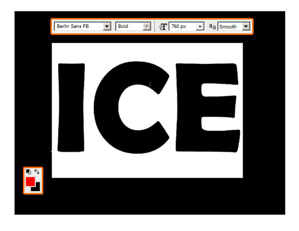
Step 2
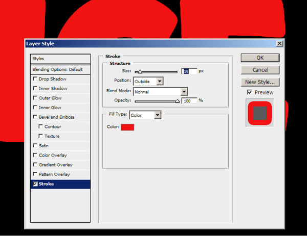
Step 3
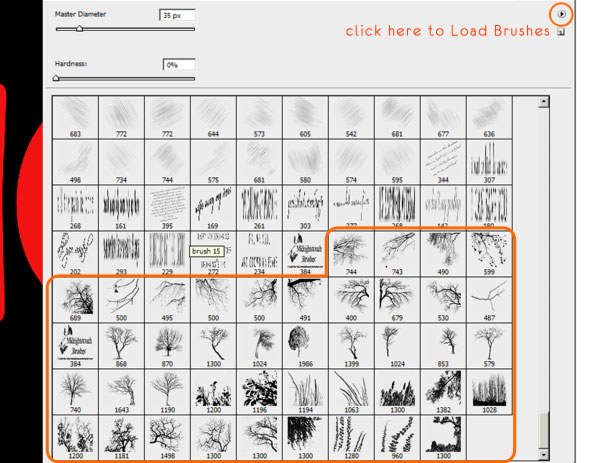
Step 4
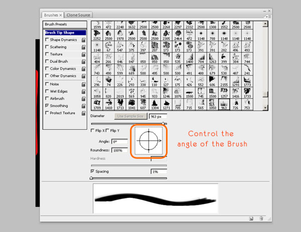
Step 5
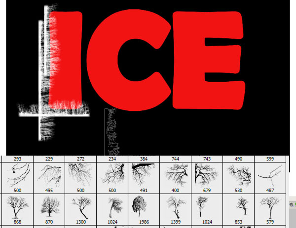
Step 6
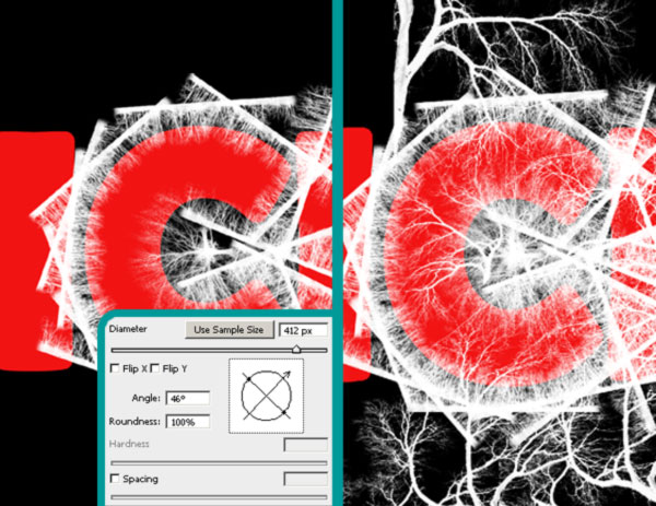
Step 7
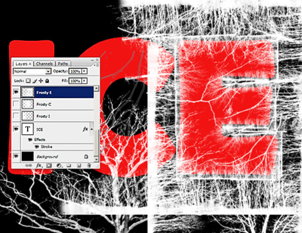
Step 8
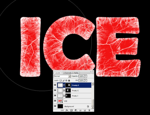
Step 9
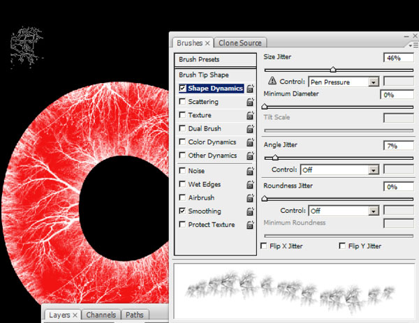
Step 10
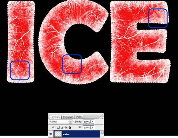
Step 11
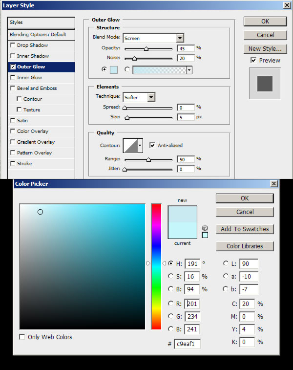
Step 12
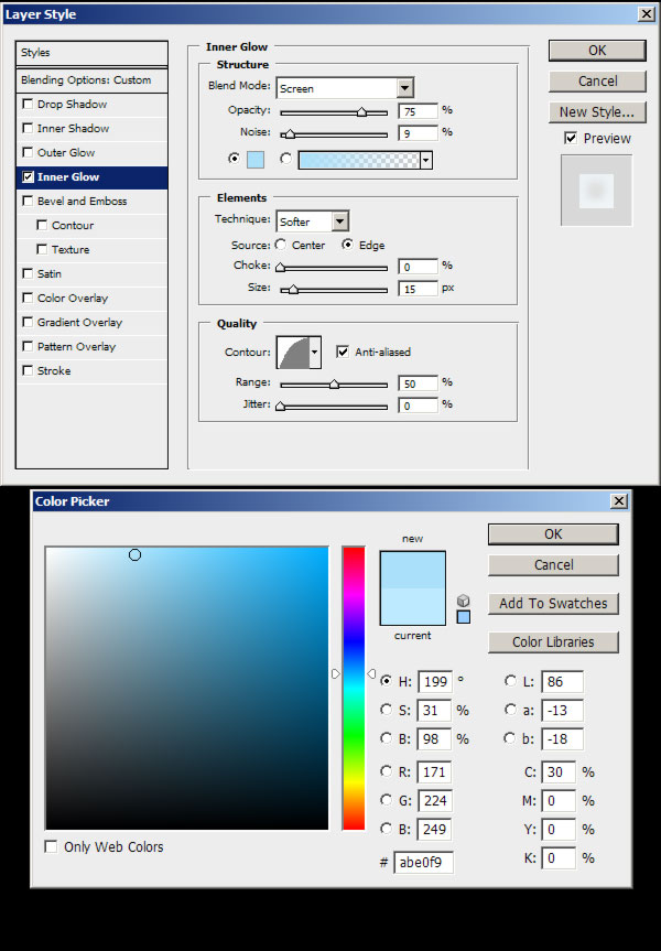
Step 13
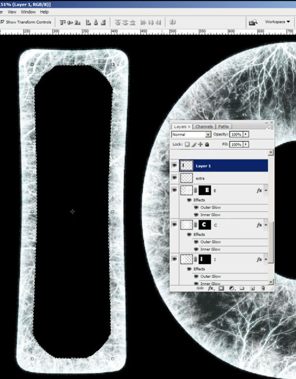
Step 14
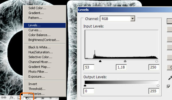
Step 15
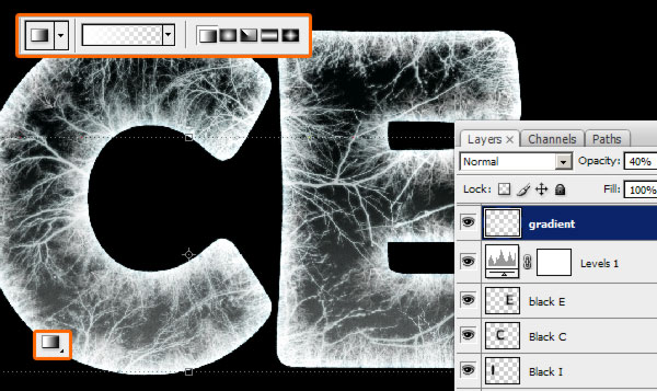
Step 16
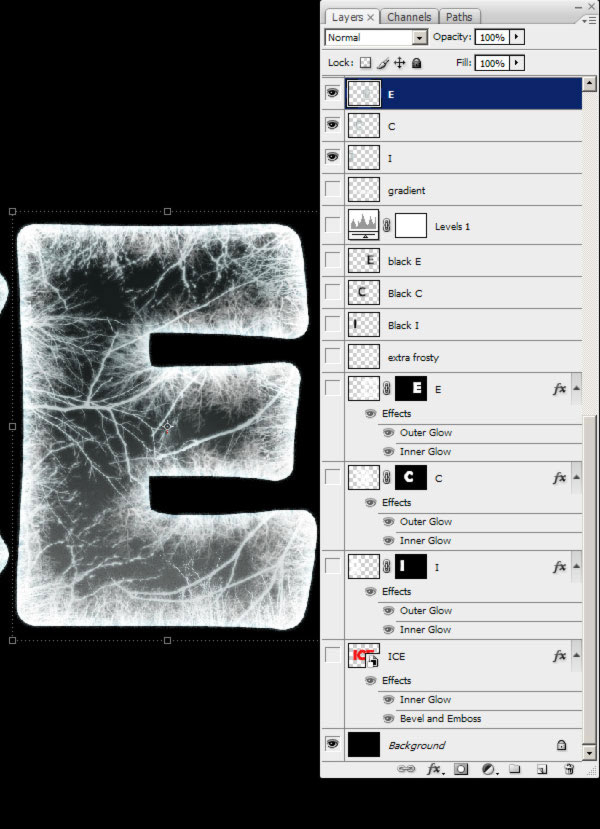
Step 17
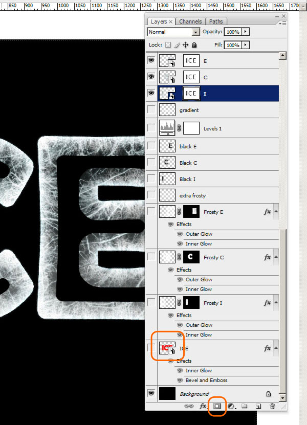
Step 18
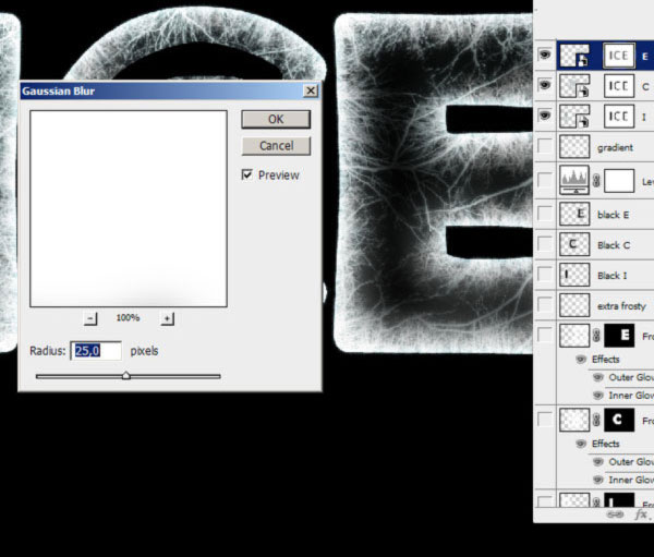
Step 19
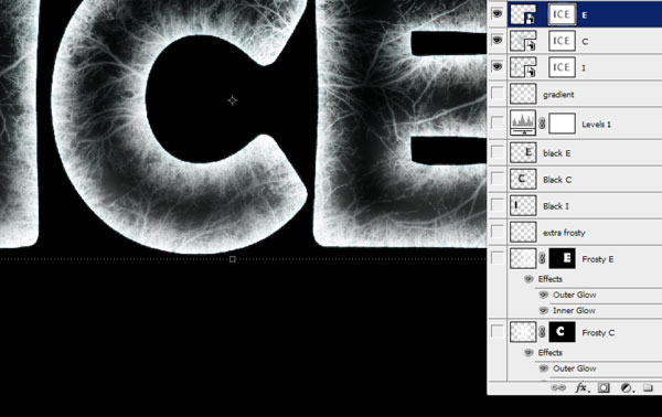
Step 20
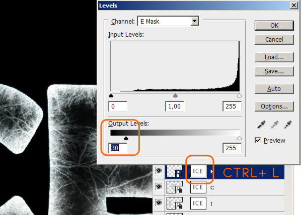
Step 21
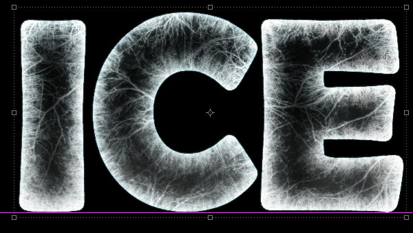
Step 22
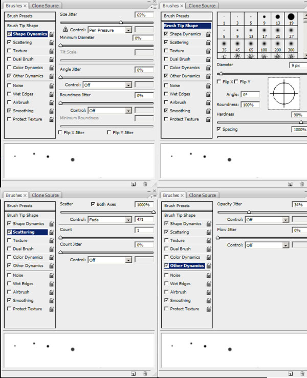
Step 23

Step 24

Step 25

Step 26

Step 27

Step 28

Step 29

Step 30

Step 31

Step 32

Step 33

Step 34

Step 35

Step 36

Step 37

Step 38

Step 39

Step 40

Step 41

Step 42

Step 43

Step 44

Step 45

Step 46

Step 47

Final Result

Assignment #32
Energy Drink Advert:
Step 1

Step 2
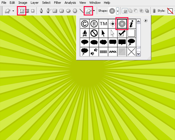
Step 3
Step 4
Step 5
Step 6
Step 7
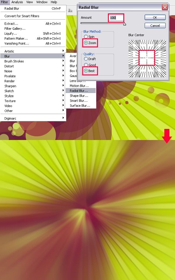
Step 8
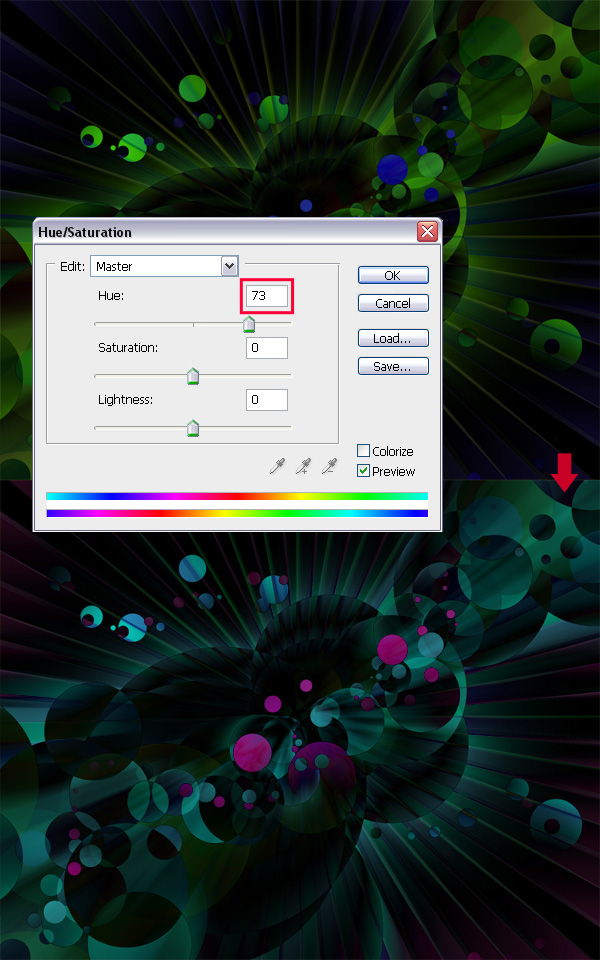
Step 9
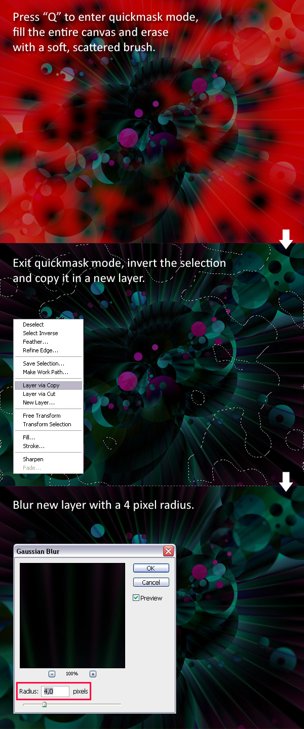
Step 10
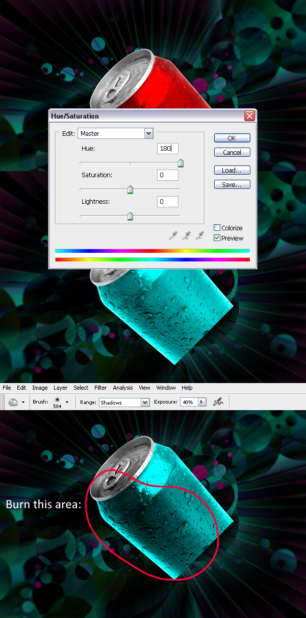
Step 11
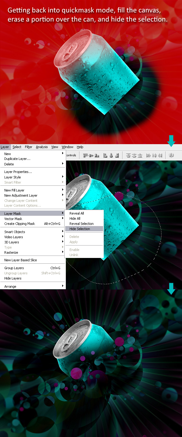
Step 12
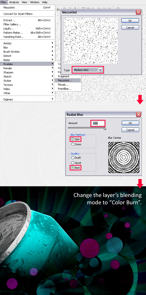
Step 13
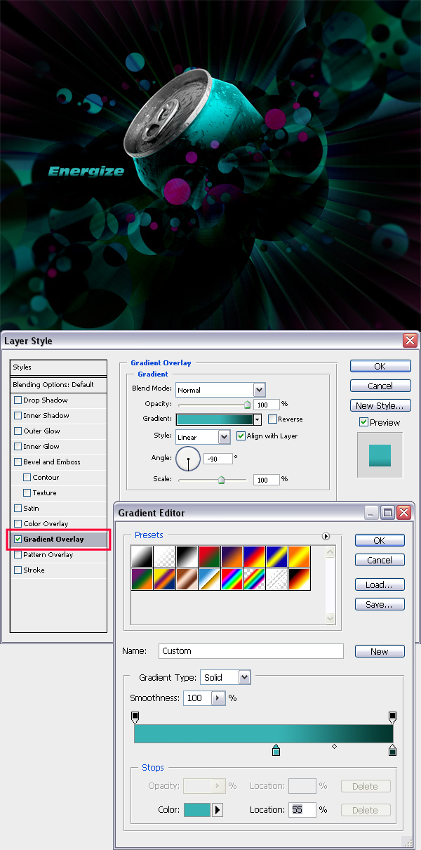
Final Result
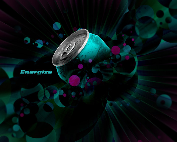
- Week 10 -
You have the option between assignment 33A (COMIC BOOK PAGE PAINTING) or ASSIGNMENT 33B (SPACE SCENE CREATION) or 33C (MOVIE POSTER ART).
To see the instructions for Assignment 33A go here: 33A
To see the instructions for Assignment 33B go here: 33B
To see the instructions for Assignment 33C go here: 33C
Assignment #33A - Comic Book Coloring
DOWNLOAD this batch of images. Pick any one of the comic book covers and paint them. Using multiply layers, textured brushes, subtle texture masks, lighting effects, and painting in shadows and highlights to achieve a professional look.
A final polished illustration from one of the black & white peices of artwork is the goal. The more detail, accuracy, and color depth the better.
Send the final JPG image file to the instructor.
Read through this booklet: Basic Paint Tutorial to get a refresher on how to paint and shade in hi-resolution black and white comic book characters.
An important part of this assignment is to apply shadows and highlights:
For more knowledge on soft shading to add a more professional look to your comic art painting: Soft Shading Tutorial
A guide for adding and cropping your textured brushes to your artwork:
Tutorial on Clip-Masking
Additional Tutorial on Inking & Painting with different techniques:
Part 1
Part 2
Part 3
BR>
Another guide for adding shadows:
More Tips on the Shading Process
More advanced (and optional) techniques:
Tips on Lighting/Shading
You may
DOWNLOAD and install these custom texture brushes for your Photoshop.
Need a reminder on how to install Photoshop Brushes? Scroll to the very bottom of this page for the info.
For the ulitmate guide on comic book coloring with tonal values and highlights, view this video clip: Color Tutorial - but beware, the file is 245 MB! It will take a while for the video to download, maybe wait until you are at a computer with a faster internet connection, it is 1 hour and 25 min. long, despite the monotone voiceover, it's well worth the wait!
Having trouble finding nice color combinations?
Go
here and
here.
For inspirational Comicbook coloring look here and here
For the ultimate list of the best download sites for Photoshop Brushes, go here.
Samples of finished comic art painted & shaded:
Assignment #33B - Space Scene Creation
This is placing two previous assignments and combining them into a larger and more detailed deep space nebula/planet scenery.
Using the techniques found in previous tutorials here and here, find new textures, produce a new star field, new planet(s) and go nuts creating a new highly-detailled nebula-solar-system.
Send the final JPG image file to the instructor.
The techniques in the three separate tutorials below will show you (in a new and slightly different method than before) how to get started to create an image similar to the final results for each lesson, although the images took several hours each to create with alot of additional fine detail work, you will still get the general idea as to how to approach it. Be creative, research for some inspiration, the goal is to develop a cool sci-fi interstellar space scene.
As part of your arsenal of weapons, you can download and install this set of custom brushes with stars and particles built in:Star Brushes
This is totally optional, but you can also put your headphones on and check out this Photoshop Space And Planet Video Tutorial it could help you out even more.
Below are three methods of achieving planets and space scenes, they are very genralized, you need to be creative and add your own creativity to each step, these are only meant to be rough guideline.
Making Planets (another Technique)


Deep Space Artwork Creation
Version 1
Version 2
Getting started - what you will need:/h3>
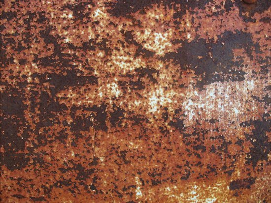
Creating the large planet
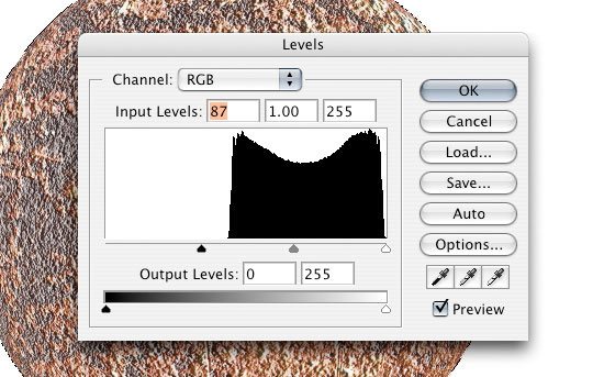

Adding an Outer Glow and Inner Glow layer style

Adding a layer mask
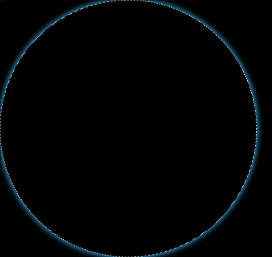
Giving the planet a glowing edge

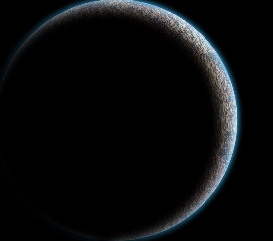
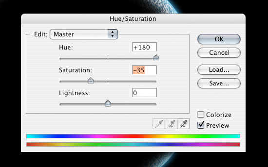
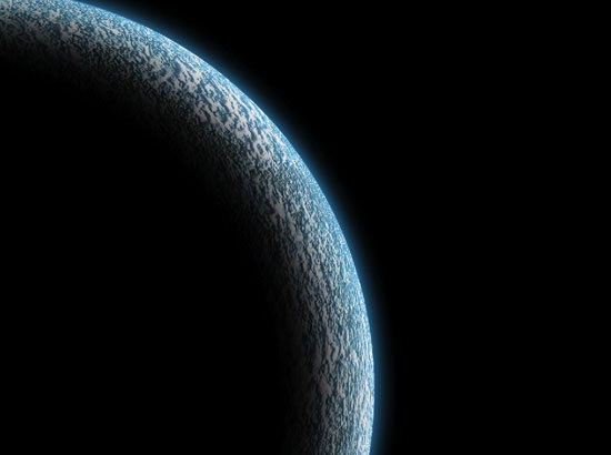
Setting up the space scene
Adding some stars
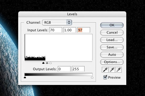
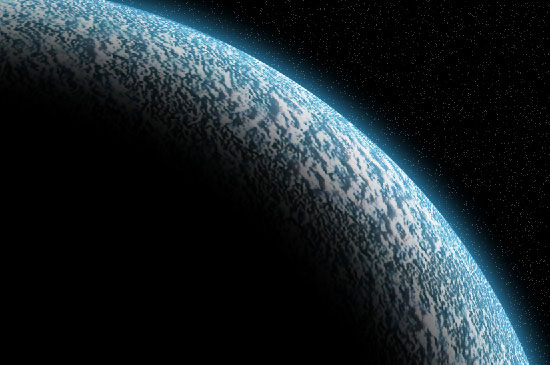
Giving the scene some realistic textures

Adding a light source

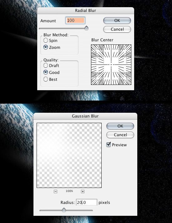

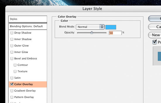
Using a Lens Flare filter
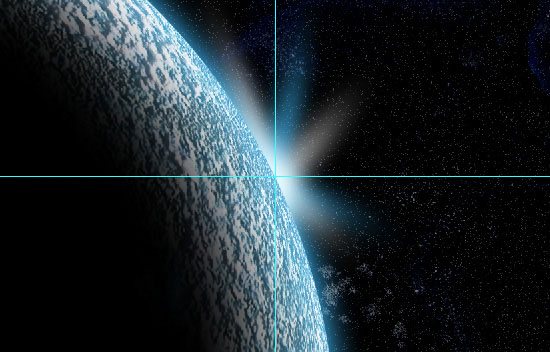
Create a smaller planet

Adding some "space dust"
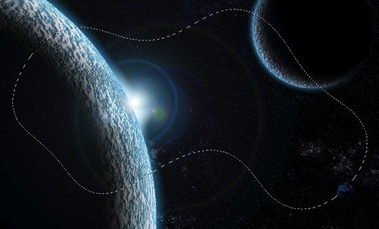
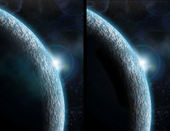
Adding a light reflection
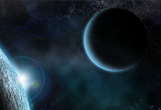


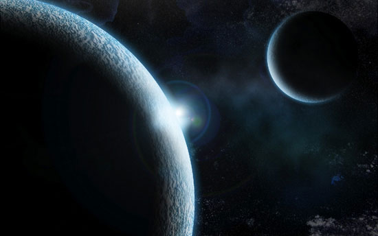
Some final adjustments and details


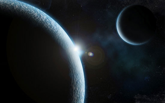
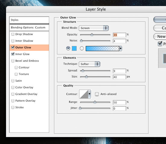
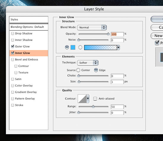

Alternate final result (Version 2)
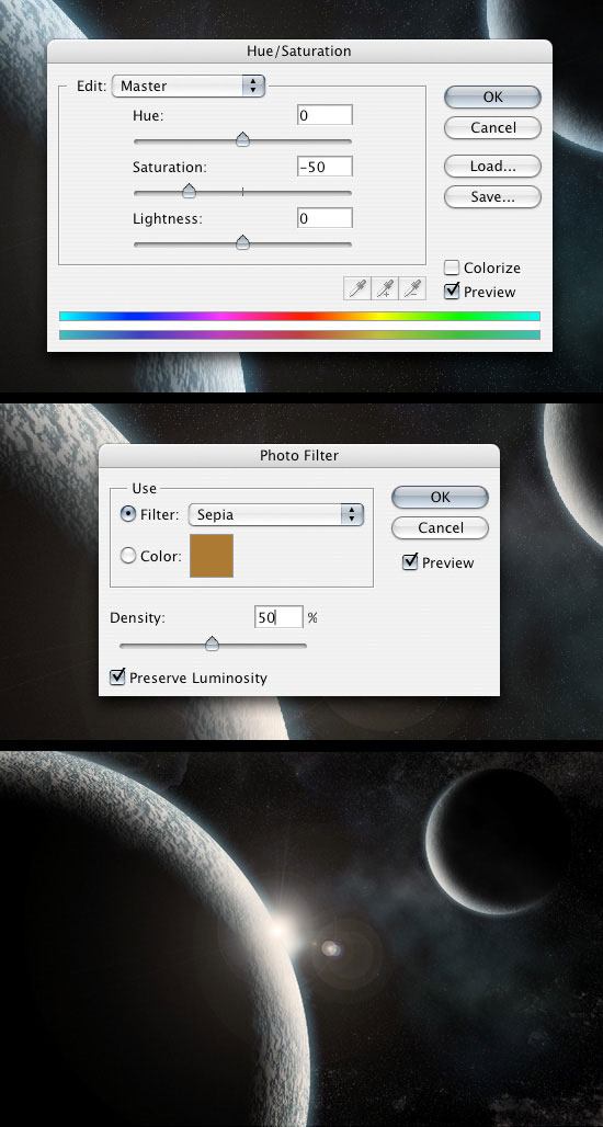
We're done!
Version 1
Version 2
Here's another tutorial, another style and method of acheiving a starfield nebula, it's very generalized to just give you an idea, the whole purpose of this is to give you some techniques and ideas on how to use the Photoshop filters and tools in a creative way.
Photoshop Stars
Follow the tutorial steps below to create the faint background stars. Again, depending on the size you choose the numbers may not work exactly as shown in the image samples, play around with all the settings at every step to get the effect you want, this whole tutorial is very general, it's up to you to create the space scene the way you want.


Nebulas


Photoshop Planets


This is totally optional, but you can also put your headphones on and check out this Photoshop Space And Planet Video Tutorial it could help you out even more.
Have fun with it, the more you work at it, the sweeter it will look.
More Samples:

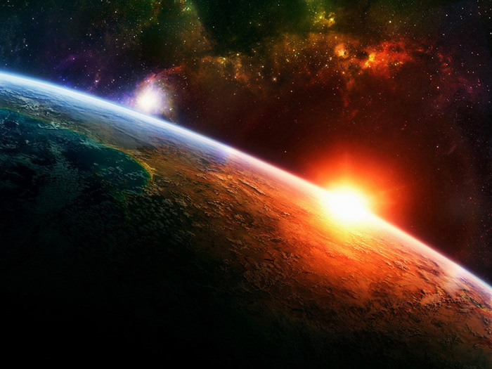
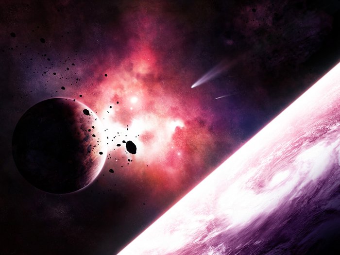
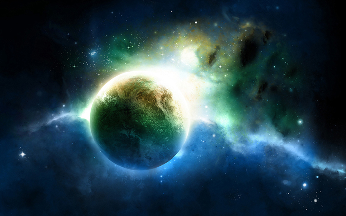

Assignment #33C - Movie Poster Art
Research the dimensions of standard movie poster sizes, and based off of that create a new photoshop document and design your own Movie Poster. It can be of anything, in any style, in any technique. If you need to, go back and refresh you memory to the old tutorials to get familiar with Adjustment Layers, Masks, Filters, Blending Options.
Also, you will most likely be searching for and editing photographs to add content and layers to your project, here's a quick guide on how to extract and isolate areas of your images to cut out and use for your purposes: Extraction Methods.
Now plan out what your poster will be, you should even roughly sketch it out on paper first to figure out the layout and composition. Search out the photo or illustration elements you'll need to put this poster together. Have fun with it, there's no limits.
Below are five links to 7 different tutorials, each one explores different facets, either creating a poster with lots of photo manipulations/collages or developing a classis retro B-movie poster design, or through a series of adjustment layers, lighting effects and high-contrst techniques creating a moody, horror based movie poster. The choice is yours. Once complete send the final JPG image file to the instructor.
Creating Your Own Crazy Movie Poster
Creating an Intense Movie Poster
Creating Sci-Fi Poster Art
Creating a High Impact Gig Poster Suitable for Screen-Printing
Creating a Cool Poster Graphic, Creating a Typography Art Poster, and Creating a Fnky Retro Poster
Have fun with it! Get inspired by researching the layouts of other classic movie posters:
http://www.wrongsideoftheart.com
http://www.moviepostershop.com
http://www.allposters.com
Bonus Task 1
Extra Credit Assignment - Tilt-Shift Photo Effect:

Step 1: Choosing the Right Photo

Step 2: Blurring


Step 3: Contrast and Curves


Bonus Task 2
Extra Credit Assignment - Retro Shiny Text Effect:
Faking aged, printed media has been massive since the 'grunge' style first became mainstream years ago. Textured work with a vintage feel is still very popular, but more recently it's the 'new retro' style that's come back in modern advertising, album covers, and poster art. The general idea is to create a vision of the future... from the past. This effect is good for all sorts of projects, flyers, websites, posters. It works particularly well with music based projects.
Step 1
Step 2
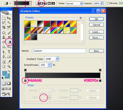
Step 3
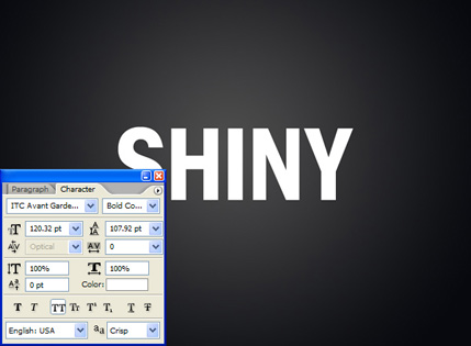
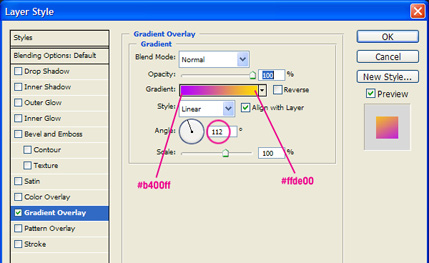
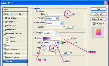
Step 4
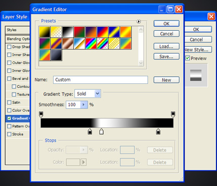
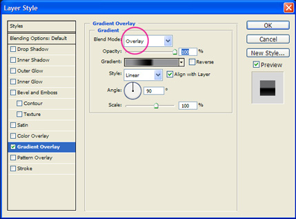
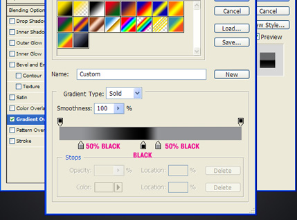

Step 5
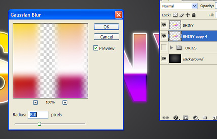
Step 6
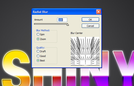
Step 7
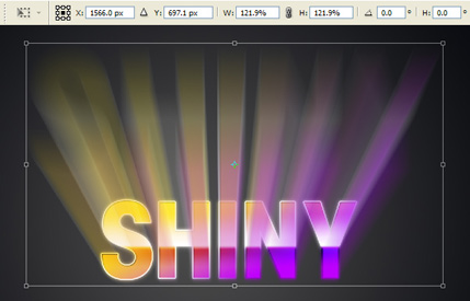
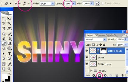
Step 8
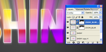
Step 9
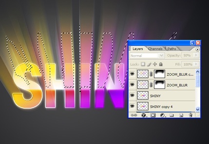
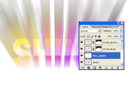
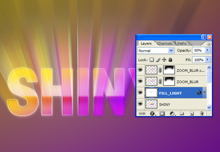
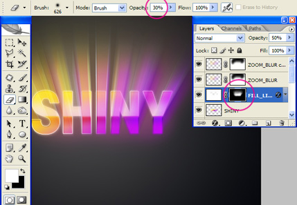
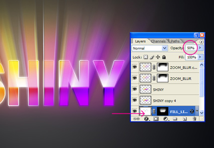
Step 10
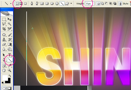
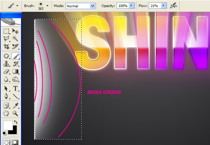
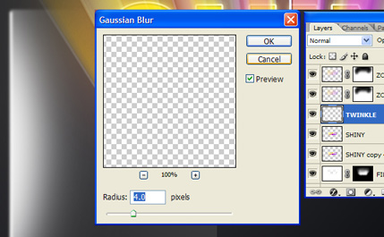
Step 11
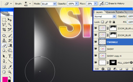
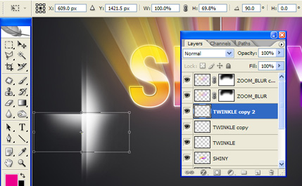
Step 12
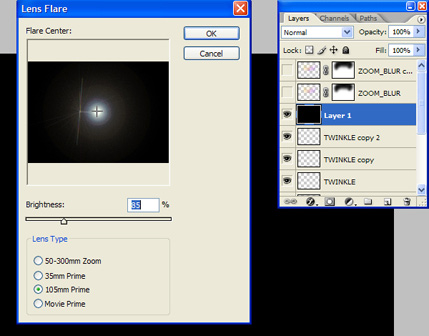
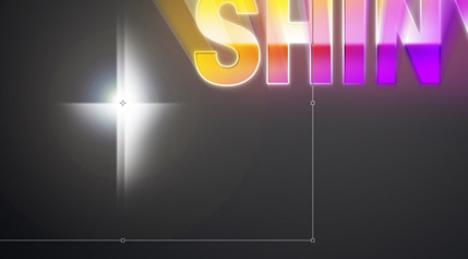
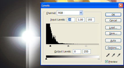
Step 13
Step 14
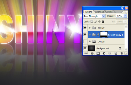
Step 15
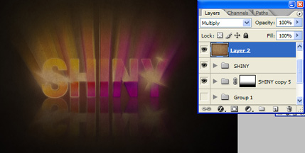
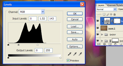
Step 16
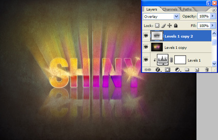
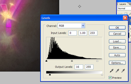
Step 17
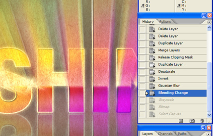
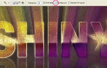
Step 18
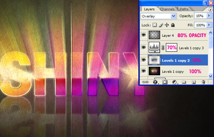
Conclusion
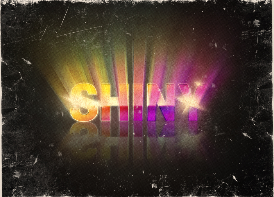
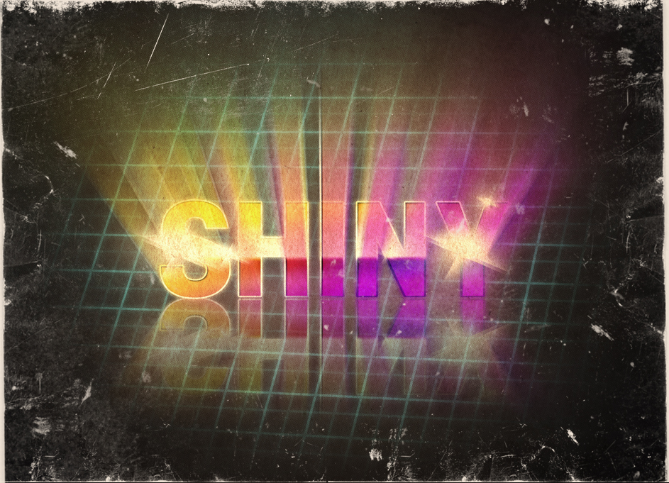
Bonus Task 3
Extra Credit Assignment - Cloud Text Effect:
Step 1
Apply the Gradient Overlay to the background layer. Use Normal for the Blend Mode, 100% Opacity, Radial for the Style and #07090b and #27160a for the Colors. Also increase the Scale to 115%.
Step 2

Step 3

Step 4
let's edit the path. Start deleting the inner part of the paths, each letter has to have only one path like in the image shown.
Step 5
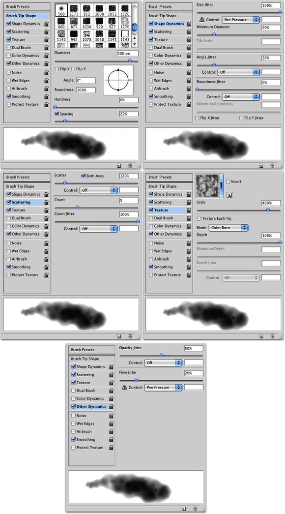
Again with the Direct Selection Tool (A), click with the right button of the mouse over the path in the image and select Stroke Path. A dialog box will appear, the stroke path window, where you can select what you will use to stroke the path. Make sure you have the brush we have just created selected and then select Brush. Also make sure that you have the color white selected for the brush color. (1).
We will repeat that 2 more times, but each one in a new layer. The first time we used white, the second let's use black and the third, white again. That will add volume to the clouds and make them more realistic.

Let's add create some more clouds, then add another layer and go to Filter>Render>Clouds. Make sure you had black and white for the colors. After that change the Blend Mode of this layer to Color Dodge and with the Eraser Tool (E) delete some areas leaving just the ones closer to the clouds text.
Also let's add some light effects. To do that add a folder in the Layer Palette, this folder has to be beneath the clouds we created with the brush tool. Change the Blend Mode of the folder to Color Dodge. Inside this folder add a new layer. Then with the Brush Tool (B) and white for the color, start painting some clouds. These clouds we will be painting will be light effects so if you want you can change the opacity of the brush by clicking on the number keys (1-0). Use the image below for reference.

Now just add some stars. To do that create a new layer and fill it with black. Then go to Filter>Noise>Add Noise. Use 10% for the Amount and Gaussian for the Type. After that go to Image>Adjustments>Levels. Increase the Black until you have just a few stars then increase the white to make them brighter. Also change the Blend Mode to Color Dodge.

Select all layers and duplicate them, then go to Layer>Merge Layers. After that go to Filter>Blur>Gaussian Blur. Use 12 for the amount. Also change the Blend Mode to Screen. That will create a nice glow and make the clouds more realistic.

You can add more light effects like some bigger stars or even play with colors, the idea of this tutorial was to show you a very quick tip on how to create clouds and a text made with clouds. Now it's all about playing and testing different variations.
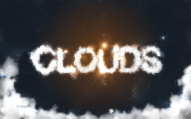
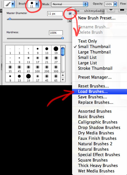
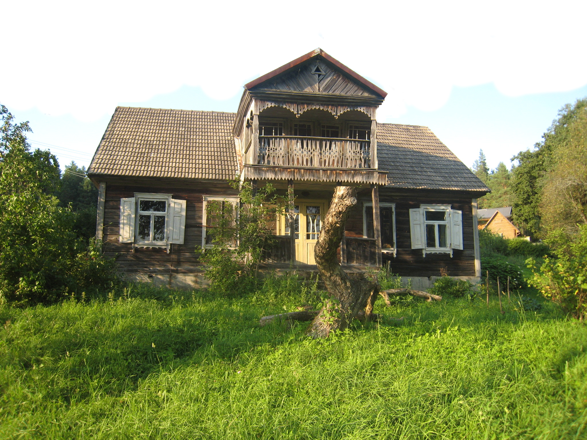
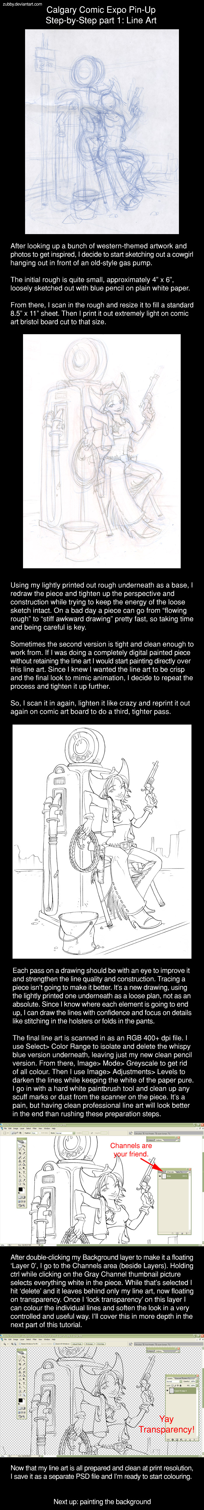
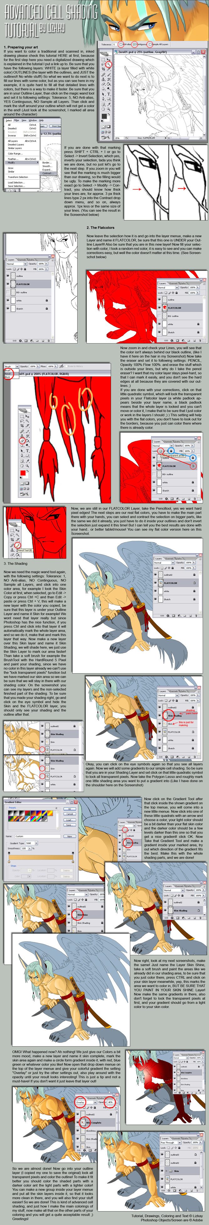
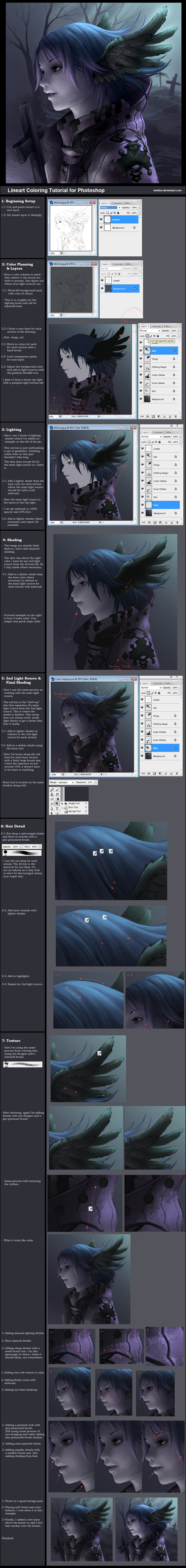