
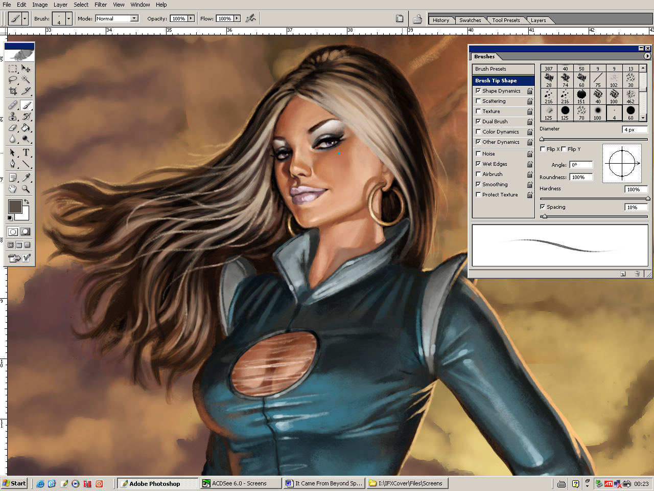
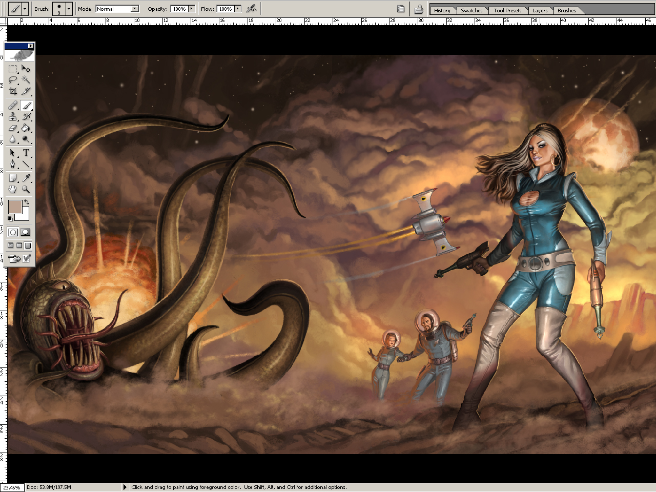
Before laying down a stroke, there's a number of things you need to think about. Well, actually you shouldn't have to think about them, it should just go automatically.
Note that this mainly goes for realistic styles. A brushstroke should also look efficient and consistent with the rest of the painting and your color scheme choice. You might also have an idea or style which disallows certain colors or textures and put priority on other things. However, even in a powerpuff girls illustration there's simplified elements of realistic rendering. Don't hide behind "it's not apart of my style so I'm not gonna learn it".
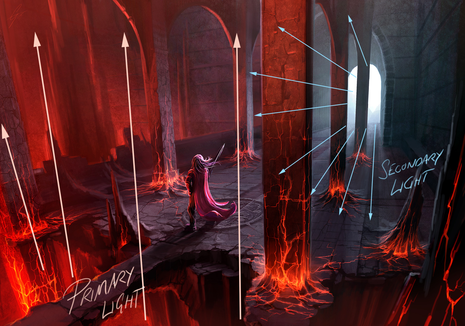
There's really just one kind of light. It bounces. You can only see the light (photon) if it enters your eye. Light does two important things when it hits a surface. First, a part of it is absorbed. This is how colors are made. A red apple reflects mostly red wavelengths, the rest are absorbed and turned into heat or something. That's why black stuff get so hot in the sun. Anyways, the reflected light bounce away differently depending on the surface. If the surface is bumpy it will bounce away sort of randomly, like a tennis ball that hits rocky terrain. If the surface is smooth it will bounce away in a predictable path. A mirror is very smooth so the light comes back undistorted, so we can see our reflection.
Note that all surfaces have speculars, because speculars is just reflected light. It's just more broken up/diluted on dull surfaces.

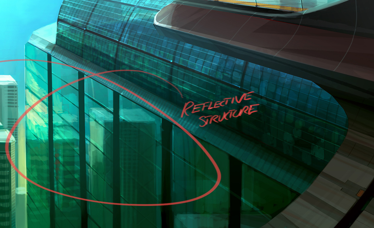
 Depending on where the eye/beholder is, it'll see different light and different specular spots on a curved surface such as this. A puddle isn't curved (other than the edges because of surface tension) so you'll only get a shiny reflection from a certain point of view. Point speculars can only appear in an environment where there's a point light source, like a sun, lightbulb or small window.
Photo - Speculars do exist on cloth, diluted and subtle. I stretched out my shirt sleeve with two fingers to get a flat surface between the two marked dots (I moved the camera and not the sleeve).
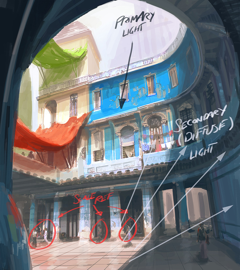
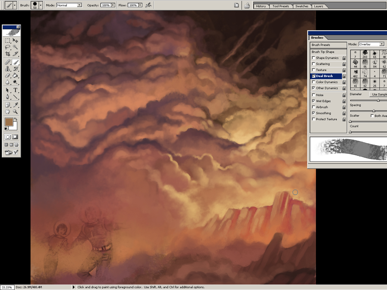
Here on earth we have lots of stuff around us that the light can bounce off, so things here are more or less lit from all angles. For example we have the sky which is like a dome shaped blue light source. Then theres the ground, walls and other surfaces. In space there's basically just one light source, the sun. This is why the moon just has a lit and shadowed side, and looks kind of flat. If you looks carefully however, you can see earthlight on the shadow side of the moon, but it's very weak. Then there's starlight, which I guess is even weaker.
When light hits a surface and bounces, it also change color. If it hits another surface of the same color it bounced off, it will make that surface look even more saturated.


(Too orange to be some sort of skintone anyways.)
The sunlight is much stronger than the skylight, which is in turn much stronger than indoor light. Our eyes adapt automatically after a while, and we can also adapt by squinting or just focusing on an object. Because we do this without thinking about it, it's hard to understand that our eyes are actually kind of limited. This limitation becomes even more obvious with cameras. If you take a picture indoors, the windows will become overexposed (bright). You might try to adjust the exposure levels to the window light, but then the indoor environment will become underexposed. This can be used to your advantage. By for example putting a character or object in the foreground where it's darker, you can make the silhouette read well against a well lit room.
The exposure to light can also make parts of a body look very bright or dark, not skin tone color at all. When the shadow is dark and the lit side is overexposed, the only place for the color to go is on the edge between them.
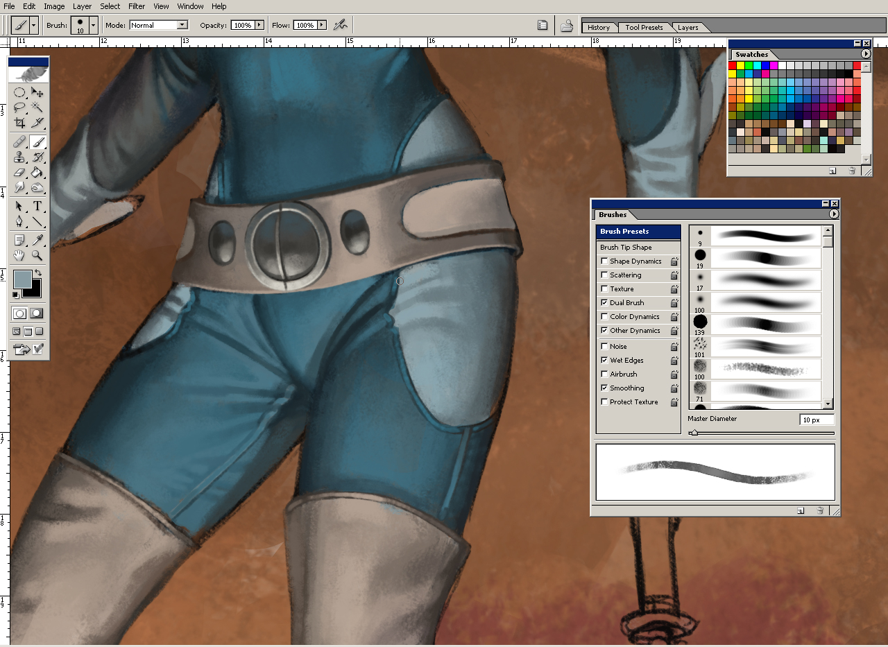
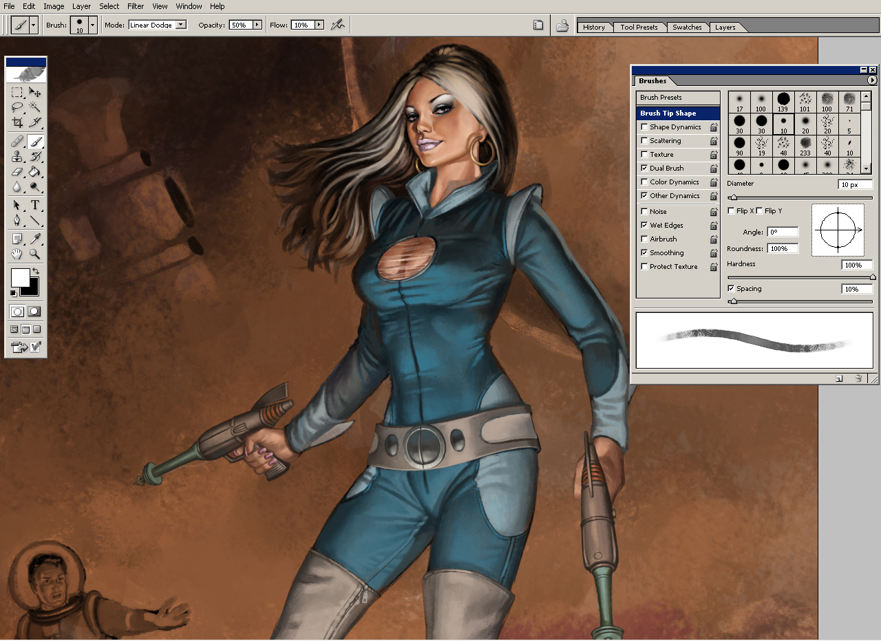
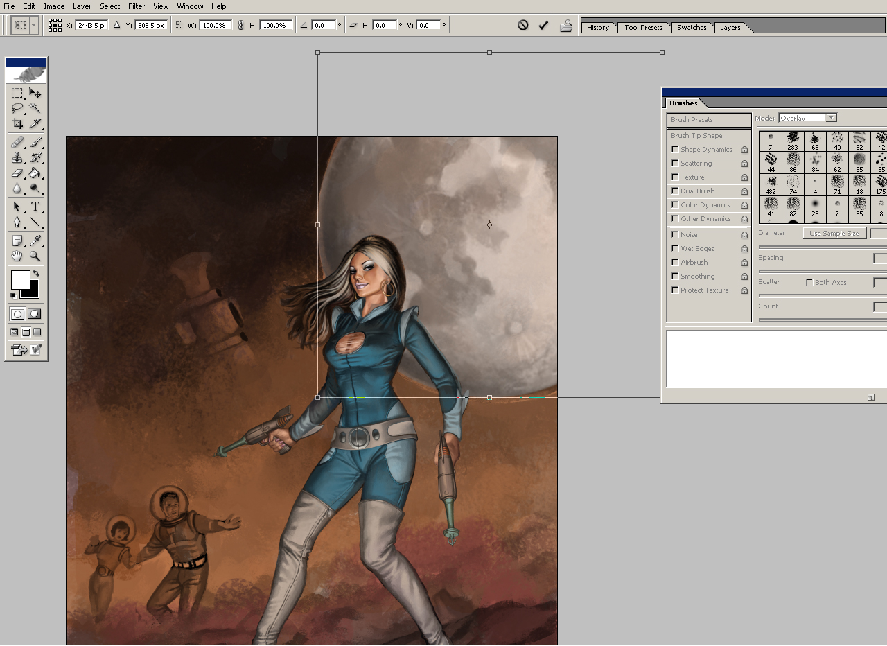
Here's an example of various materials and how i render them.

Shadows are quite flat and generally less saturated than the lit side. It's easier to notice ambient light in the shadows. Shadows get blury over distance, this is called diffraction.

(Shadows don't add (multiply) with just ONE lightsource that is...)
Consider the environment. The light is stronger outside, and the skin color tend to be less saturated due to the sky blue ambient light and sky blue speculars. Sometimes the skin color become shifted towards purple because of the sky blue being mixed in. This is especially true if the subject is standing in a shadow.
Indoors (no windows, only light bulbs) the light is warmer and allows skin saturation to be amped up to oranges and reds.
The shadow color of the skin can sometimes wander off to greens, especially if the room have green components, like wallpaper, plants, furniture.
In a white room or a bathroom the skin tones would be quite pale, closer to local colors and less contrasted (shadow/light) due to lots of ambience.
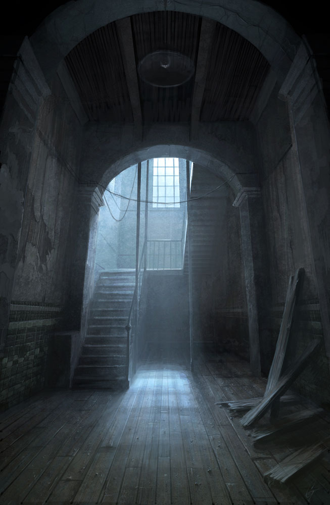
A room with a single strong light source will probably result in near black shadows.
...so, the type of environment your character is placed in very much affects how you should render it.
The human body has a lot of different hues. Parts covered by cloth gets less tan. Mons pubis, the hip bone area and the chest is quite pale. The shoulders and lower arms gets a little extra tan. The inside of the lower arm is often pale however. The kneecaps and elbows have a little darker skin. The face also has a lot of hues, such as rosy cheeks, males might have grey or almost green jaws because of stubble. The best way to learn the hues of the human body is to make studies of course. Don't forget that animals, monsters and objects also have hues. If you paint everything with the same hue and saturation it will look boring.
Some hues are due to ambient and reflected light. The shoulders and surfaces pointing up can get a blue hue because of the sky reflecting.
 Saturated gradients -
The gradients between the shadow and light is not just an in-between color of the shadow color and light color. If the shadow and light is just blended, it will look very lifeless. If you look at pictures you will see that the gradients is saturated. It's especially easy to notice if you remove that saturation.
Saturated gradients -
The gradients between the shadow and light is not just an in-between color of the shadow color and light color. If the shadow and light is just blended, it will look very lifeless. If you look at pictures you will see that the gradients is saturated. It's especially easy to notice if you remove that saturation.
 Sub-surface scattering -
Strong light can penetrate the surface of some materials and bounce around, then exit again. This will increase the saturation and make the surface look illuminated from the inside. In the case with human skin, we sometimes see it on hard edges between light and shadow.
Sub-surface scattering -
Strong light can penetrate the surface of some materials and bounce around, then exit again. This will increase the saturation and make the surface look illuminated from the inside. In the case with human skin, we sometimes see it on hard edges between light and shadow.
Photo - Leafs are gloss on the top side which means there can sometimes be a sky blue specular here. The light shining thru the leaf makes the bottom side more saturated, this is also true for ears and fingers, which can turn super red when heavily backlit.
Photo - Sub-surface scattering on the fingertips. The light on the left side of the thumb is probably light reflected off the index finger.
Photo - Note that the edge only appear if the light is overexposed. It does not as pronounced on the thumb.
Colors and values are relative. By using various tricks it's possible to trick the viewer into thinking a color is really another color, or a value is darker than it is. Unfortunately, the artist is also tricked into using too much colors or values than is needed.
A hard edge between two values will be much more obvious than a soft one. You'll have to know when to use which. Sometimes your choice of values is very limited, such as when you're working in the shadow. By using hard edges you can describe a lot more detail with less values available. However, using gradients is very useful for changing value without the viewer noticing. The 'fake flat' illustration looks flat, but is actually a gradient. The square is the same color as the left side of the 'flat' rectangle.

Colors with the same value are relative in terms of hue instead. A common mistake is to draw one detail too saturated, then something else nearby looks grey, so to compensate you increase saturation on that detail too, and as a result the whole painting end up too saturated.

It's easy to get carried away and go over the top with highlights. This makes it hard to see what color the subject is. Instead you should use shadows to describe the volume of the subject.

Work with larger brushes and remove unnecessary brushstrokes. See the bad and better example below. I really didn't do much on the second one. It's actually simplified. It's surprising how much a little flattening here and there can do. I did spend some extra time on the face though. A bad face can ruin everything. Image is from reference.


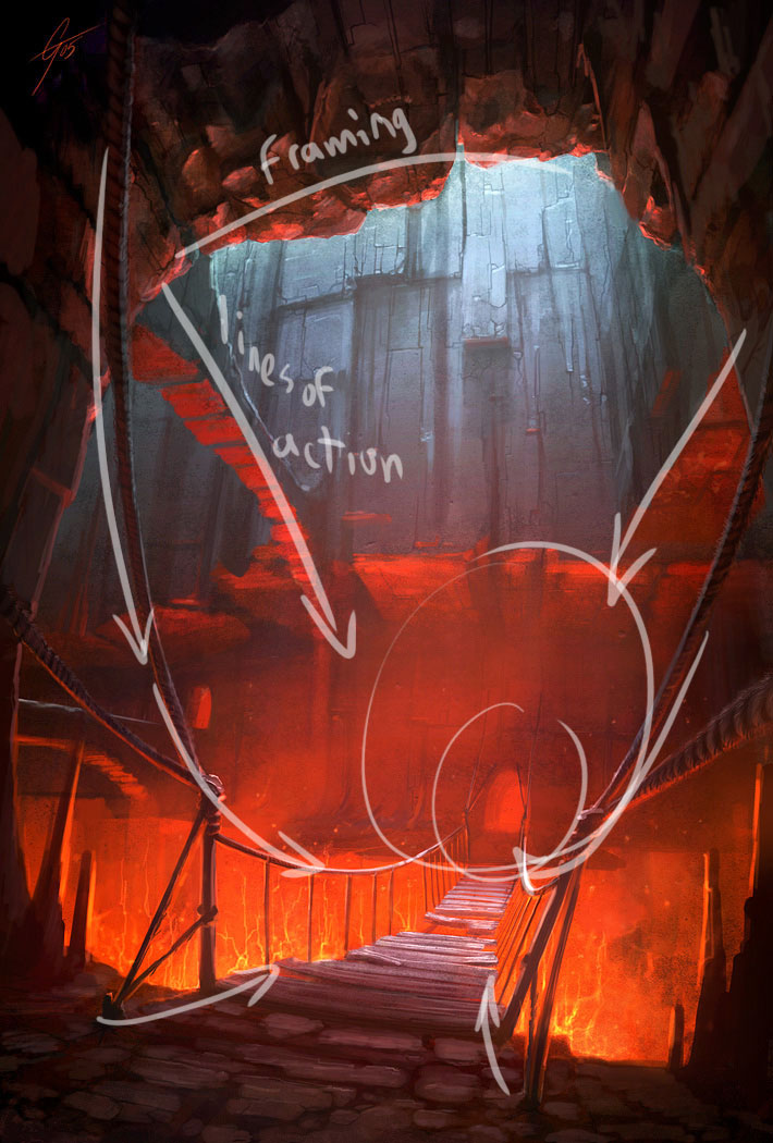
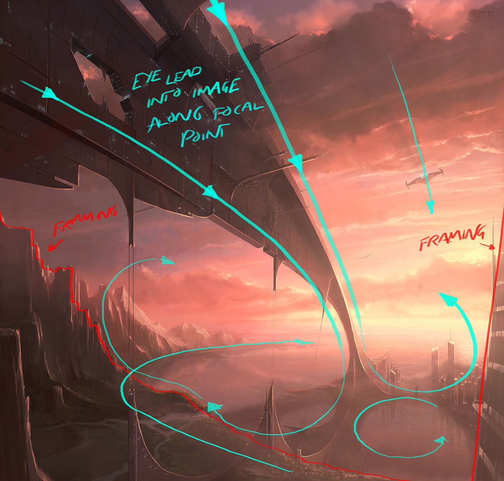
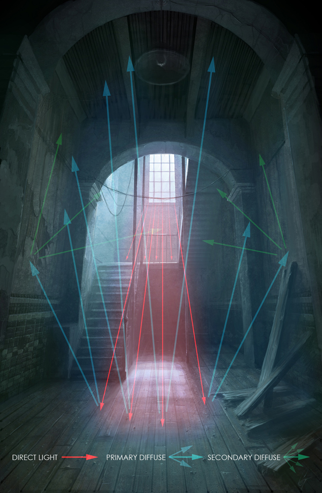
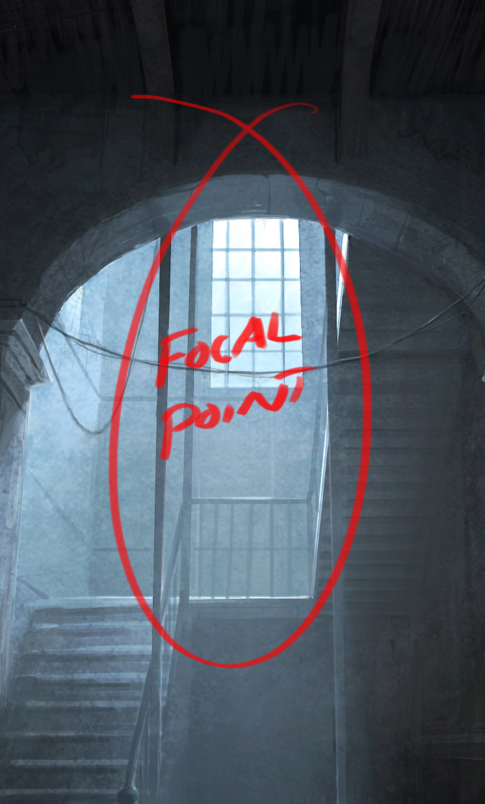
A painting is a hierarchy of important and less important details. If you're doing a pin-up the main figure and silhouette is the most important. In comics they often use a fat outline around the silhouette, whilst the less and less important details get thinner and thinner lines. When painting you do the same thing, but with brushstrokes instead! You use differences in hue, saturation, value, edges, sharpness, detail and composition to lead the viewer's eye towards the focus point of the painting.
If you use the same rendering everywhere on the painting it will look flat. You can lead the eye toward important spots, but once the eye is there it needs something interesting to keep it there, like proper details. The amount of details on a spot should be proportional to the amount of time the eye stays there.

Attempt to isolate some of the techniques you can use to attract the eye.
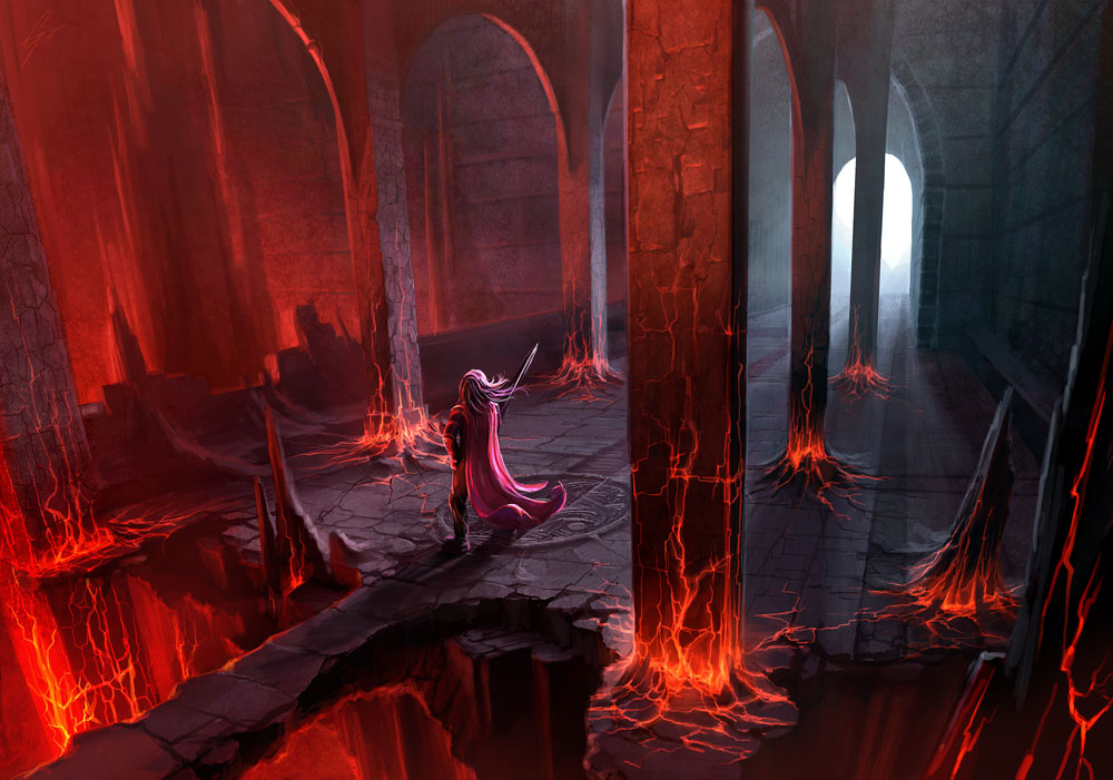
Here's an example I made: (A) Important forms | (B) Textue | (C) Both
It can be very dangerous to get excited about rendering details, especially at an early stage. You can not render details the same way in the shadow as in the light. On the second one (B) I just rendered all the details to demonstrate how it can look if you just scribble down all the detail without thinking about the important forms (A). (C) is still a bit confusing but that's more of a construction issue. Side views can only get you so far, and the anatomy is pretty odd which makes it harder to read.

A is the form without detail, B is the detail and C is both. Be careful not to do too much B, the form has to read!
Exaggerate - One great thing about art is that you can exaggerate things, like hips and boobs. Haha, no, actually I'm serious. It's a good thing if important curves are more pronounced.
Simplify - The advantage art holds over photos is simplification. In a photo you'll get distracting details. When drawing, you can remove objects that aren't relevant to the scene. Wrinkles and minor protrusions can be removed to get a better line flow. A common mistake I see is when someone has drawn all the abs (belly muscles) with an overly amount of crosshatching. It's better to leave out lines, especially if you're going to color, because then the contrast between different color fields can work as lines.
Harmonize - Another word for this is 'swooshyness'. Unlike the above things it has to do with the relation between details and how lines intersect and take over one and other. Try having a few swooshy lines that you align several parts after.
Stylize - When going for a style it's important to be consistent. You can turn curves into hard edges, or you can go for sweeping sinus lines. I prefer a combo where I turn a curve into a hard edge at a certain threshold.
Line weight - With a few exceptions, I'm not a big fan of fixed line width. Here I'll attempt to devise some general guidelines for when and how to vary line width.
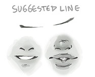
Also, you do not always need to draw a line. Sometimes it you can just hint the ends of it, and the eye will fill the rest in. Examples are places where skin is pushed together, like the mouth, buttocks, pushup boobs etc. It's good to make the line a little thicker where there's a gap. Examples are places where clothing stretch over gaps between muscles or... cleavages.
