For this tutorial, set up an A4 canvas at 300dpi. If you intend to silk-screen the design when you're finished, then you might want to output at 600dpi though.
Download then open this image of a girl. Press Command + Shift + U to desaturate the image. Then go to Image > Adjustments > Shadow/Highlight and apply the settings shown below. This will make more of the dress detail visible.

Select the Burn Tool from the Tools palette, then set the Range to Shadows and the Exposure to 9%. Pick a soft-edged Brush (about 195 pixels in diameter) and burn in some more tones into the skin. Use smooth strokes along the skin paying more attention to areas of detail such as wrinkles or folds in the skin.

Use a smaller brush to burn in smaller details, in this case her chest area.

Finally, use a much larger soft-edged brush (around 300 pixels) and set the Burn Tool to Midtones. Finish adding some depth to the skin tones.

To start degrading the image apply a Noise Filter and a Gaussian Blur.

Then go to Filter > Sharpen > Smart Sharpen and really oversharpen the image to get a photocopy-like feel.

Sharpen again (Smart Sharpen) with a bigger radius this time. This will bulk up all the outlines and make the image appear as though printed with uneven ink distribution.

Clone out the top of the head, go from the point where it meets the top of the chair upwards. Use the background as the source point (Alt-click to define your source point).

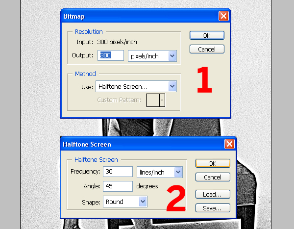
Copy and paste the girl into the working A4 document and Go to Image > Mode > Grayscale. Then go to Image > Mode > Bitmap and set-up as shown below.
Go sxc.hu and download this image of a Tiger. Next, roughly cut around the tigers head using the Pen Tool to draw a path. Don't focus on cutting out the hair detail, we'll get to that in the next step.

Select your completed path in the Paths Palette, then make a selection from it by clicking Make Selection. Next, go back to the Layers Palette and select the background layer, then go to Layer > Duplicate Layer. Select the duplicate layer and click the Add Vector Mask Icon at the bottom of the Layers Palette. Fill the background layer with white.

Select the Smudge Tool and set it to a strength of about 35. From Photoshop's default brush list select the largest of the "Spatter" brushes. Set the brush to a pixel radius of around 90. Click the Layer Mask Icon of your tiger head and begin smudging out from inside the mask. Follow the lines of the fur and keep going until the head looks fluffy.

Flatten the image and then roughly follow Steps 2-9, adjusting details to suit the tiger image.

Use the working document as a guide to resize the tiger head. Press Command + Alt + I and reduce the tiger head to 70% at 300dpi. Bitmap as per the settings in Step 11. Next, select the working document and go to Mode > Grayscale. Copy and paste the "Tiger Head" into the working document.

Now we need to plug up the gaps around the tiger head because, and I'm almost ashamed to say it, we're going to use the Magic Wand Tool. It's fine to use it in this instance as we only need a rough cut. So select the Pencil Tool and draw directly on the "Tiger Head" layer ensuring there are no white gaps in the outline around the "Tiger Head."

Select the Magic Wand Tool, make sure the Contiguous box is checked, and then select the area around the "Tiger Head." Erase any extra blacks (from the background) using the Eraser Tool.

Finally, use the Clone Tool to clone out any unwanted hair detail from the girl picture.

Go to Image > Mode > RGB and flatten the image. Duplicate the "Background" layer and set the Layer Blending Mode to Multiply. Fill the background layer with a strong color. Finally, create a new layer in between the "Background" and the "Main Art."

Roughly cut around the figure using the Polygonal Lasso Tool. This technique is all about the flaws and imperfections so be really loose. Then fill with an off-white. I've gone for Pantone 7500m for the off-white and 172m for the orange. You don't need to worry about Pantones if you intend to print off your home inkjet or use digitally.

Select the Pen Tool and set it to Shape Layers. Draw in some flames along the bottom. The trick is to get the bezier curves right, see the close up image below for a more detailed view.


Create a new document with the same dimensions as the working document. Copy the flames into the new document and flatten. Use your favorite grunge brushes (there are many available on the web) to add distress to the flames. I've created my own from some scanned in cards, but that's another tutorial ;-). Then convert the flames to a Bitmap as you have with the girl and the tiger image.

Copy and paste the bitmapped flames into the working document. Fill a new layer with dark red (Pantone 1805m works, but doesn't translate onto your monitor that well). Take the Magic Wand Tool, uncheck the box marked Contiguous, and select the black from the flames. Use the selection to create a Mask for the Dark red layer.

Place text on roughly and then rasterize all the text layers (Layer > Rasterize > type).

Use the Polygonal Lasso Tool to select one letter at a time. With the letter selected press Command + T and randomly rotate, nudge, and resize until satisfied. Remember the words have to look imperfect but legible. You might want to put the kettle on because this can take a while and it's about as fun as cleaning the toilet. Once this is done, paste it into a new document (same dimensions as the working document) and distress then bitmap.


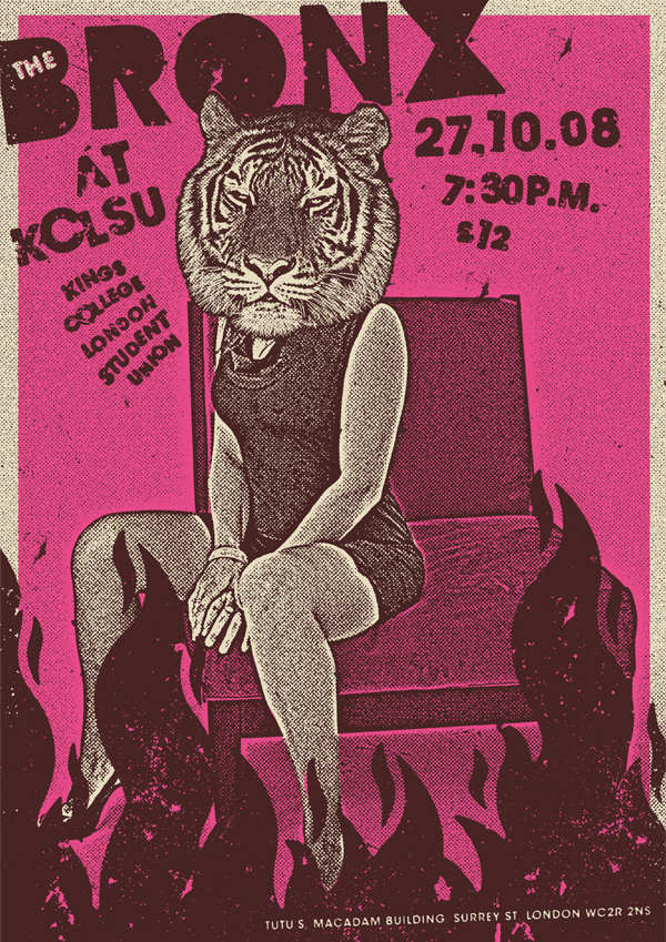
When designing a poster it's good to take a step back and really look at what's been done. From this I've noticed some layout adjustments need to be made. It's best to split the text onto different layers to rotate and resize. "The Bronx" text needs more impact for example, so I've enlarged and rotated it slightly. I've also added another layer of dirt, moved the main graphics down the canvas and cloned in some more of the background to compensate.
And to finish I've adjusted the colors back to three and added a semi-border, it's looking pretty tight now so that's it. I then placed each flattened single color on it's own layer. The Pantone references of the final three layers for those interested are; Pink 205m, Off-White 7500m, and Purple 4975m. The final poster design is below.