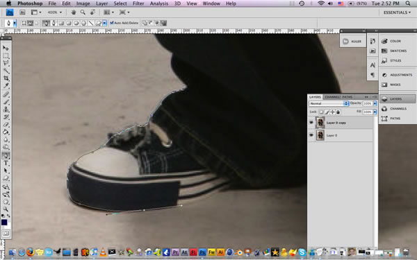
Create a new document at 1600 x 1200 pixels with a resolution of 72dpi. Start off by opening all of your images separately and lets extract our guy from the background, use the pen tool. You can find these images here: http://fl8us.deviantart.com/art/Deserted-City-4100373 and http://b-e-c-k-y-stock.deviantart.com/art/Scared-People-2-46126819.
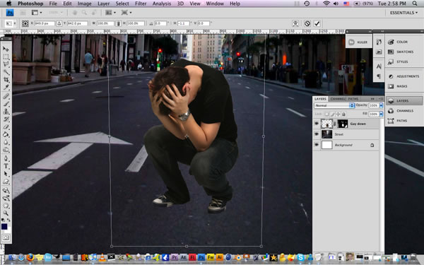
Place the street image on our blank canvas and set the guy image on top of it. Lets give the right perspective to our guy go to Edit/Transform/Perspective. See the image below.
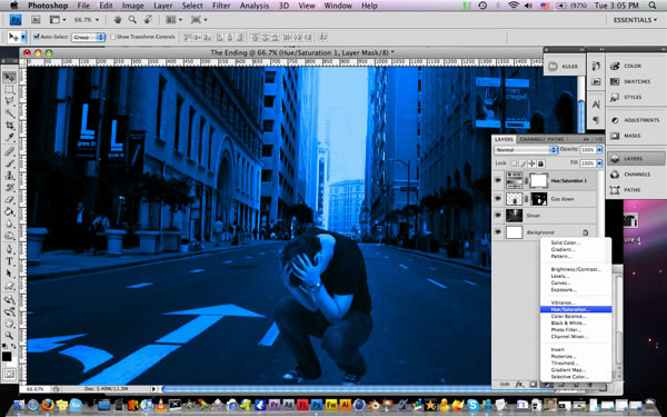
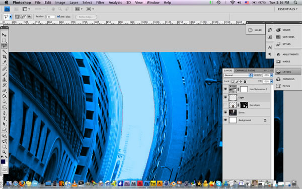
Lets create an adjustment layer of Hue/Saturation and check the colorize option, above all the layers. Keep playing with the colors until you get something you like.
Ok go to our buildings layer and add some warp to it go to Edit/Transform/Warp. Play around until you get something like this. Its really important that you leave the street the most straight as possible.
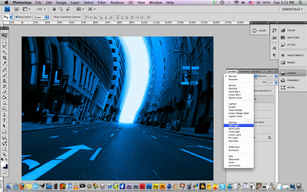
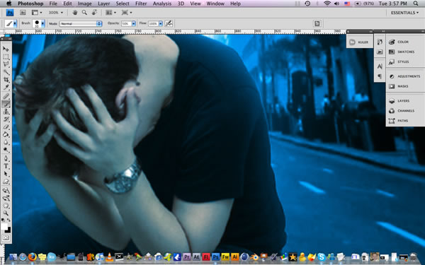
Turn off the guy layer and create a new layer on top of it. Use the Lasso Tool (L) to select all the part back there and fill it with white. See the image below
Now lets add some blur to our light. Go to Filter/Blur/Gaussian Blur and set it to 28%. Change the Blend Mode to Soft Light and duplicate the layer and give the same blur.
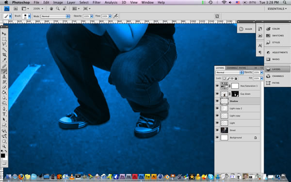
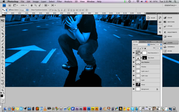
Now turn on the guy layer and create a new layer below call it "Shadow". Grab a small soft brush and low its opacity to 60% and start covering under his feets. See the image below.
Then create a new layer below of the "Shadow" layer and hit Cmd+left click over the guy layer to load the selection and fill it with black, using the Paint Bucket Tool. and go to Edit/Free Transform and rotate the image.
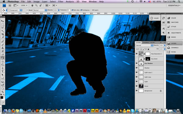
And go to Edit/Free Transform and rotate the image. Like the image below.
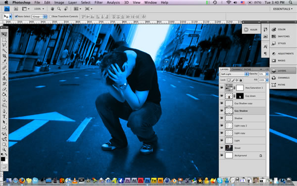
Then add a blur to our shadow Filter/Blur/Gaussian Blur and set it to 5%. Low the opacity to 70% and duplicate the layer, then by using a large soft brush with 50% opacity erase some areas until you get something like this. This step its really important if you wanna get a more realistic look.
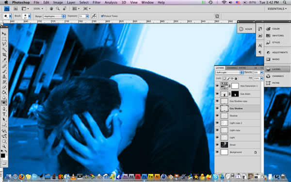
Now lets add some light to our guy that matches with our background. Grab the Dodge tool, select Highlights and set the exposure to 5% and highlight some areas.
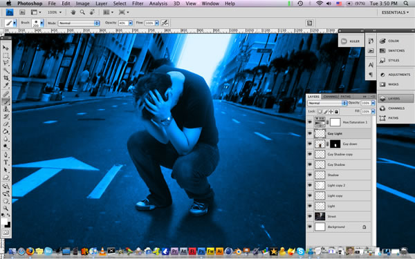
Now create a new layer on top of the guy layer and call it "Light guy" and hit Cmd+Left Click on the Guy layer to load the selection. Then just go back to the Light guy layer and using a large soft white brush start covering all the back area, until you get something like this.
Ok, now lets duplicate the guy layer and put it above all the layers and change the blending mode to Color with 60% opacity. And with a large soft eraser erase all of it and leave the skin tone. Just like this.
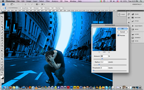
Now lets add the final touches and merge all the layers. Then lets add some sharpen go to Filter/Sharpen/Unsharp Mask with this values.
Thats it! Then you can add some nice noise to your work and get nice film look. Hope you learn something from it :-)
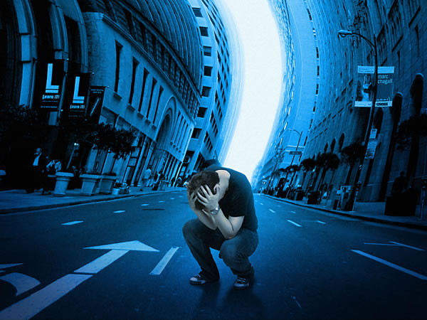
This will be our final product:

Materials Needed:
On the Groove III photo from iStock (you can use your own stock photo)
Ayosmonika font
1. Open a new document in Photoshop with dimensions 550ł¾600. If you intend this to be a large poster, you may want to consider changing the dimension of the document.

2. On the new layer and using a Gradient Tool (G) set to Linear Gradient, create a gradient from colors #a1360a to #1c0832.

3. The next step is to create the half-tone background. Go to our Channels palette and create a new layer and using the Paint Bucket Tool (G), fill it with the color #9e3116. Hit on Filter > Pixelate > Color Halftone. Set the Maximum Radius to 20 pixels. Leave the settings for Screen Angles (Degrees) to their default values. You should now have something like this.

4. Using the Magic Wand Tool (W), select the areas that are colored black and Invert the selection by hitting on Select > Ineverse. Go to Edit > Copy or CTRL/CMD + C to copy the selection. Go back to our "Halftone" layer and paste what we just copied by hitting on Edit > Paste or CTRL/CMD + V.

5. Let us now change the color of our "Halftone" layer by hitting on Blending Options > Color Overlay and use the color #db3919.

6. Change Opacity of our "Halftone" layer to 15%.

7. Let us now create our second halftone layer. Create a new layer on top of our "Halftone" layer and using the Paint Bucket Tool (G) once again, fill this layer with the color #9e3116 and hit on Filter > PIxelate > Color Halftone. Use the same settings we have on Step 4.

8. Change the Blending Mode to Difference and the Opacity to 15%. We should now have something like this.

9. Let us now create our retro circles. Using the Ellipse Tool (U), create a circle with color fill #b62f12. Make sure the Shape Layers option is activated. Draw the circle somewhere below the bottom half of the document.

10. Repeat Step 9 three more times and draw the inner circles. For the colors I have used # f67001, # fbcd29 and # acb204. We should now have something like this.

11. Merge or flatten all the 4 circles together in one layer. Duplicate this layer 3 times. Arrange and resize the circles so we would have different placements and varied sizes.

12. Underneath all our circles layers, let us now draw our vertical retro lines. Using the Rectangular Tool (U), draw vertical lines from the top of the document to where our circles are. Use the same colors as we did with the circles on Steps 9and 10.

13. Repeat Step 12 but this time, draw the lines from the circles to the bottom of the document. We should now have something like this.

14. Let us add a photo to our artwork. I used this photo from iStock (http://www.istockphoto.com/stock-photo-293471-on-the-groove-iii.php). Crop out the woman from the entire photo and place it on a layer underneath all our circles and above our retro lines.

15. Now let us add a bit of a hand-painted feel to our model. Duplicate the layer with the photo of a woman. With the topmost layer active, go to Filter > Artistic > Poster Edges and use these settings.

16. Change the Blend Mode of this layer to Overlay and its Opacity to 50%. Add a Drop Shadow to this layer by hitting on Blending Options > Drop Shadow and use these settings.

17. Let us now add hand-drawn outlines to our model. This will give it more of a hand-drawn or hand-painted feel to it. Using the Pencil Tool (P) with its color set to #000000, manually draw outlines around our model. This part is a bit easier to do with the use of a tablet, but if you donÆ─¶t have one, a mouse will do. We should now have something like this.

18. Notice that the outlines we drew are a bit sharp. Let us unsharpen the outlines a bit by going to Filter > Blur > Gaussian Blur and set the Radius to 0.4 pixels.

19. Notice the color of our model is a bit pale. Let us go to Image > Adjustments > Brightness/Contrast.

Let us edit its colors a little bit more by going to Image > Adjustments > Levels and use these settings.


20. Below the layer with our model, let us add more retro lines. Repeat Step 12 but this time, draw the retro lines past the top and bottom edges of our document. This prevents the lines to be cut off once we tilt them. Let us tilt our new retro lines a few degrees to the left as shown below. To tilt, go to Edit > Transform > Rotate.

21. Let us now add some texts to our artwork. IÆ─¶ve used the fonts Ayosmonika and the color #acb204 for the word "Muzik" and Helvetica and the color #b62f12 for the word "life".

22. Let us add a few accents to our artwork. Using the Rounded Rectangle Tool with color set to #b62f12. Also set the Radius to 10pixels. Draw a few drips around our circles.

23. Let us add some more accents by adding some scattered X symbols to our artwork as shown below.
Voila! We now have a funky retro poster! Feel free to add your own little tweaks to your design to give it a funkier feel!