
Open a regular photo in Photoshop. I used a photo of this cat.
Duplicate the layer and go to Filter>Other>High Pass. Use 5 pixels. Then change the Blend Mode of the layer to Hard Light.

Duplicate the High Pass layer. Keep the blend mode with Hard LIght.

Duplicate the original photo and change its Blend Mode to Screen. Then with the Eraser Tool (E) or with a Mask. Delete the dark areas of the photo. Leave just the light areas, the eyes, nose, and mouth. Below you can see the areas I kept, the marquee selection.

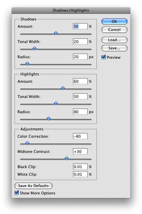
Group all layers and convert them to Smart Objects, Layers>Smart Objects>Convert to Smart Objects. Or if you prefer just merge the layers. Then go to Image >Adjustments>Shadow and Highlights. Use the values from the image below. With this adjustment you can edit how the shadows and highlights will be displayed, and you can simulate the HDR effect by increasing the Tonal Width and Radius on the Shadow and Highlights, and, also the Midtone Contrast.
This is just one way to
enhance your photos, you can use the Unsharp Mask filter as well. But I
prefer the high pass with hard light, I think it gives a better result,
however that will depend the photo you are working on. The most
important thing is test and play with the settings and of course add
more techniques to your repertoire.
Here's the BEFORE & AFTER.
Adjusting your photographs to get the color 'just right' can be a chore. Think
about this: The Old Masters of painting spent years of their lives learning about
color. Why let all their effort go to waste on the walls of some museum when it
could be used to give you a hand with color correction? When Photoshop entered the CS series it included a new tool called 'Match Color.'
This tools was made so that you could match a series of photos to one another. But there is another thing you can do with 'Match Color' that is much cooler: You
can match the colors in your photos to those in famous paintings. I keep a directory of about 30 of my favorite paintings and anytime I need to do
color correction, I just scan through them to find the one that gives the photo
I'm working on the best look. This technique can be used in other ways. For example, use the color from a scanned-in
1970's Kodachrome snapshot to give a recent photo a vintage look. Need to make a
picture more menacing? Use the color from a picture of a storm.

Color Correction Techniques:
Improve Your Photography with Classical Art

Here is how to do it:


More examples:
Image Used / Settings
Result
Original
William Blake
"The Ancient of Days"
Luminance: 200
Color Intensity: 200
Original

Johannes Vermeer
"Milkmaid"

Luminance: 100
Color Intensity: 100

Original

Pieter Brueghel
"The Tower of Babel"

Luminance: 100
Color Intensity: 100

Original

Honoré de Balzac
painting after a photographic 1842
by Louis-Auguste Bisson.

Luminance: 100
Color Intensity: 200
Note: People think my friend here looks like Balzac.

Claude Monet
"Self Portrait"

Luminance: 100
Color Intensity: 200

Original

Edward Hopper
"Nighthawks"

Luminance: 73
Color Intensity: 100

Original

Edward Hopper
"Nighthawks"
Luminance: 200
Color Intensity: 200

Original

Sandro Botticelli
"The Birth Of Venus"

Luminance: 100
Color Intensity: 100

Original

Claude
Monet
Boats in Collioure

Luminance: 100
Color Intensity: 100
